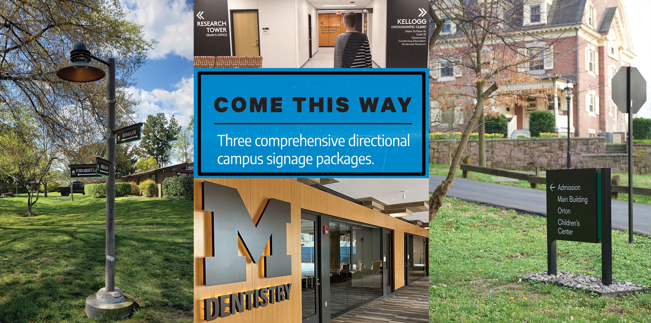
DEMAND FOR WAYFINDING signage has increased over the last several years. “Through our focus on higher ed and prep schools, the underlining need for wayfinding signage on these campuses is to improve the parent and student experience,” says Keith Davis, a technical design consultant with KRD Design (Chester Springs, PA). “As the cost of education increases, schools realize that they are competing for student enrollment and need to provide the best possible experience for the student, prospective students and their parents, which can separate them from the next school.”
Industry insiders agree that wayfinding signage will continue to be a key element for any building or campus looking to improve visitor experience. It offers a comfortable and seamless way for people to navigate the space with ease. While GPS will improve on mobile devices, static wayfinding signage will always have an important place in our society.
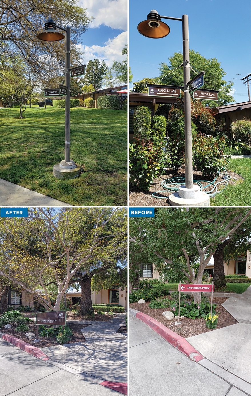
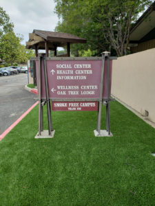
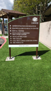
 NEWLY MINTED: MSAG’s wayfinding signs feature a brown background, white text and mint-green borders.
THE RIGHT DIRECTION
When the Mt. San Antonio Gardens (MSAG), fondly known as “The Gardens” and a nationally recognized not-for-profit CCRC Life Plan Community, decided to refresh its 30-acre campus in Claremont/Pomona in Southern California, they reached out to A & I Reprographics in Ontario, CA. The management team at MSAG was seeking new, clean wayfinding signage to replace its aging and out-of-date signs, to create a look more aesthetically pleasing to the garden environment and to make campus navigation easier for senior adult residents and their guests.
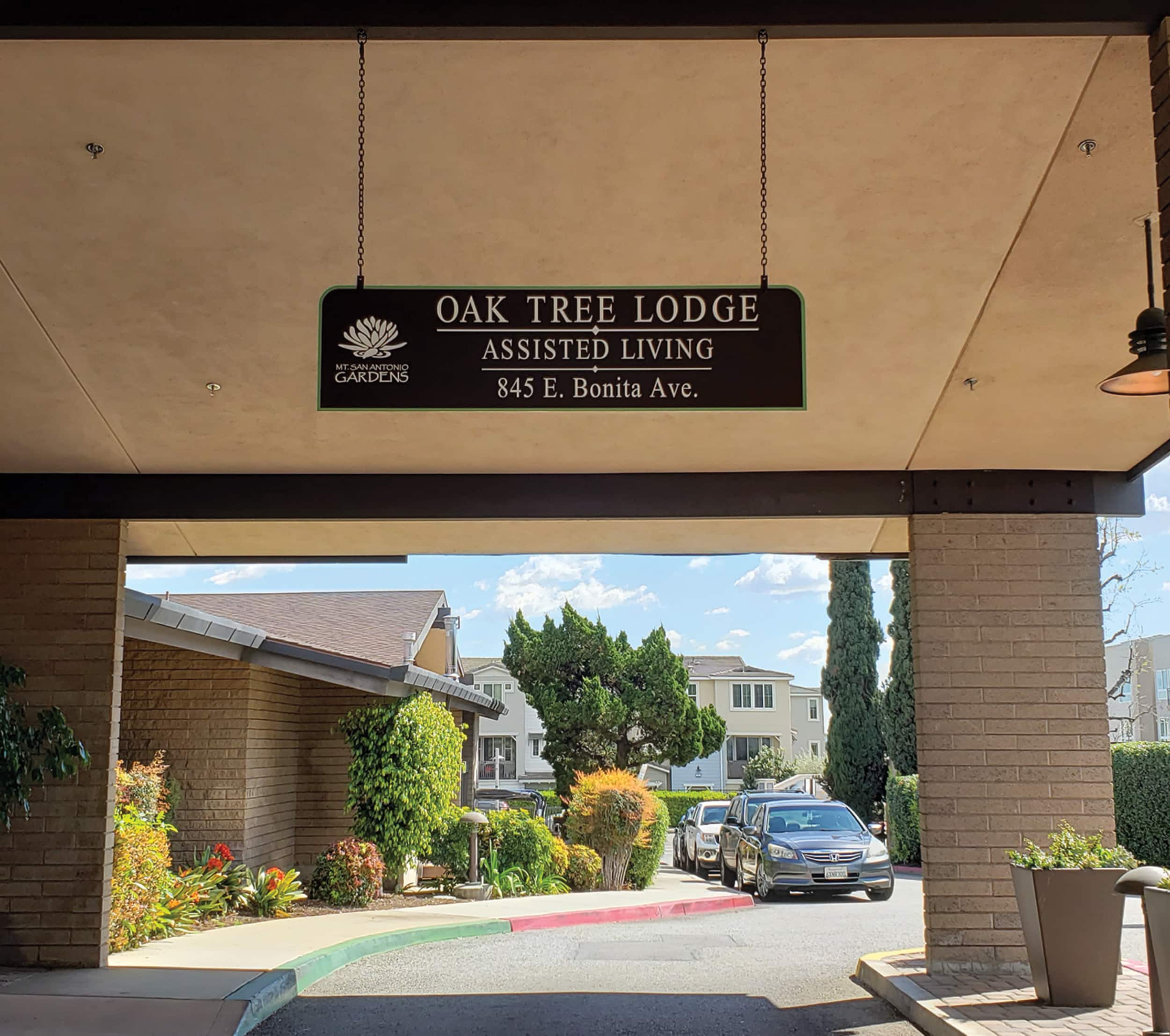
“In our initial discussions with management in May 2023, they wanted a cohesive design concept for their wayfinding signs,” says Kathy Moylan, A & I’s president. “They wanted all of the signs to have the same typeface, same color scheme, same shape but smaller while including all of the necessary information. We proposed the arch design to accommodate the MSAG logo and the wayfinding information. MSAG loved the concept, so we created initial design proofs of each sign.”
To complement the gardens, all of the wayfinding signage would have a brown background, white text and mint-green borders. Times New Roman was selected as the typeface for this project after several options were considered.
A & I partnered with Gemini Sign Products to outsource the signage fabrication. Gemini cut, printed, coded and packaged the signage, which was delivered to A & I’s Ontario office.
To produce the signs, Gemini nested the artwork on ¼-in. aluminum sheet and laser cut the designs. From there, the firm bead blasted the returns and stroke sanded the face before taking it to their paint area where the custom Matthews Paint MP3364 Doppelbock Brown was mixed and applied to the face, back and returns. Details were applied through the UV Colorlast process, an alternative solution for multicolor logos when a quality, cost-effective product needs to be delivered quickly.
Before the new signage was installed, the existing signs had to be removed. Studs or posts were cut and grinded away, making way for a clean surface to drill and mount the new posts and signage.
 FORM & FUNCTION: Logo use reinforces the brand while clear copy directs residents and visitors.
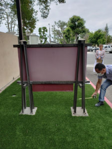
The new signs were installed on custom-made 2-in. square steel tubing with steel plates welded to the bottom and drilled to mount into concrete footings (existing and new). The installation team drilled each steel post to accept a threaded stud tapped into the back of the signs, then drilled the back of the posts to accept a nut-and-fit socket for securing the sign. Plastic caps hid the drilled holes after installation as well as the top of the tubing, which had a plastic cap to give it a clean, finished look.
The team mounted each sign to a concrete base in planter areas along the property. They drilled the concrete footings and installed redhead concrete anchors to secure the new posts. Areas that did not already have concrete were dug and concrete bases were poured using Quikrete and round tube forms. The installers set the anchors in concrete and secured the posts to anchors after the concrete had fully cured.
The only challenges faced by A & I during installation were the lack of electric power to operate its equipment, the different widths apart of each footing on existing signs and the different mounting techniques on older signs. “We compensated by using a small generator for power and cutting the studs off of some signs or using a cutting wheel,” Moylan recalls.
Once the MSAG project was completed in March 2024, its management team agreed that the signage seamlessly merged form and functionality, prioritizing accessibility and ease of navigation throughout the community.

DRILLING DEEP
As one of the leading dental programs in the country, the University of Michigan School of Dentistry in Ann Arbor, MI attracts top-notch students, faculty and researchers to its three-story building and adjacent seven-story research tower. Even the general public is welcome to its on-campus dental operatory clinics and Sindecuse Museum of Dentistry. But administrators decided that the buildings needed a complete renovation after more than 60 years, including new wayfinding signage.
The team assembled for this project, known as Blue Renew, was the project architectural firm SmithGroup (Chicago); sign company InkSpot DESIGN Inc. (Chicago) to provide design and documentation; another signshop, Visual Entities (Wyoming, MI); and nationwide Clark Construction Co. Wayfinding took on greater importance amidst the changes to the school, which included the transformation of two entrances to the building, reorientation of patient clinics, enclosure of open courtyards that became research and faculty spaces, and the creation of new internal pathways.
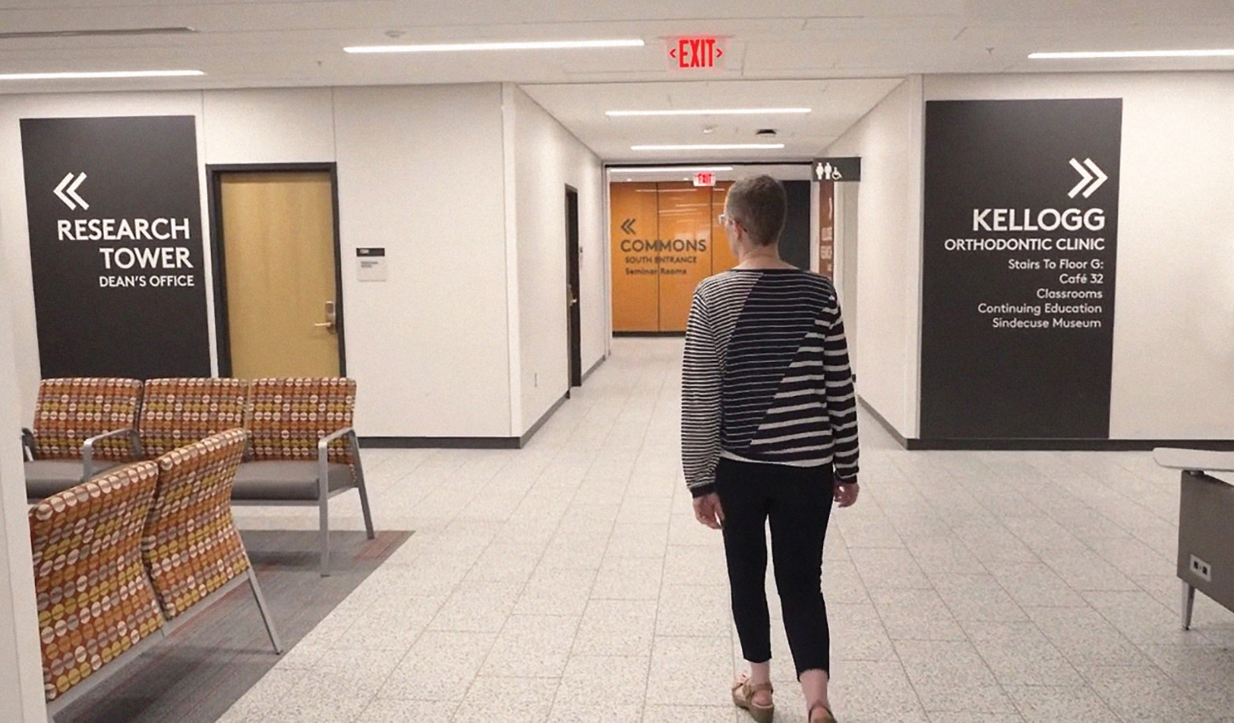
“We decided to make the wayfinding signage prominent and clear,” says Jan McCarthy, owner and president of InkSpot Design. “We were directing people to elevators, patient registration, patient parking, clinic waiting areas, clinics, seminar rooms, faculty offices, the café, student labs and commons areas. Our goal was to produce clear brief messages, follow the geometry of the interior finishes, and use a neutral color palette for the signs including white, dark neutral tones and copper. Wayfinding needed to be positioned to be highly visible along pathways, especially at monument walls and elevators. Donor recognition could be incorporated into identification signage at clinic entries and other key destinations.”
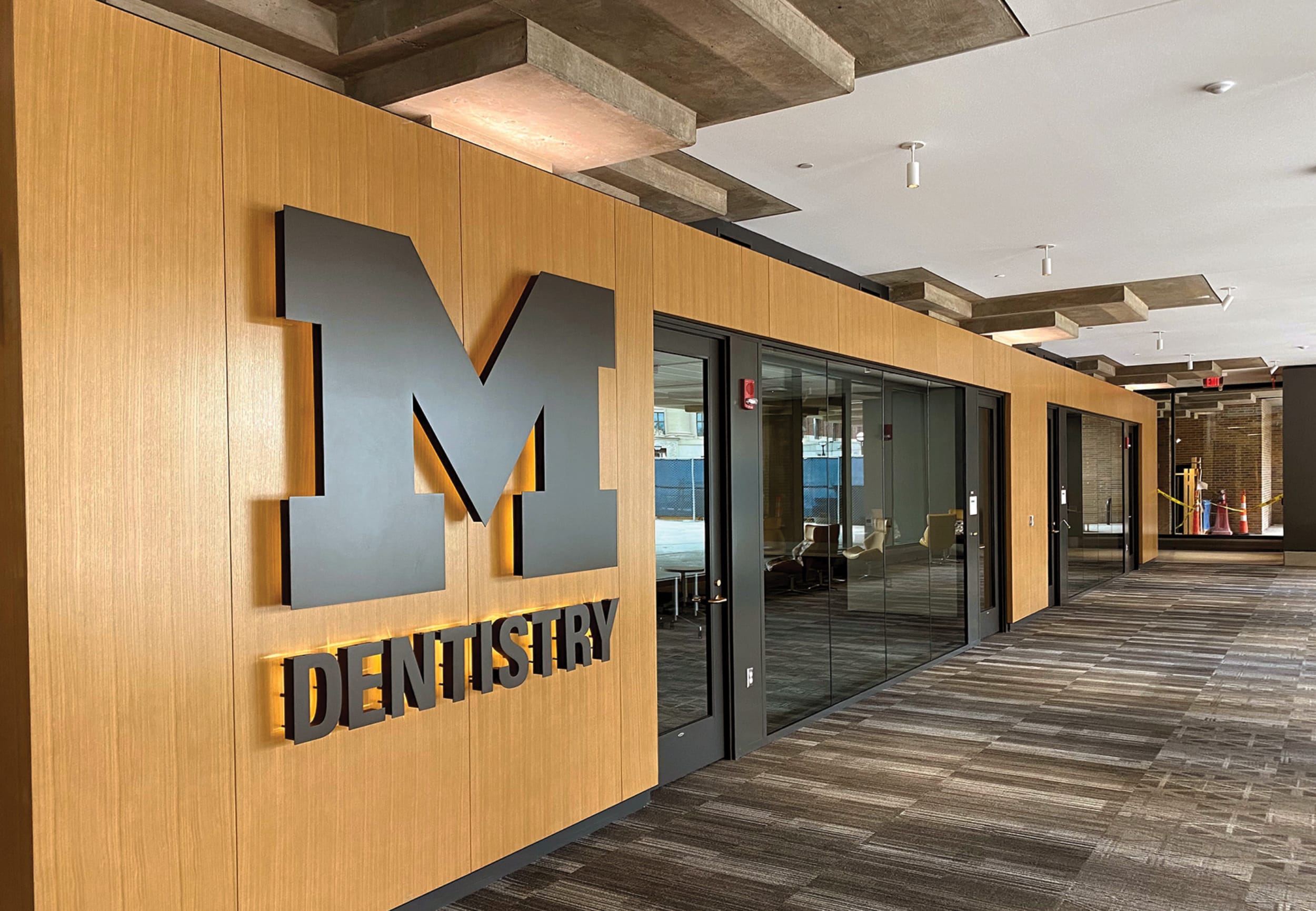
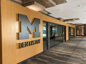
 BIG BLUE’S TOOTH: The University of Michigan’s School of Dentistry updated its campus after more than six decades and the signage was a major component.
McCarthy and her team encountered an obstacle in the form of ongoing patient clinical services, which forced the team to conduct sign construction in multiple phases. The absence of windows throughout most of the building pathways and interior corridors posed another hurdle. Without a visual reference to outside landmarks and entrances, many people had difficulty figuring out where they were in the building and had to travel back to where they entered.
As they began to design the signage, the iconic block “M” was prominently featured at three major entrances and locations. Directional panels at key intersections display large individual letters and panels, usually 40 in. wide x 90 in. high. Decreasing letter sizes also indicate the hierarchy of information, from more general orientation, e.g. clinics, research, Kresge Building, to more specific listing of spaces.
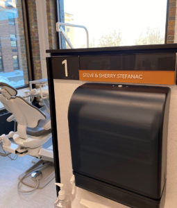
“We wanted to make walking through the building as easy and quick as possible, to enhance the patient and student experience,” McCarthy says. “A donor-recognition program was also developed that includes individual lettering, as well as names printed on acrylic bands at entries to clinics and on the many individual dental operatory stations. The donor names are all either the dark neutral or white, following the same color palette as all the wayfinding, but are applied on color bands that follow the architectural color coding by floor.”
Visual Entities, which produced all of the interior wayfinding, divided its work into five categories: code-required signs for restrooms, stairwells, exits and select building support rooms; room/space ID signs for labs, offices, support spaces, operatory/exam stations and workstations; clinic entrances, registration and elevators for highly-visible public access; wayfinding for directional information along pathways; and donor recognition to be displayed in a variety of locations.
Materials used included
- Cut-out acrylic lettering, routed and cut-out metal logos, fabricated and halo-lit metal logo.
- 6 mm ACM panels, routed to attach mounting z-clips for easy installation; background color painted with Matthews Acrylic Polyurethane, then graphics digitally printed with an Epson GS600 onto 3M 1J180 and Matte 8520 laminate applied to the painted panels.
- Acrylic letters laser cut 3/8-in. deep, painted with Matthews Acrylic Polyurethane.
- Tactile acrylic signs digitally printed with Direct Color Systems 2D Printer.
- Colors all match standard Rowmark sheet plastics as used by the UM signshop.
The sign materials and fabrication processes were designed for the local UM signshop to make future adds/updates in-house through internal campus orders.
As the $140 million project came to a close, university administrators were very pleased with the entire initiative including the wayfinding signage, stating that it was an important element of the restructured building. Even the students complimented the signage, saying that it is easier for them and for the patients to find their way to clinics, and the school seems more welcoming as a result.
 UNDER-STATED: The design is intended to harmonize with the architecture in a timeless manner.
TAKING THE CAMPUS TOUR
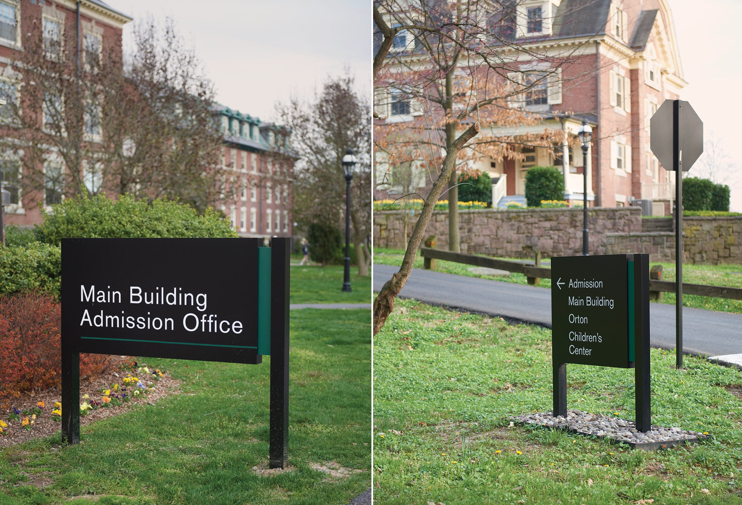
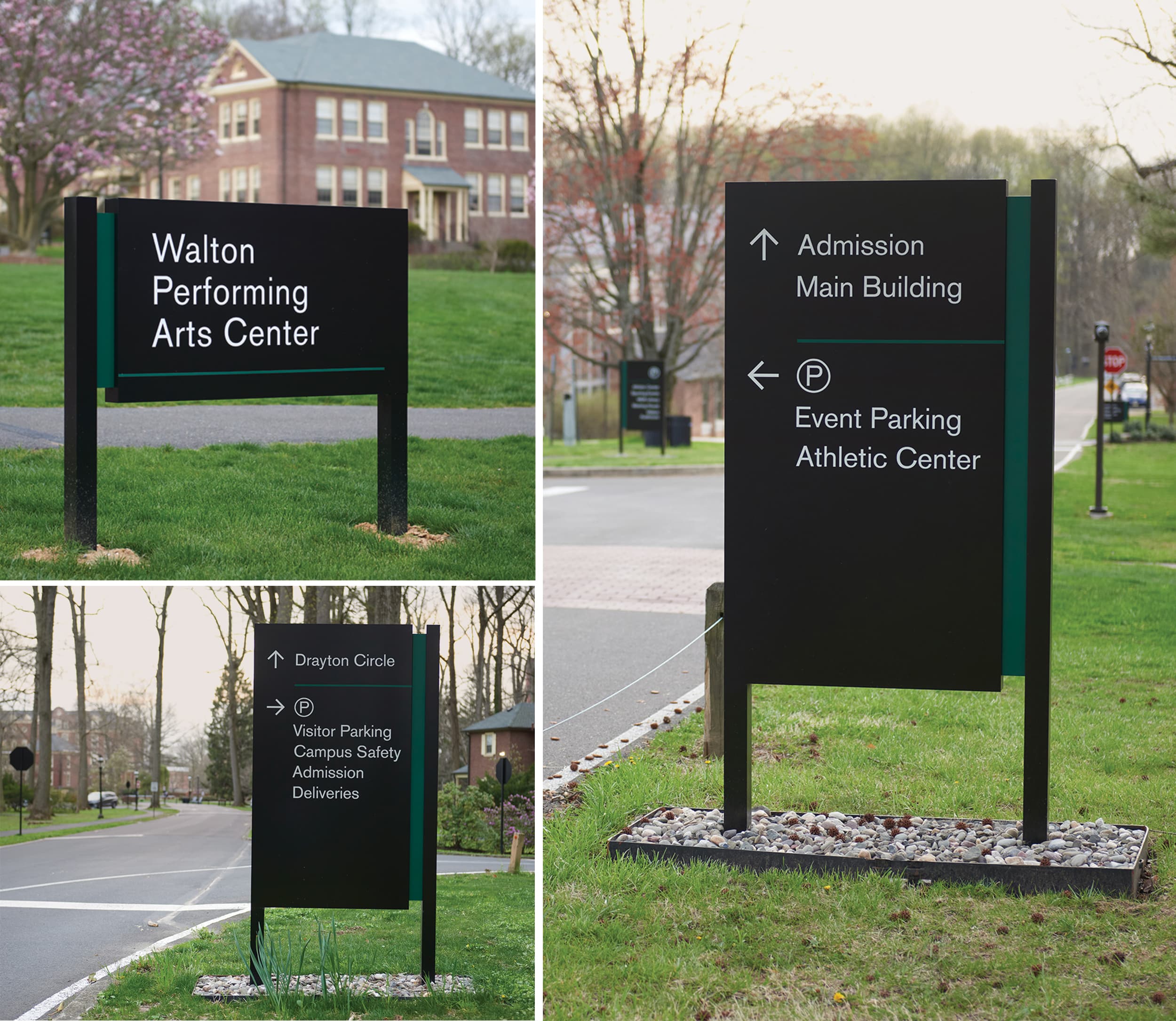
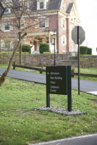
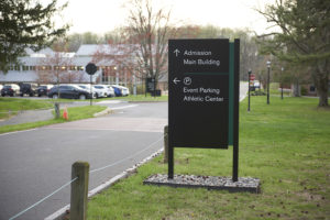
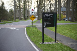
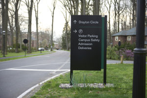
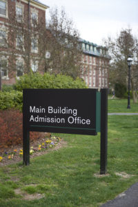
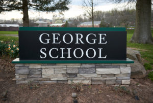
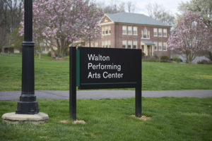
On the elegant campus of George School, a private Quaker co-ed boarding and day school outside of Philadelphia, administrators sought to increase its welcoming spirit for prospective students and their families with easy-to-identify wayfinding signage across the school’s 240-acre wooded campus. Last year, the school asked AGS, a signage and graphics manufacturing firm in Exton, PA, along with Keith Davis, a technical design consultant with KRD Design (Chester Springs, PA), to produce a turnkey design-build project for full campus exterior wayfinding.
“Our primary goal was to address an old, out-of-date campus signage system, but also support a new methodology of campus wayfinding and enhance the first-time visitor experience,” Davis says. “We designed and constructed new gateway entrance signage at the outset to establish the intended campus entry point, then crafted the campus wayfinding experience.”
The team met with campus administrators to review project goals, discuss the first-time visitor experience and general campus navigation challenges. It was important that the signage system harmonize with the campus architecture and enhance the school’s brand standards in an understated yet timeless way. The team then conducted a full-campus audit over three days to gather information and survey over 340 locations.
“We looked at everything from GPS direction giving, vehicular circulation and walking paths,” Davis recalls. “We then went into a Wayfinding Master Plan, identifying the primary decision points around campus, parking lots and the destinations associated with those lots. We discussed naming, terminologies and methodology with the project stakeholders and took that data into design phase.”
Using this information, the team designed a full menu of custom sign types from vehicular wayfinding, lot and building IDs down to parking space signs and regulatory panels. A full-campus programming document was created based on the Wayfinding Master Plan and audit, which allowed AGS and KRD to work with the school’s facilities department on budgeting and project phasing for implementation.
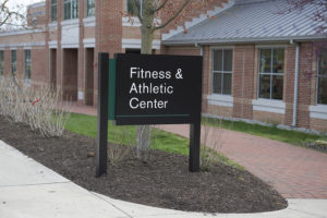
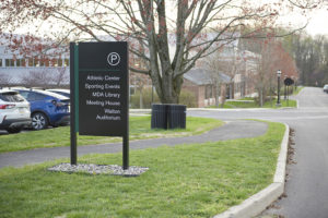
The sign’s design needed to be both utilitarian and aesthetic. For the project’s primary fonts, the team chose Akzidenz-Grotesk sans serif and Janson serif, both from the George School brand standard. To provide a natural integration into the environment, the team settled upon forest green, which harmonized with the campus and the outdoors.
To ensure that the signage could withstand the elements, AGS used standard fabricated aluminum construction and Matthews applied paint in a post-and-panel style with reflective 3M vinyl. AGS also used Wayfindit to perform the programming services for client review and approvals, as well as organize the manufacturing phases to ensure that the copy/message on each sign was confirmed prior to application. Sign face layouts were created for every location, allowing the school prior approval while two sign location prototypes were used to evaluate size, scale and legibility.
 EASY DOES IT: Designing simple fabrication methods helped keep this project on budget while meeting expectations.
Dimensional lettering for the main ID’s is router-cut then mounted to the sign cabinet using very high bonding (VHB) tapes, designed for applications where a permanent bond is needed and expected.
As the new signage was being installed, the AGS team worked with the school’s facilities department to discuss specific sign placement. This included winter snow removal methods that had affected previous sign locations and appropriate setbacks to maintain visibility. Landscaping can also be a wrinkle around campus wayfinding, so the team worked with the facilities crew on landscape edging and river rock infill around the wayfinding signage to protect the base of the sign locations from damage and extend system longevity.
With the project fully wrapped, George School was extremely pleased. “With transparency from the beginning, we established budgets to be fiscally responsible to the school’s overall signage budget while designing simplistic fabrication methods and meeting its design exceptions,” Davis says. Today when George School holds an open house or graduation, students, prospects and their families can easily navigate the school’s leafy campus.
PHOTO GALLERY (21 IMAGES)
? A & I Reprographics | InkSpot DESIGN | KRD Design
Advertisement

 Women in Signs2 weeks ago
 Buzz Session1 week ago
 Women in Signs2 weeks ago
 Russell Toynes6 days ago
 Ask Signs of the Times2 weeks ago
 Real Deal2 weeks ago
 News1 week ago
 Business Management1 week ago
