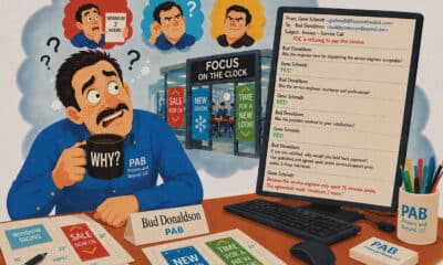
3 of 2023’s Most Redesigned Sign Designs
The case studies make hilarious, but useful learning experiences.
DESIGN REVISIONS ARE like death and taxes. We all have to do them, like them or not, and often agonizingly, not always for the better. Sometimes after two, three, four — enough’s enough, right? But some customers venture far past single-digit revisions, entering a Twilight Zone dimension of endless redesigns. In that spirit, we bring you a trio of Brain Squad members’ most redesigned designs of 2023.
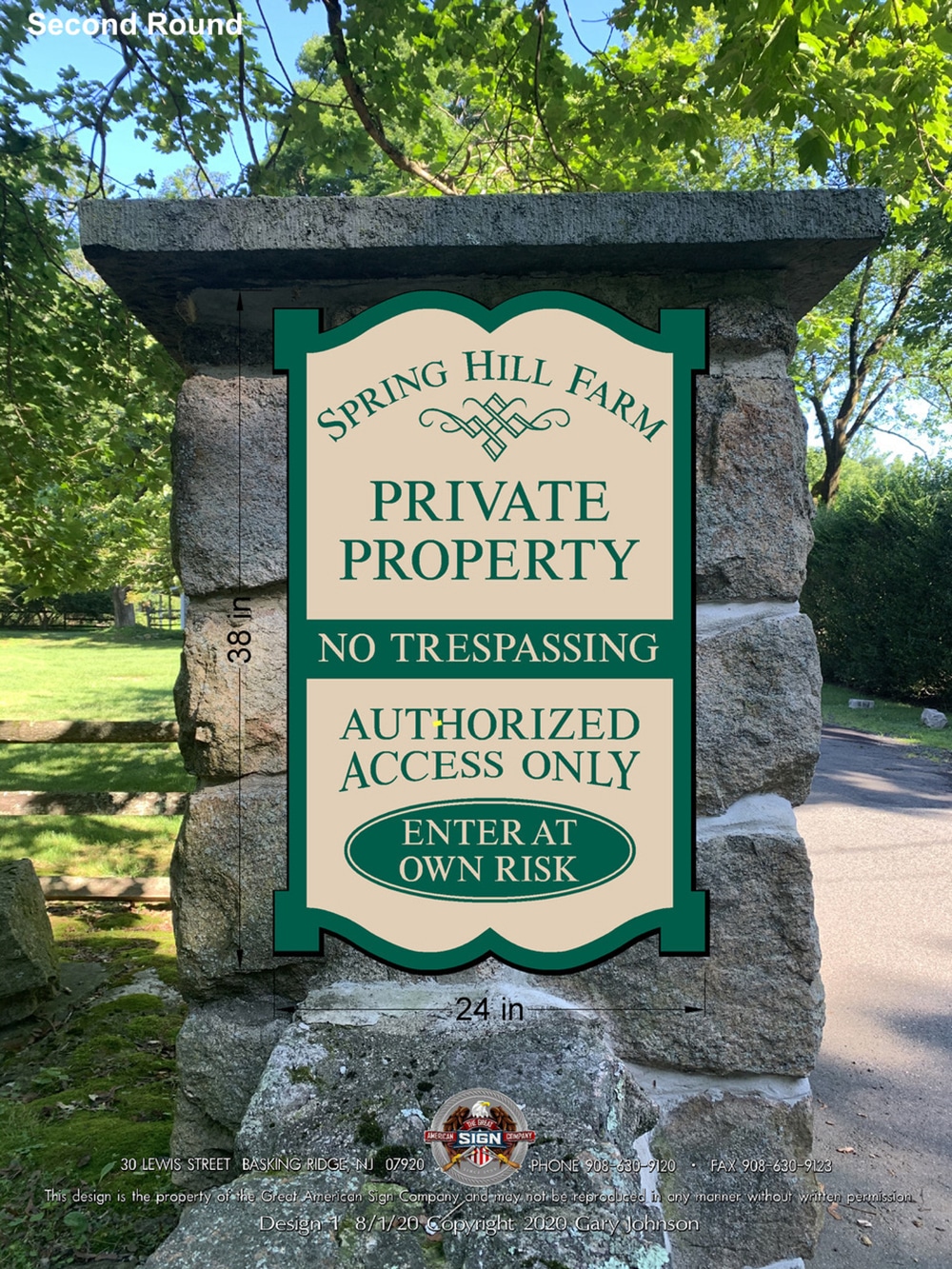
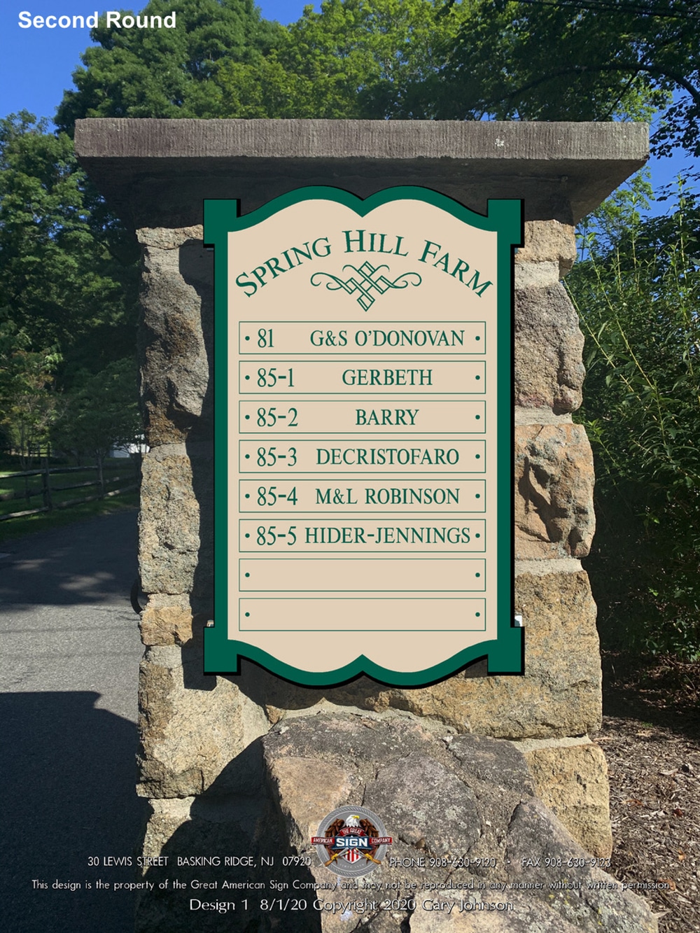
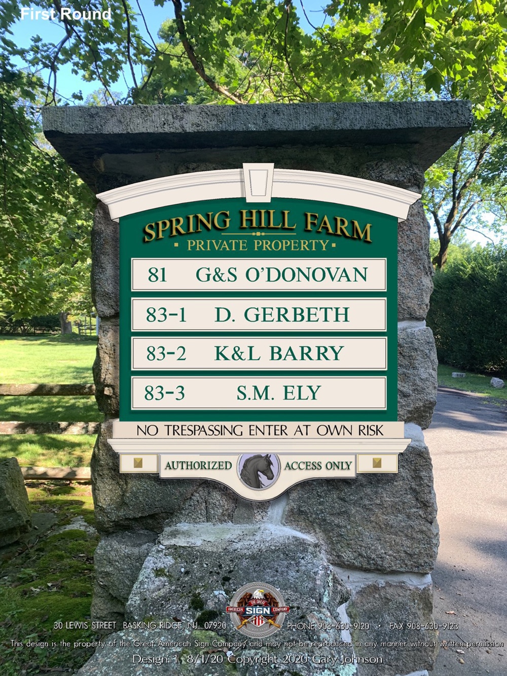
 END OF THE ROAD: The final version shown above bears little resemblance to the earlier attempts shown below.
COMMITTEE ASSIGNMENT
“Unfortunately, every customer now thinks they are an art director so I have just about given up designing signs,” says Gary Johnson, owner of Great American Sign (Basking Ridge, NJ). “I have several sign designs that I could show you that started out as beautiful designs, only to be ruined by customer changes.” Signs designed by committees are by far the worst, Johnson says. But the trouble doesn’t end there. Once a sign has been approved by the customer, the design can then be ruined by the permitting process and the township’s arbitrary rules and restrictions, he adds.
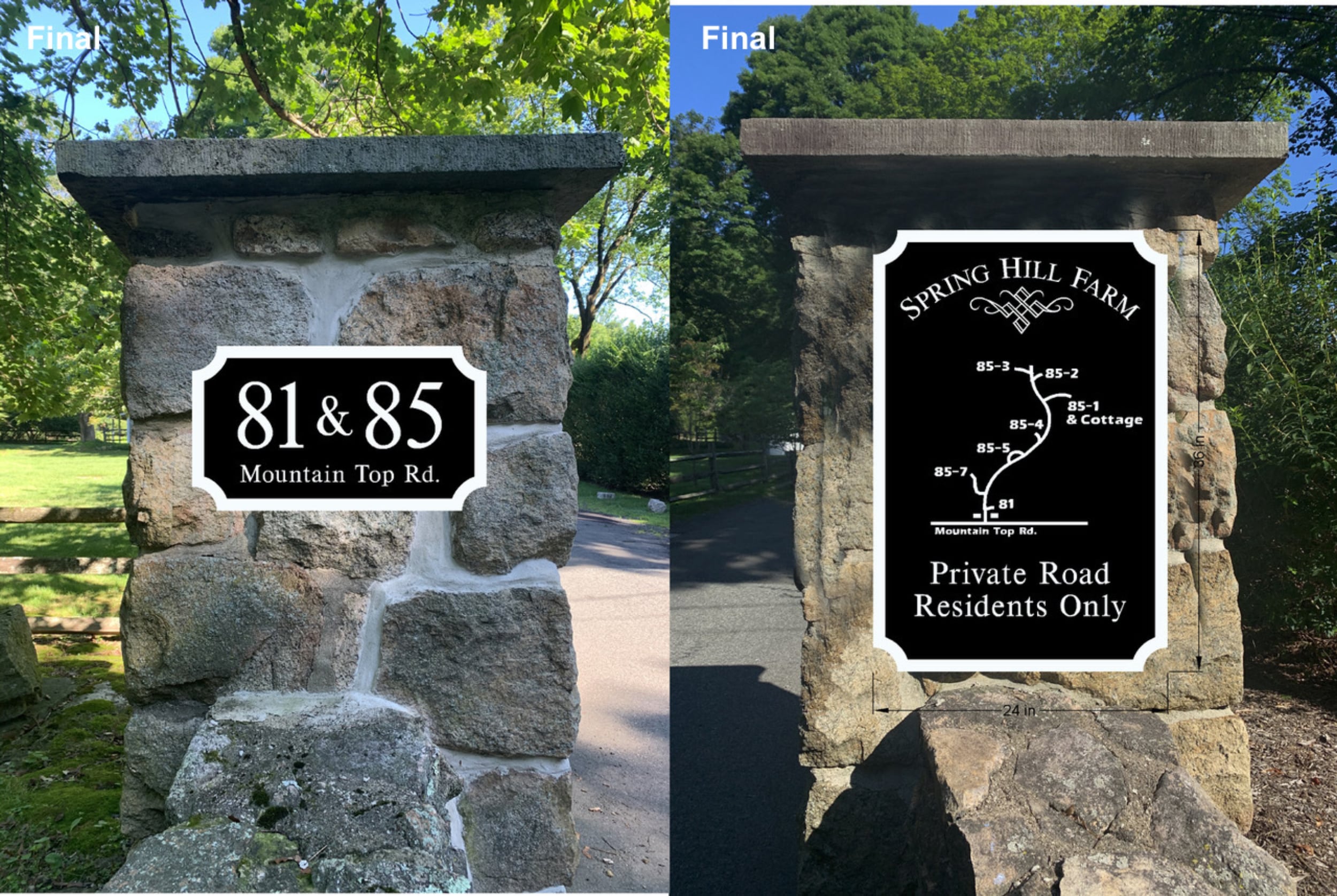
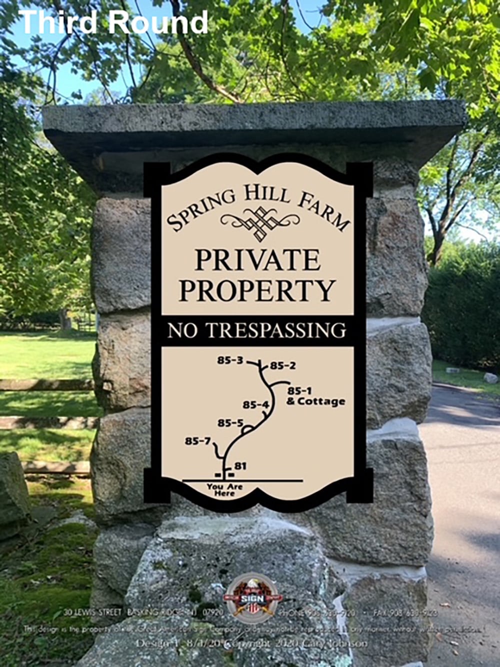
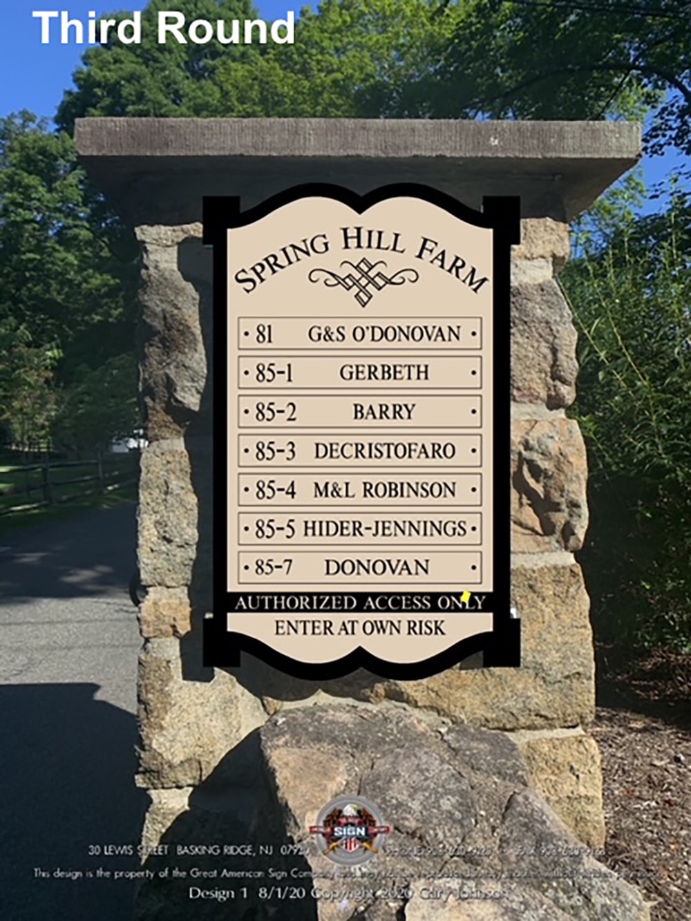
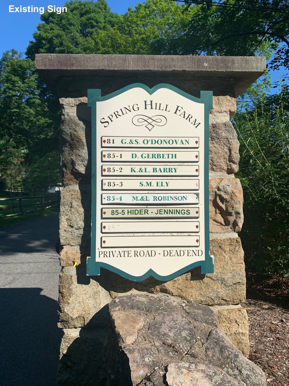
The customer whose redesigned sign is shown here is the HOA for an estate with multiple homes. Once likely a farm with multiple houses for family and workers, now all are private residences. Among the responsibilities for the HOA are road maintenance, snow removal and Great American’s signs.
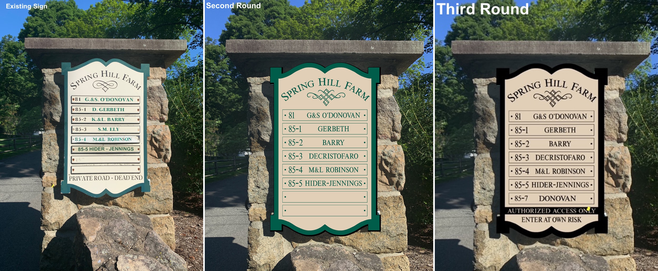
An existing sign on one of a pair of stone entrance pillars was showing its age and the HOA wanted to discourage curious neighbors from walking past the entrance, Johnson says. “This is a very colonial part of New Jersey and I thought by giving their sign a more formal look with 3D molding and goldleaf that it would help increase the prestige and value of the property, as well as tamp down on what I thought was an excessive amount of warning verbiage.”
To start, Johnson created two identical signs for each of the pillars for symmetry, each listing half of the residents. “Making two signs also allowed the names to be bigger, making them easier to read,” he explains. The client agreed with the two-sign solution but wanted the signs to be simpler like the existing sign with one sign just for residents names and the other with excessive no trespassing verbiage.
Next, the association wanted to change the green to black, add a map and move around the “No trespassing” verbiage.
After that, the residents wanted to change everything. “Signs by committee are the worst,” Johnson reminds us.
All in all this took about a year to complete as there were a lot of little changes between revisions and it would be months before the HOA would get back to Johnson with any feedback. “They could have had two beautiful signs and instead chose to have two overly simplified and in my opinion confusing signs,” he says.
AdvertisementAttorney-client privilege
Ongoing $100k-plus electric sign project summed up by Edward DeZuzio, Butler Sign Co. (Wayne, NJ).
- Qualification round of pricing by end user.
- Sign Cabinets
- Channel Letters
- Create proposal as selected provider.
- Revise sizes and pricing because attorney did not account for huge permissible sign area.
- Actually was an upsell to larger sign based on using advertising dollars to onsite signage and the ability to read sign code. With millions of views per day,
- yes millions, end user would be nuts not to spend a tiny bit more for 10-plus years of onsite advertising.
- PO issued, waiting on signed proposal and art approvals.
- New logo released for ‘production.’
- Revise sizes and pricing because attorney did not account for huge permissible sign area.
- Print samples to demonstrate how persnickety blue is on a letter face without a white inline.
- Marketing team decides changing the logo at this time and moving their headquarters would not be wise.
- Waiting for digital versions of existing logo.
Future activities: See items 3 and 6, repeat indefinitely.
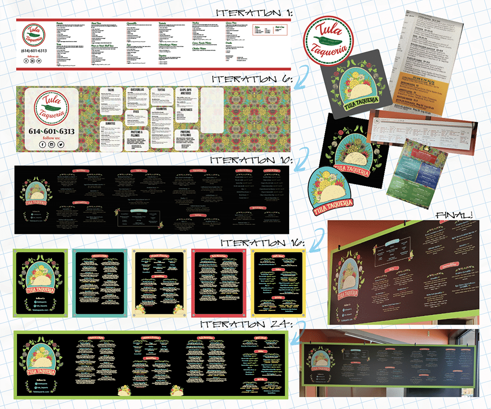
 AY DIOS MÍO: This process may have involved more revisions than items on this menu.
NO MÁS, POR FAVOR!
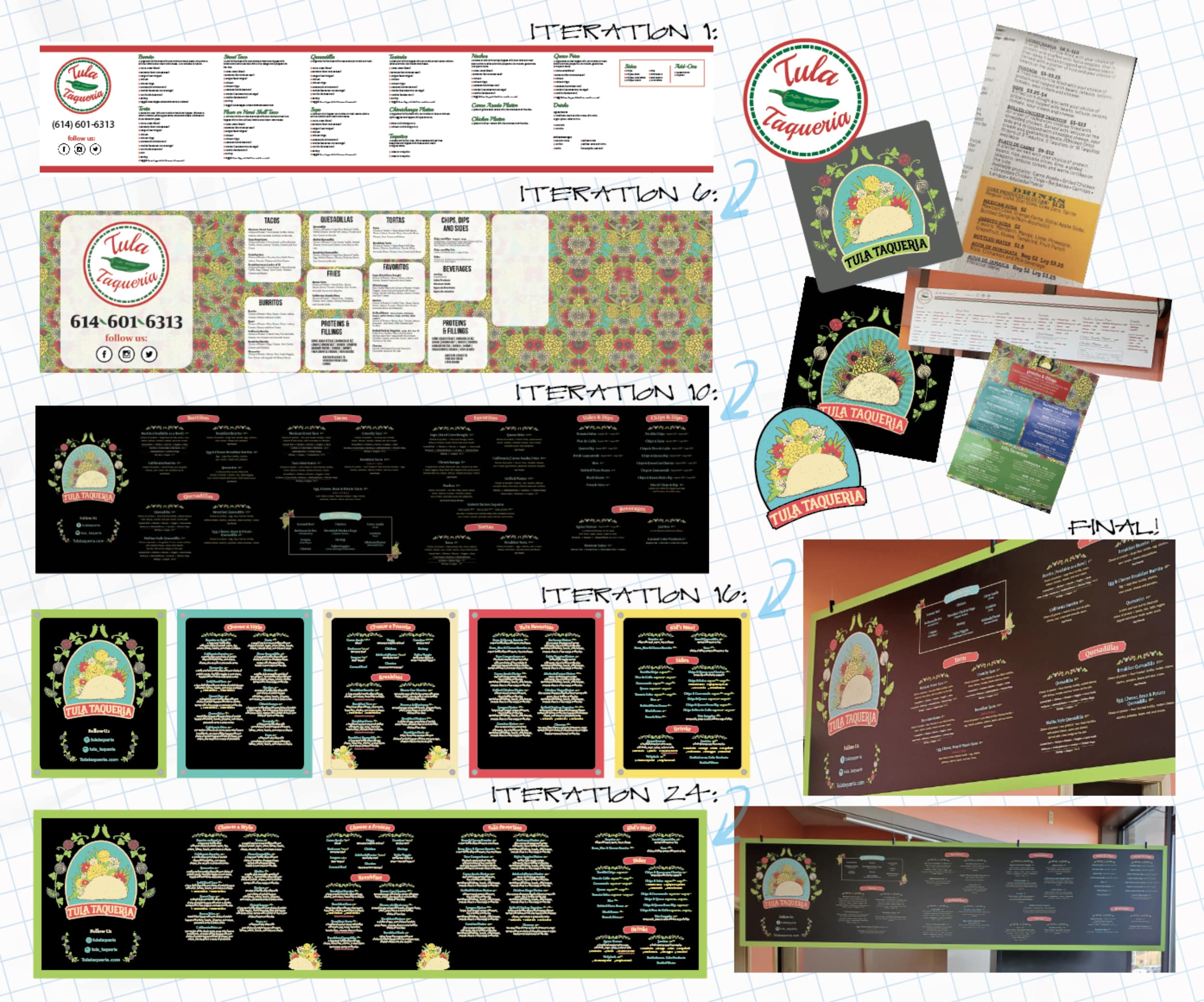
Derek Atchley and Atchley Graphics (Columbus, OH) worked with a local restaurant for Latin American cuisine, and despite an extensive two-part site survey and design meeting, as well as supplying existing in-use menus and creative assets, the signshop made no fewer than a couple dozen design revisions. “We also made revisions on materials multiple times,” Atchley says. “The end result was in no way a representation of the initial design concept and we had to rewrite their entire menu for them.”
The signage was for a more efficient display and understanding of their menu and the ordering process. The client provided a random assortment of artwork they created and from a separate designer they had used for other elements, such as apparel. Instructions were very loosely provided, Atchley says.
“… upon installation, the owner boasted to his staff that the final result was all his original ideas and all we did was ‘hit print.’” — Derek atchley
“We essentially had to redesign the menu multiple times to account for a slimming down of the volume of content the client initially wanted on the menu,” he recalls. The restaurant already had handout menus that Atchley recommended they position at the start of the queue, but then the owner wanted all that information, and more, on the overhead menu. This made the graphics tiny, jammed up and hard to understand. “We reduced the copy several times to make it more readable and understandable at a distance,” Atchley says. “The color palette we were asked to use was also way too confusing and made readability too hard, so we cleaned that up, too.”
The shop satisfied the client’s requests at every turn, only to receive an all new set of ideas or directions to shoehorn into the layout. “New ideas and directions were being emailed almost every other day,” Atchley says. The entire design process, from initial consultation through all the revisions took at least four weeks — “a minimum of 2-3 weeks longer than needed,” he adds.
Once finally approved, the graphics were printed on one of their HP digital printers and matte-laminated on one of their GBC laminators, with finishing all done on the shop’s Summa digital cutter. These were applied to an Alumacore base panel and edge-trim, which installers anchored from the ceiling with aircraft steel cable.
Atchley Graphics had literally used all the copy and creative assets the client supplied and requested, only for the shop’s lead designer to almost entirely recreate the artwork from scratch to scale back a huge portion of their copy. “The irony was,” Atchley says with a smile, “upon installation, the owner boasted to his staff that the final result was all his original ideas and all we did was ‘hit print.’”
The shop learned to have a more detailed initial project consult at the start that set better expectations ahead of time on design revisions. “We did cover our time after the fact, and the client understood,” Atchley says, cautioning, “but definitely let the client know upfront that excessive design revisions can get pretty expensive.”
 OUT OF LETTERS: Luckily, the client chose design Z, avoiding Greek … or Egyptian hieroglyphs.
FASHIONABLE ASYMMETRY
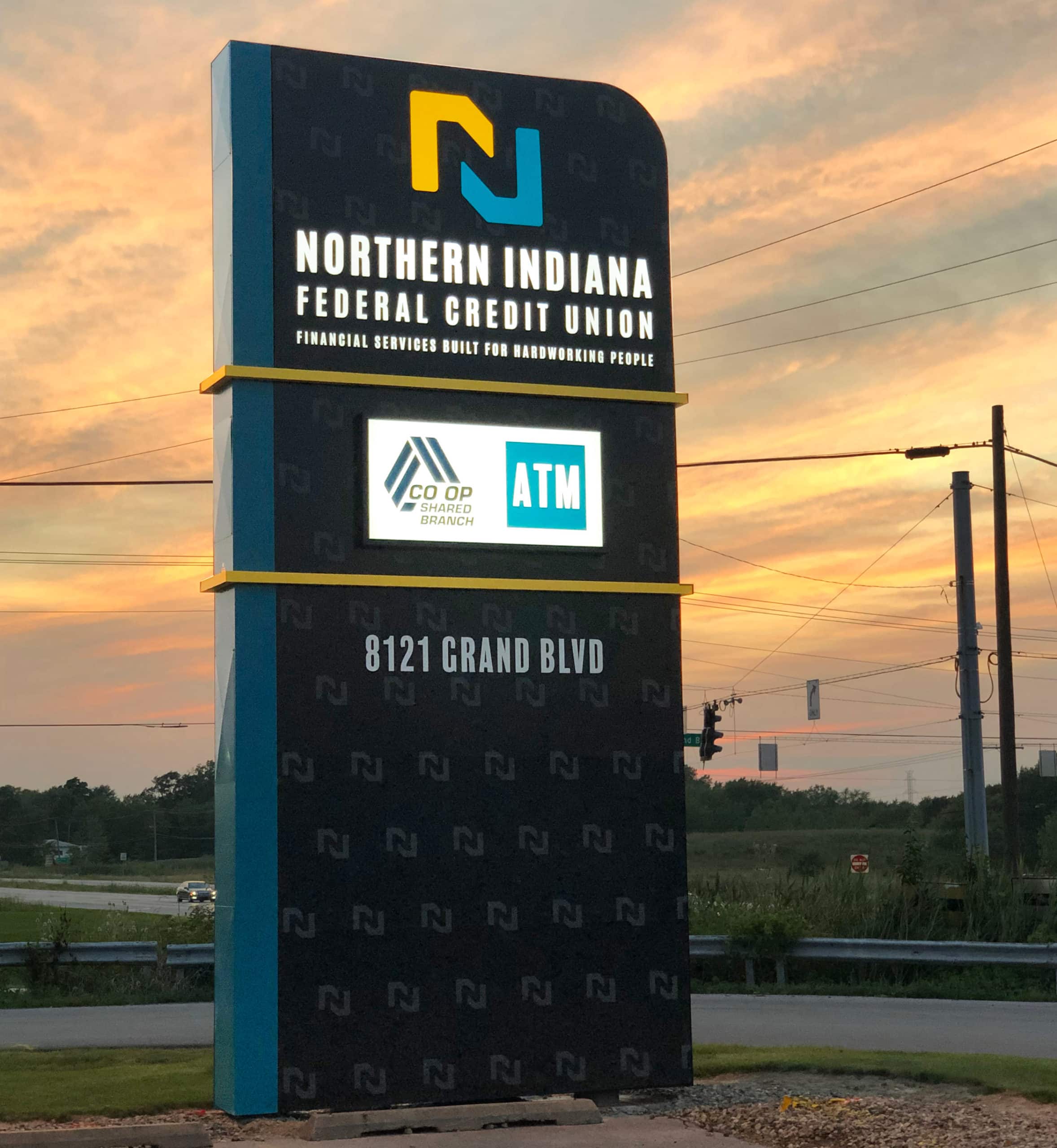
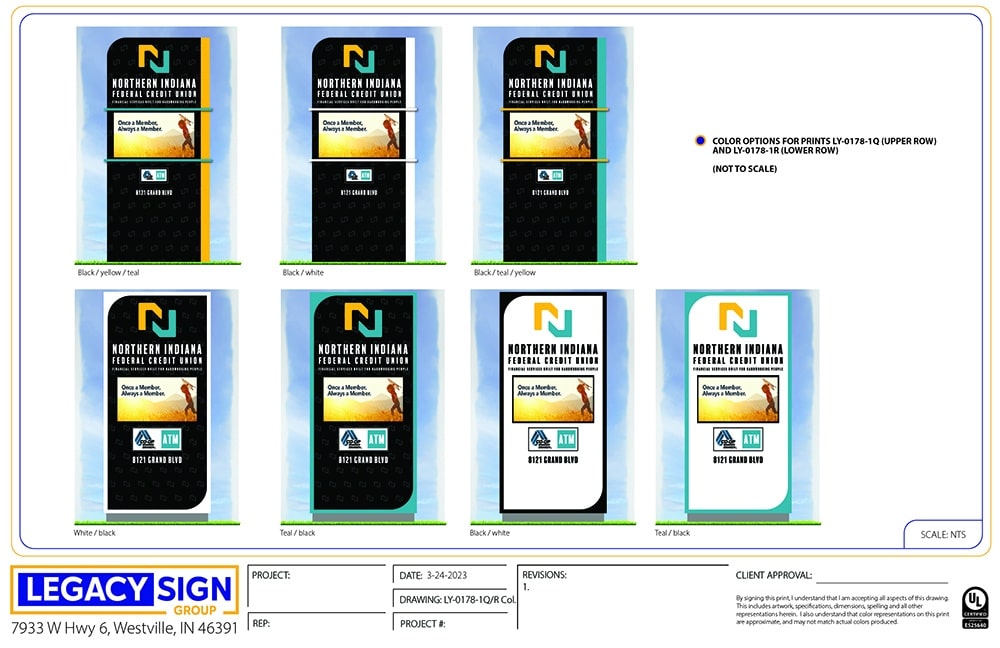
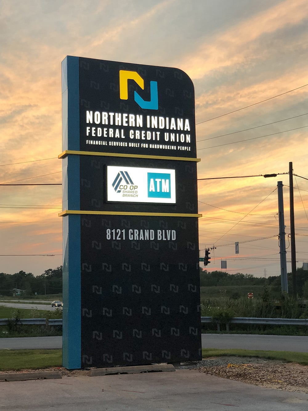
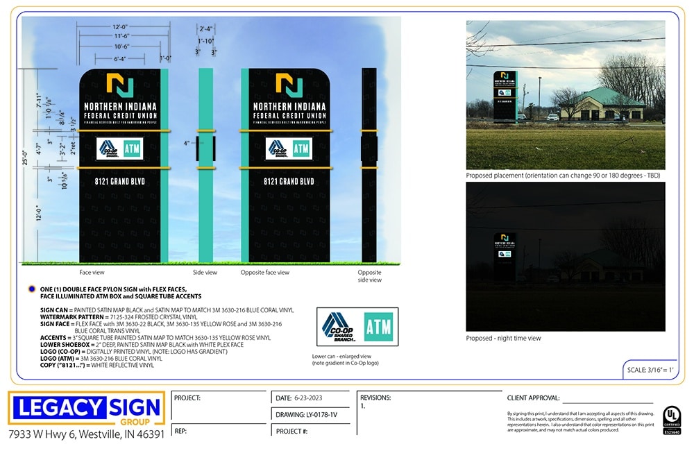
Legacy Sign (Westville, IN) found a very amenable client in Northern Indiana Federal Credit Union (Hobart, IN), who never once responded negatively to any of the versions brought to them, according to Legacy designer James Burling.
The credit union must compensate for the lack of visibility of their location next to a stoplight on a busy road, which presents an opportunity for an eye-catching design that might attract and inform passing and stopped traffic, Burling says. The client also has a recognizable black, gold and turquoise color scheme, which they wanted to incorporate into the design but did not have a specific vision for how the sign would look and function.
“They gave us a lot of leeway to try some different color combinations, layouts and effects,” Burling adds, and experiment Legacy did. Using the Adobe suite of designing software plus the Illustrator CAD tools plugin for scaling and dimensioning, the shop set out with an asymmetrical angular design that sought to draw attention on a “dreary stretch of road,” while still maintaining a professional, not too whimsical look.
The client loved the design’s ‘wow-factor’ right away, but asked for other color combinations within the same layout. A few weeks later, they asked for other designs using the same concept: bold, angular, eye-catching designs with three main colors. A few months later, following internal discussions, the client requested a more conventional option but one that still ‘pops’ like the shop’s original concepts.
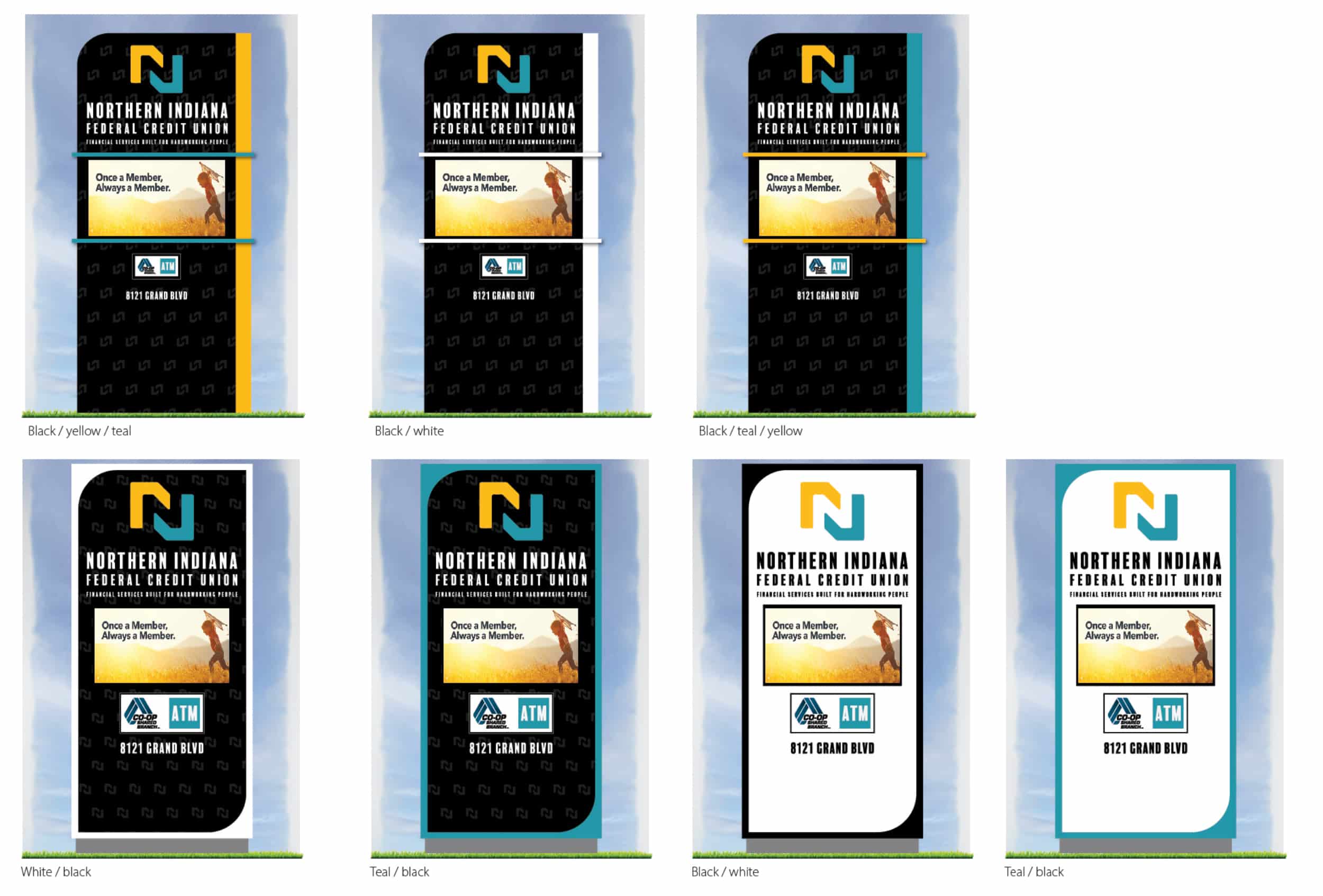 VERSIONS A TO Z: 26 versions of this design were shown to the client, one for each letter in the alphabet.
So, Legacy settled on a much more conventional monolith style, Burling says, but the asymmetry from earlier versions remains with a single rounded corner on the top of the can and a bright band of color running around the edge. They fabricated the sign using a Roland plotter and an AXYZ router for cutting plex and ACM, as well as 3M Panagraphics III substrate film for the flex face, GE LED lighting and Matthews paint.
Legacy introduced their first design concept in November 2022 and proceeded through 26 variations, some of which were just color variations, before the customer chose a final design in June 2023. Once they had determined two key concepts that the client preferred, it boiled down to trying to interpret feedback into a design that works best for both worlds.
The moral of the story, Burling says, is the dilemma of diverse options. Too many options only confuse customers, but signmakers must also be flexible and willing to explain why a layout or color scheme might not work. The client may not immediately see the difference between a great design and color combination and not-so-great ones, so by following their credit union client down the rabbit hole and providing expert guidance along the way, Legacy came out on the other side with a great project.
PHOTO GALLERY (11 IMAGES)
? Great American Sign | Atchley Graphics | Legacy Sign

Secrets of Lead Generation
Boost your sales by generating more leads! In this light and lively webinar featuring Maggie Harlow, CEO of Signarama Louisville Downtown (Louisville, KY) and the “Business of Signs” columnist for Signs of the Times, learn the secrets of how leads are generated, where they come from and how you can cultivate better (not just more) leads.


Bulletins
Get the most important news and business ideas from Signs of the Times magazine's news bulletin.
-

 Business Management2 weeks ago
Alternative Management Advice for Sign Companies
-
 Fabrication + Installation1 week ago
Small Signshop, Big Fabrication
-
 Paul Ingle2 days ago
120 Years of Signs, and I’ve Seen 41 (Mostly)
-
 Real Deal5 days ago
Sign Company and Customer Clash on “Minimum 2 Hours”
-
 Benchmarks2 days ago
5 High-Performance Vehicle Graphics Projects
-

 Tip Sheet4 days ago
Workflow Automation, Budget Discussion and More Signshop Tips
-
 True Tales2 weeks ago
My Shirt Says “Signs”
-
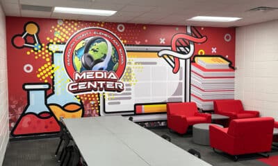
 Mildred Nguyen2 weeks ago
Interior Reimage Transforms Georgia School