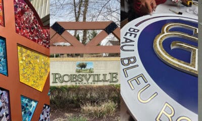
3 Monument Signs to Excellence
Weathering a category 5 hurricane, plus more great examples.
SO MANY SHAPES and sizes, materials and settings, designs and budgets — but all monument signs share the goal to stand out, to create a marker, to let all know that X is here. We asked three sign companies to share those details and more: the finer points of monument signs.
THE STORY OF THE HURRICANE
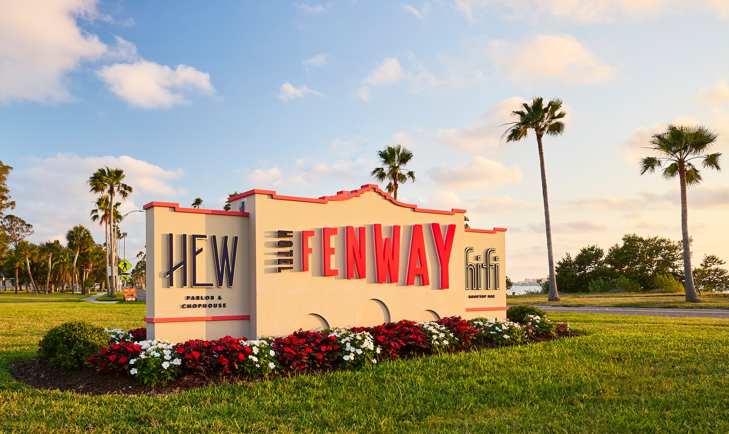
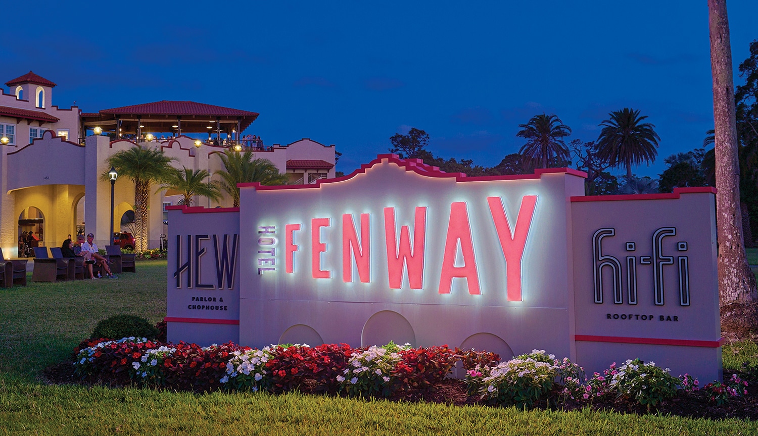
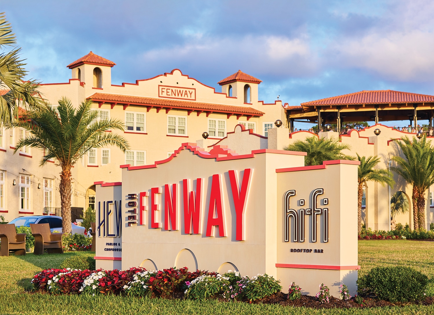
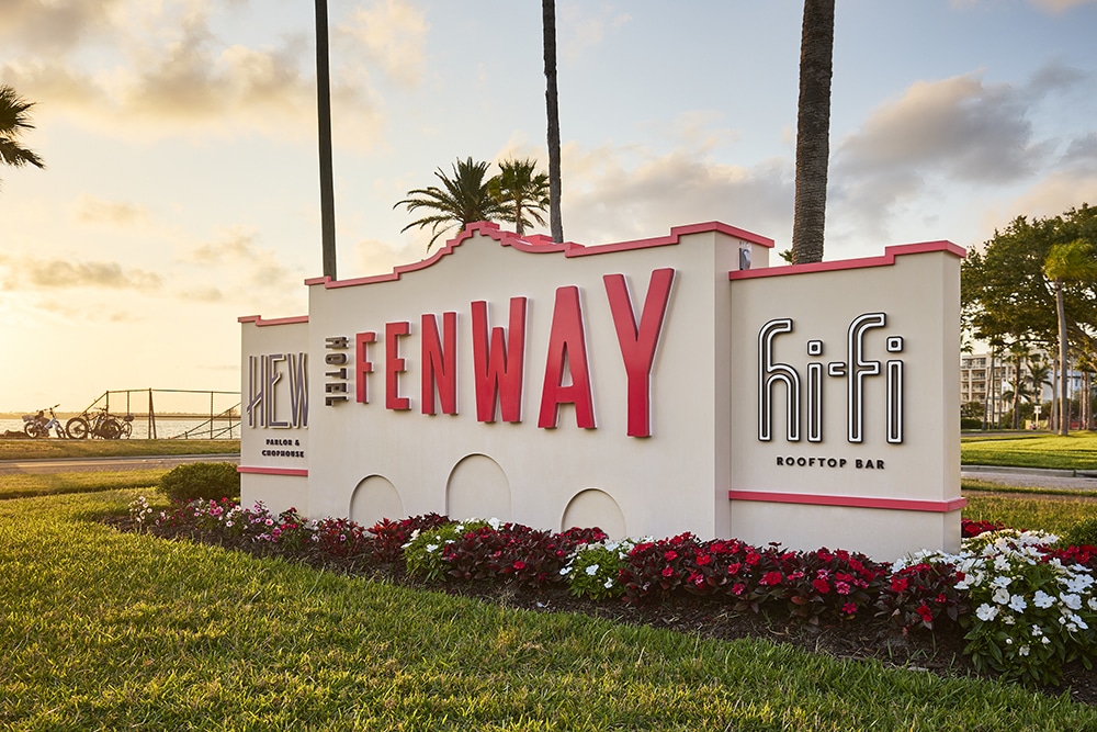
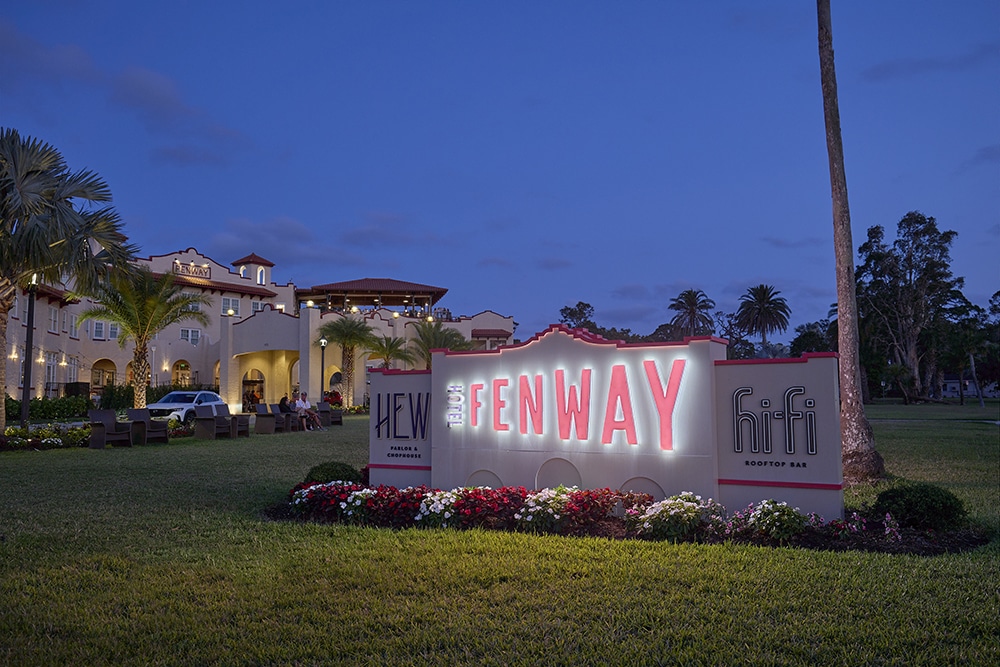
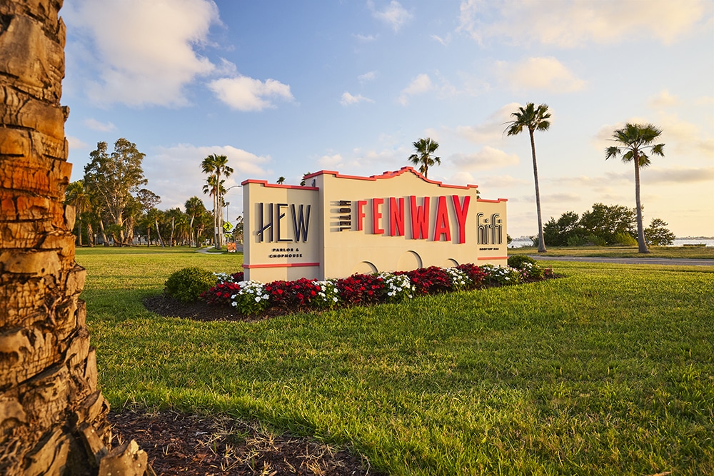
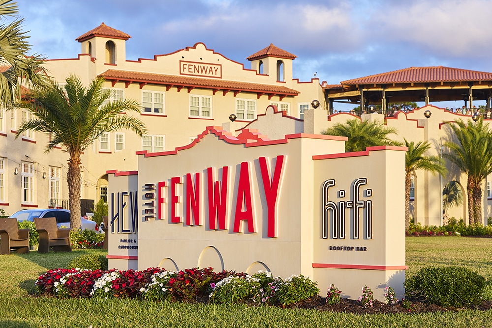
No sooner had Creative Sign Designs (CSD; Tampa, FL) completed the new monument sign for the Fenway Hotel in Dunedin, FL, that Hurricane Milton — tied for the most intense Atlantic hurricane ever recorded over the Gulf of Mexico — impacted the west coast of Florida.
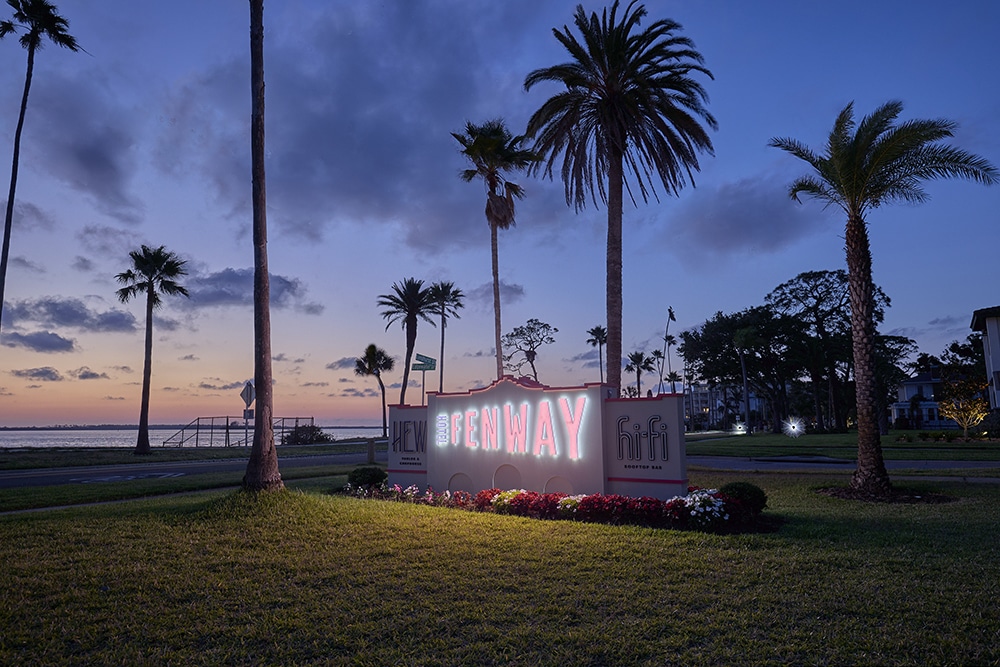
“After installation, the sign successfully withstood Hurricane Milton without damage in a real-world test that reinforced the importance of the engineering, foundation design and coastal considerations built into the project,” says Joshua Weber, project manager II for CSD. “It was a memorable and validating moment for the entire team to see the design hold up under extreme conditions.”
Long before the category 5 storm paid its visit, CSD landed this project at the hotel owned by Mainsail Development (Tampa, FL), a long-standing client. “This project was awarded based on our established relationship and prior successful collaborations, with trust in our ability to deliver a cohesive and context-sensitive signage program,” Weber says.
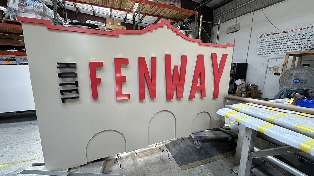
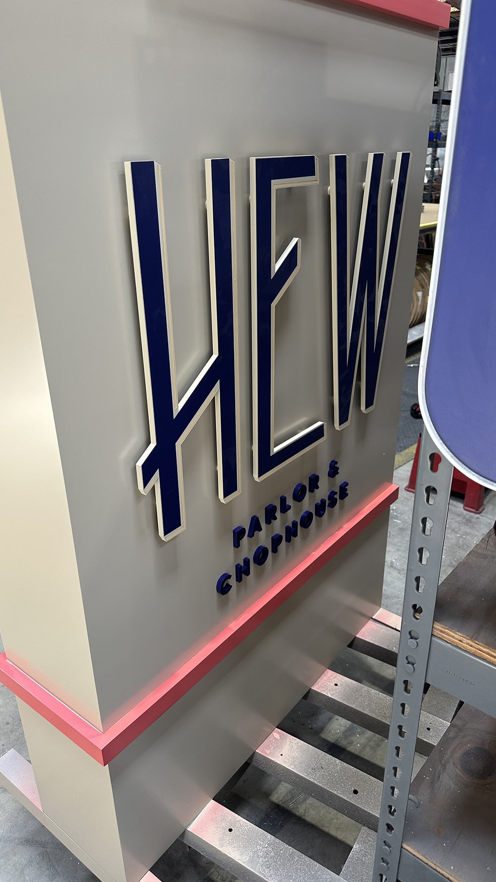
 Creative Sign Designs carried over some, though not all, architectural elements to the hotel’s monument sign.
Monumental Characteristics
Beyond visibility, the most obvious characteristic — to stand out — and the primary consideration was architectural integration, Weber says. The monument sign was designed to align with the Fenway Hotel’s architectural character, proportions and material language, which CSD was handling as well.
Because the hotel’s interior signage was completed prior to the monument sign, it served as the design benchmark. The monument was intentionally developed to carry through the same visual language: aligning materials, color palette and overall to ensure a cohesive experience across the entire signage package, Weber says. This approach allowed the monument to feel like a natural extension of the interior environment rather than a standalone element.
“Careful attention was given during the design and drawing phase to ensure the monument complemented the building rather than competing with it, allowing it to feel intentional, site-specific and enduring,” he says.
The monument sign was constructed using durable, site-appropriate materials selected to complement the Fenway Hotel’s architecture while being able to withstand the demands of a coastal environment. “The fabricated metal structure incorporates integrated, energy-efficient LED illumination and was fully engineered for hurricane wind loads,” Weber says. “Power supplies were strategically located in elevated, accessible areas to ensure serviceability while reducing risk in the event of flooding during severe weather.”
These design and engineering considerations proved critical, according to Weber, as the monument successfully withstood Hurricane Milton without damage — reinforcing the importance of resilience, serviceability and site-specific design in coastal signage.
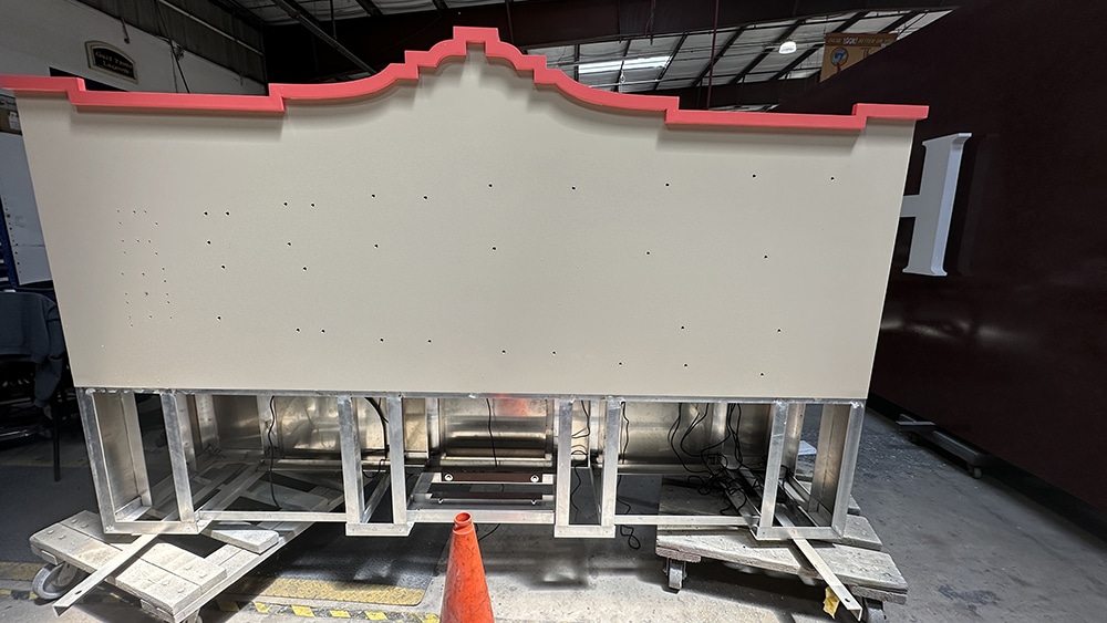
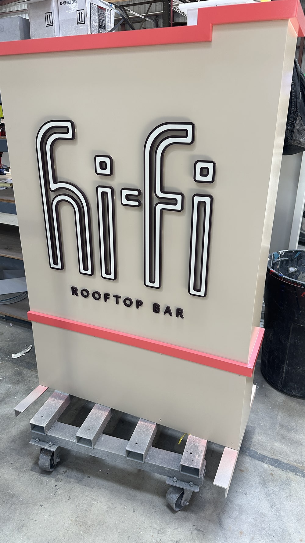
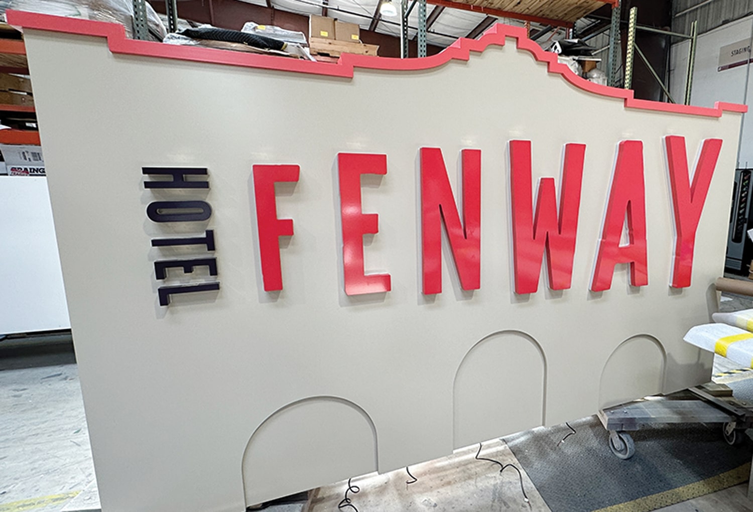 The front of the center portion of the monument, which was constructed in three sections.
Installation & Revelations
CSD completed the install over several days using a four-person crew and requiring close coordination with local permitting officials and inspectors, particularly for the foundations. Given the site’s proximity to the Gulf, excavation had to account for the local water table while meeting structural and code requirements, Weber says.
The monument foundations measure 4 sq. ft. by 2 ft., 6 in. deep and incorporate three Schedule 40 steel posts. The monument was fabricated in three primary sections and assembled on site prior to final installation, allowing for efficient inspection approvals, precise alignment and a controlled installation process under challenging coastal conditions, Weber reports.
“One of the most valuable takeaways for readers is the background and intent behind the monument sign,” Weber says. “The Fenway’s transformation from a historic music venue into a boutique hotel required a design approach that respected the building’s architectural identity while nodding to its musical past. The monument sign plays a critical role in that transition — serving as both a wayfinding element and a storytelling piece that bridges the site’s history with its new purpose.”
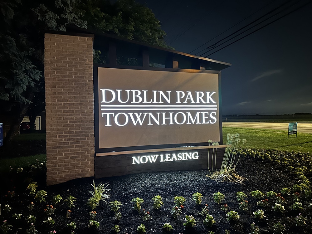
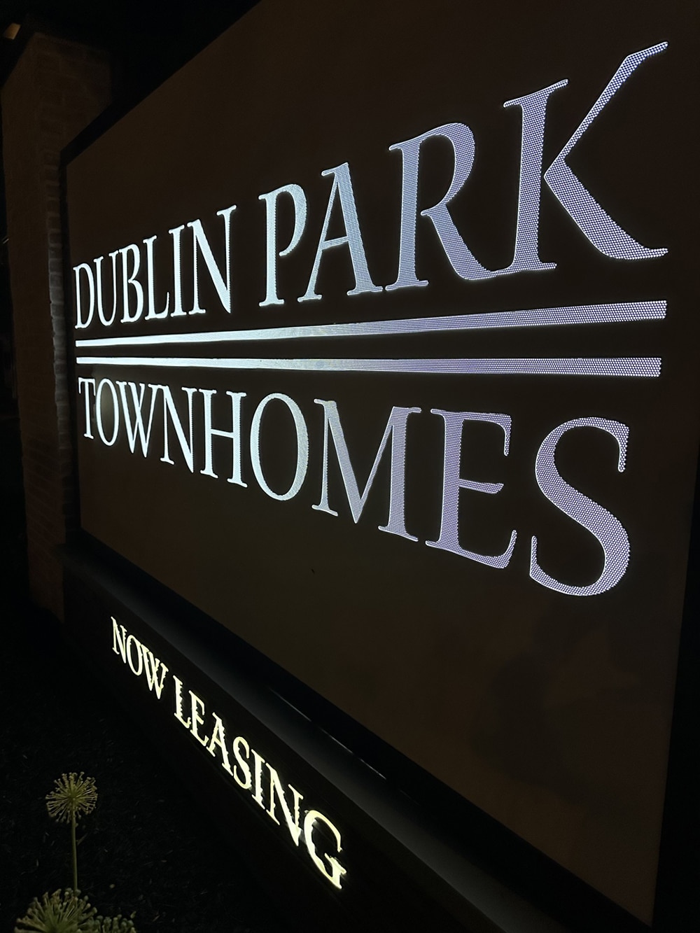
TOP THIS
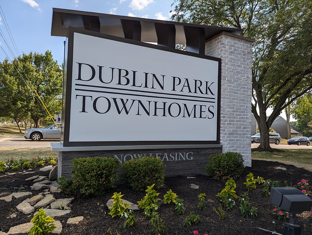
For those of you who doubt the importance of marketing, which I addressed last month (see ST January, 2026), a simple internet search won American Sign Studio (Columbus, OH) the job to remake the monument sign for Dublin Park Townhomes in Dublin, OH, says Paul Brockman, the signshop’s vice president. Were American Sign Studio not “findable” or lacking sufficient SEO, they may not have gotten the project.
On the other hand, other local companies that Dublin Park reached out to recommended they call American Sign Studio because of their reputation in multi-family housing projects, Brockman says… so all of you proponents of reputation and word of mouth are also vindicated.
“All the existing monument and wayfinding signs were purple,” he repeats. “Yes, I said purple.”
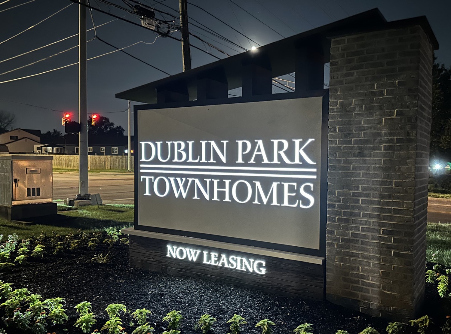
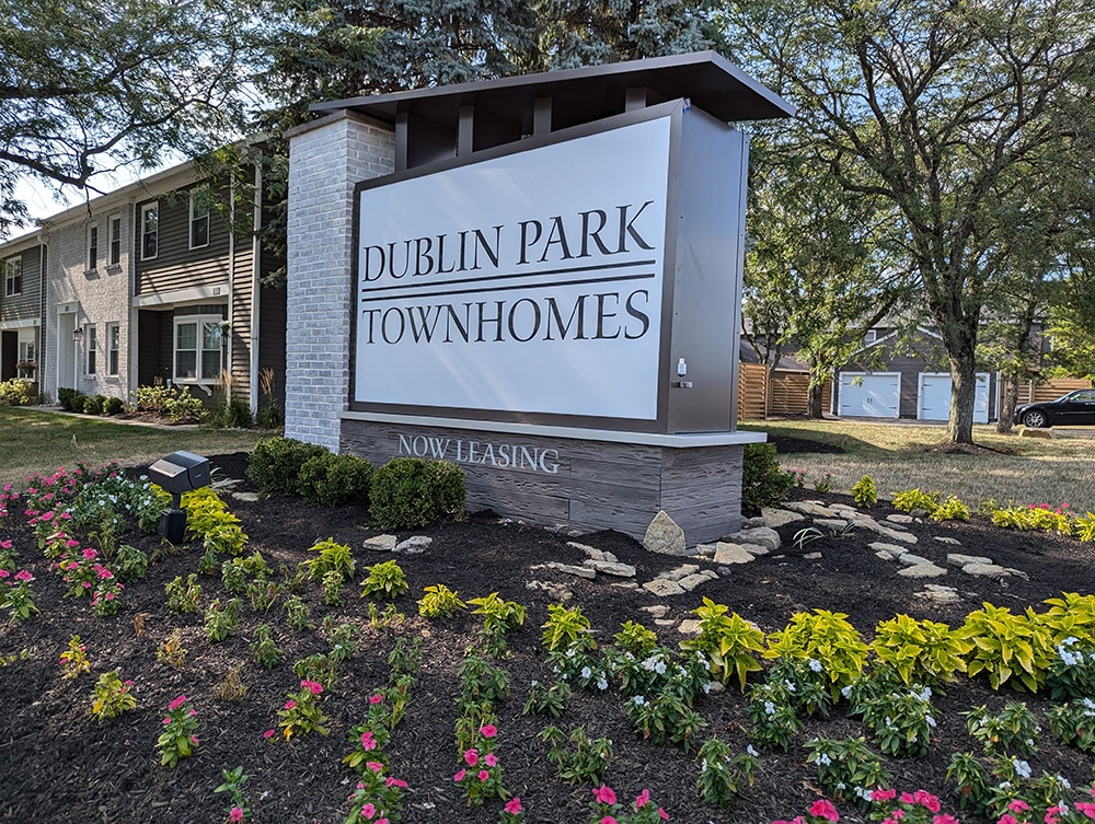
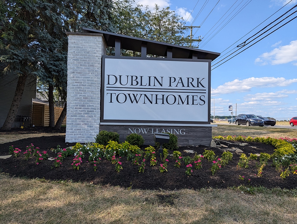
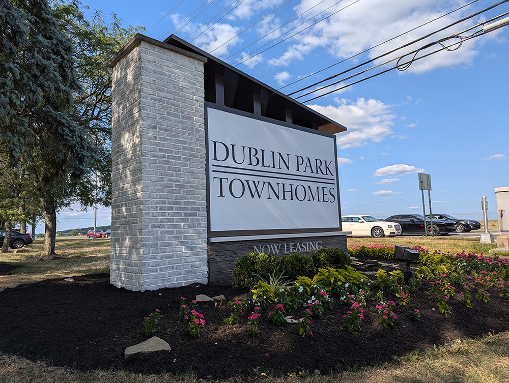
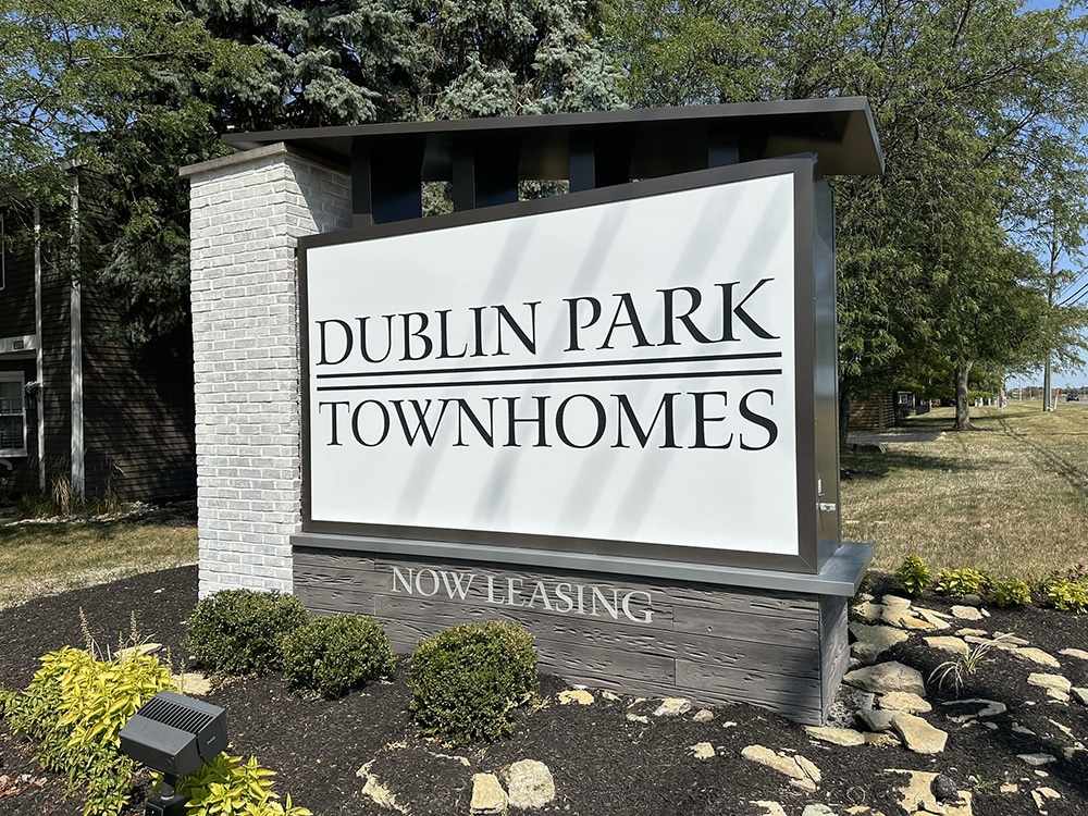
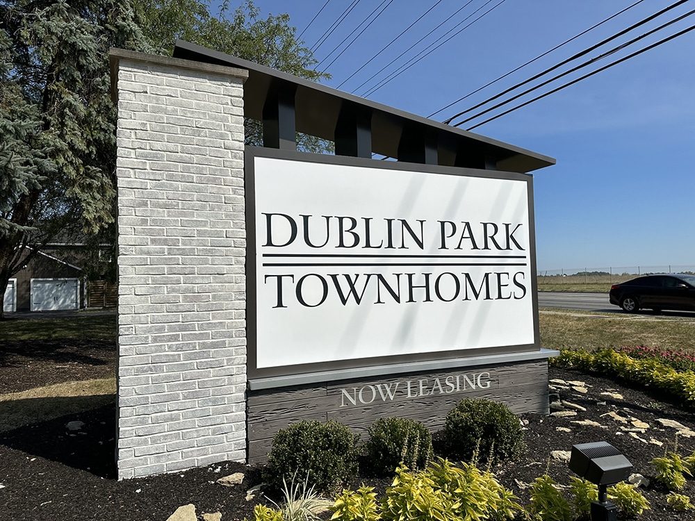
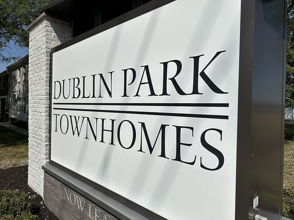
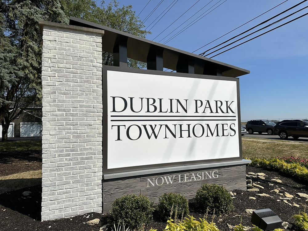
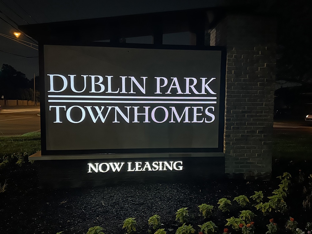
 American Sign Studio drew inspiration from a proposed new clubhouse roof for the monument sign they did for a nearby townhome complex.
Monumental Characteristics
Monument signs can make a great first impression for almost any business, but especially multi-family housing, Brockman says. It’s a great way for developers to differentiate their products, he adds. “We really want to deliver a ‘Wow!’ to our clientele, but like everything else, funds are not unlimited. Our challenge is to find out if the wow is more important than the budget or is the budget more important than the wow. It’s not exactly that black and white; often it’s finding that middle ground that is comfortable for them.”
The townhomes’ ownership needed help with rebranding to address a declining retention rate and attract a different resident demographic. Along with new signage, the ownership would be painting throughout the exterior and building a new clubhouse, Brockman says. “After we discovered all this, it was pretty clear what their goals were,” he says, reflecting, “So now, how do we design a sign to help them achieve their goals?”
American Sign Studio was informed of the clubhouse design and exterior paint colors, along with other exterior updates. This information was critical to make sure the new signage would be brand consistent, Brockman says. “The proposed clubhouse had a unique architectural feature where it had a monopitched roof plus whitewashed brick. We knew those would be elements for the sign, tying all the branding together,” he adds.
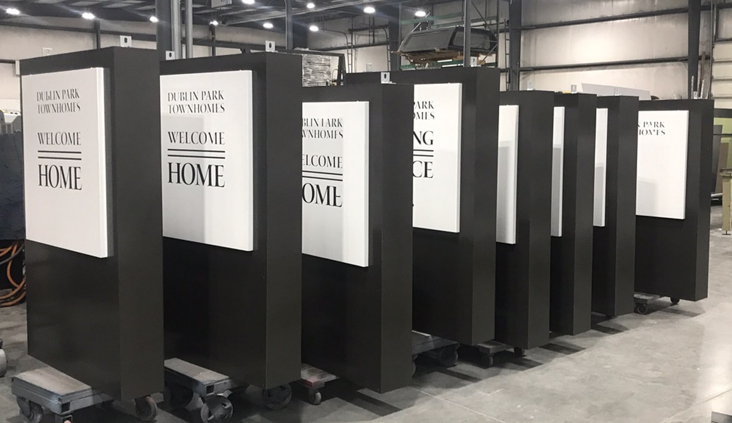
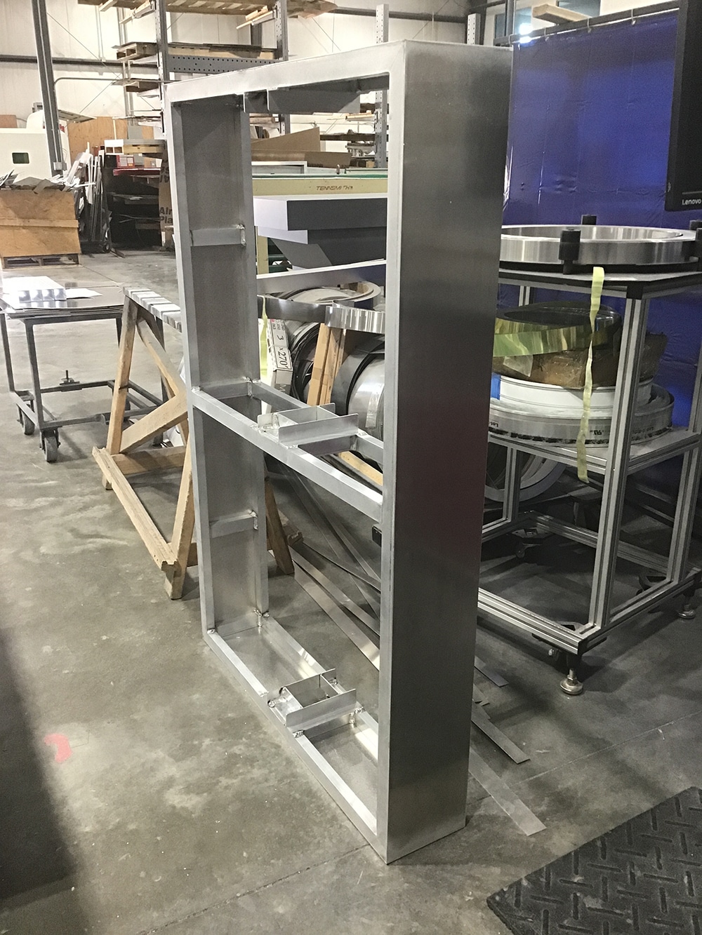
The shop produced several designs over the course of nearly two weeks. One reason for the many revisions was to reduce the cost. American Sign Studio changed from push-through acrylic to a routed face and decided to re-use the existing brick pillar. They were also able to size the cabinet to sit on the existing slab — changes that helped bring the budget down considerably, Brockman reports.
The sign was manufactured by Integrity Sign Solutions (New Albany, IN) and features a custom-made topper consisting of aluminum and four vertical support columns set at an angle installed on the main cabinet. The internally lit LED aluminum cabinet is painted bronze with a routed white face. The text comprises 3M Dual-Color black film applied first surface. The aluminum base is also internally lit LED, and cladded with Pecky Cypress Planks from Texture Plus.
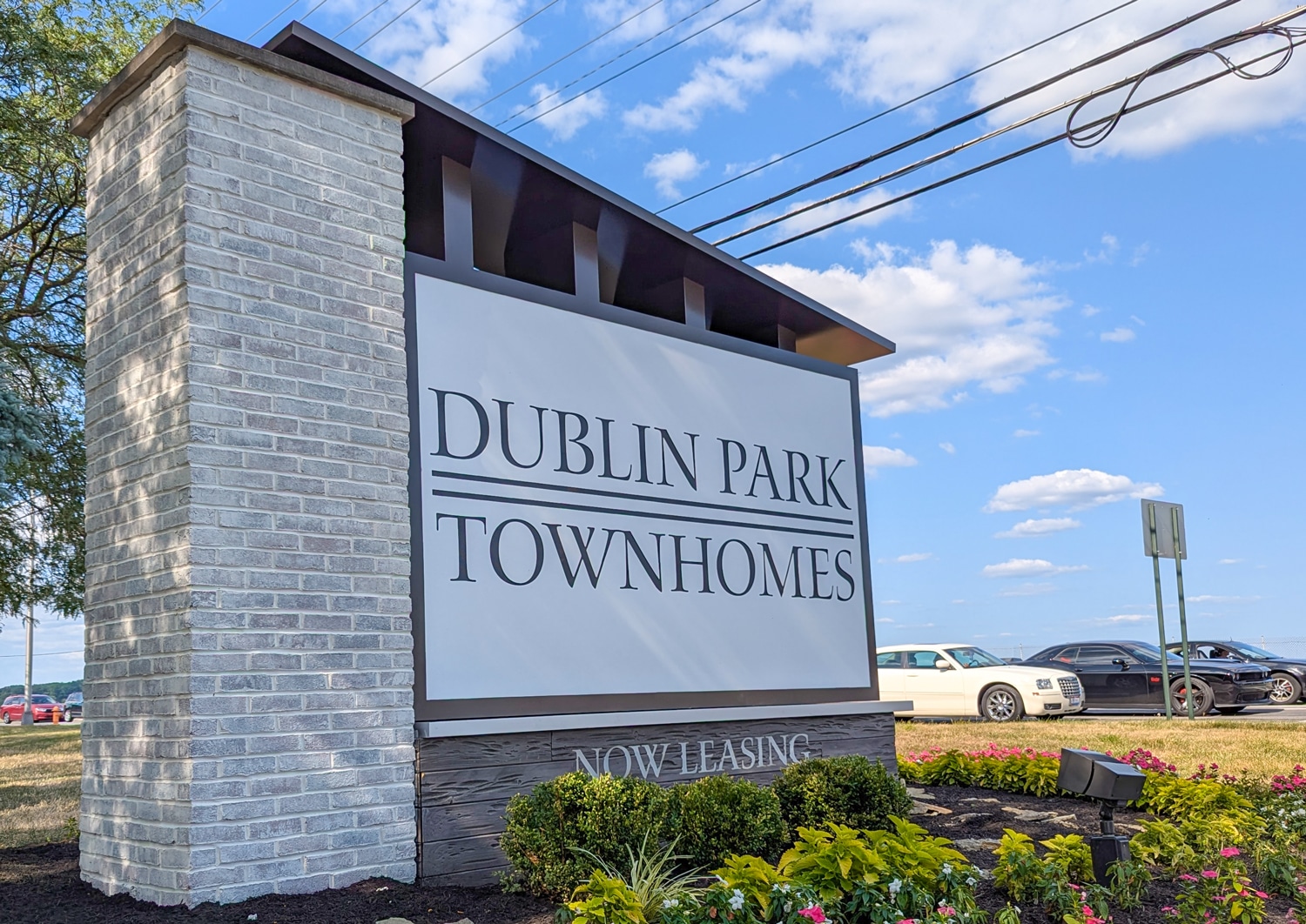
 The design executed here took time to arrive at, with the revisions primarily aimed at decreasing the cost.
Installation & Revelations
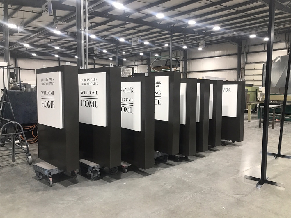
The installation, which ran smoothly, consisted of an in-house three-person install team and took two days, including the demolition and removal of the existing sign, whitewashing the existing brick, and installing the sign with a small crane onto an existing concrete slab/footer. The retail price of this sign was approximately $50,000.
Although the client has tabled the clubhouse for the time being, “the coolest part of the sign is the monopitched topper” emulating the proposed clubhouse roof, Brockman says. Even without the clubhouse, the new monument sign really creates a “Wow!” he adds, and has also helped the client attract the type of resident they want.
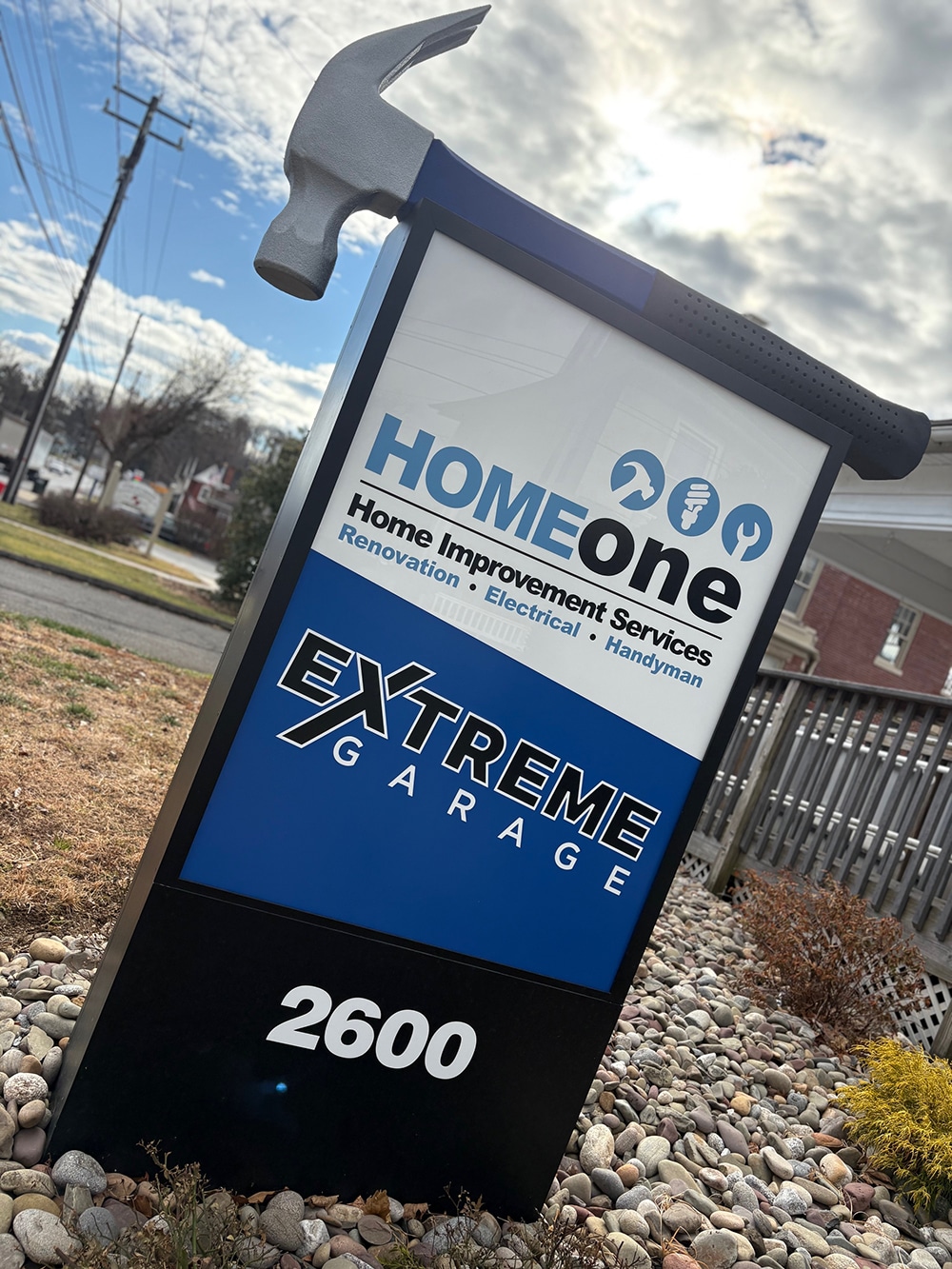
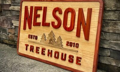
NAILED IT
For customers who want someone to help them hammer out the morning, hammer out the evening, all over this land, now they know where to go!
Local small business Home One Home Improvement Services, a long-standing customer of Signarama Lancaster, PA (Lancaster, PA) has worked with the signshop for many years and recently approached them about revamping their monument sign, says Lynsey Washington, Signarama Lancaster’s senior project manager.
“Our customer, a local handyman, wanted a unique and eye-catching sign,” she says.
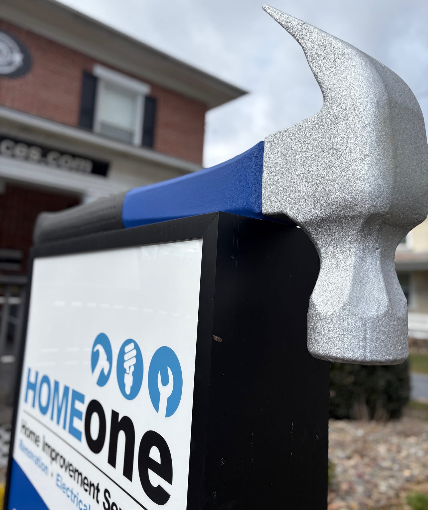
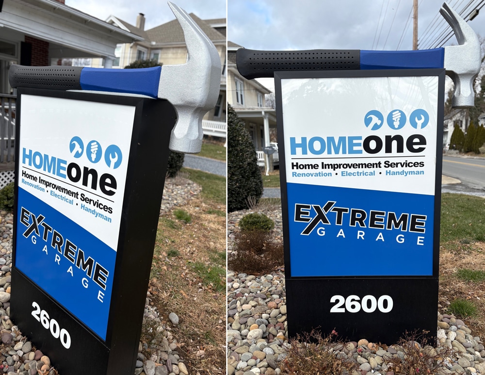
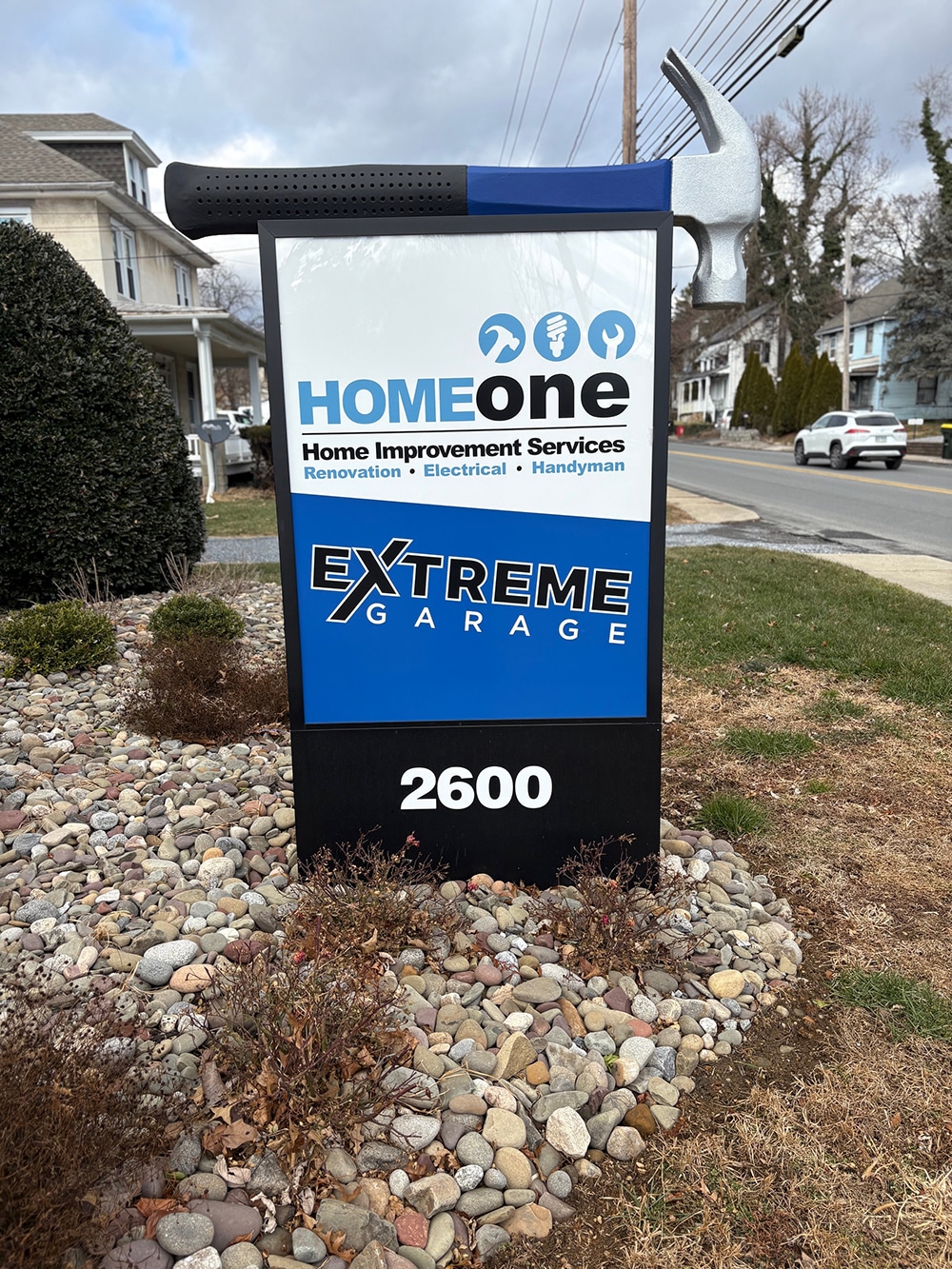
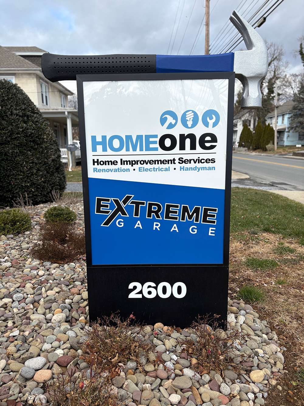
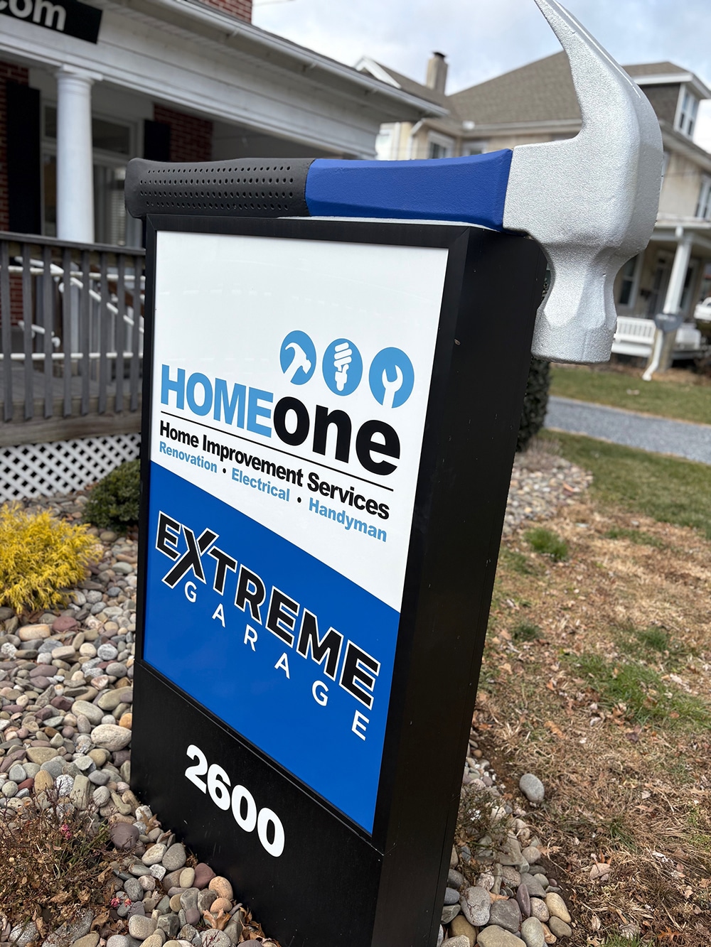
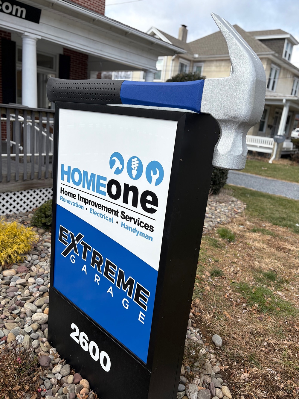
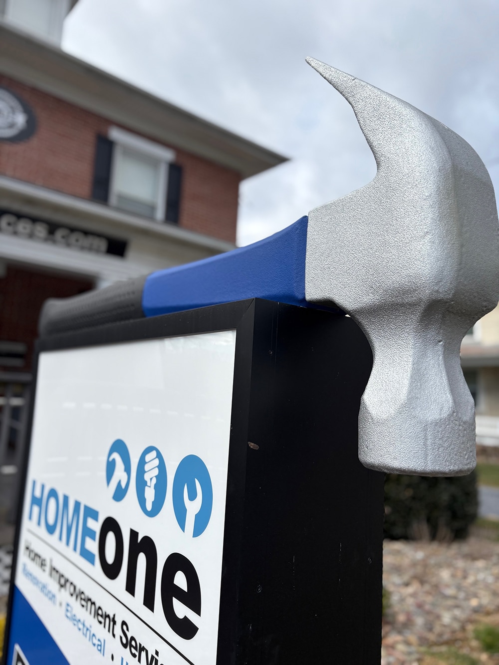
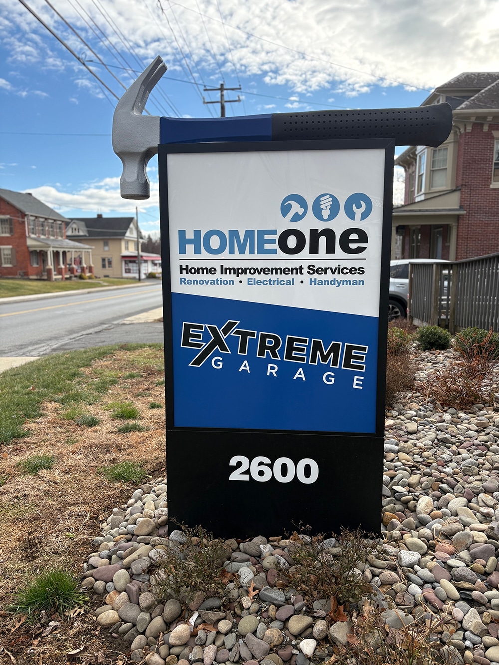
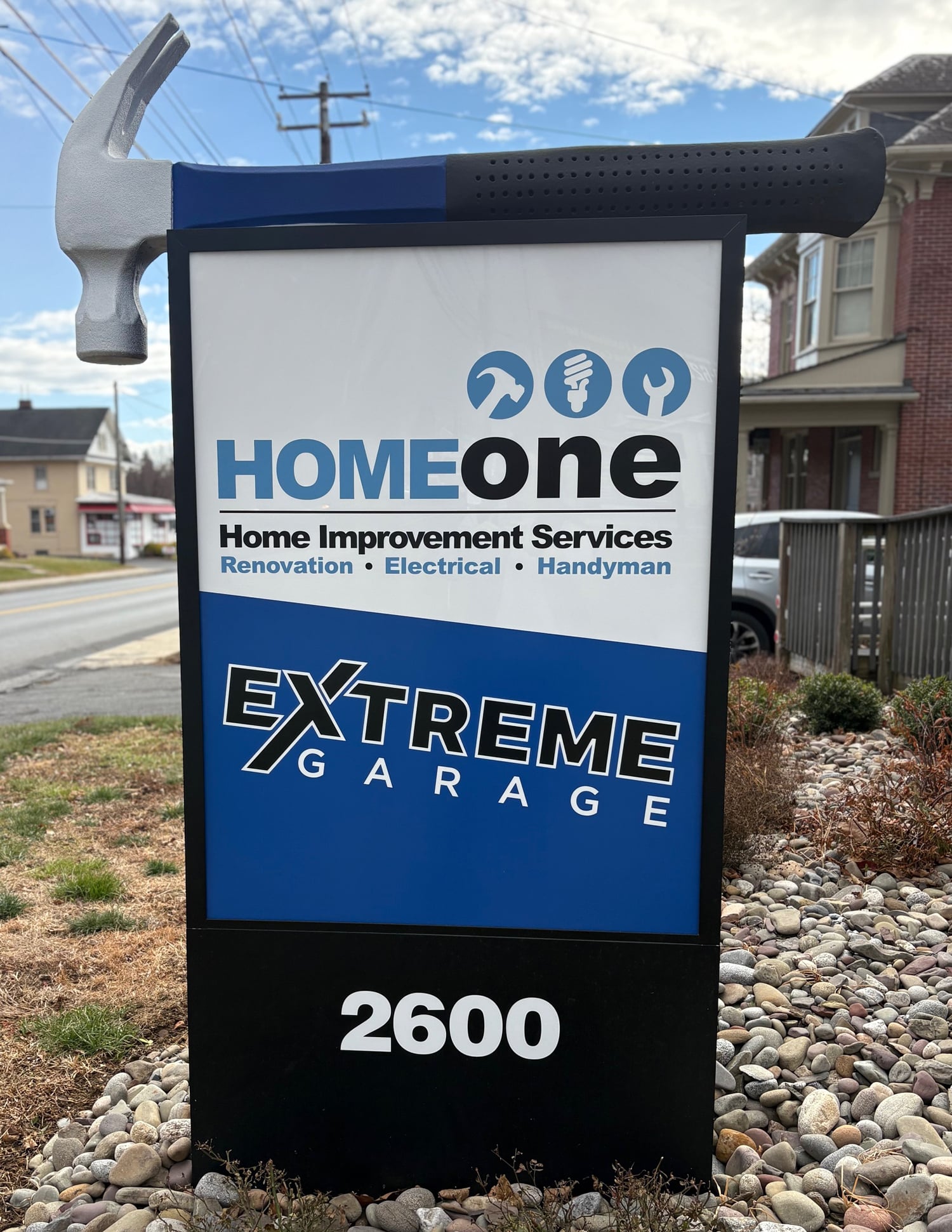 The hammer at the top completes this monument sign by Signarama Lancaster, PA.
Monumental Characteristics
Beyond standing out, Signarama Lancaster’s main considerations for the most important elements of monument signage are structural integrity and long-term durability, Washington says. “It’s important that the foundation, materials and overall design hold up over time while also complying with local zoning requirements and fitting the surrounding environment,” she adds.
The client provided a few initial sketches and worked hand in hand with Signarama Lancaster’s designer “to bring this beautiful concept to life,” as Washington put it. “We built an aluminum structure featuring a double-sided lightbox, topped with a custom Peachtree City Foamcraft hammer for the perfect finishing touch.” The black section of the monument features an aluminum lightbox with two acrylic faces.
“For the hammer, I sent the proof to Hawk,” Washington says, referring to a representative of Peachtree City Foamcraft, “who then called and walked me through it. We discussed the depth we were looking for and explained that the bottom of the hammer needed to be flat, with a piece of wood installed inside so we could screw up through it to securely attach it to the lightbox.”
Installation & Revelations
The installation required a three-person team. Signarama Lancaster first removed the existing sign and concrete footer, which was the most time-consuming part of the job, according to Washington. “Once that was complete, we installed the new sign in its place,” she says. “The installation went very smoothly, with no unforeseen issues.”
Washington feels that sometimes you can come across projects and think, “How am I going to make this happen?” Unique, different or first-time projects can feel intimidating initially, but they’re often the most rewarding projects and the ones you should hold onto. “Don’t brush something off just because it feels intimidating,” she advises. “Those challenges are where the real growth and satisfaction come from.”
PHOTO GALLERY (33 IMAGES)


Secrets of Lead Generation
Boost your sales by generating more leads! In this light and lively webinar featuring Maggie Harlow, CEO of Signarama Louisville Downtown (Louisville, KY) and the “Business of Signs” columnist for Signs of the Times, learn the secrets of how leads are generated, where they come from and how you can cultivate better (not just more) leads.


Bulletins
Get the most important news and business ideas from Signs of the Times magazine's news bulletin.
-

 Editor's Note5 days ago
Signs of the Times Is A-Changin’ in 2026
-

 Ask Signs of the Times1 week ago
How Are Sign Companies Pricing Installations?
-
 News2 weeks ago
2026 Women in Signs Awards Nominations Now Open
-
 Benchmarks2 weeks ago
9 Sign Company Signs With Effective Messages
-
 Business Management1 week ago
Marketing Signwork
-
 Dimensional Signs1 week ago
5 Bold Dimensional Signs
-

 Business Management5 days ago
Your Signshop Floor Doesn’t Need a Task for Everything
-
 How To7 days ago
Building Wood Signs That Actually Last Outdoors