After this baseball season, when Yankee Stadium is shuttered and bulldozers raze the second incarnation of the “House that Ruth Built” (the original Yankee Stadium was renovated in 1974) to make room for its replacement, Fenway Park, home of the Boston Red Sox, will stand alongside the Chicago Cubs’ Wrigley Field as one of baseball’s “cathedrals” that harkens back to the days of 25-cent bleacher seats and nickel hot dogs. Presumably, Red Sox fans sneer at their loathed archrivals’ jettisoning tradition.
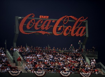
In keeping with reverence for team history, the Red Sox have incorporated a behemoth, 42 ft. 8 in. x 12 ft. 3 in. sign that identifies the Coca-Cola Corner on Fenway’s third-base side. The sign looms over premium family seating and concessions, and accommodates 412 fans.
A mix of retro and ultra-modern, the sign replicates a vintage, Coca-Cola bottle-shaped sign via a series of 1,059, state-of-the-art, LED lamps, which 252 circuits control to create a “signature” sequence that traces the Coca-Cola logo. The fabricator, designer, client and others involved offer insights on how the Corner gained its luminescent personality.
Why be retro?
Given Coca-Cola’s almost century-old relationship with the Red Sox, numerous, nostalgic signs and graphics would presumably loom. However, team officials quickly zeroed in on one sign that once inhabited the neighborhood. On Storrow Street in Allston, just a few blocks from Fenway, a Coca-Cola bottler featured a 44 x 20-ft., time-and-temperature sign on its exterior wall lit by approximately 10,000 incandescent bulbs for 31 years before its shutdown and demolition in 1984.
Advertisement
Janet Marie Smith, the Red Sox senior vice president of planning and development since 2002, has extensive experience in supervising ballparks that synthesize retro style and modern amenities. She presided over the construction of the Baltimore Orioles’ Oriole Park at Camden Yards, which opened in 1992 and is generally regarded as the first of new new-generation ballyards that replaced multipurpose facilities and were designed as fan-friendly destinations. She also helped coordinate the Atlanta Braves’ move into their current home, Turner Field, in 1997. She said the team’s owners, John Henry, Tom Werner and Larry Lucchino, wanted to create branding that helped uphold the team’s heritage and “create a feel like your grandfather’s ballpark.”
The master plan
To accomplish this, the team enlisted Ashton Design Assoc. and Triangle Signs, both of Baltimore, to respectively undertake the project’s design and fabrication. Ashton’s Ronnie Younts, the firm’s project manager, said the biggest challenge was finding the correct bulbs to suit the application.
“We wanted to create the ambience that an incandescent sign creates, but we wanted the sign to be as energy efficient as possible,” he said. “It took considerable trial and error to find that replicated the vintage sign’s incandescent red.”
Bob Kaye, Triangle’s executive vice president and an 18-year, sign-industry veteran, said energy conservation was a high priority for the project. Ultimately, the consortium elected to light the sign with Action Lighting’s (Bozeman, MT) red, surface-mount LED bulbs, which proved sufficiently durable and contained bulbs with an appearance that closely emulated frosted, incandescent bulbs.
Triangle hired Animated Lighting (Kansas City) to create the 25-second, scrolling program. According to Paul Smith, Animated Lighting’s president, the company implemented four, Monster Brain animation controllers, and 64, Qty. 4 independent, channel-light controllers. Animated Lighting coordinated using its proprietary Animation Director software platform.
Advertisement
According to Kaye, scripting across the entire signface required installing a custom raceway to bundle the inevitable tangle of wires such a system requires. The framework comprises different aluminum gauges (most commonly 0.80 in. thick) with a 1/8-in., aluminum backing, which the company CNC-routed.
Matching the Coca-Cola logo’s PMS color, Triangle decorated the sign’s front face with Akzo Nobel acrylic-polyurethane paint; the backside was painted to seamlessly match Fenway’s hunter-green walls.
As of the All-Star Break, a July surge finds the Red Sox a half-game ahead of the upstart Tampa Bay Rays in the American League’s Eastern Division. It’s possible, perhaps probable, that Red Sox’s experience will enable the team to stave off its younger counterparts, but the Coca-Cola Corner’s addition to the Fenway experience will augment the park’s ever-present ambience and tradition.


 Projects1 week ago
 News1 week ago
 How To7 days ago
 News2 weeks ago
 Real Deal2 days ago
 News2 weeks ago
 Manager's To Do2 weeks ago
 Dale Salamacha2 weeks ago