The new owners of The Wrap, a quick-service burrito chain, sought a new look as it prepared to expand nationally from its local New England roots. The owners turned to FRCH Design Worldwide (Cincinnati) to revamp the restaurant chain’s identity.
Although the restaurant owners weren’t sure initially if they wanted to change the name — The Wrap existed for eight years before they purchased it — they eventually opted for a different name.
The restaurant’s original name, The Wrap, connotes cold food. You’d expect tuna salad or deli turkey rolled in a flour tortilla. But, instead, the restaurant features more elaborate, eclectic, hot burritos.
They had a variety of ingredients that were multi-ethnic, things that were really different from the competition in the marketplace,” said Monica Gerhardt, FRCH director of brand strategy. “They didn’t necessarily want to be ‘burrito’; they didn’t necessarily want to be ‘wrap,’ and our challenge was to communicate that this was a friendly place where you were welcome, but that you were going to get something really different — diverse, more modern, more hip.”
When planning the name change, the FRCH team conducted free-flowing discussions to consider all the options, based on such details as location and ingredients. They presented their top choices to their client for feedback. As with all aspects of the project, frequent communication between FRCH and the client characterized the creative process.
Eventually, all parties settled on the name Boloco, a take on “Boston local company” and a nod to the chain’s roots. The name’s lack of a specific prior meaning allowed the designers to communicate the brand without limiting it to wraps or burritos, said Santiago Crespo, FRCH director of graphics.
“It provided us a nice blank canvas to add meaning and create the brand around it,” Crespo said.
The added tagline, “Inspired Burritos,” identifies the variety of creative food served there.
The client still liked their former logo’s swirl, which many wrap/smoothie restaurants utilize in some version. So, FRCH morphed it into the new logo and design, said Chad Witzel, FRCH senior graphic designer.
Boloco’s new logo features a swirled conversation bubble, which emphasizes the restaurant’s neighborhood-hangout style. It’s also loosely reminiscent of the product itself, Witzel said.
The modern logo design appeals to a young audience — the restaurant’s target market is college students and young professionals — but is also approachable, familiar and gender neutral.
“The logo [text] was based on a classic sans-serif typeface. But, to make it different and memorable, we rounded out the edges and mixed upper and lower case. It’s quirky enough to catch your attention, but it’s also timeless,” Crespo said.
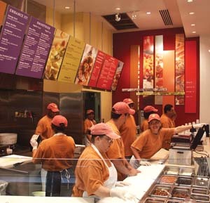
Once the name and logo were solidified, production graphics were created for menuboards and wall graphics, said Jeff Waggoner, FRCH’s director of environmental graphic design. The mechanics of the menuboard were designed on a rail system, so that queuing and information could be changed — and the order in which the customer should read it.
“We did change it [at the first new location in an Indianapolis mall food court], because people automatically were starting at the left side of the menu display and reading from left to right, so we switched the panels,” Waggoner said.
“Because of the newness of this brand, and not knowing how it would be received in the marketplace, we designed as much flexibility into these components as possible, so we could work through this with them,” he said.
FRCH completed all of the work through production art, which was then sent to vendors to print. Posterloid (Long Island City, NY) manufactured the menuboards, and AdMart (Danville, KY) fabricated the signage and wall graphics.
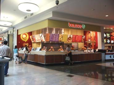
Boloco recently opened two new locations outside of New England, with 10 more planned this year and others in the works. The 10 Boston area locations are undergoing a gradual changeover to the Boloco name and graphics during a six-month period, said Boloco president and CEO Nick Lanni.
Designing Effective Logos — A Signmaker’s Perspective
By Brad Ferguson
Logo design can perplex a sign designer. Poorly designed logos abound, made possible by computer/software access. Award-winning design firms can create a logo, but Internet ads tout logo-design services for as little as $25. Do they offer the same quality? What makes a good logo design?
An effective logo projects an image and gives personality to a company or product, and should do so quickly. As a sign designer, you’re not often asked to create logos. Nevertheless, understanding some general principles of effective logo design can be helpful.
Keep it simple
Most effective logo designs are simple, with limited elements, lines, colors, type styles, embellishments or tricks. Though there are exceptions, such as Anheuser-Busch’s elaborate eagle and ‘A’ mark, logos that are both complicated and effective are rare. A simple logo is faster to read, easier to understand and instantly recognizable. Which are you more likely to read and remember, a sign with a few words or a complex directory sign?
A simple design also tends to have a distinctive silhouette, which also facilitates rapid recognition. Further, a simple logo lends itself to more applications with less expense (embroidery, embossing, die cutting, engraving, etc.).
Simple colors
Few effective logo designs use more than three colors. You’ll rarely see an elaborate color scheme in the logos of many Fortune 500 companies. More colors will be more expensive for print reproduction — and sometimes impossible — to easily reproduce.
Printing letterhead will likely be more expensive with multiple colors. Plus, newspaper reproduction may be difficult, and embossing may be out of the question. Think beyond sign layout when considering color. An effective logo design should adapt to various uses.
Pick appropriate letter styles
Most good logos comprise one letter style. Many use two styles, or two fonts of the same style, with varying weights. Using three or more fonts is rarely effective. Type styles should represent the client company appropriately and be clearly readable.
An elaborate script has a classy appearance, yet most scripts are light, even in their bold versions. Thin-stroked letters often make weak logos, though thickening strokes can improve legibility. Also, because light colors on a dark background tend to expand optically, a reverse-color scheme may brighten a thin-stroked letter.
A heavy-stroked letter has its own problems. Counter spaces (middles) of small letters in a bold font can become illegible when reduced to business-card size. You can design versions of logos with slight alterations in stroke and spacing for different size applications.
Use functional proportions
Ideally, a logo should be proportioned so that it functions well as a discrete unit. A long logo may look good as a letterhead but terrible in a different format, such as a billboard. Generally, width and height shouldn’t be overtly disproportionate. Different versions of the same logo (such as stacked and non-stacked) can be designed for different applications.
Avoid clipart
A logo’s purpose is to distinguish a company from its competitors, and it should be unique. Avoid clipart in logo work because it reflects poorly on your design skills, and it may infringe on someone’s copyright. Corel’s copyright agreement specifically prohibits using its clipart as part of a “trademark” or “service mark.”
To sell a design whose ownership can be called into question is a disservice to the client. As with most clipart agreements, you’re not actually buying ownership of artwork, you’re only being given a license for its limited use.
Avoid design clichés
Trick treatments, such as bevels, chrome, swooshes, drop shadows and multiple outlines, are usually best avoided in logo design. Sign people have a particular fondness for panels. A logo design with multiple panels often looks more like a sign layout than a logo design. These treatments can be used to make good logos, but they’re often overused.
Consider black and white
By designing black-and-white logos, you can concentrate on the effective elements: proportions, shape and legibility. The design will probably need to be reproduced in a single color anyway, even if it’s just for printing invoices. It’s easier to add color later than to remove it.
Logo projects an image
An effective logo should project (or reflect) a company’s identity. Determining a company’s desired image is really the first step in the design process.
Brad Ferguson is a 30-year sign industry veteran from Kansas City, MO.


 Women in Signs3 days ago
 Heidi Tillmanns2 weeks ago
 News1 week ago
 Business Management6 days ago
 Jameson Parker5 days ago
 Women in Signs2 weeks ago
 Women in Signs1 week ago
 Women in Signs2 weeks ago