Brewpubs have long been an urban trend; now, public houses that serve hard-apple and other ciders and ales have become similarly fashionable. And, of course, no establishment can be deemed au courant without on-premise signage that strongly conveys the brand.
Owners of Ft. Collins, CO’s Compass Cider – where resident master cidermaker Toby Osborn brews hearty concoctions with such names as Silk Road, Deviation and Sailor’s Sour – invested in quality signage that befits their enterprise by hiring Dan Seese, owner of an eponymous sign-fabrication studio, to design a 3-D storefront sign complemented by a handpainted, side-wall mural.
Using an original logo designed by Centralia, WA-based graphic artist Joy Barberg, Seese streamlined it and made it code-compliant.
“The original proposed sign wasn’t permissible by city codes and would’ve gone way beyond their budget,” Seese said. “To give them a striking, 180º entry presence, I devised an illuminated, projecting sign, and incorporated a compass rose into the bracket to reinforce the theme.”
To design, Seese used using a combination of SA Intl. FlexiSign, Adobe Illustrator and Photoshop software. Compass set up shop in one of the oldest buildings in Ft. Collins, with a stucco façade that conceales an aging brick structure. Unsure of the brick’s strength, he devised numerous mounting holes in case any bolts failed. To bolster the sign’s wind-load stability, Seese incorporated a large, circular, mounting plate as the compass’ center, with a dozen bolts around its perimeter.
He enlisted ABC Sign Products, also of Fort Collins, to fabricate the entry sign. It comprises 0.125-in.-thick aluminum with second-surface, push-through letters fashioned from ½-in.-thick acrylic. All components were formed on the shop’s MultiCam 3000 CNC router. To create the sign’s map pattern, ABC added a double-density digital print to 3M translucent vinyl that was applied to the acrylic prior to routing. Seese said the denser material prevented the color from appearing washed out when illuminated. Six, GE Tetra double-sided, power-strip LED modules transform the sign info a nighttime beacon. The shop decorated the signface and bracket with Matthews acrylic-polyurethane paint. ‘
Advertisement
Seese assembled the sign with two, square-aluminum tubes, built into the cabinet, and welded it to the ¼-in.-thick, aluminum mounting plate. Aluminum studs secure the second-surface acrylic. To mount the sign, Seese used redhead, 3/8 x 2.5-in. Tapcon hardened-carbon-steel screws, which were installed into 5/16-in.-diameter holes drilled into the brick.
He complemented the entry sign by painting a mural on a street-facing side wall. Seese used 1Shot® lettering enamel, 1.5-in. Mack 5840 cutter brushes and ¾-in., soft-bristle fitches.
“I was involved in the project for approximately three months,” he said. “Every project has its challenges, and sign codes are a common hurdle. It was rewarding to give great exposure to a fun startup business.”
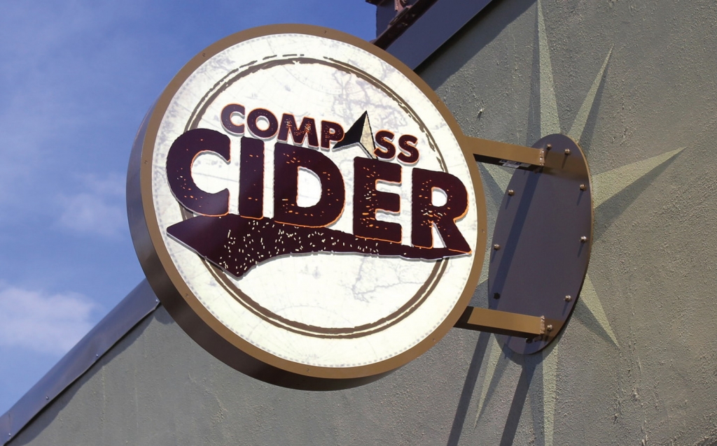

 Photo Gallery2 weeks ago
 Paula Fargo1 week ago
 Real Deal1 week ago

 Photo Gallery1 week ago
 Projects1 week ago
 Women in Signs2 weeks ago
 Signs of the Times2 weeks ago

 Business Management6 days ago