MEDICAL SIGNAGE — whether for an outpatient clinic or large hospital — has to get its message across quickly and clearly. Patients want assurance they’re in the right place, whether they’re looking for dental care or the nearest ER. These signs blend style and function to make healthcare providers’ availability and expertise known, day or night.

Healthy Smiles Served Here
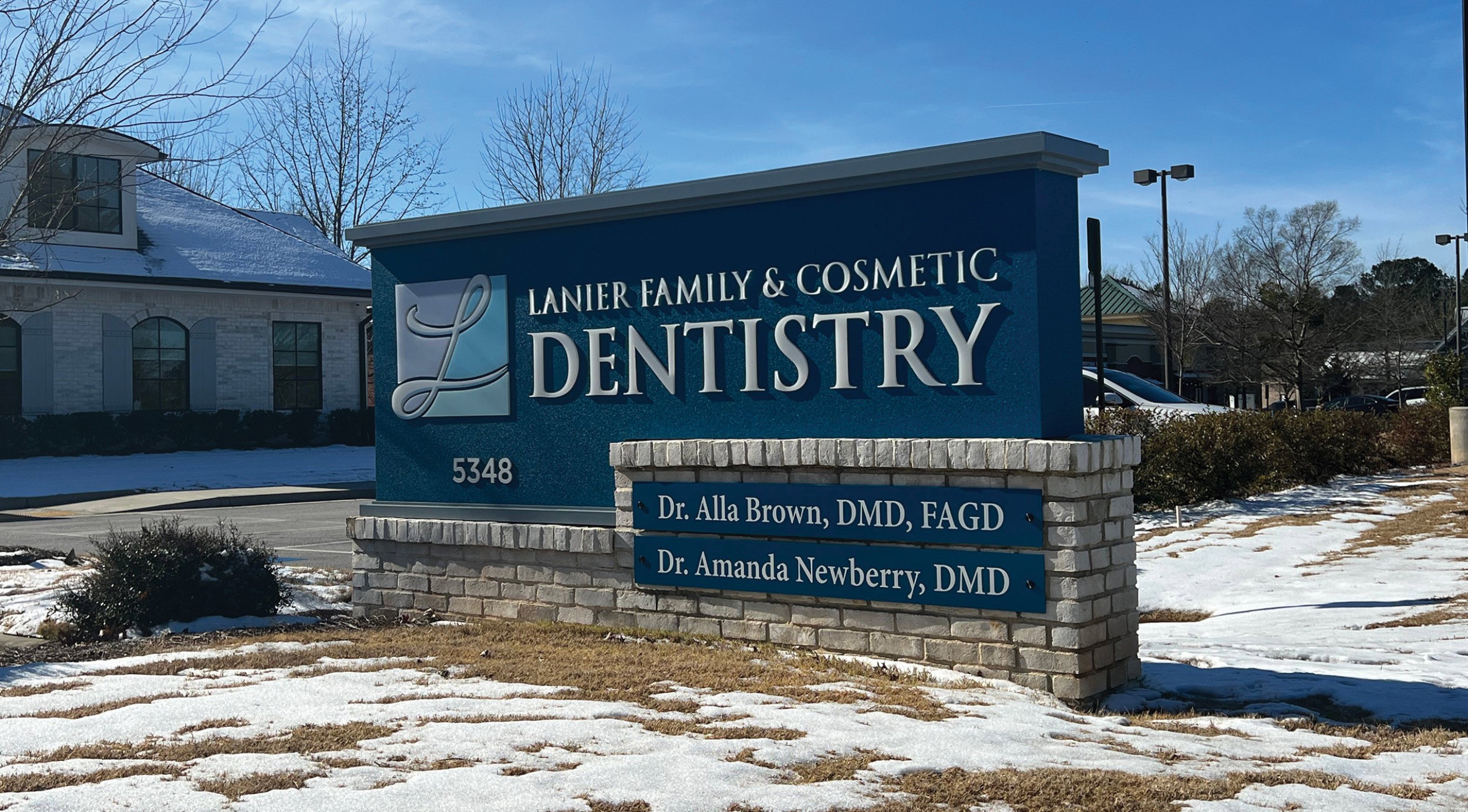
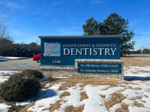
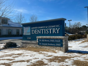
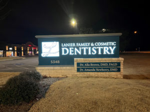
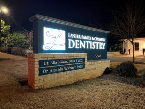
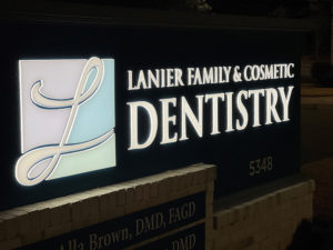
Michael Johnson, senior graphic designer, Henry Graphics (Buford, GA), designed the architectural sign for local practice Lanier Family & Cosmetic Dentistry, with the client’s logo as a starting point. “The customer provided us … carte blanche to design a sign that befits their image and clientele,” Johnson says. Henry Graphics produced the cabinet faces using a MultiCam APEX3r and printed the 1/2-in. push-through acrylic graphics using a Mimaki UCJV300-160. An existing brick base was modified as the foundation, and the cabinet surround was painted with Matthews Conventional Series.

Say Cheese
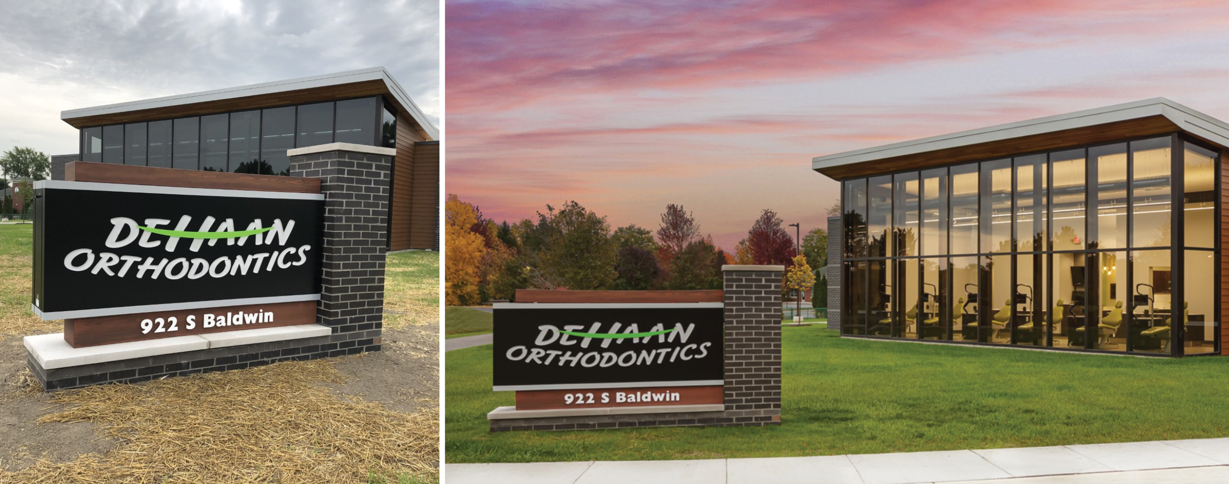
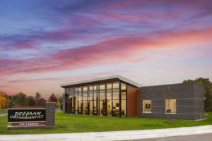
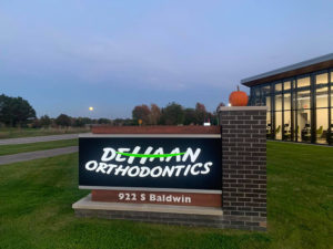
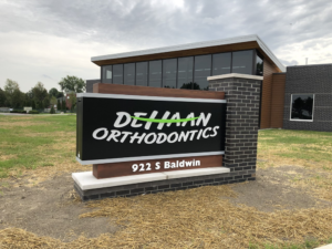
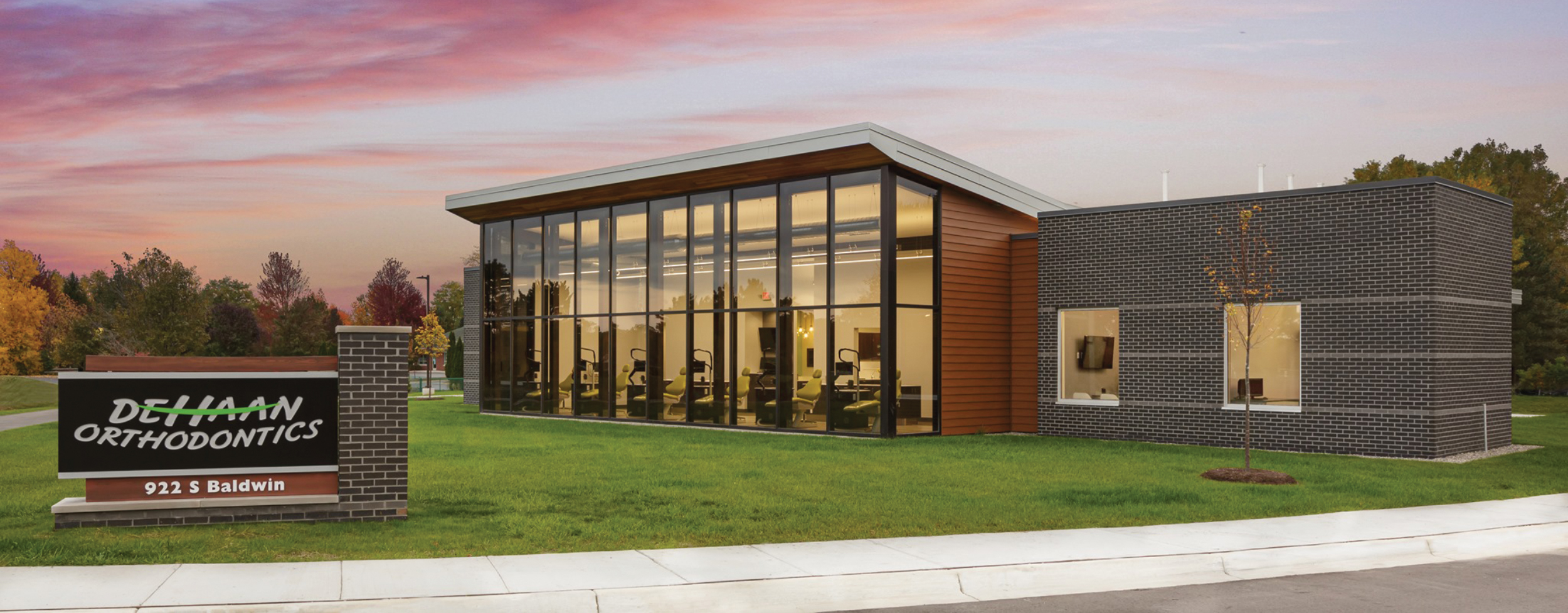
“Our client provided the ‘smile’ logo and asked us to incorporate the design into modern signage,” says Bob Chapa, CEO and president of Signarama Troy | Metro Detroit (Troy, MI), referencing the logo for DeHaan Orthodontics in Clarkston, MI. The mostly handcrafted sign was formed using Avery Dennison translucent vinyl and Hanley LEDs, as well as an aluminum extrusion cabinet, custom faux-wood painted reveals and masonry work to match the facade of the client’s newly constructed offices.

This Way for Care
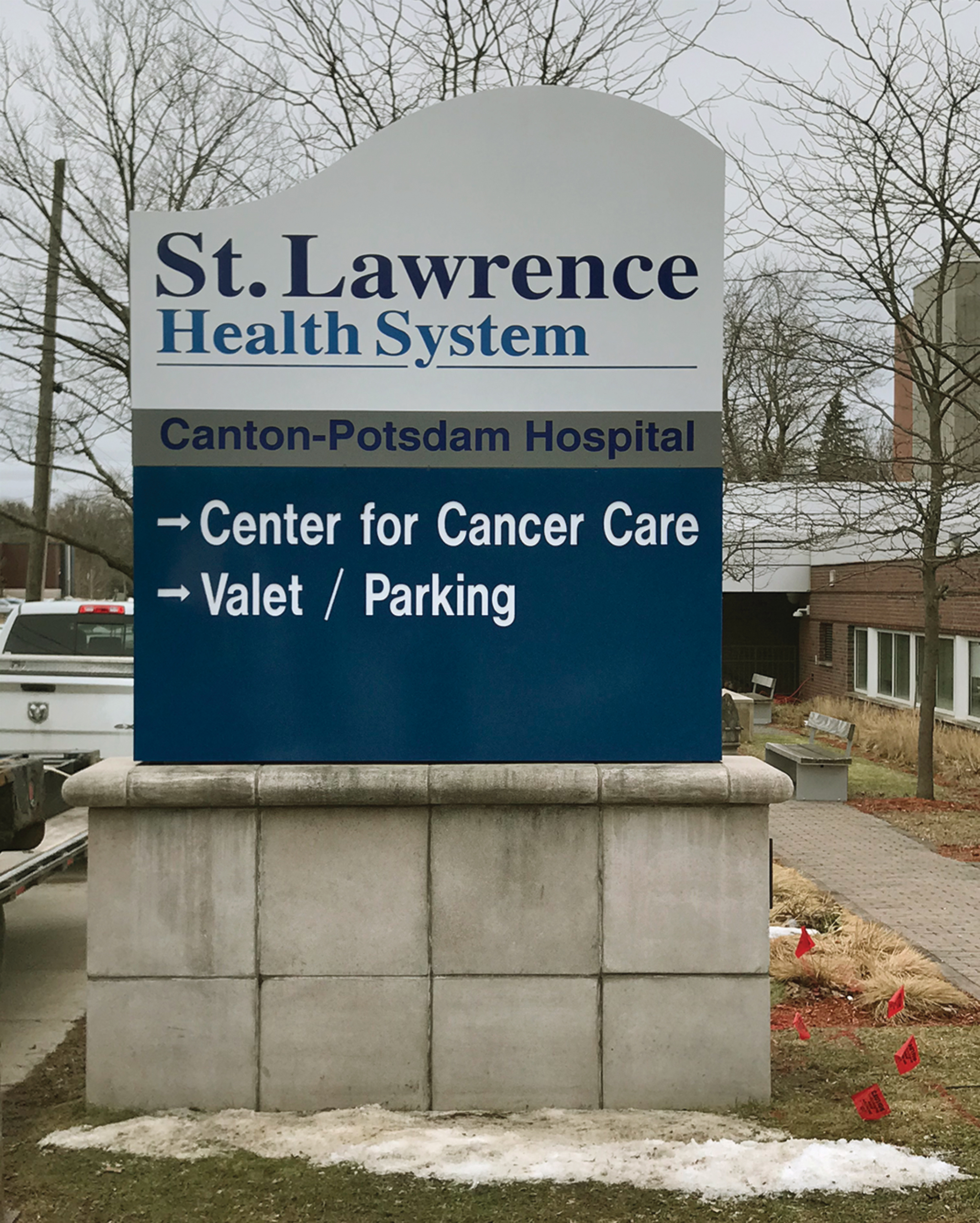
Northeastern Sign Corp. (South Colton, NY) used Brooks Washburn Architecture DPC’s (Potsdam, NY) concept to create seven ground signs for St. Lawrence Health’s Canton-Potsdam, Gouverneur and Massena, NY locations. The Center for Cancer Care signage includes a SignComp (Grand Rapids, MI) kerf-cut, 12-in. double-faced body with embedded lettering, according to Northeastern manager and VP Mike Crosley. Principal LED’s Tap Out Stik lighting illuminates the interior steel body, while LORD adhesive 406/19 connects aluminum angle brackets to the backs of the removable sign faces.
Advertisement

High Visibility
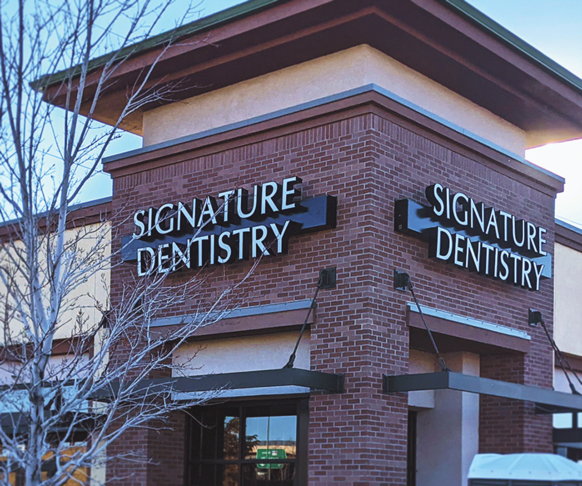
Signarama Brighton (Brighton, CO) opted for a simple front-lit channel letter design — not the scripted font of their client’s logo — for Signature Dentistry in Aurora, CO. “We were concerned about readability on the building,” says Signarama Brighton owner Dawn Homa, so they included an oversized black raceway to lift the sign away from the exterior. The shop tapped Direct Sign Wholesale (Denver) to fabricate the letter faces using MultiCam and AXYZ routers and Plaskolite’s OPTIX LD acrylic. Both SDS ChannelBender and Computerized Cutters Accu-Bend machines were used to form the letters.

Lofty Letters
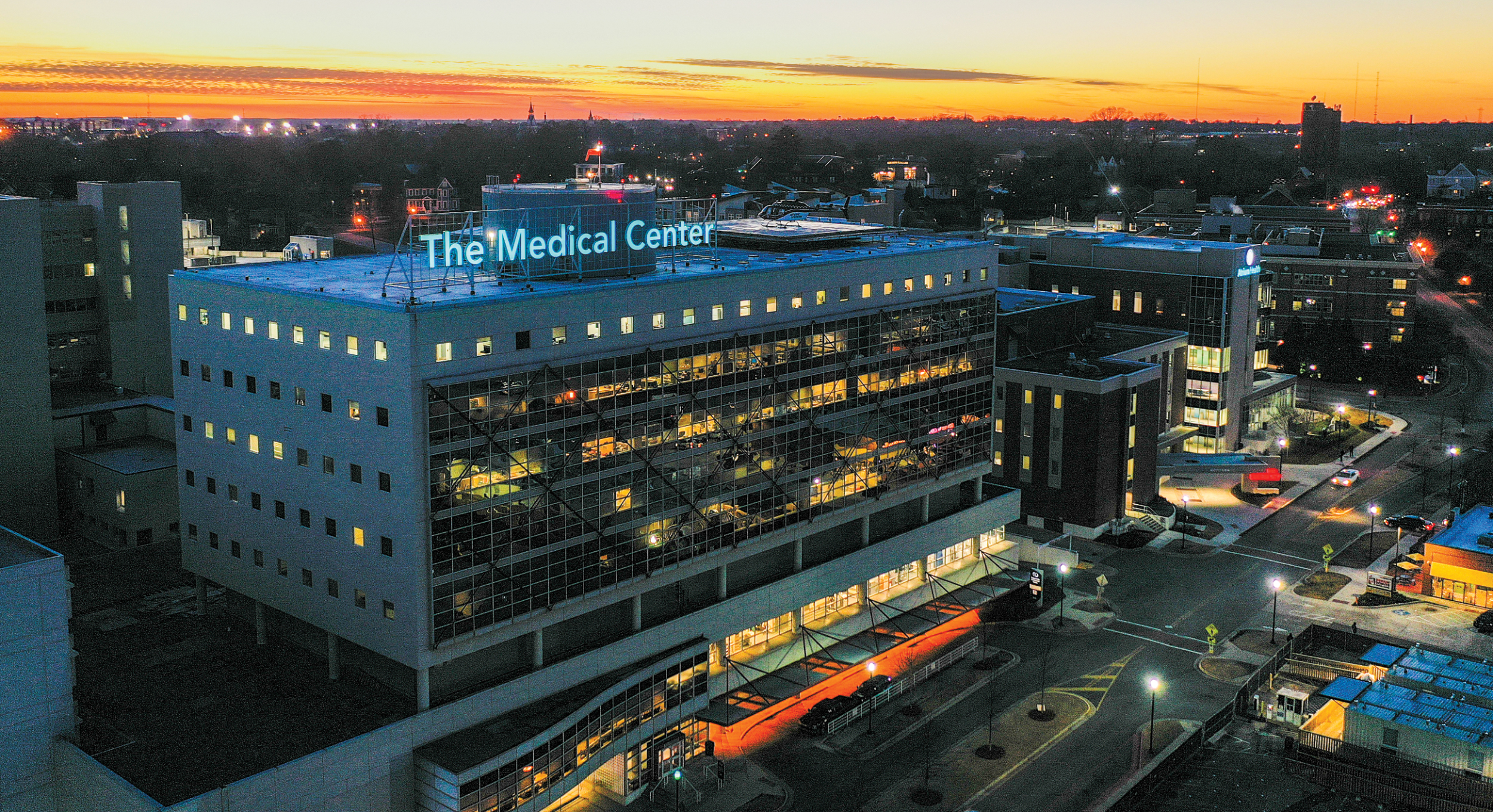
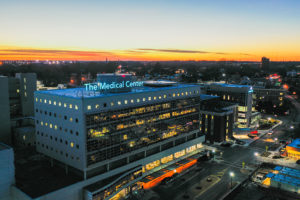
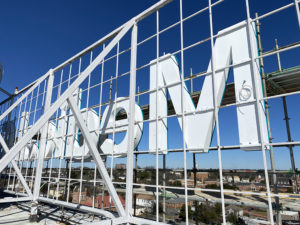
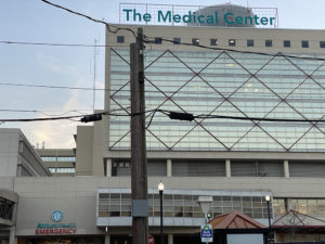
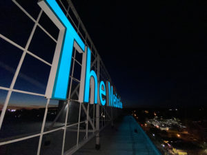
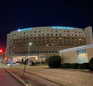
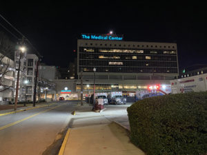
For RP Signs’ (Charlotte, NC) rebranding effort for Atrium Health in Macon, GA, they mounted a 6-ft.-tall channel letter set atop the medical center’s roof. “It was close to the edge and an operational helipad was just behind the install area,” says James Neely, RP’s director of project management. Fabricated from 1/8-in. aluminum cut with a MultiCam router, RP applied AkzoNobel paint for the letter forms and retainers, and 3M translucent teal vinyl for the letter faces, which are illuminated by GE Current 24v LED modules.

Custom Calling Card
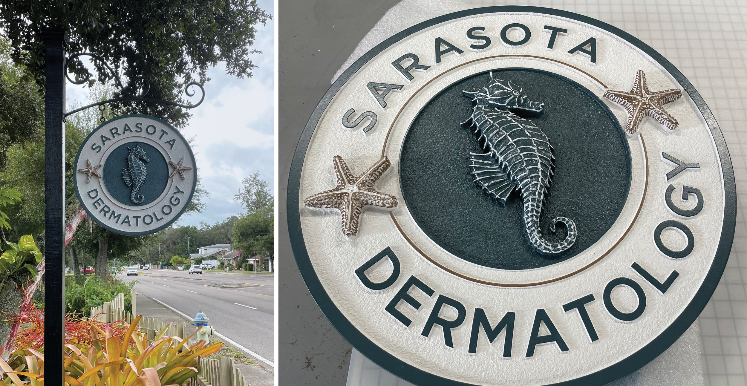
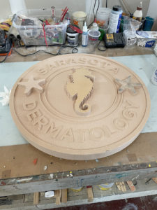
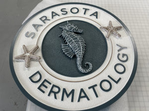
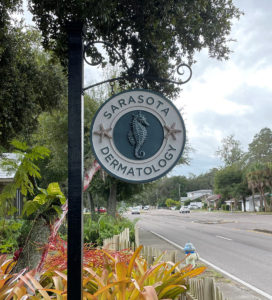
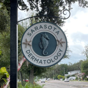
SpeedPro Affinity Solutions (Sarasota, FL) partnered with local Mote Signs of Sarasota to create a custom sign for Sarasota Dermatology. With a graphic designer’s starfish and seahorse logo as their jumping off point, SpeedPro used an Esko router to cut the 26-in.-diameter sign using 2-in. Jasper high-density urethane (HDU) for the base and 1.5-in. HDU for the 3D sea life, which were manually tooled for texture, according to SpeedPro owner and president Steve Rowe. Sherwin Williams paint gave the sign its finishing touch.
PHOTO GALLERY (20 IMAGES)

 Tip Sheet1 week ago
 Photo Gallery2 days ago
 Ask Signs of the Times4 days ago
 Real Deal1 week ago
 Benchmarks6 days ago
 Women in Signs1 week ago
 Photo Gallery1 week ago

 Women in Signs1 week ago
