COLOR HAS THE ability to invoke differing reactions and sentiments depending on its use. In today’s extremely saturated marketing world, many brands are seeking to stand out as recognizable. The use of color is one extremely important factor in establishing brand recognition, and in many cases companies have grown to identify with a specific color because of a successful marketing campaign.
Brown and gold can make you think of UPS, a specific orange may suggest Home Depot, while light blue-and white checkers point to BMW. Some brands have gone as far as to trademark their specific color, as T-Mobile did when they staked legal claim to their specific shade of magenta, Pantone Rhodamine Red U.
The importance of brand-specific color is easily understood in the modern race for instant recognition. Keeping a specific color consistent over all types of media, however, can be a challenge. In the sign business alone, there are various methods for portraying color, and matching a brand-specific hue across multiple media can be difficult. Here at North American Signs, we experienced this exact dilemma fora recent customer who took their brand’s color very seriously.
The Challenge
A customer came to us with a request for a sign that would feature their brand’s shade of green in multiple ways. In this instance, ensuring that the shade was correct was even more crucial due to one of their main competitors also using green for their primary brand color — though a discernably different shade. Our customer wanted a set of channel letters on a halo-illuminated backer cabinet, with the letter returns painted their green and the halo lighting matching their green as well. This presented some challenges since we were dealing with two different methods of portraying color: paint and light.
Advertisement
Another challenge involved with this project was communicating with the customer about the degrees of shade variability. Color can look different depending on how it is being viewed, whether it is printed out on a piece of paper, on a computer screen, in a picture, lighted/unlighted, against different backgrounds, painted, etc. When a customer has an idea of a color from one of these sources, they can be frustrated when that same hue is not portrayed similarly in a different medium. Concise and consistent communication with the customer was a must in this situation to ensure the end product would be to their liking.
The Solution
Matching their green in our paint system for the returns was easy enough, but the halo lighting caused some real difficulty. After a bit of trial and error, we settled with the customer on the most cost-effective measure for the halo lighting. This included the layering of printed vinyl and diffuser vinyl on the back of the cabinet while lighting with white LEDs to get as close to the desired color as possible. The result was not a perfect match, but the customer agreed it was the best solution given their budget and timeline.
The more expensive options included either the use of custom-lens LED modules such as Everylite’s Rebel line, or a high-end RGB blender by Allanson with specialty modules. These solutions can be used to create a wider array of accurate colors, but are extremely expensive when compared to regular LED lighting solutions.
Many factors relate to lighting and color when it comes to signmaking. After this experience, we found it crucial to explain all of the variables involved in color matching to a customer from the beginning, and be ready to present to them a variety of options that fall within a wide budgetary range.
Advertisement
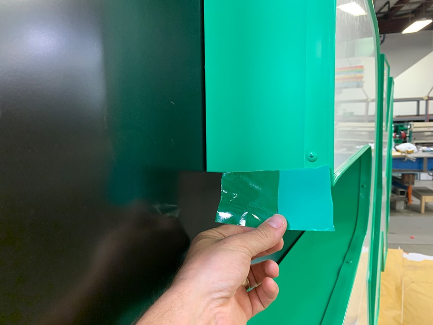 An example of how paint, printed vinyl and stock vinyl can look different though listed as the same color. Note that the darker vinyl is designed to portray the desired color when lit, though our experience proved otherwise.


 Maggie Harlow2 weeks ago
 Editor's Note6 days ago
 Fabrication + Installation1 week ago
 News2 weeks ago
 Dimensional Signs1 week ago
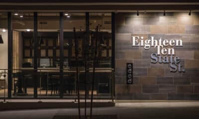
 Business Management1 week ago
 Big Survey1 week ago
 News6 days ago