Whether its intent is to inform, identify, persuade or guide, a sign communicates a message, and the manner in which it communicates is important. Consideration must be given to all aspects of a sign's design. A typographic solution that speaks with a voice can be defeated easily by a non-supportive color scheme and structure.
As our information-rich society becomes more saturated with not-so-rich information, designers unconsciously seek content-siphoning shortcuts. If a sign "speaks" with a proper voice (considering its environment, object and subject), its message is more readily comprehensible.
There are no absolutes — only objective solutions influenced by subjective reasoning — governing how signs speak to an audience. From the cautious, consistent and recognizable form in emergency-room identification, to deliberate counterculture expression in edgy retail environments, signs must speak in a manner viewers understand. This level of comprehension may come through conditioning, based solely on what viewers have always known to be true, or through a preconceived notion of what they expect to encounter.
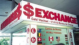
A designer establishes a sign's vernacular using typography, color, materials and form. Psychological and social conditioning shape people's perceptions and contribute to their comprehension of a sign's message. If an emergency room's entrance is marked with elegant mauve script, it would create a voice far too delicate and understated for its purpose, and the few patients who recognize the entrance sign would undoubtedly question the hospital's credibility.
Conversely, if a high-end jewelry store were to use all Helvetica caps in black with a red neon halo on a corrugated metal signband, it's safe to say they won't sell many $20,000 tennis bracelets.
Typography and articulation
Advertisement
Graphic design is the embodiment of visual and verbal communications, and typography is often the greatest tool to express both. If we consider pure typography a reflection of the spoken word, then we must understand how to use letterforms as an extension of our own voices. The most effective sign-design solutions are those that accurately characterize the entity behind the message and speak to its audience with an appropriate ethos.
One common issue in sign design is insufficient understanding of typography. A cookie-cutter solution displaying only required information doesn't take into consideration how its messages are perceived or understood. If an inappropriate typeface is utilized, it creates an improper voice. Solutions such as these are seemingly oblivious to their environment and do little to reflect an institution's desired brand image.
Effective sign design is not a matter of idiomatic personal expression, it is a commitment to the client's needs.
Form and context
Form, in regard to structure or visual content, is essential to any signage program's integrity. It should serve as a logical voice extension created through typography and substantiate the offering by lending context.
Legendary graphic designer Paul Rand, in his book A Designer's Art, speaks of the cruciform as "a demonstration of the perfect form" because of its aggressive vertical and passive horizontal. Seen regularly on street signs to indicate a four-way intersection, the cruciform takes on an entirely different meaning when placed on an exterior church wall. If typography is the voice of a sign, form is the amplification of that voice.
Advertisement
Color, materials and tone of voice
To an audience, color is often the most personal aspect of a sign's voice. A person's response to color may be either learned or inherited. Personal preference, seasonal influences and context play major roles in how color is perceived.
Materials are only slightly less relevant than color in garnering a consumer's response. Materials, like overall sign form, provide tremendous opportunities for differentiation as they allow for proprietary expression of a brand.
An effective combination of color and materials reinforces the message of any given sign and complements typographic solutions to establish the proper tone of voice.
Redefining sign design
Environmental graphic design is being redefined as the public becomes more astute due to the growing onslaught of communications. The public's ability to discern genuine from deceptive, informative from misleading and qualitative from inferior has flourished. Generations reared in the digital revolution are influencing the standards of communication and forcing designers to rethink their craft.
Advertisement
The proliferation of the Internet and virtual environments allows messages to be projected in ways not even imaginable in a true physical environment, creating greater challenges (and opportunities) for traditional channels. The joining of cultures and generations and the blurring of boundaries between communications that inform, identify and entertain suggest a greater need for signs and other visuals to speak in a language reflective of the intended message.
Much expression of the unique brand identity of a company, retailer or institution rests heavily on its signing program. The challenge that lies ahead is to create recognizable, memorable signs that don't lose functionality for identification, wayfinding, persuasion or entertainment.


 Projects6 days ago
 News6 days ago
 How To4 days ago
 News2 weeks ago
 Business Management2 weeks ago
 News1 week ago
 Manager's To Do2 weeks ago
 Dale Salamacha2 weeks ago