
Signs Brushed with Greatness
Paint and goldleaf artists perform the classics.
FROM LETTERHEADS TO Walldogs and more, passionate sign pros commit time and effort to produce timeless handpainted and gilded signage using old-world creativity and patience. Following are four accomplished signmakers who’ve shared their “greatest hits.”
 Photo by Alan Luntz
POURING EVERYTHING INTO IT
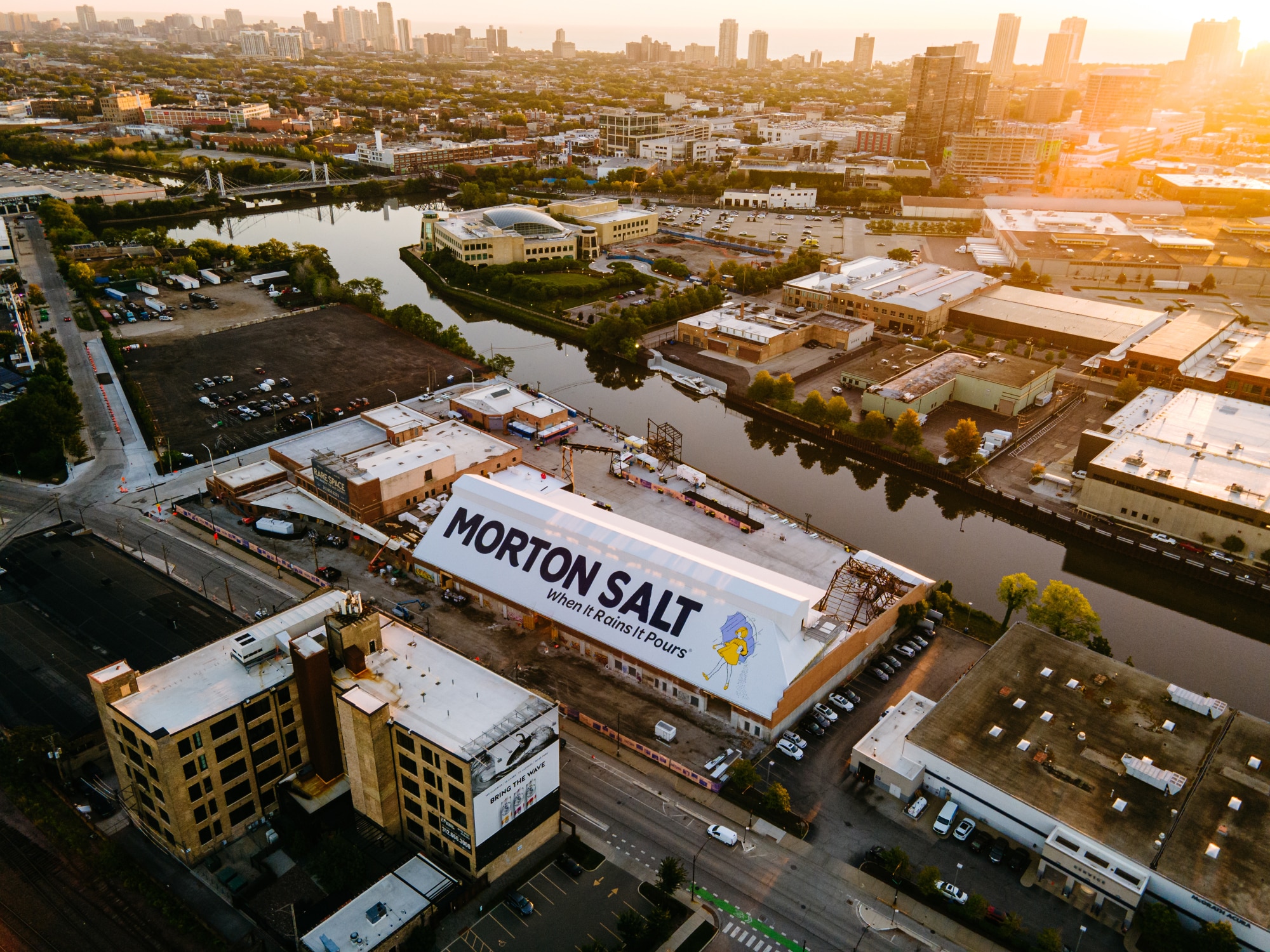
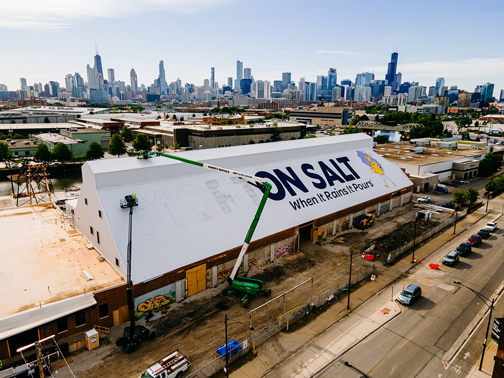
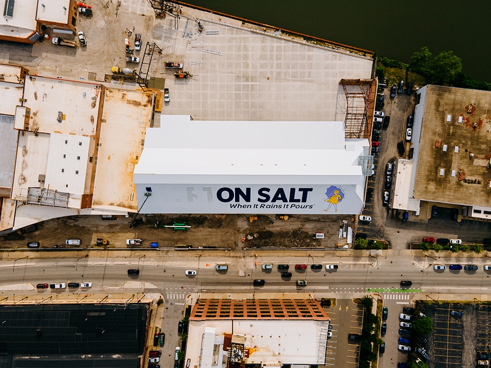
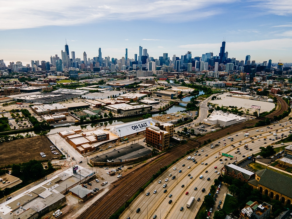
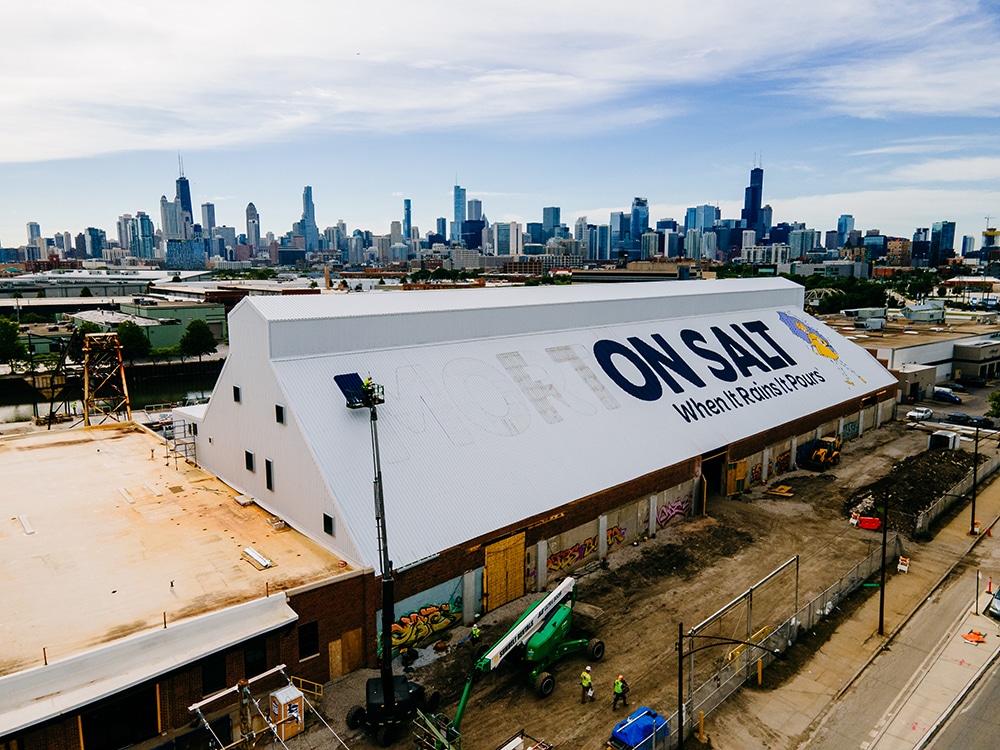
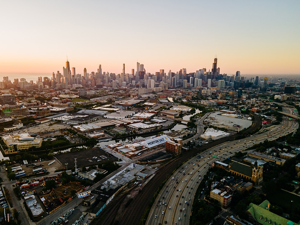
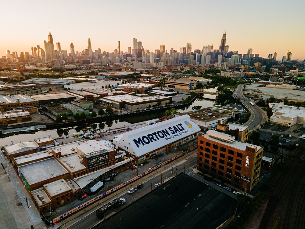
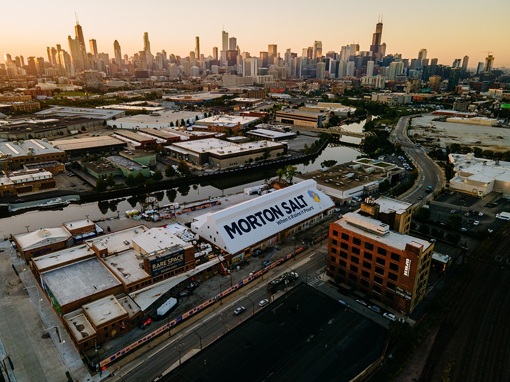
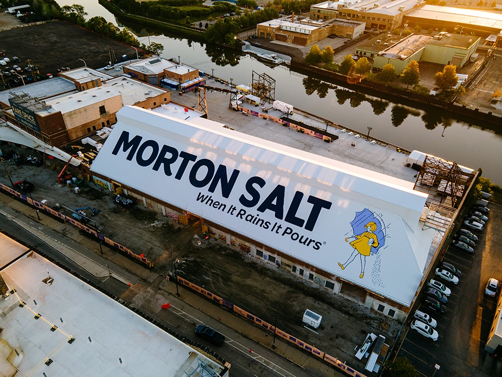
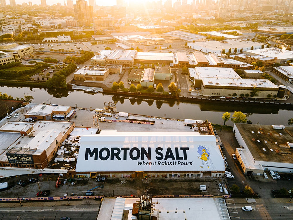
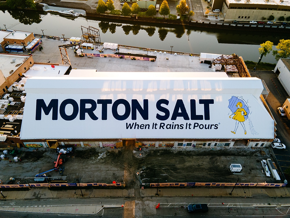
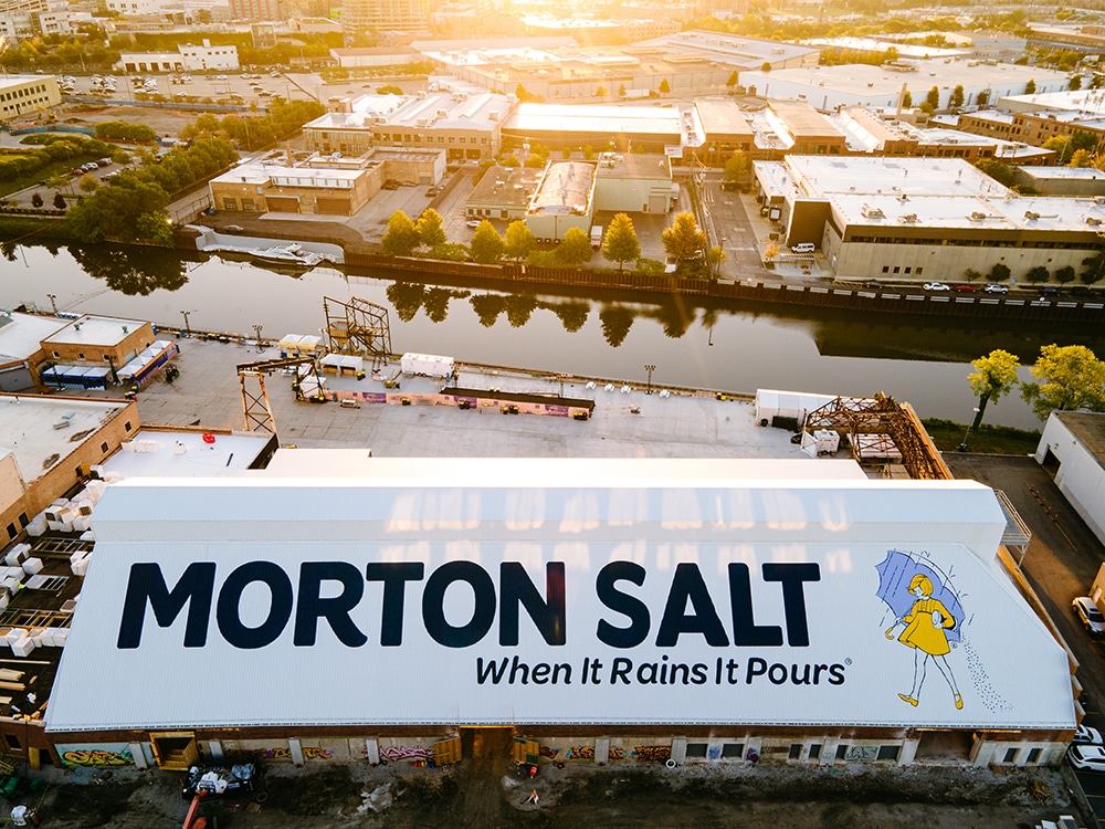
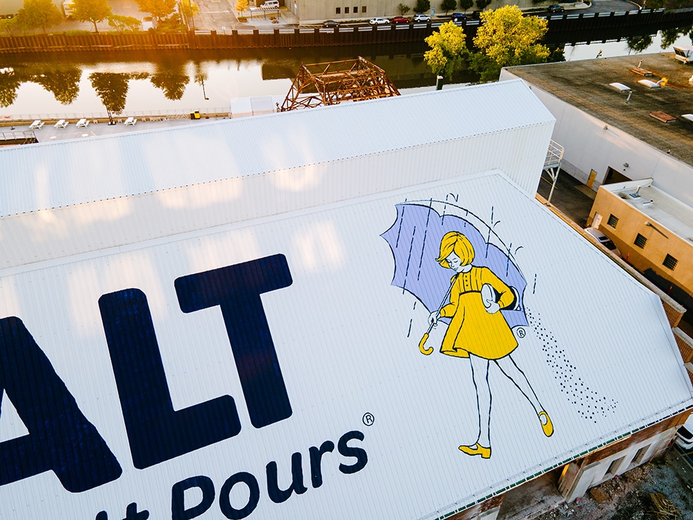
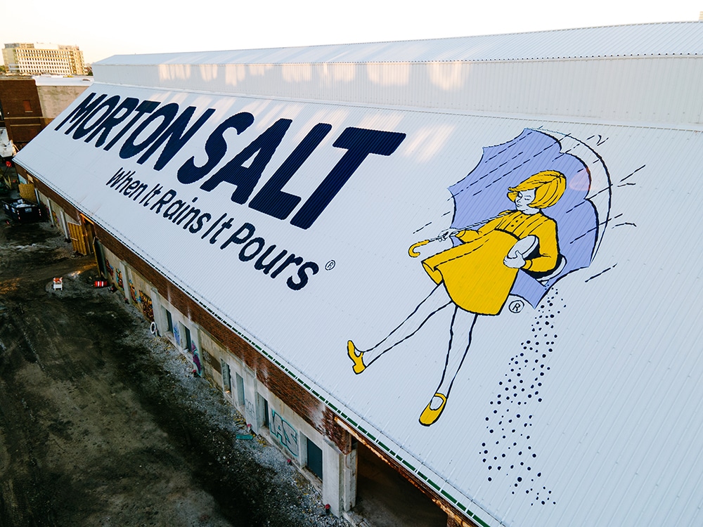
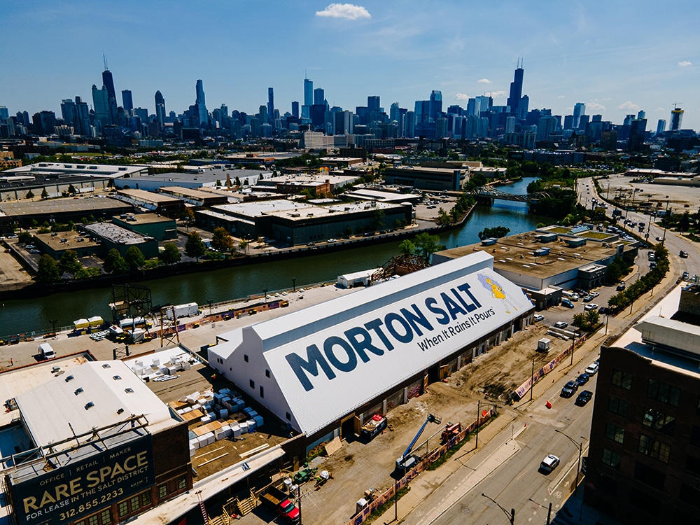
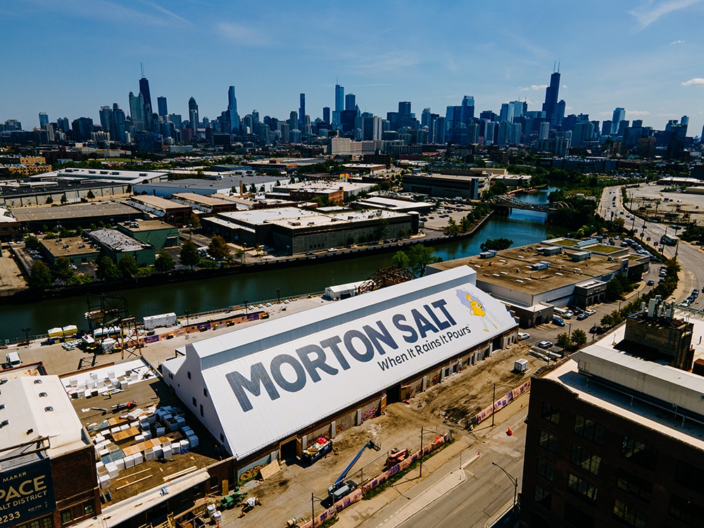
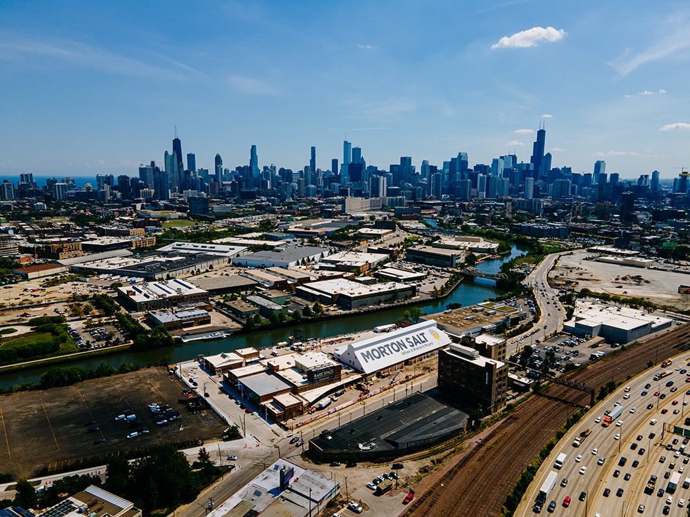
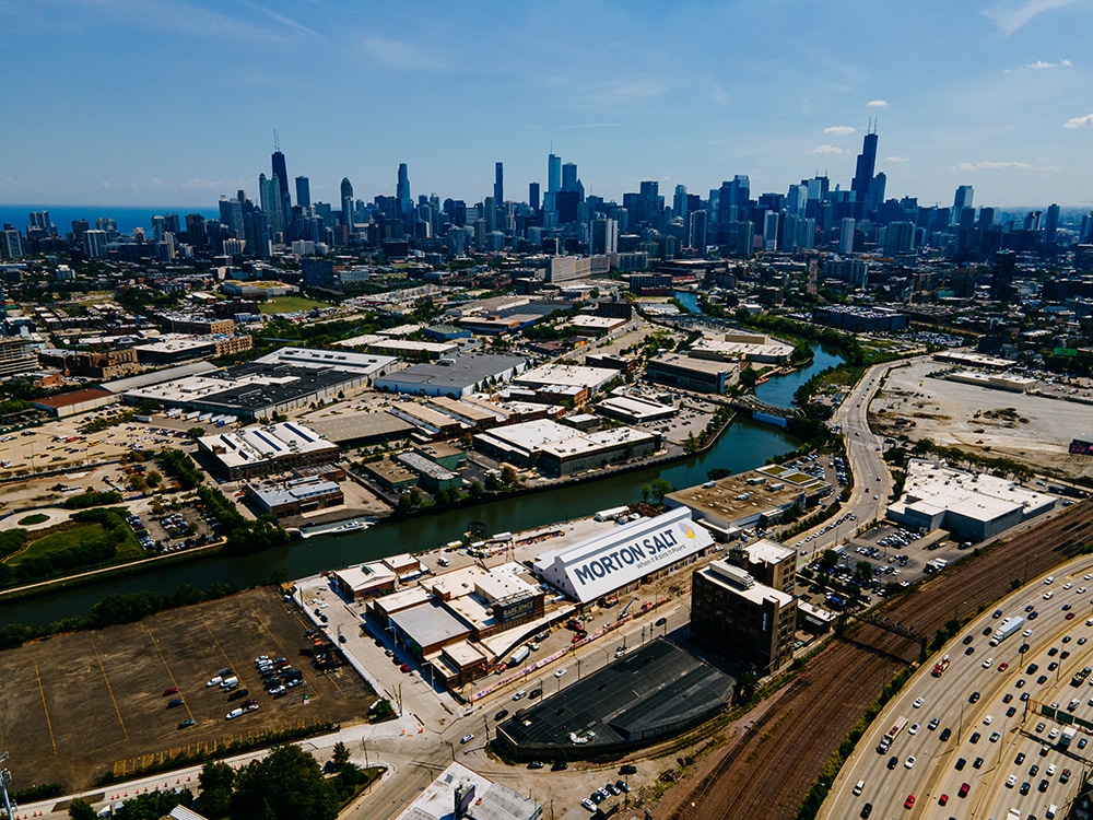
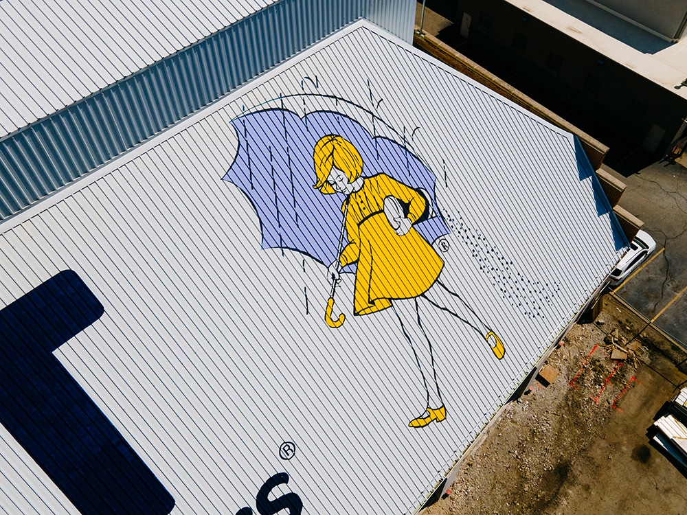
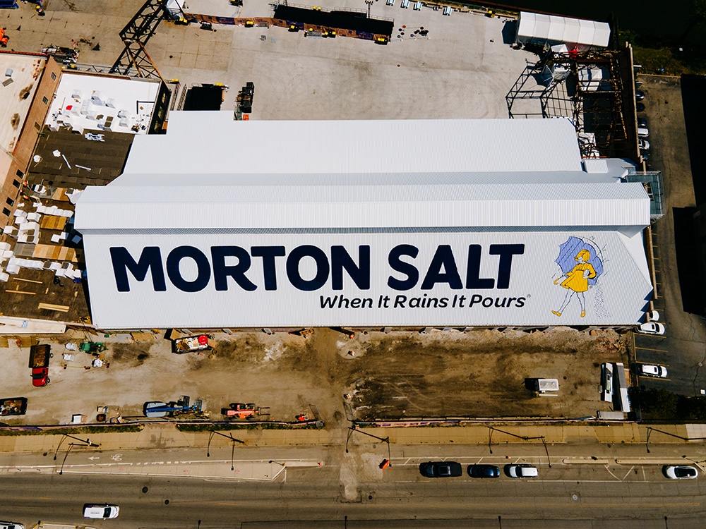
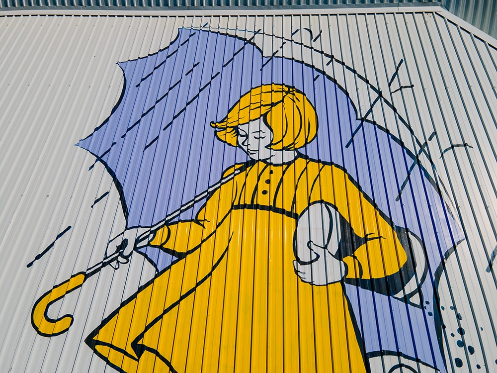
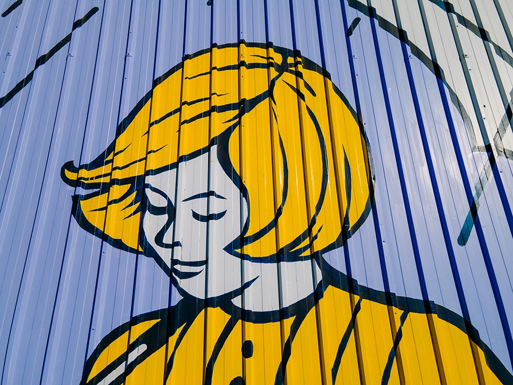
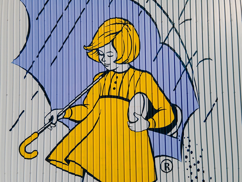
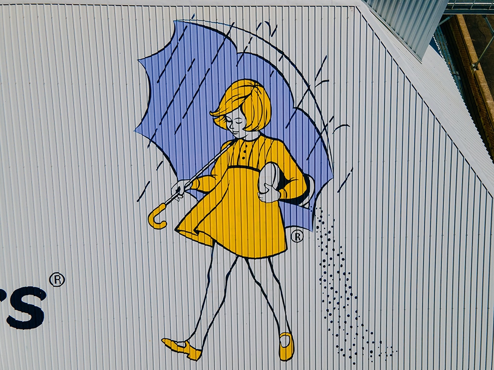
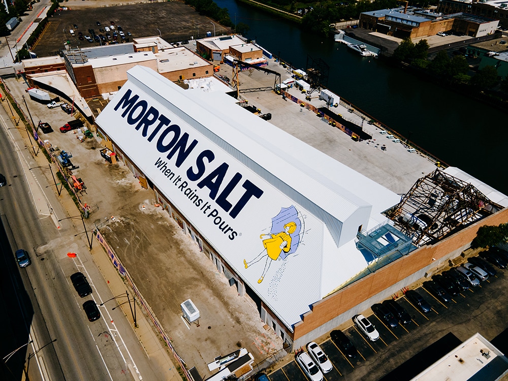
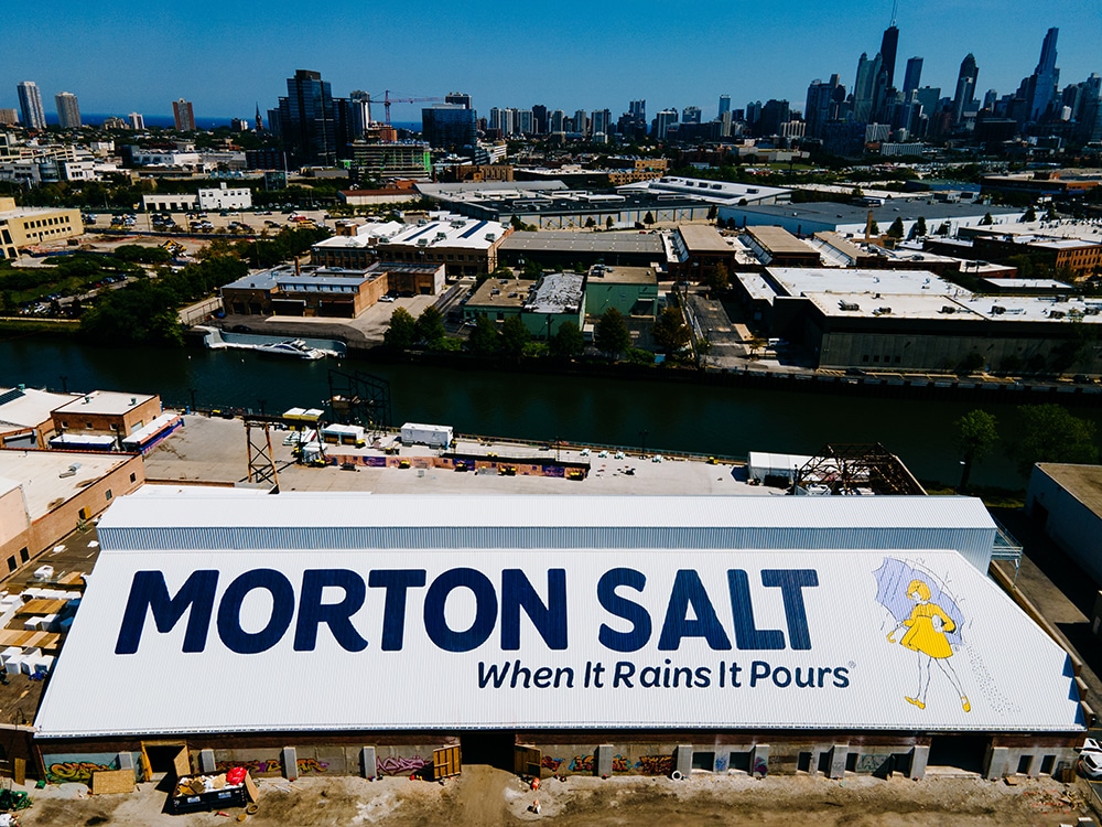
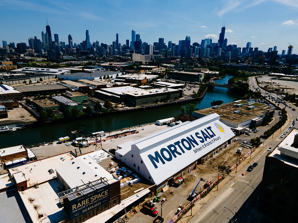
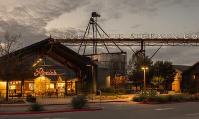
What’s more thrilling than seeing your landmark sign from the air as you arrive at Chicago’s busy O’Hare International Airport? That’s been the case for Alex Perry, CEO of Right Way Signs right there in the Windy City, who gets to admire his firm’s iconic Morton Salt Shed roof sign, one of the most recognizable and well-known in Chicagoland. For nearly a hundred years, the Morton Salt warehouse has remained a familiar fixture. Its huge, 16,000-sq.-ft. roof, emblazoned with the iconic Morton Salt Umbrella Girl mascot and famous When It Rains It Pours slogan, has been an enduring landmark. Today, it has morphed into the Salt Shed — a new indoor/outdoor entertainment complex — attracting over 70 million views annually, from inbound and outbound drivers on the expressway, riders on the local Metra train to passengers on flights.
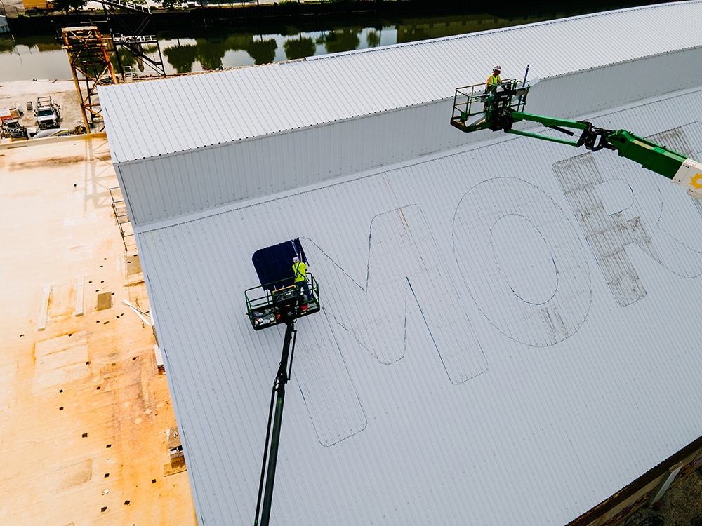
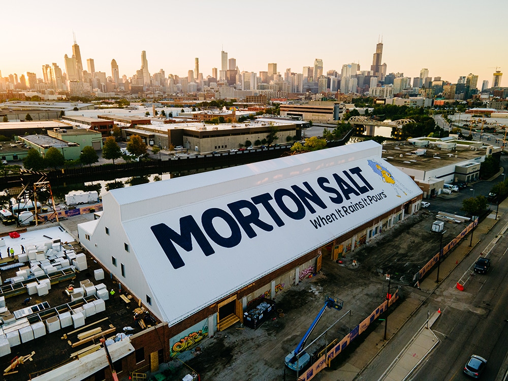
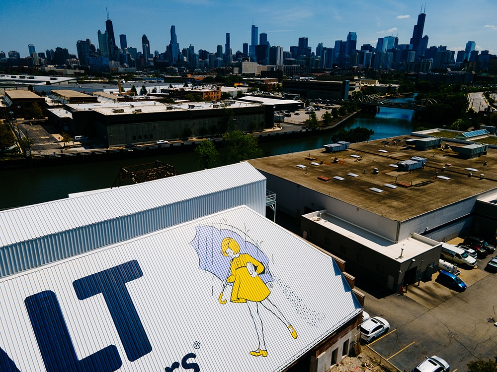
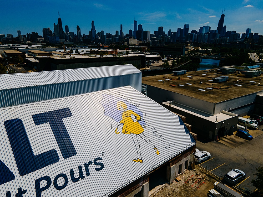
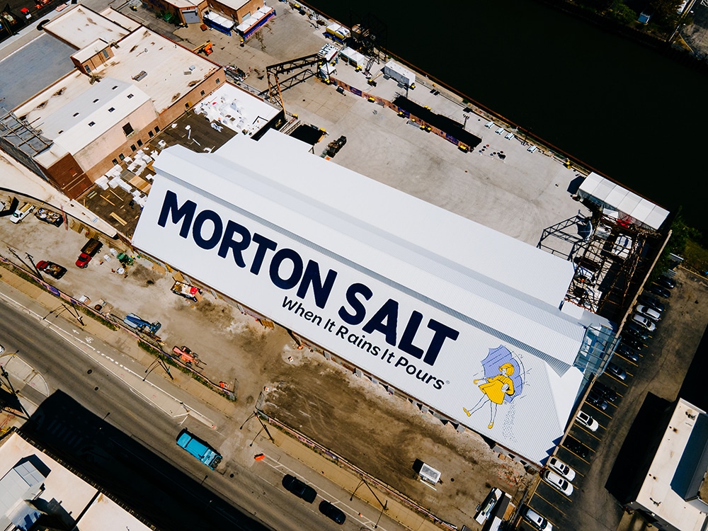
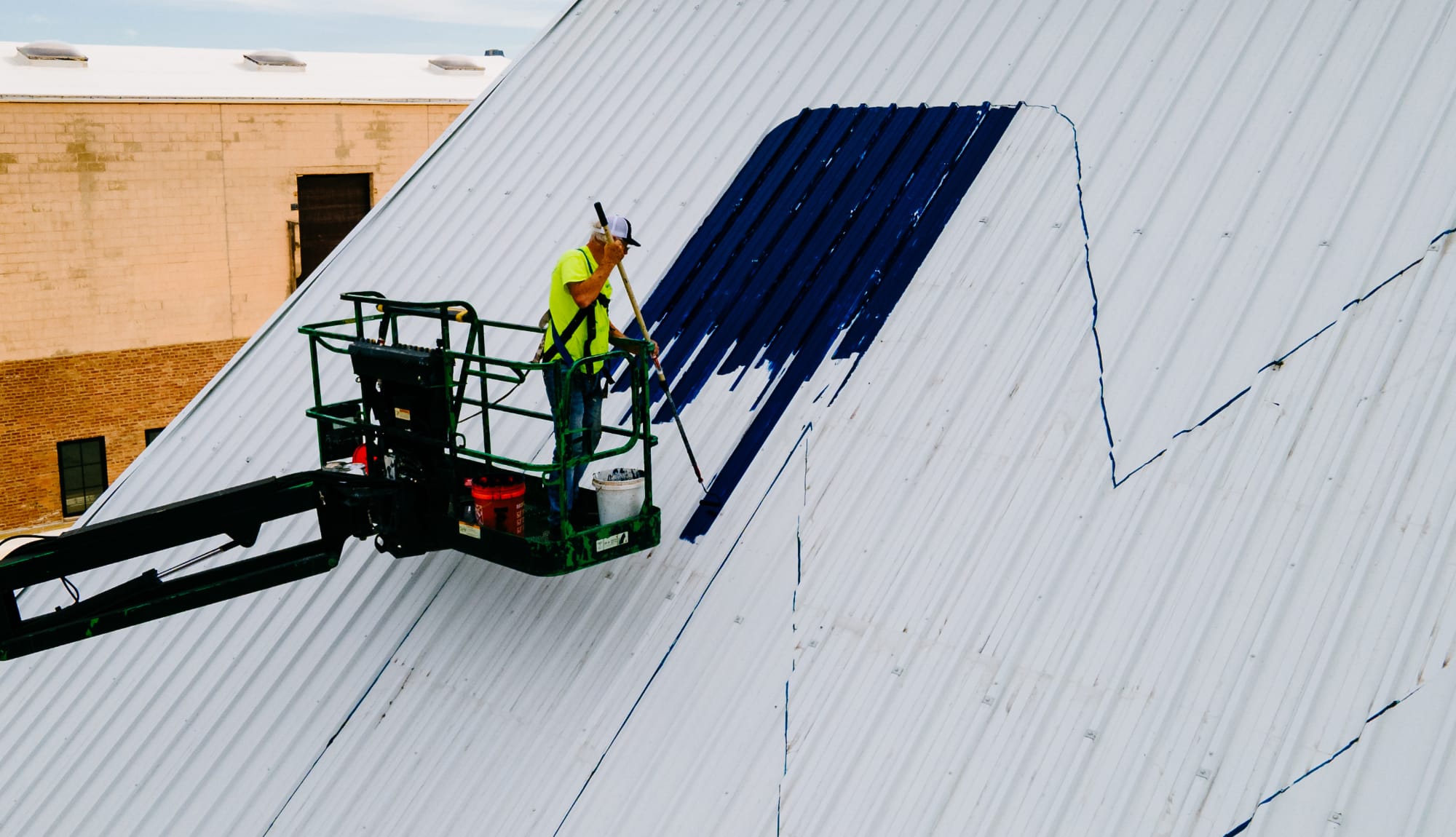 A CUTE ANGLE The Morton Salt Shed’s steep roof presented a painting challenge.
“When we won the contract, the first meeting was to reiterate how important this project is to Chicago,” Perry says. “It’s what people see on a daily basis and it’s an enduring landmark. I told our team that this was the most visible project our company will ever do and it will most likely outlast us (with the exception of repainting the letters every 10 or so years) so let’s make sure we meet and exceed expectations. For us, this was a bucket list sign project.”
Right Way Signs was awarded the project in the spring of 2021 but the kickoff was delayed until spring/summer of 2022. In all, it took over one year of planning and producing samples, months of testing and researching, and finally six weeks to complete.
“Originally we wanted to use 1 Shot or Ronan [paint], and take a blue right out of the can,” Perry says. “To this day I think it would have covered better with one coat instead of three. Anyone that has used this color blue knows it’s a difficult color and takes multiple coats. We eventually settled on a Sherwin-Williams [DURA CLAD ‘Direct-to-Metal’ (DTM) Acrylic Coating].”
Advertisement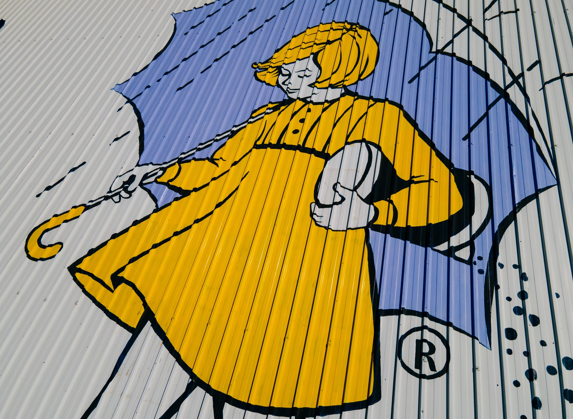 LOGO CENTRIC
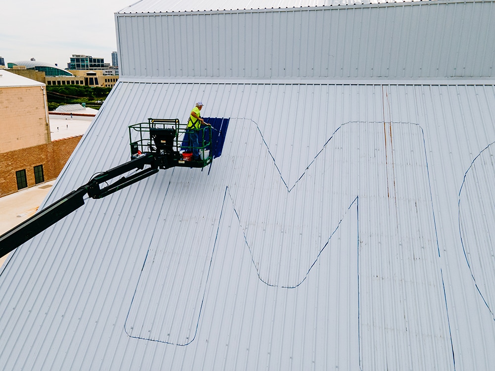
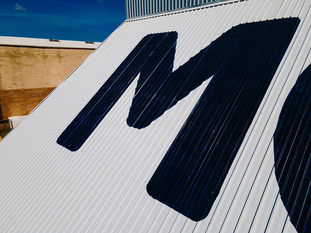
The roof’s deep corrugation made measuring and centering the logo more difficult.
But to handpaint this enormous sign presented challenges: the weather, the angle of the roof and supply chain issues. Right Way was supposed to start painting in the fall of 2022, but due to a supply shortage of roofing materials for repairs, the project was pushed to mid-November. But, this is Chicago, and the team was nervous that they would only get a few letters painted due to snow and wind, so they postponed the project till this spring.
Another tall couple of hurdles were the height of the roof and its angle. To access the roof at its angle, the Right Way team had to use an 85-ft. lift. Although the shop has painted on angled surfaces before, the Morton Salt Shed roof proved to be more difficult because the team had to maneuver an articulating lift without the basket bouncing and damaging the new roof. And due to the deep corrugation of the roof, the team had to work harder to assess the logo’s measurements and ensure that it was perfectly centered.
Plus, more supply chain issues presented themselves in getting the project’s paint. After all, “when it rains…” Perry recalls that they needed to order from four different vendors to complete the job.
It took a team unafraid of heights to complete the Morton Salt Shed: Ches Perry, lead signpainter, planning, patterns, measurements, painting of the letters, filling them in and triple-coating them; Ally Braden, assistant signpainter, who helped outline and fill in the letters and logo; Sam McMorris, design and production who helped with proofing, measurements, overall visuals for the team to follow; Charles Davis, vinyl, large format print and patterns, who prepared pattern prints for the team; Jason James, lead installer, who helped prep the roof, taking two weeks to power wash and remove all of the dirt and debris; and Alex Perry: CEO, who handled project management and communication.
Advertisement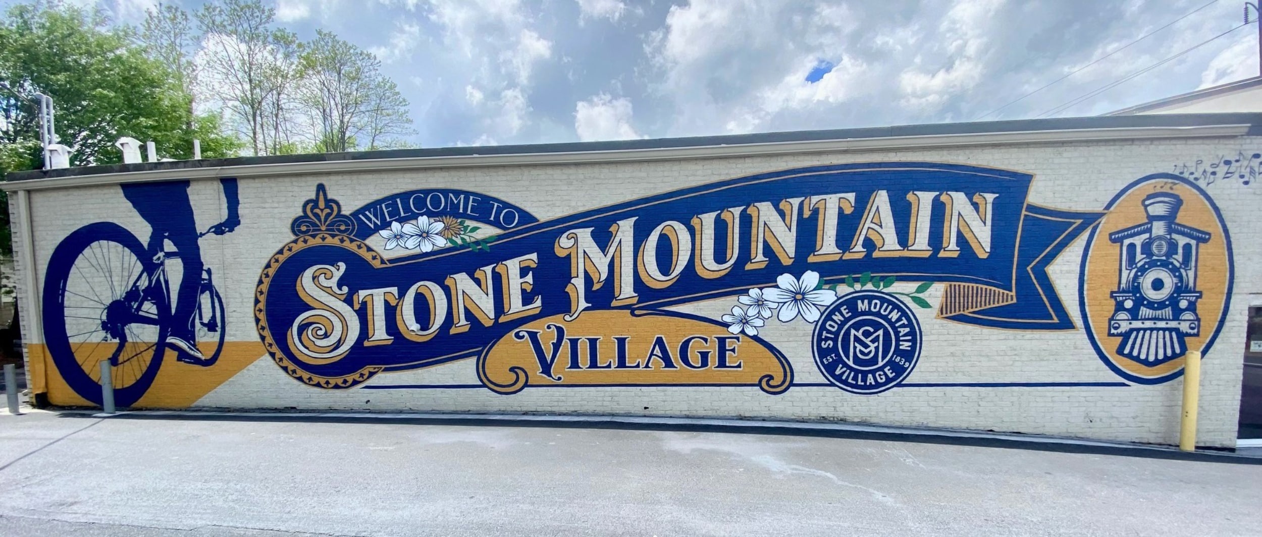
PAINTED IN STONE
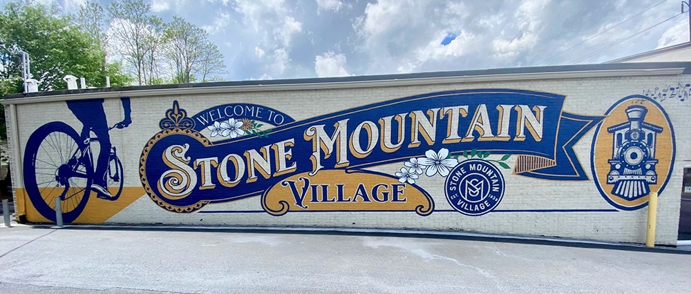
When visitors arrive at Stone Mountain Village, GA, the city adjacent to the state’s most visited state park, they are greeted by a large, handpainted 12 x 60-ft. mural welcoming them to a revitalized and energetic area with new retail and restaurant establishments. The mural, completed in March 2023, was commissioned by the Stone Mountain Village Downtown Development Authority (SMVDDA) to upgrade its downtown area and attract more visitors.
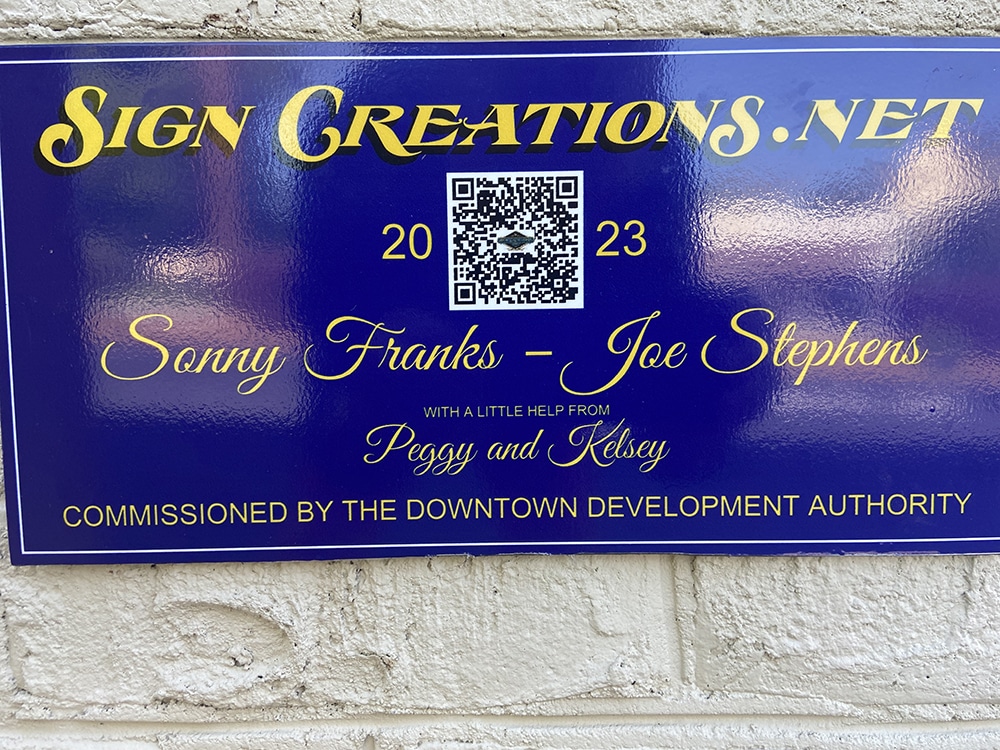
Enter Sonny Franks of Sign Creations (Lilburn, GA). Franks, a self-described lover of handpainted signage who started in business in 1969 as a summer job, was recommended for the project by the city manager of Lilburn, a town near Stone Mountain, where he has painted several wall murals. Franks discussed different ideas with the SMVDDA board, including the need to acknowledge the many bicycle riders who tour the park in large numbers. The mural also includes a train as a nod to the tracks running through town and its railroad heritage.
Once the design was approved and with no power on site, Franks used pounce patterns instead of projection to depict the design on the wall. Pouncing is an art technique used for transferring an image from one surface to another, similar to tracing and useful for creating copies of a sketch outline to produce finished works.
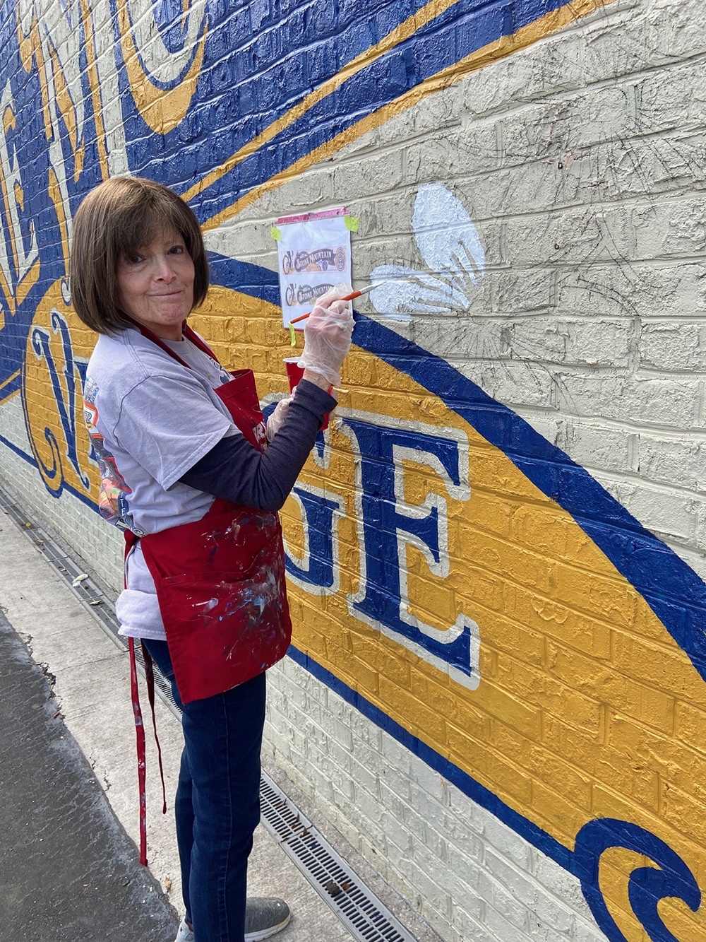
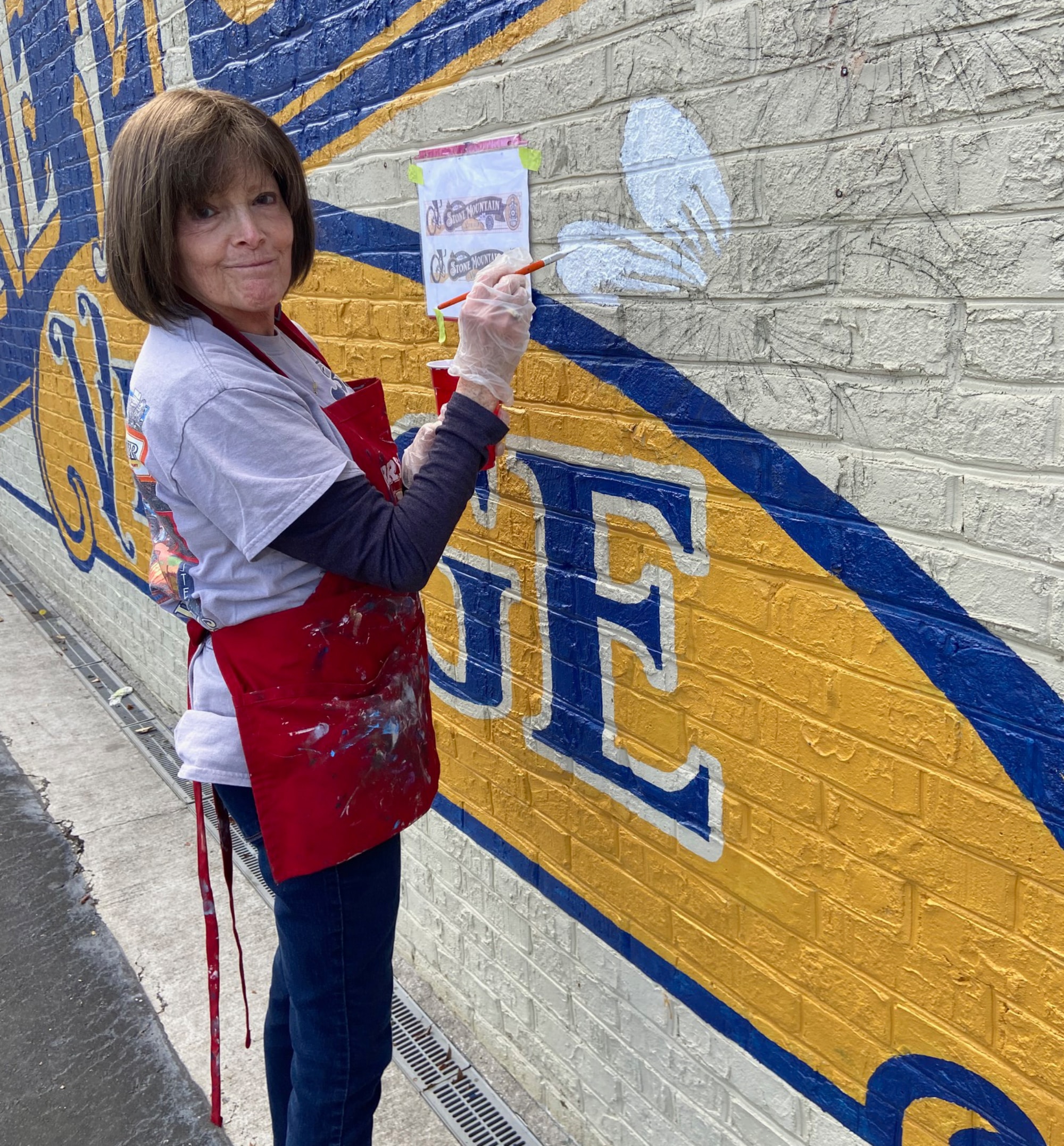 HELPING HAND
Peggy Franks, Sonny’s wife, contributed to painting the flowers.
Franks chose Purple Armadillo brushes by Mack Brush and inexpensive China bristle brushes from Harbor Freight Tools (for fill-in) to paint the three colors. He purchased Sherwin-Williams exterior acrylic latex base colors in gold and blue, then added other colors to tone down those shades for a unique hue.
Franks mostly worked solo on the project with occasional help from his friend, Joe Stephens, and wife Peggy Franks. In all, the project took about two weeks to complete mostly because the brick was quite rough. To reach the higher areas, Franks used a 6-ft. rolling scaffold and a small ladder.
He believes his paint job will look good for another eight to 10 years, and, because it involves only three colors, should be easy to touch up when necessary.
After years of struggling with vacancies, today, local families, tourists and sports enthusiasts enjoy the area’s many opportunities. The new mural stands as a gateway welcoming everyone to Stone Mountain, and has even drawn positive attention from the community who want to take selfies beside it.
 SELF REFERENCE
Wallis’ mural uses trompe l’oeil (below) to depict a signpainter painting the wall.
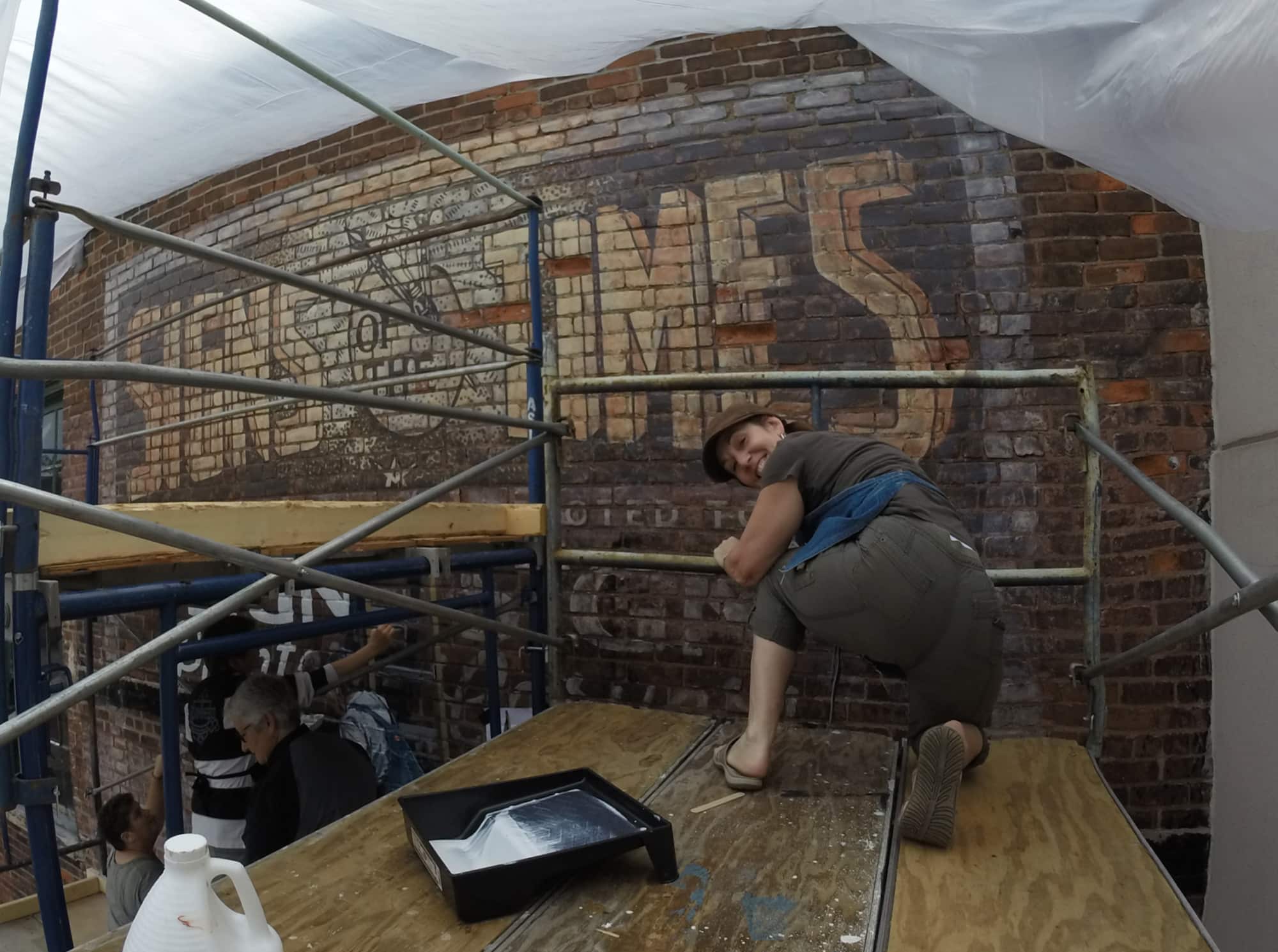
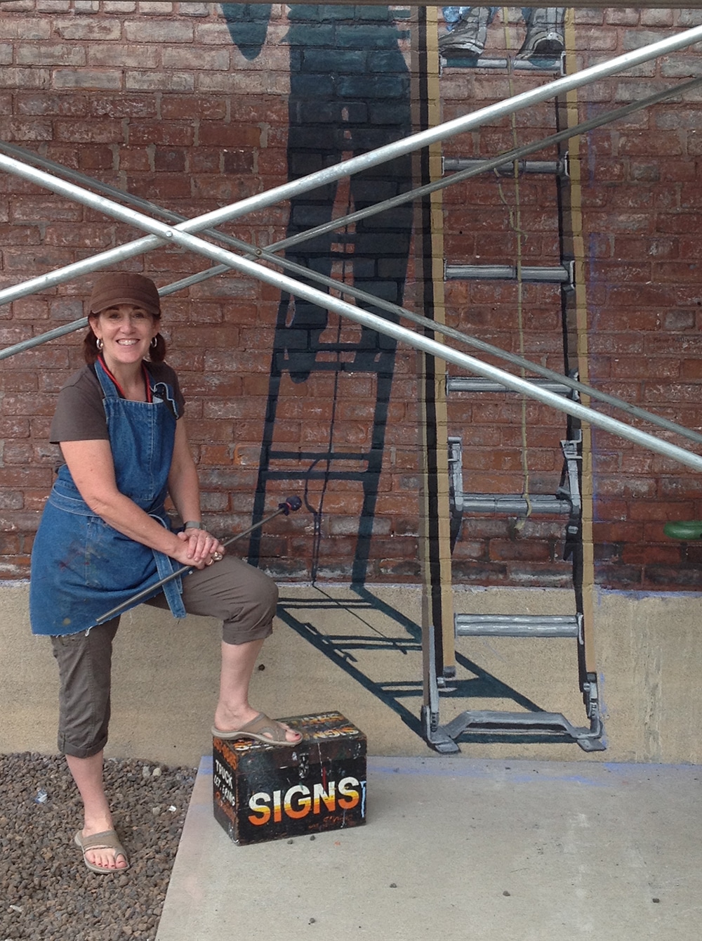
GHOSTS AT THE MUSEUM
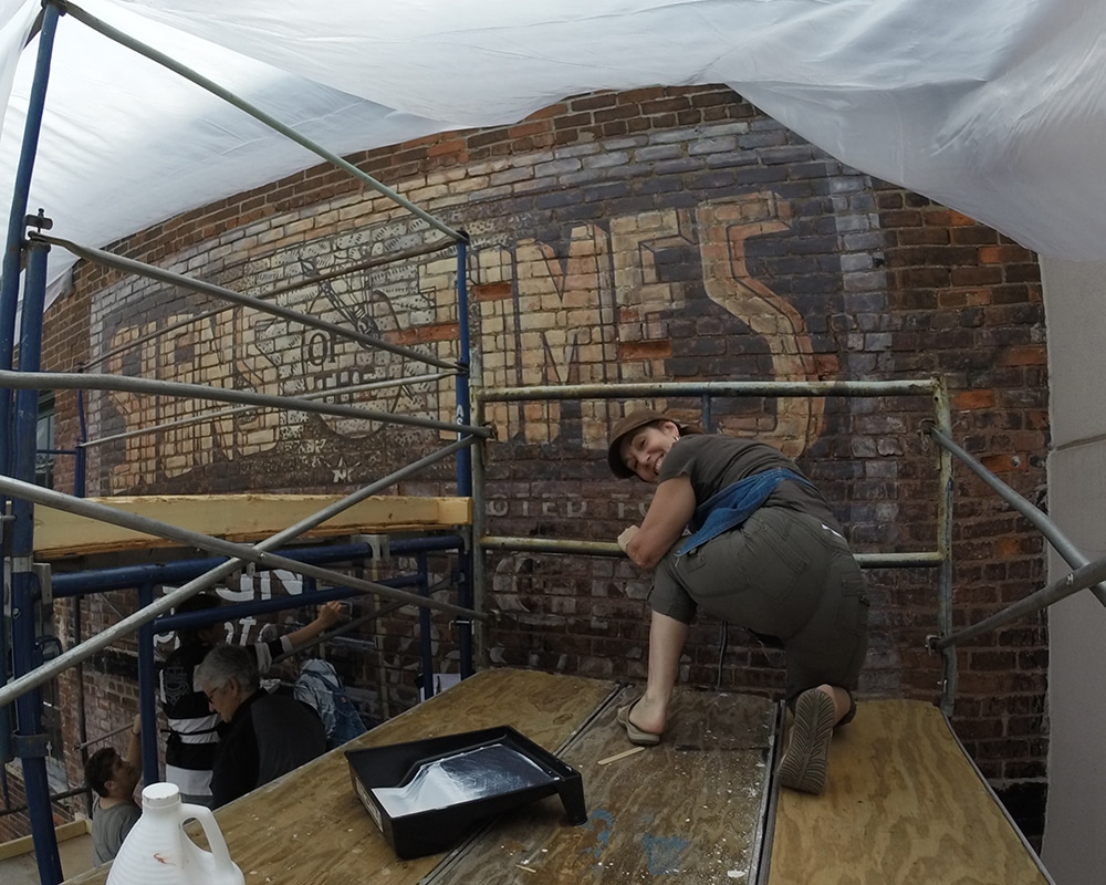
As the 40th anniversary of the Letterhead Movement was fast approaching at Cincinnati’s American Sign Museum in September 2015, the organization decided to produce five murals on the property during the three-day event. One of those murals — approximately 16 ft. wide by 20 ft. tall — would honor the cover of the first issue of Signs of the Times magazine from 1906. Elaine Wallis, recently retired from Signature Sign & Image (Niagara Falls, ON, Canada), a self-taught signpainter for the past 40 years, was chosen to be its designer and project leader.
“I was beyond thrilled and honored to be named for this project,” Wallis says. “This is definitely my greatest project. I’m just a girl who graduated from art school and fell in love with lettering, sign designing and mural painting. To be asked to produce a mural representing the earliest history of Sign of the Times magazine on the wall of the American Sign Museum, dedicated to the art and magic of signmaking, was like the Holy Grail for me.”
For her mural, Wallis created the idea of connecting the present day with the past. She felt that 2015 was a renaissance for signpainting and wanted to embrace handmade quality like classic signage. Her vision was to combine distressed painting and trompe l’oeil to pay homage to the classic signpainters. Wallis imagined that a wall ad at the turn of the century might use the masthead and bold lettering boxed in with a heavy border. She envisioned this ad would fade away into a ghost sign on that weathered brick wall. She portrayed the classic signpainter in actual size to help “fool the eye.”
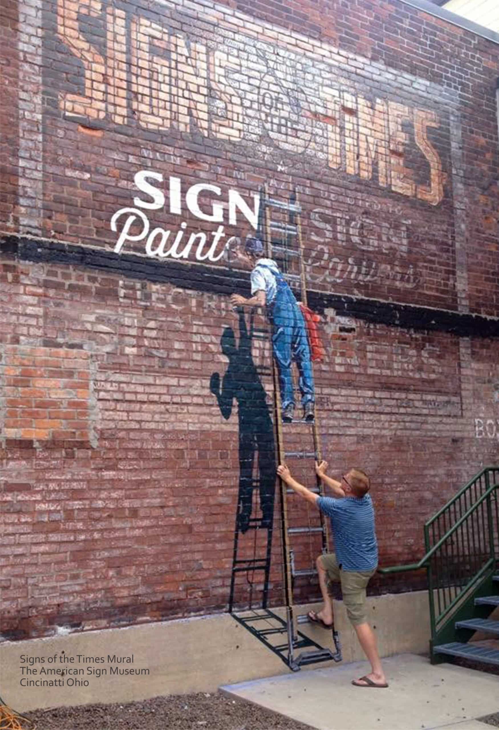
There were happy accidents: “The parging at the bottom of the wall that doubled as the sidewalk really made the tromp l’oeil work,” Wallis says. “The actual wall faces west so the sun hits it in the afternoon making the cast shadow of the signpainter very accurate. Plus, the cast shadow looks like a ‘rock star’ pose, which I love because signpainters are rock stars to me.”
Wallis and her team, which completed the mural in three days, used Nova Color Artists Acrylic Paint, a long-lasting water-based acrylic formulated for outdoor mural work, and Nova Exterior UV Clear as topcoat. Several sections of scaffolding helped her team easily work above each other. Wallis chose to use pounce patterns rather than projecting the design onto the wall at night because pouncing is more accurate and her team could get right to work. The most challenging aspect of the project was setting up the scaffold around a side door staircase.
Since Wallis had never used these techniques before, she reached out to fellow Letterheads for guidance. Fellow Canadian Rick Janzen, who specializes in distressed signage for the movie industry, helped her achieve the ghost sign look. Her son Mark Wallis modeled as the signpainter. Mary Gillespie helped to work out the paint technique on a large maquette and plotted and perforated her patterns. Additionally, her dedicated team of Canadian artists on site included Loraine Lamb Lalonde, Erica Taylor, Larry Whan and Noella Cotnam.
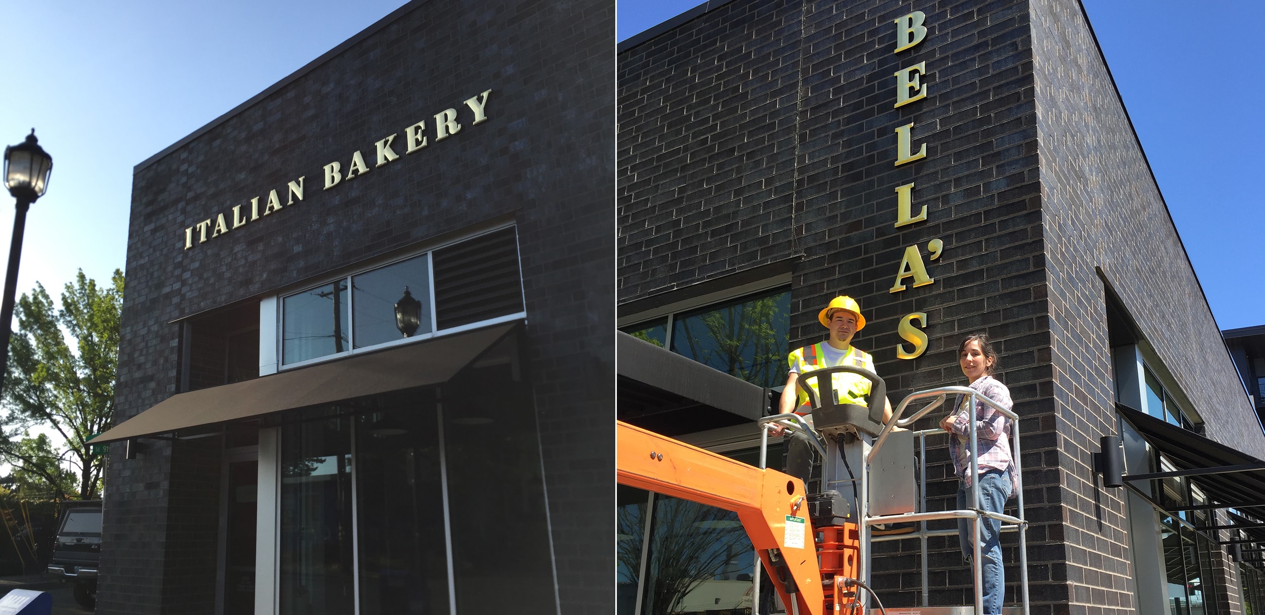 SERVICES ENGAGED
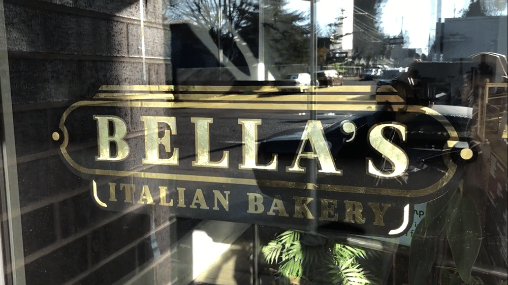
Gilded dimensional letters (above) and window signs (below) reflect timeless quality.
GOLDLEAF SIGNS, GOLDEN ENDINGS
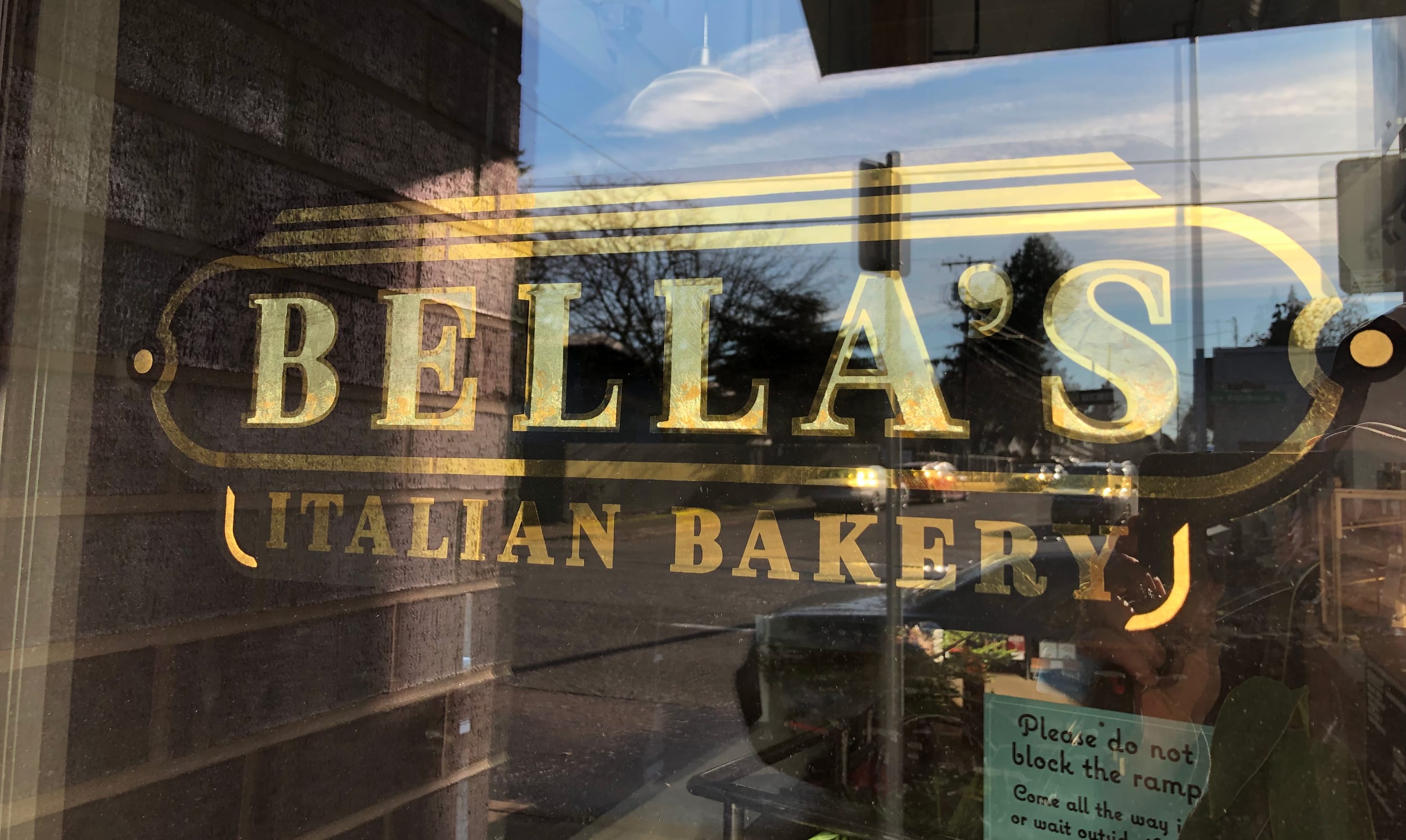
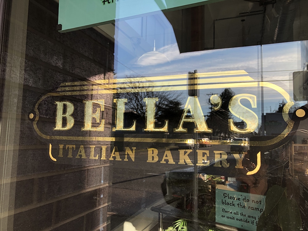
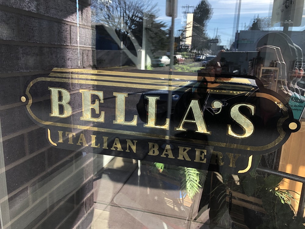
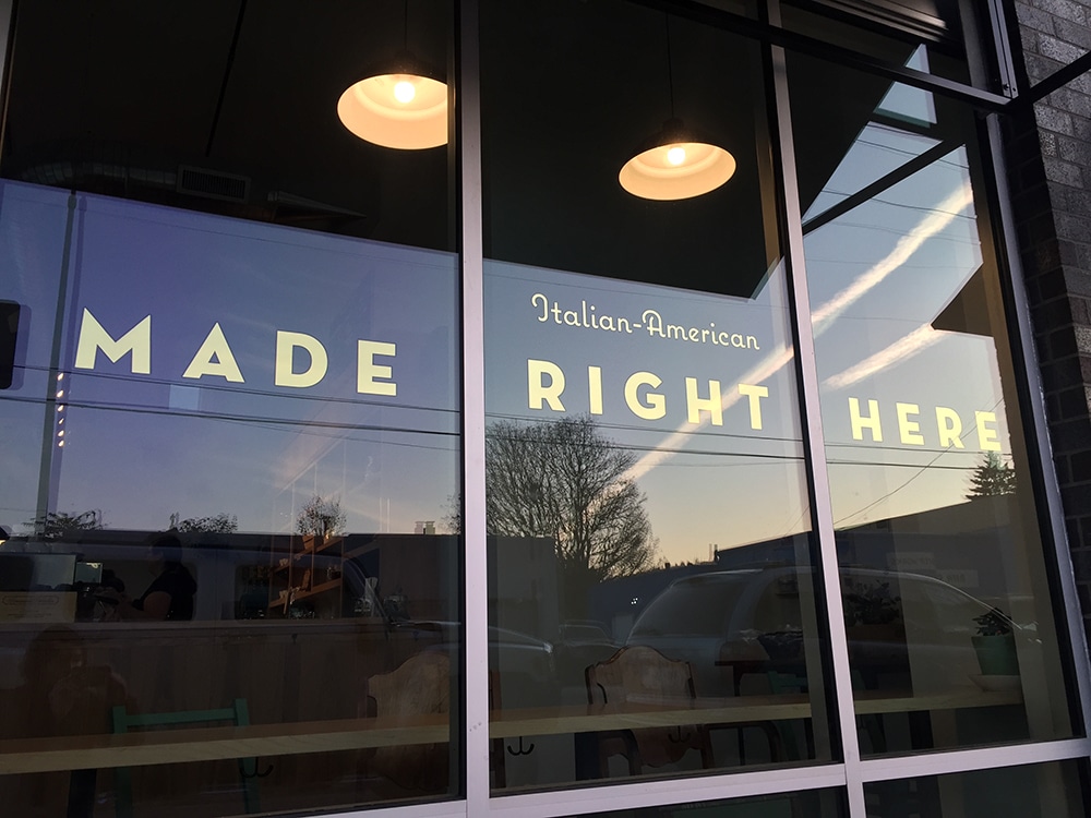
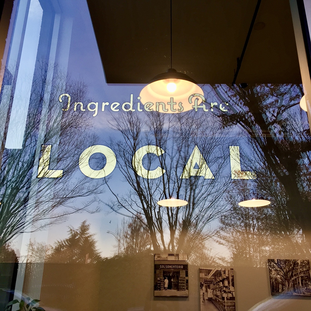
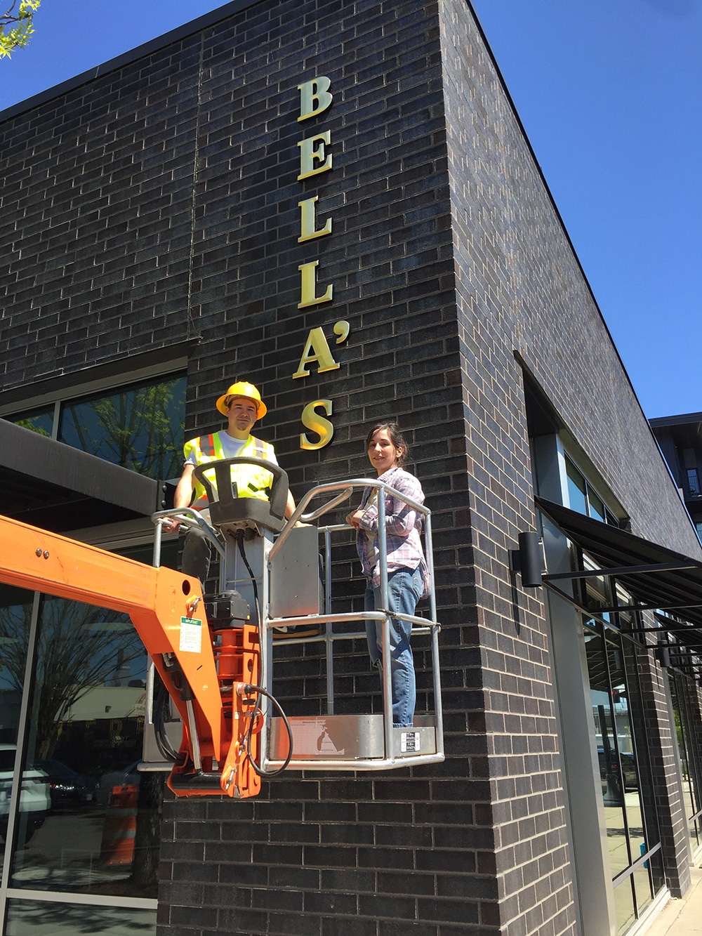
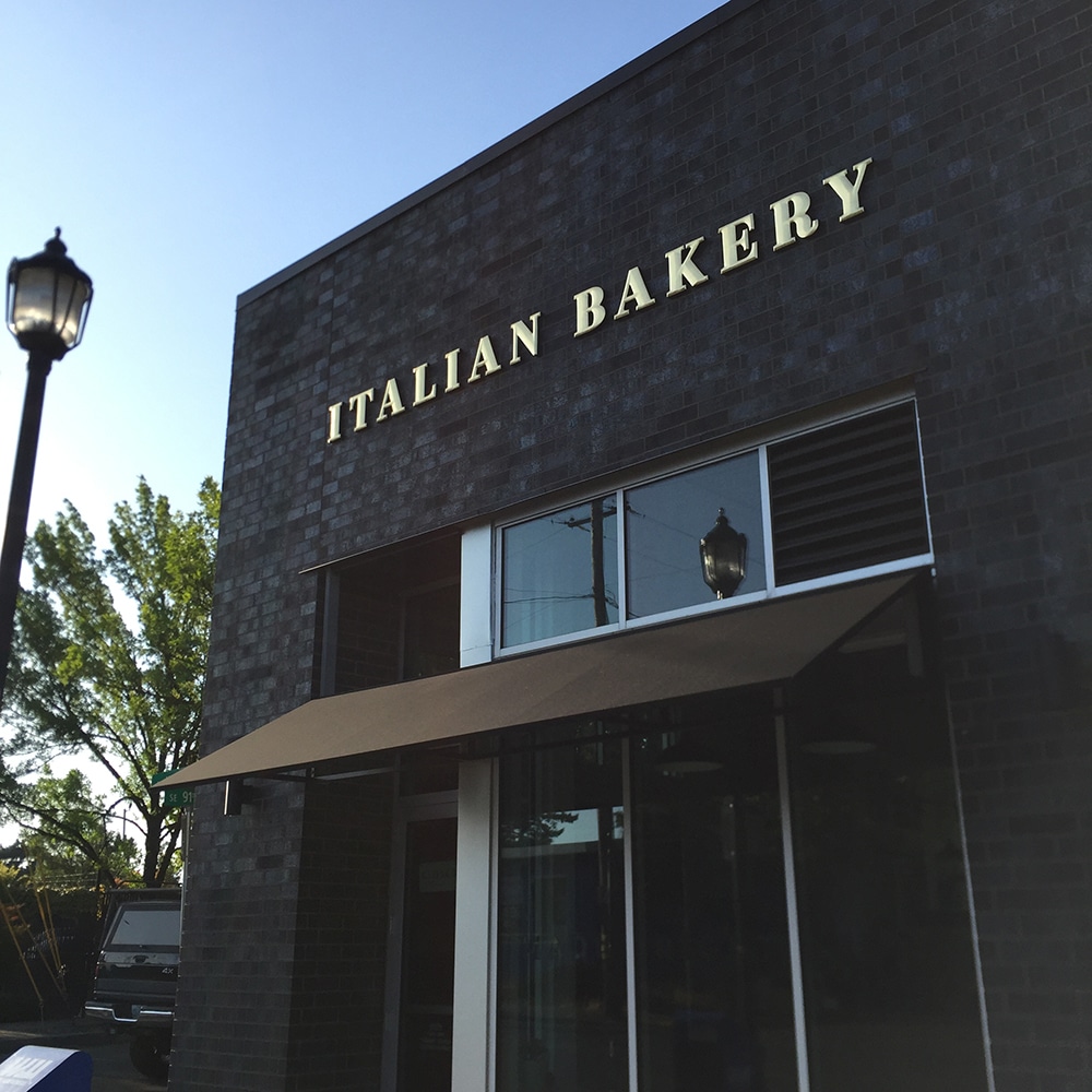
When a new artisanal Italian bakery opened across the street from Studio Sign Co. (Portland, OR), Nick Lee, its owner, introduced himself and his business and asked if they needed signage. Who would have imagined that this meeting would connect both his business and personal lives?
The bakery owner Michelle and her designer wanted the signage to convey feelings of hand-crafted quality and timelessness to brand Bella’s Italian Bakery and its goods. Lee sold them on his experience and talent — and using classic goldleaf for both the windows. “Goldleaf projects account for about half of my work,” Lee says. “I enjoy this type of work because it is unique and the results are beautiful and satisfying to look at.”
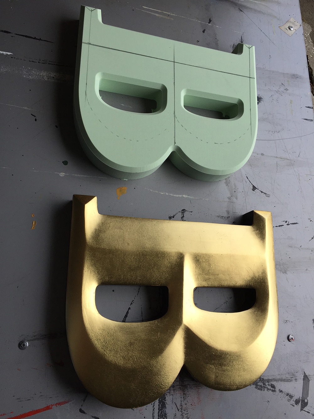
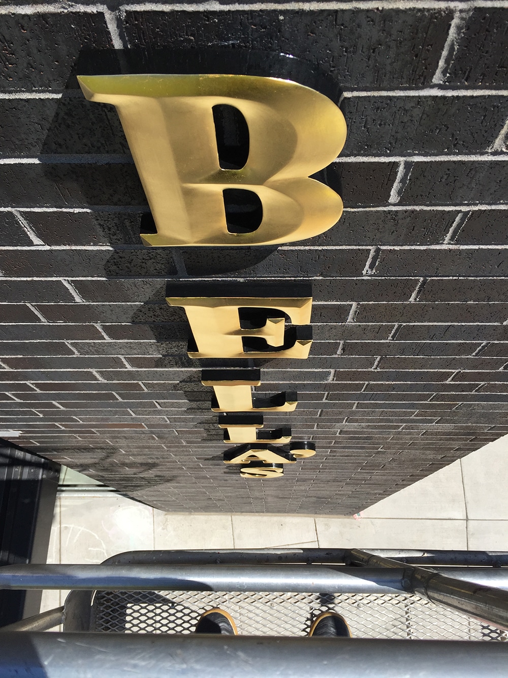
From his large studio space in Southeast Portland, Lee began to create the window gilding and the carved-and-gilded fascia signs. The front glass door gild is 7 x 21 in. and the other two window gilds are 5 in. tall by 2 to 10 ft. wide. The carved and gilded letters are 1 ft. tall by 16 ft. long on the horizontal letters, and 1 ft. wide by 9 ft. tall on the vertical letters. Both were carved out of 1.5-in. thick DUNA-USA CORAFOAM High Density Urethane (HDU).
Lee was grateful to have help from his father and mentor Melvin Lee, who graciously came out of retirement to assist on the window gilding. For the display windows, Lee used a long wooden mahl stick to steady his hand, along with Scharff Brushes lettering brushes and a Gold Leaf Supplies Flying Squirrel Gilders Tip for the classic black outlines with burnished/mirror gold. Their preference is to use Wehrung & Billmeier Gold Leaf 23k XX Deep glass gold, and back it up with Nazdar enamel. For the front door, Lee mixed it up a bit using a combination of 23k burnished outlines with 18k lemon gold matte/satin centers and 23k matte details. He used his own creative techniques such as two-tone matte/mirror and blended different karats of gold to make the signage really stand out.
The dimensional letters took a couple of weeks. First, he cut out the HDU letters, then he handcarved the convex prismatic faces, painted at least four coats of Coastal Enterprises FSC-88 WB HDU Primer, sanded to a smooth finish, painted a topcoat of 1 Shot Imitation Gold and painted the returns with Ronan One Stroke Lettering Enamel in black. Finally, he used his slow set oil size, waited for the proper tack, and surface-gilded with Manetti Italian-made 23k Gold Leaf, available from SeppLeaf Products.
Once the carved and gilded dimensional letters were complete, Lee used an articulating boom lift to install them on the brick building’s exterior where they face all types of weather: rain, sun, wind, snow. Lee chose 23k goldleaf because it will never tarnish and Corafoam HDU because it has a lifetime outdoor warranty.
And what about the personal side? After completing the bakery’s sign work, Lee asked owner Michelle out on a date where they shared their passion for creativity and artistry. They are now engaged to be married.
PHOTO GALLERY (64 IMAGES)
? Alan Luntz | Right Way Signs | Sign Creations | Signature Signs | Studio Sign Co.


Secrets of Lead Generation
Boost your sales by generating more leads! In this light and lively webinar featuring Maggie Harlow, CEO of Signarama Louisville Downtown (Louisville, KY) and the “Business of Signs” columnist for Signs of the Times, learn the secrets of how leads are generated, where they come from and how you can cultivate better (not just more) leads.


Bulletins
Get the most important news and business ideas from Signs of the Times magazine's news bulletin.
-
 Dale Salamacha1 week ago
Sign Company’s Fire-Inspection Fiasco
-
 Russell Toynes1 week ago
Better Sign Design
-

 Maggie Harlow4 days ago
5 Ways to Show Up as a Helper
-
 Electric Signs3 days ago
3 Contemporary Channel Letter Sign Solutions
-
 Mark Kissling5 days ago
Daunting Sign Cabinet Retrofit
-
 True Tales5 days ago
Sign Company Says “No” to Critical Error
-
 News2 weeks ago
Mimaki Creates Collectibles for LIV Golf Club
-

 Manager's To Do1 week ago
Mid-Year Analysis Leads To-Do Lists for July-August