Definitions of sports entertainment have changed considerably through centuries and millennia. In the Flavian Amphitheater, as ancient Rome’s Coliseum was then known, all social classes congregated to watch gladiators, prisoners of war, criminals or unwitting victims battle other gladiators or an assortment of exotic, deadly beasts. Their Greek contemporaries sated their appetites for sport by watching footraces, wrestling and various feats of strength.
The stadia in which athletes perform have also evolved. The word “stadium” evolved from the Greek stadion, or approximately 600 ft., which was a standard stadium length. In that era, few tall buildings existed, and the stadium could be seen from afar. Wayfinding wasn’t necessary: That the ruling classes sat closest to the action, and commoners furthest away, wasn’t questioned.
After having remained relatively constant into the 20th Century, stadia have significantly transformed. During the 1960s and ’70s, municipalities trended heavily toward behemoth, multi-purpose stadia that could be reconfigured to accommodate multiple sports, concerts and other crowd-drawing events. Contrastingly, this past decade has ushered in a sea change as single-use facilities have mushroomed.
Thus, without concerns about sharing their stadium’s environmental graphics, professional teams have incorporated more sign types. Also, colleges seeking broader recognition amidst the Information Age have also redoubled their branding efforts through digital graphics, wayfinding and concession-sign upgrades, among others.
This trend has yielded several winners: the teams, who gain a stronger public identity; the fans, who enjoy an enhanced stadium experience; and, of course, signage and environmental designers, fabricators and installers, who’ve gained steady work as our obsession with spectator sports continues unabated. So, break out your favorite team’s colors and fight-song lyrics, and revel in an array of stadia-graphic solutions
Advertisement
Dodger Blue’s Golden Anniversary
Fifty years ago, the Dodgers vacated Brooklyn’s Ebbets Field to move to Los Angeles and a then-new stadium – an HBO documentary, The Lords of Flatbush, aptly articulates the reasons for the Dodgers’ westward migration – affirmed the epochal U.S. westward population shift that had picked up steam since the Depression. Almost instantaneously, the Dodger fan’s character shifted from blue-collar Brooklynites who adored the scrappy “Bums,” who were usually bested by the crosstown Yankees in the World Series, to laid-back West Coasters who leisurely occupy Dodger Stadium and spawned the “in by the third [inning], out by the seventh” stereotype (I’ve been to a game at Dodger Stadium; it’s not entirely untrue).
Now firmly entrenched in their West Coast identity, Dodger officials sought to celebrate their golden anniversary in Chavez Ravine, as the area where the stadium was built was known, through an updated wayfinding and concession-sign package. Stadium ownership and team representatives hired business units of HKS, a Dallas-based architectural firm (the environmental graphics division [EGD] and HKS BrandSpace), to undertake designing the program.
The existing relationship – HKS renovated the stadium’s concourse — facilitated the rapport and understanding of the stadium’s needs, Chris Bauer, HKS/EGD’s vice president and director, said. J.B. Chaykowsky, HKS/EGD’s lead project designer, described the signs’ inspiration as mid-20th Century “California Cool,” a throwback to the Dodger’s arrival in Los Angeles “that references modern art’s geometric forms and color schemes, especially the work of [painter/sculptor] Ellsworth Kelly and [sculptor] Donald Judd.”
Developing the system required HKS/EGD to use a broad software complement:
• Google’s Sketch-Up program to quickly superimpose rough renderings over their intended spaces;
Advertisement
• Macromedia Freehand to outline construction documentation;
• Filemaker Pro to assign message schedules;
• CaDD to develop location plans;
• 3-D Studio Max to create formal renderings that demonstrate signage and graphics in situ for client approval; and
• Adobe®’s Creative Suite® to facilitate type layout and sign design.
Rather than using consecutive numerals, Dodger Stadium’s wayfinding system segregates even-numbered sections to one side of the stadium, and odds to the other. After having tried unsuccessfully to persuade team management to switch to a consecutive system – the team cited an operational issue and a desire for historical preservation — HKS/EGD implemented universal symbols to identify stadium amenities, which accommodate the city’s large contingent of non-English speakers and foreign tourists.
Advertisement
Seattle-based TubeArt, with whom they’d worked on a Seattle-area hospital’s sign program, handled fabrication. The shop was awarded the contract only three months prior to Opening Day, so time was of the essence. The original wayfinding placards specified 8-in.-deep, aluminum-plate boxes, but, to simplify fabrication and save time, TubeArt altered the specs to 9-in. pieces, which still enabled seamless construction. The wayfinding elements comprise brushed-aluminum faces with applied vinyl and symbols enveloped in dusted-finish circles to create a ghostly effect. Chaykowsky praised TubeArt’s fabrication of seamless elements and sharp corners for successfully conveying the concept.
Concession-stand signage represented another major project component. Chaykowsky said enlarged kitchen areas within the stands crowded cashier areas and limited available menuboard space. To remedy this, HKS/EGD created several smaller, modular, menuboard components that included space for digitally printed items and photos that allow customization of each stand.
To maintain consistency within the Dodgers’ existing graphic standards, the team specified Futura for all signage applications, from concession stands to section IDs. Concession-stand letters comprise routed Sign•Foam® high-density urethane, which TubeArt painted to match the section’s seat color, and coated the faces with Chemetal’s brushed-aluminum finish. Finally, the shop applied the letters to a backlit signage band specified in the stadium’s architectural documents. To identify the baseline box-club seats, TubeArt fabricated LED-backlit Steel Art letters with anodized returns that created a glowing effect.
To date, renovations have only occurred on Dodger Stadium’s field level, but the system will be carried through all seating levels by next season, and parking and exterior-directional signage will be addressed by 2012.
The Los Angeles Dodgers decided to implement new environmental graphics to commemorate its 50th anniversary on the West Coast. HKS/EGD (Dallas), the environmental-graphics division of the architectural firm who handled recent stadium renovations, developed the graphics. TubeArt (Seattle) fabricated the program. (Above) TubeArt (Seattle) fabricated these luminous LED-backlit channel letters with anodized returns.
1 | 2 | 3 | 4

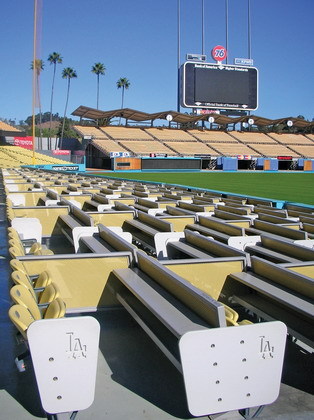
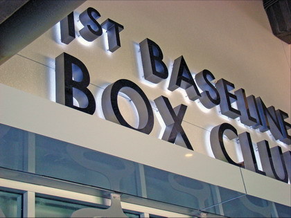


 Photo Gallery4 days ago
 Tip Sheet2 weeks ago
 Ask Signs of the Times6 days ago

 Real Deal2 weeks ago
 Benchmarks1 week ago

 Women in Signs2 weeks ago