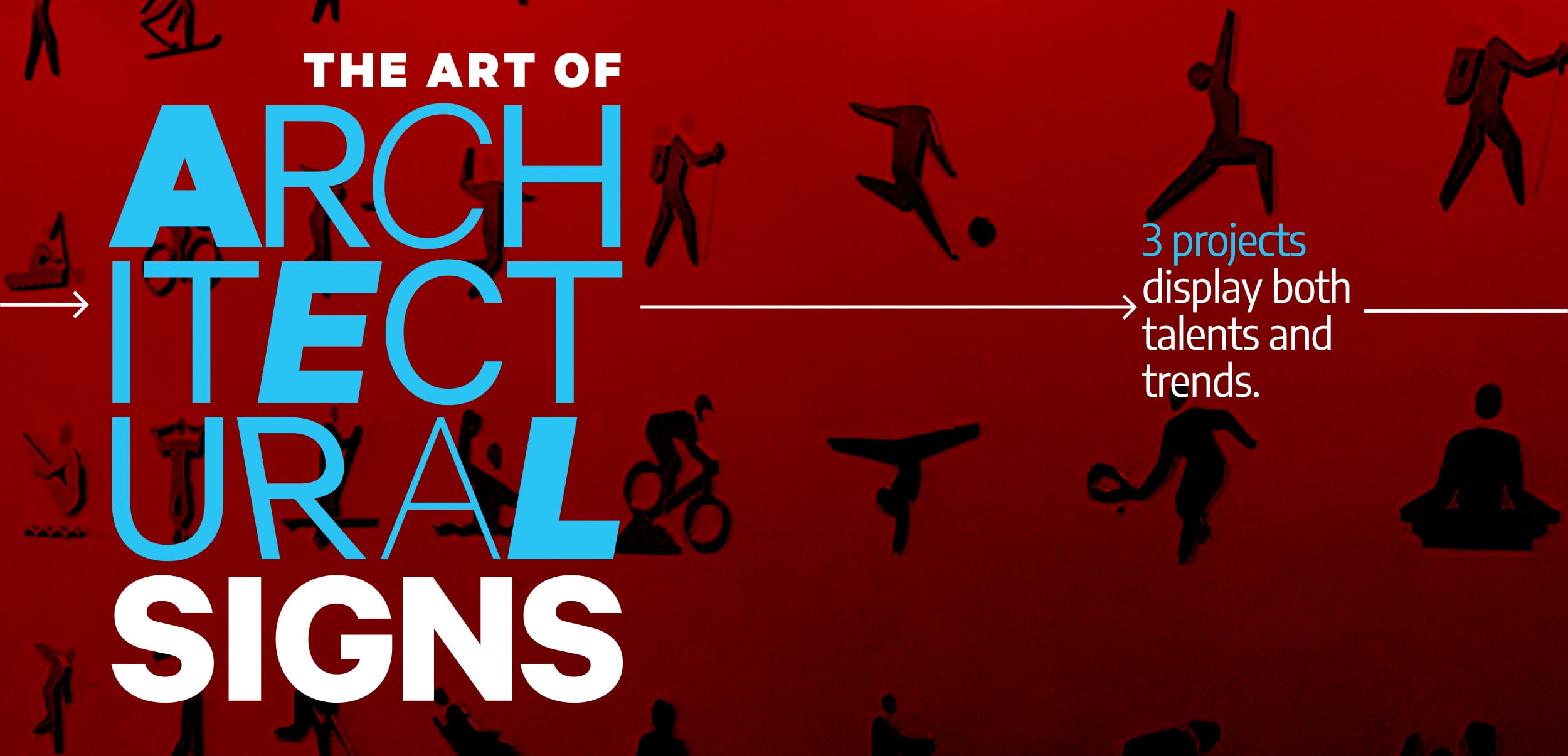
WHAT HAPPENS WHEN you blend creative elements, sculptural treatments and artful twists along with decorative design features to a sign project? An unobtrusive yet powerful architectural signage display. This specific type of signage provides visual brand identification and navigational systems for buildings. It can also serve as a decorative element effortlessly integrated into its setting as if it were always there. The best architectural signage brightens the look of its space, taking any form that can be imagined, and is aesthetically pleasing.
Architectural signage can be found on exteriors, such as the outdoor of a building, or interiors, in the form of wall signs and lettering. It is essential, say signmakers, to work in coordination with project architects to translate their ideas into tangible elements that reflect the customer’s original vision.
“In recent years, we’ve observed a shift in architectural signs,” says James Lerner, president of Gelberg Sign Co. (Washington). “They have evolved from being mere advertisements to becoming decorative elements while still serving their advertising function. These signs integrate the idea of design and decoration, reflecting a growing emphasis on aesthetics and creativity.”
Romain Ly, chief executive officer at Brown Graphics Inc. (Dallas), agrees. “We perceive architectural signage as a harmonious blend of artistry, analytical prowess and pioneering creativity. It is a powerful way to communicate and enhance the built environment, rather than simply letters, signs and lights.”
Large and bold statement graphics are requests Poblocki Sign Co. (Milwaukee) is getting. New technology like 3D printing and producing architectural signage increases accessibility, blends into the décor and produces a “wow factor,” they say.
“Looking ahead, we anticipate that architectural sign trends will continue to evolve in a direction where signs cease to be solely advertisements and become integral decorative elements,” Lerner of Gelberg Sign says. “We expect a strong emphasis on the integration of ideas and decoration, ensuring that signage complements the architectural and design aspects of the space.”
 off the wall
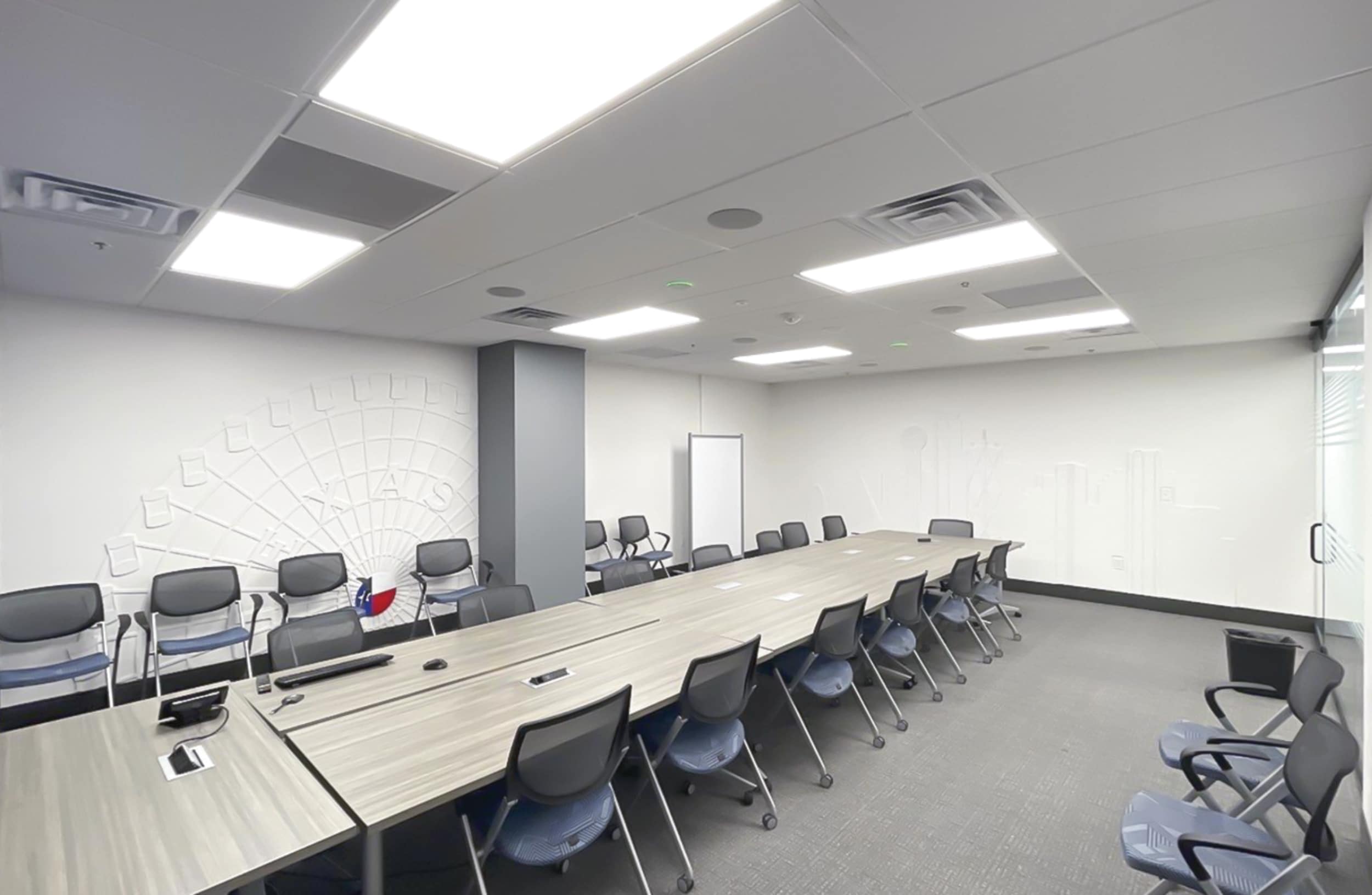
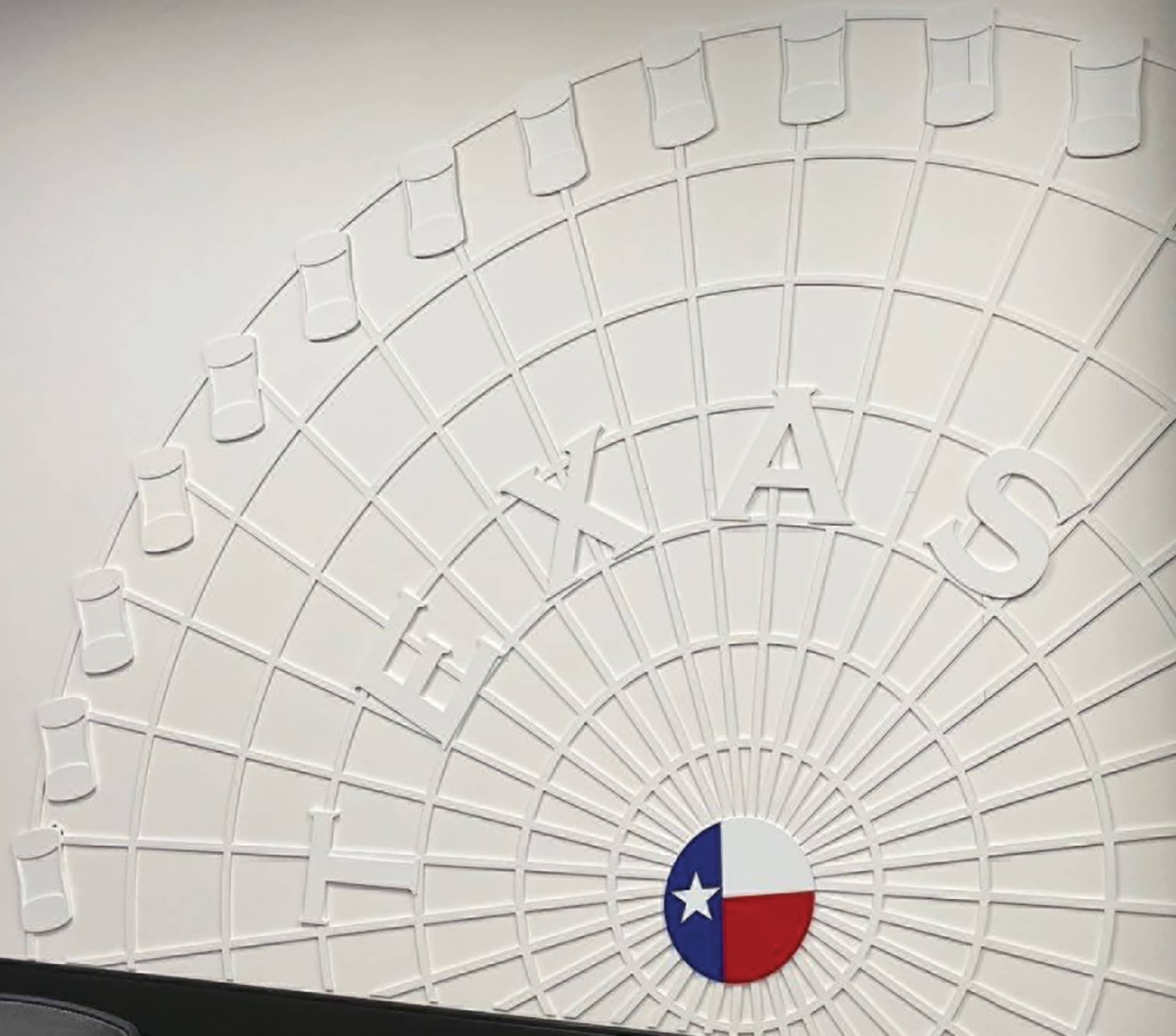
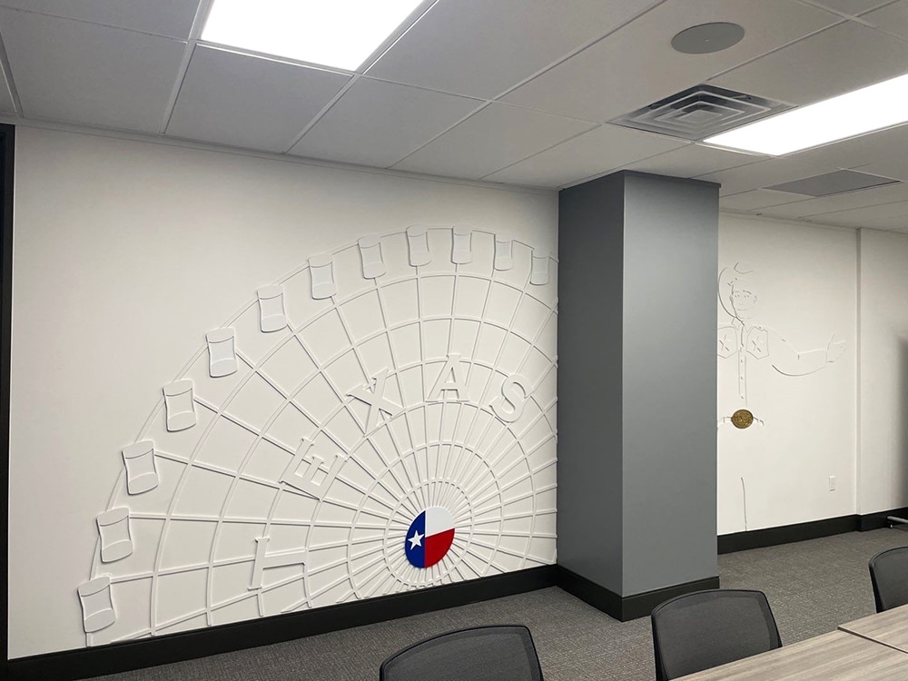
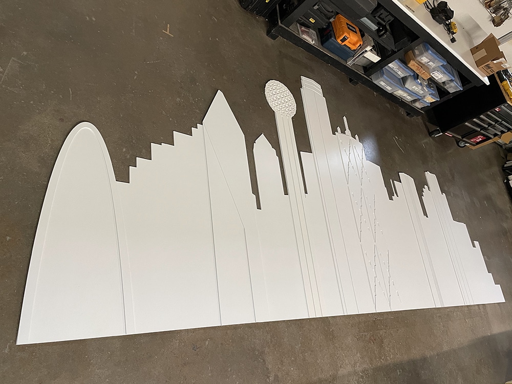
Icons of Texas, such as its famous Ferris wheel (left), and of Dallas’ skyline (right), emanate from these office walls.
GOING BIG IN TEXAS
Interior architectural wall signs can improve brand recognition and embed a company, its message and its logo into the minds of visitors and customers. Consider the case of a Texas insurance firm seeking to hyper-embrace its new location.
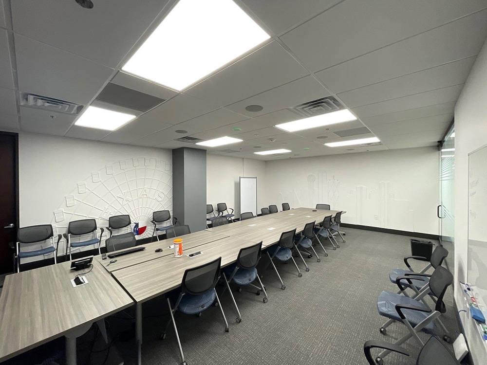
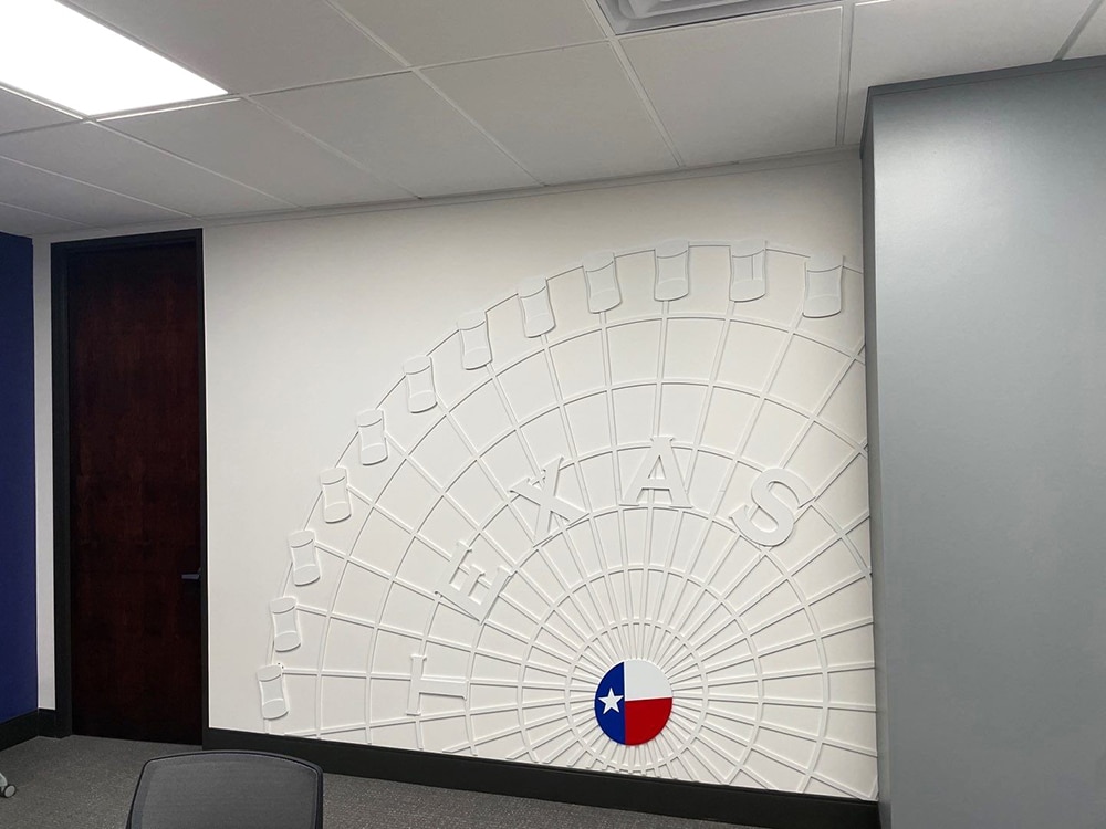
When Assured Partners was designing its new headquarters and conference center in Plano, TX, the innovative insurance firm wanted guests and customers to gain a sense of place, specifically the iconography of both Dallas and Texas. After a recommendation from the building management company, Assured hired Brown Graphics to design, fabricate and install wall elements along three of the four walls in the main conference room.
“Our client wanted to transform their conference room beyond just colors and fonts,” explains Romain Ly, Brown’s CEO. “They sought a narrative embodying Dallas’ essence. We delved into Texas’ rich history, drawing inspiration from the iconic Texas State Fair, its magnificent Ferris wheel and the iconic figure, Big Tex, the towering cowboy. We spent about a month exchanging ideas, imagery and substrates. It’s always one of our favorite parts.”
These images solidify the foundation of Assured’s welcome wall. The Ferris wheel symbolizes perpetual innovation — its silhouette in the design is captured with dynamic strokes, signifying the need to evolve continuously. Big Tex embodies Texan warmth and hospitality. Brown worked hard to embrace Big Tex’s persona to ensure his welcoming presence was palpable to all conference attendees.
By merging these three symbols, the design reflects Assured Partners’ identity as a progressive company deeply anchored in the community. “At the Dallas office, it’s not just art — attendees experience a slice of Dallas’ spirit, a fusion of city pride and corporate ambition,” says Kevin Obregón, Brown’s fabrication and production manager. “In this blend of design and heritage, Assured Partners didn’t just acquire a conference backdrop, but a canvas echoing Dallas’ heart and dreams.”
Time, however, was critical. Assured was expecting an important, company-wide conference-call meeting to be hosted by its corporate headquarters in Plano in the new conference room. Brown had to finish the project on time so that Assured’s employees could proudly see the Dallas landmarks as a backdrop for their video call.
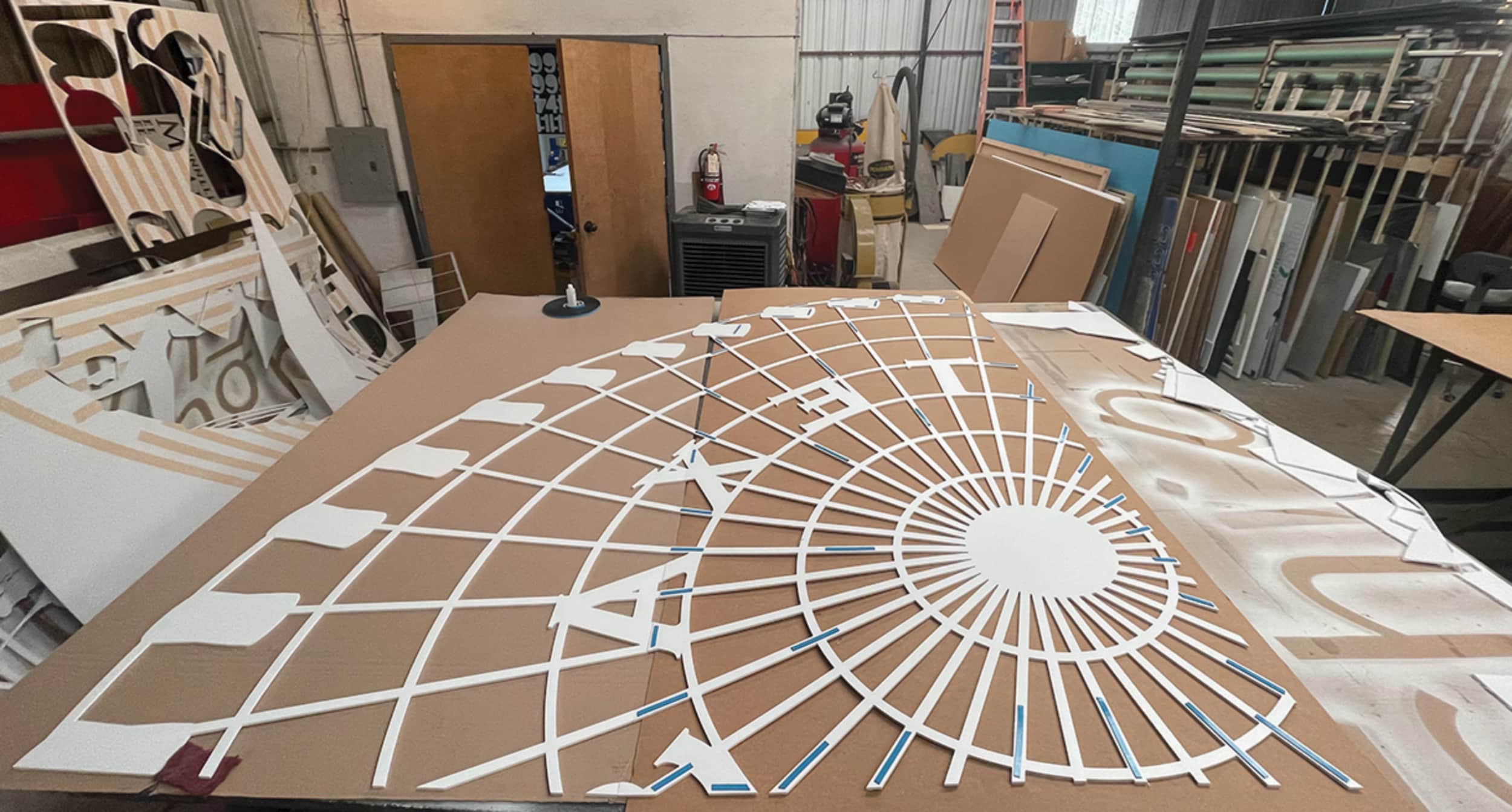
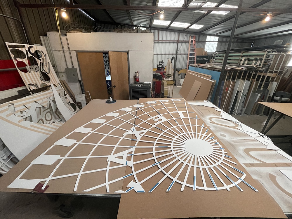
Obregón’s team got to work. Everything was fabricated in Brown’s facilities with the intent of speeding up the installation process with few onsite improvisations needed. They chose PVC sheets for being 100% recyclable, hygienic, waterproof, fire-resistant, mold-proof, affordable, easy-to-clean and dent-removable. The firm used its Accu-Cut XP Series Model 4F8F 4 x 8-ft. CNC router, manufactured and serviced by Computerized Cutters in Plano, near Brown’s shop in North Dallas.
 lone star
These architectural signs reinforce the client’s Texas roots.
Fabrication involved a great deal of detail and forethought to overcome challenges. For areas that received a “proscenium” look — a theatrical scenic-like wall treatment of layers of substrates — the task was to account for the numerous wall outlets and internet outlets at various locations to keep onsite edits and cutouts at a minimum.
In the production of the Texas Star Ferris wheel, for example, the key was to add an additional layer for the gondolas to help hide the seams around the perimeter. The designer had to place the center hub of the Ferris wheel exactly where a cluster of electrical outlets were located so the network of emanating lines from the wheel’s center didn’t break. This was achieved by making the hub removable with magnets and steel plates embedded in the PVC.
The Texas Star Ferris wheel was also very spindly and squirrelly to handle because it featured areas encompassing an entire 4 x 8-ft. sheet span of artwork held together with sections less than an inch in width. More gangly elements included the cityscape, which featured several buildings with recognizable features. The team had to give that portion a separate layer.
Ultimately, Assured Partners was satisfied with the new conference room. “We didn’t have to make a single edit, as it turned out, thanks to good planning and modular thinking in the design process, which saved the day,” Obregón says.
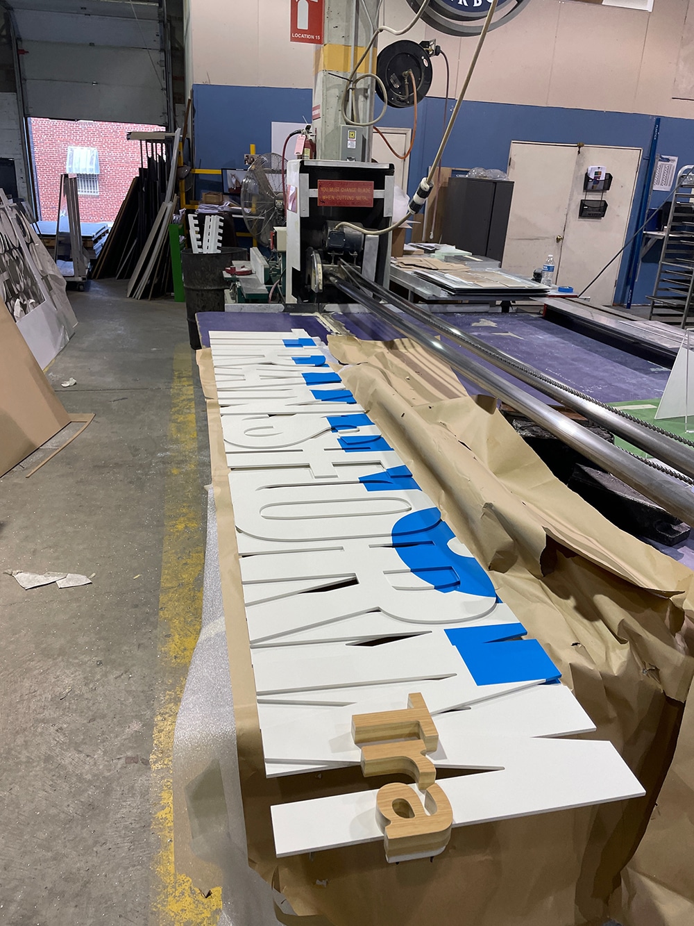
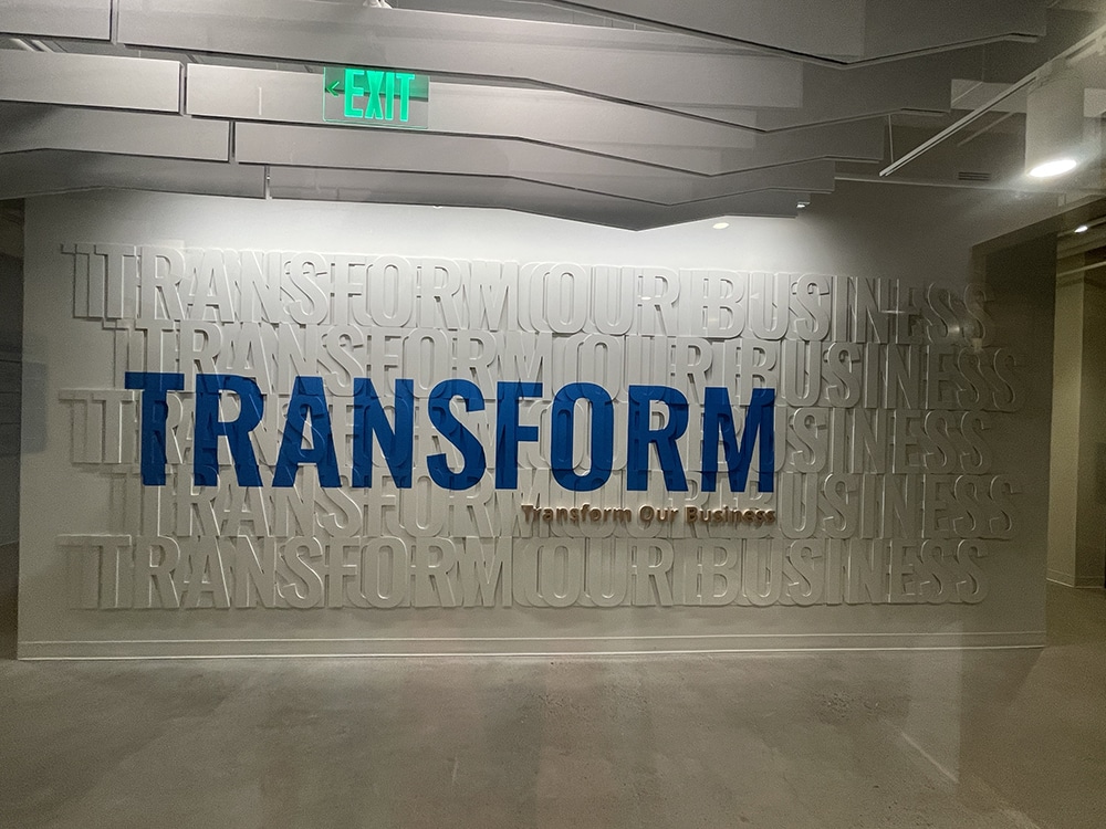
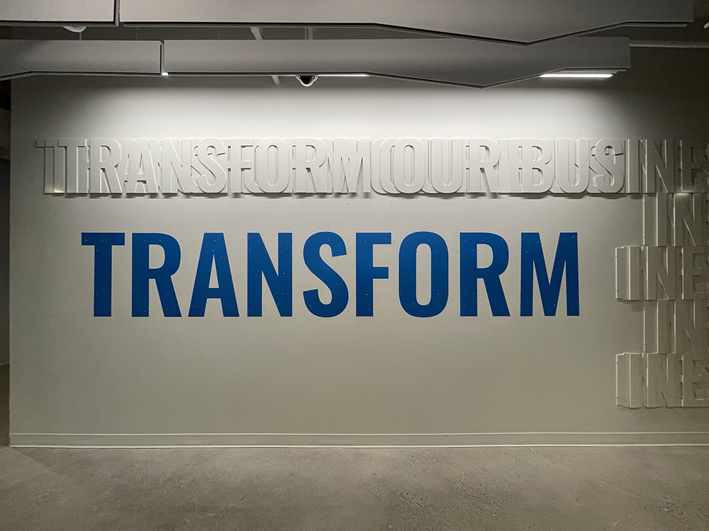
 on the wall
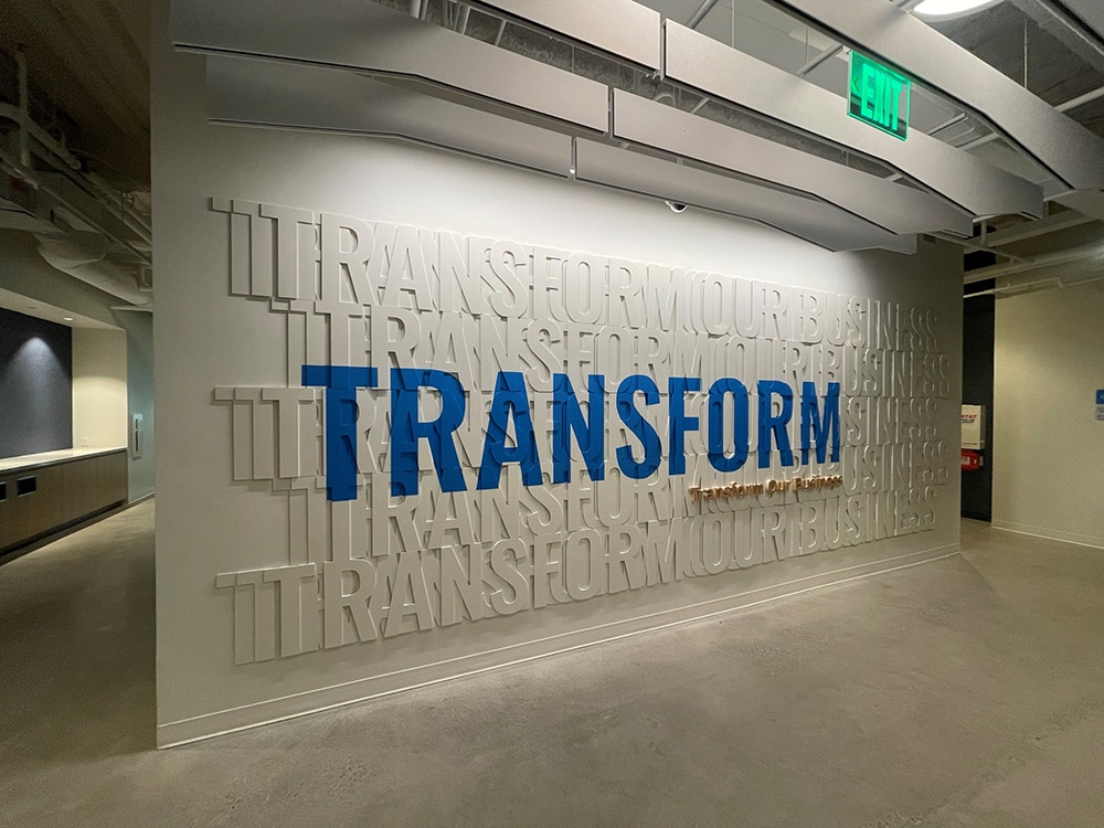
Dimensional “writing on the wall” drives home this client’s tagline.
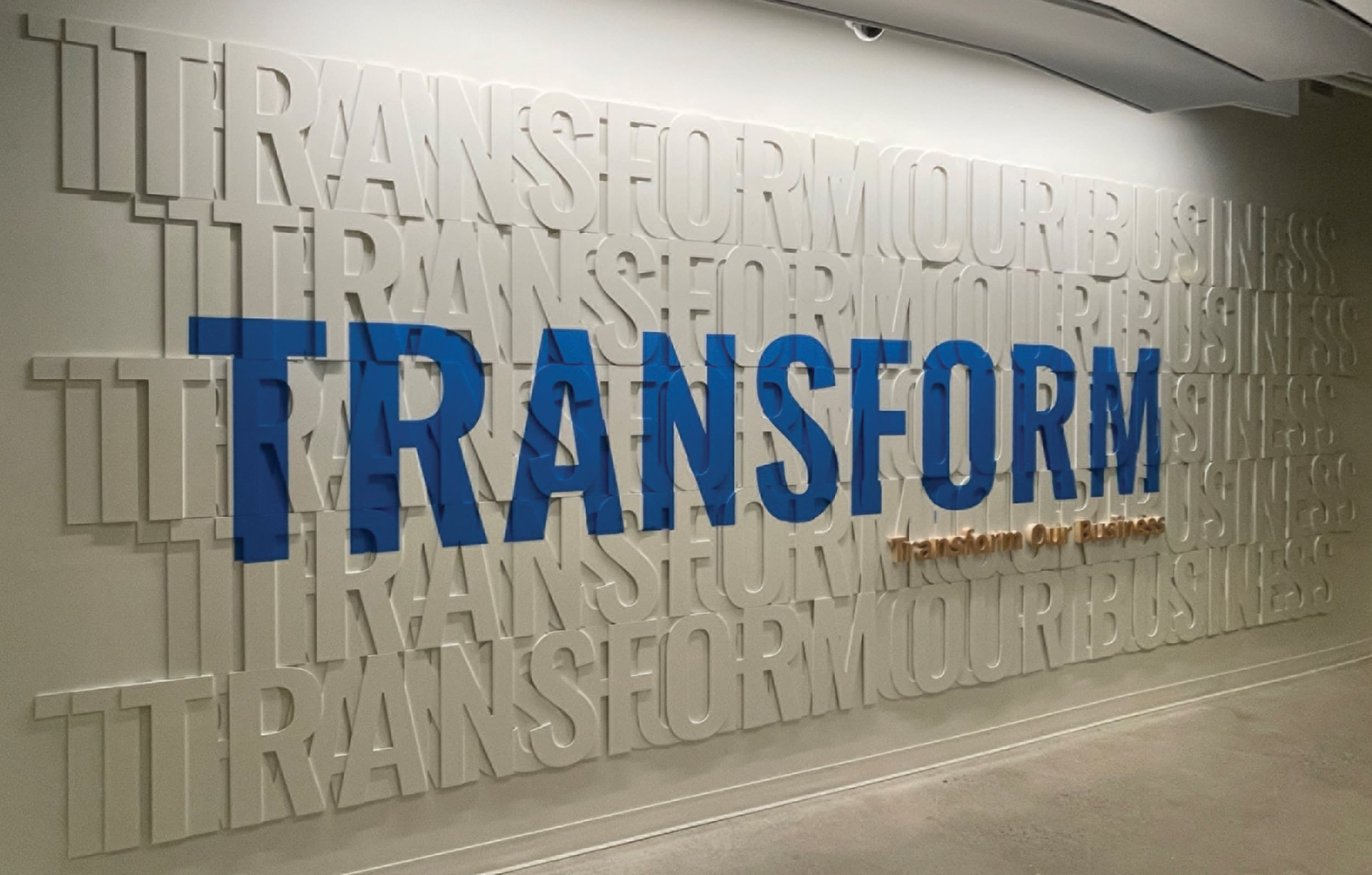
TRANSFORMING A HEADQUARTERS
When CareFirst, the largest healthcare company in the Mid-Atlantic, decided to renovate seven floors at its Maryland headquarters in Baltimore, the firm turned to Gelberg Sign Co. The renovation consisted of wall graphics, dimensional letters, a moss wall and numerous architectural features.
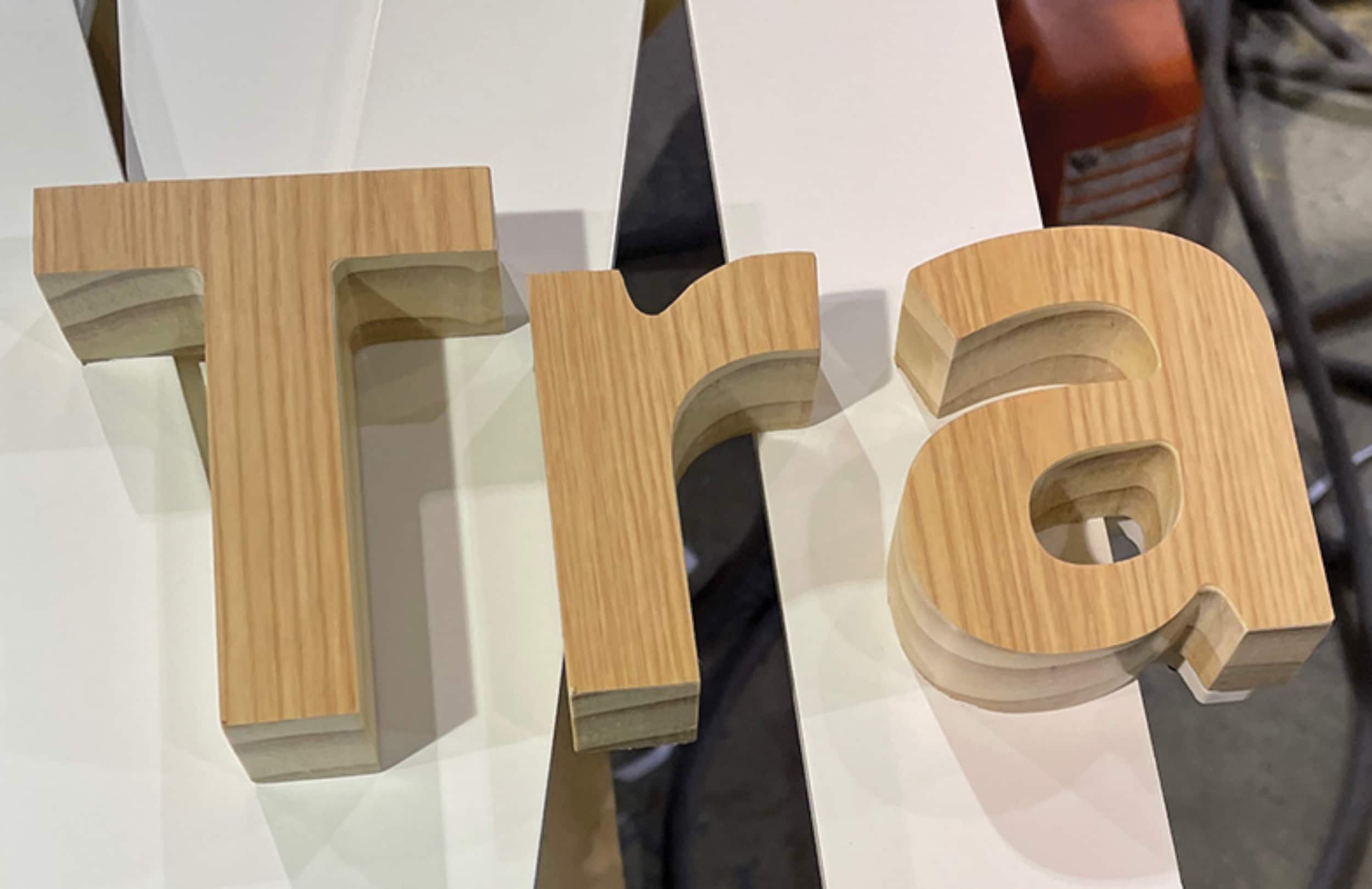
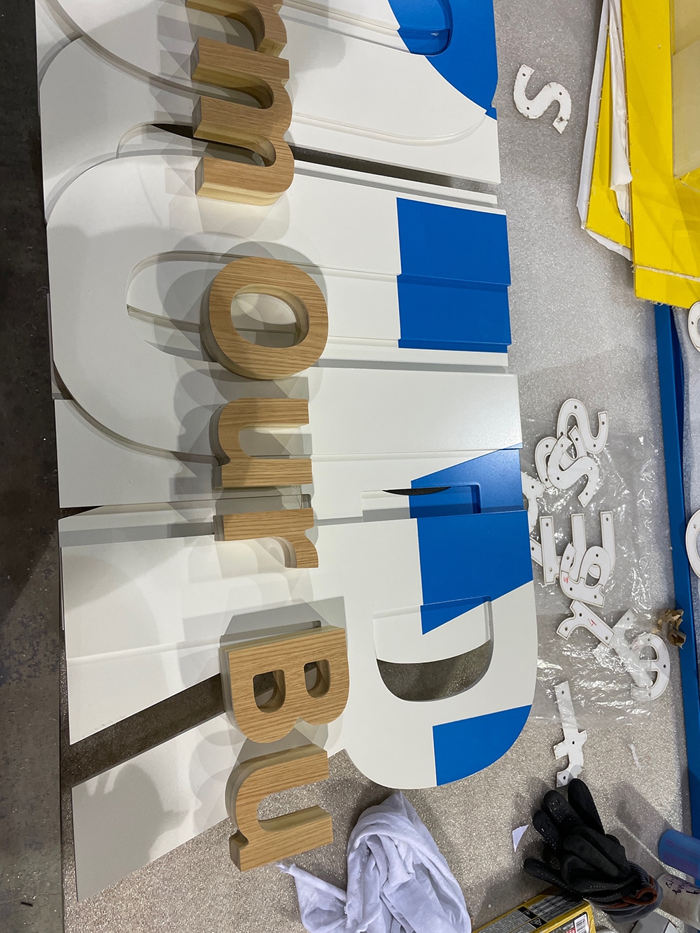
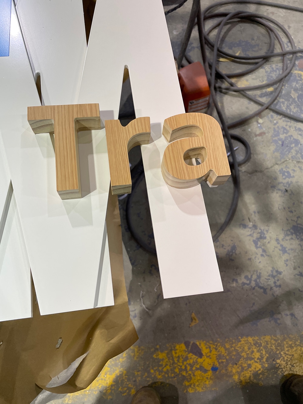
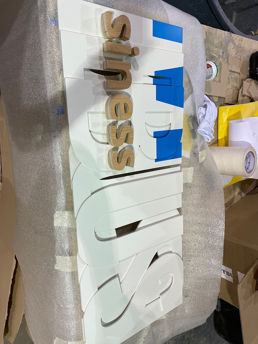
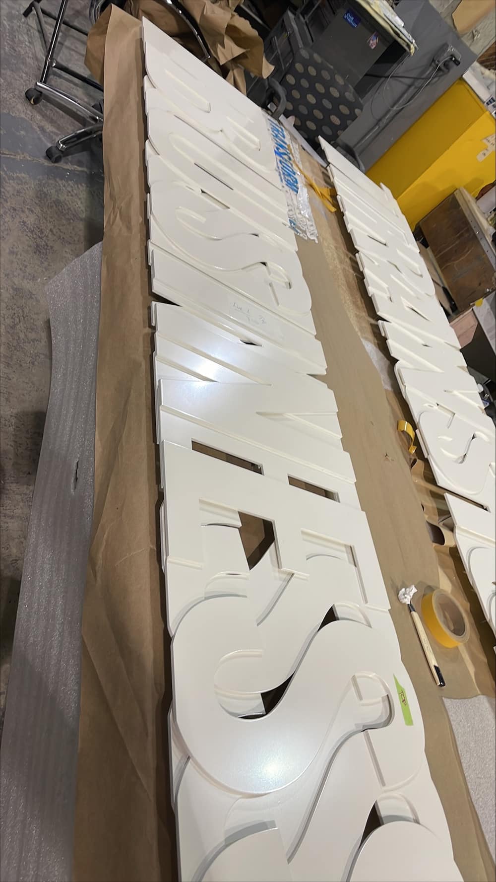
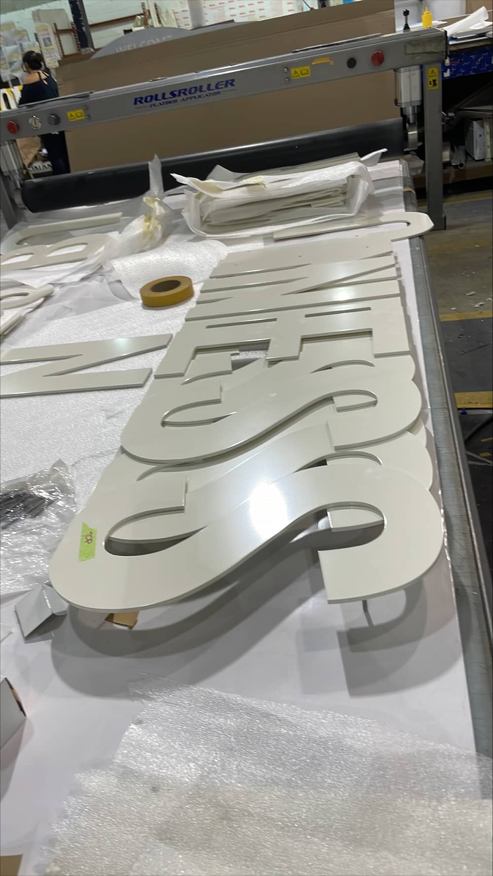
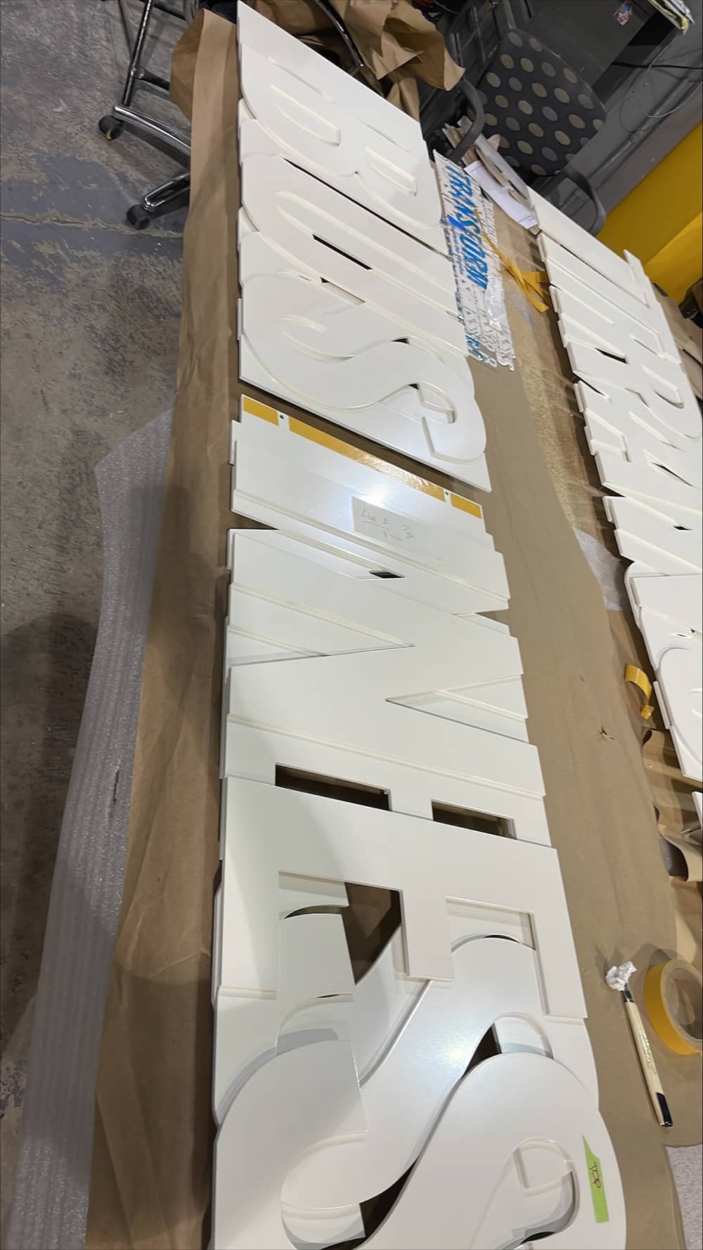
The welcome wall sign on the 10th floor posed the most difficulties. The sign comprises three layers of offset ¼-in. acrylic, with the words “Transform Our Business” as a backer to stenciled lettering and a 1-in. stained, solid-wood tagline.
“Our project management and production teams worked closely with the client to define the design and project scope, and address production and installation challenges involved in creating this multilayered piece,” says James Lerner, Gelberg’s president. “Providing a full-size proof-of-concept sample section for review using 1/16-in. acrylic produced on the [World Lasers LR Series 4832 CO2 laser cutter] prior to production was a crucial part of the process.”
The multilayered aspect of the design created some unique obstacles, including how best to align and securely fasten each layer, and how best to apply the “TRANSFORM” lettering to each layer in the field. The entire Gelberg team was involved in finding the best solution.
Once the proof of concept was agreed upon, the team tackled three to-do items. First was a rigid, hole-drilling pattern for installation, PVC-cut on one of the shop’s routers. Next came the acrylic and wooden letters shaped between Gelberg’s Gerber Sabre 408 and ShopSabre 4896 CNC routers. Through creative concealed engineering, more than 300 individual letters were transformed into fewer than 30 discrete components for both expedited cutting and ease of installation. The vinyl blue “TRANSFORM” letters on the wall raised the final hurdle. Gelberg fabricators applied the letters directly with previously created patterns, and then the acrylic parts that would overlap were masked and painted with the matching blue color.
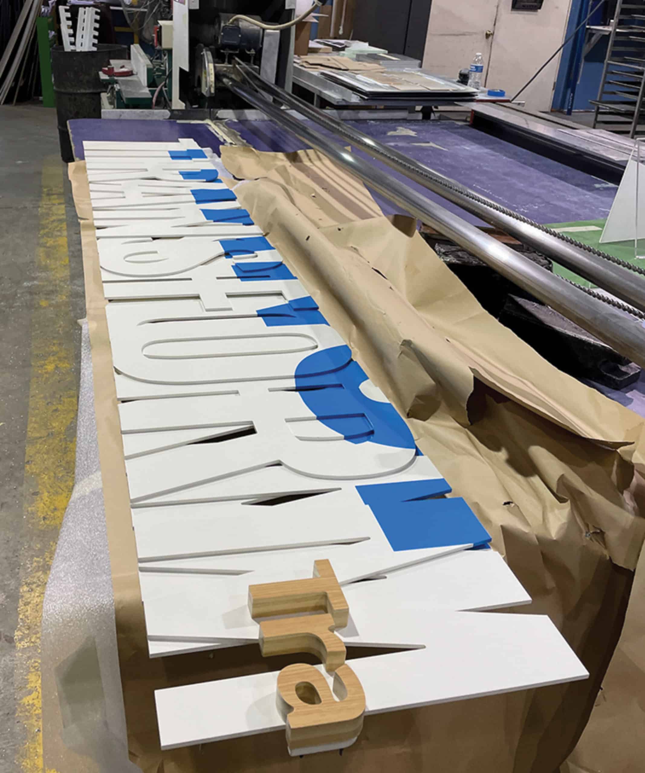
The team applied a stencil to each layer carrying the design intent through to the face of the substrate, then assembled the layers into vertical sections with 510 through-pins holding them together, as onsite assembly of individual letters was not realistic. The problem was maintaining alignment of the stenciled copy throughout each layer and around each individual letter.
Due to the 10th floor’s daytime occupation at CareFirst, Gelberg’s team worked during the night and part of the morning to ensure a smooth installation process. The install team coordinated constantly because the wall’s different elements had to perfectly match and align to the next element. The team learned onsite, however, that the walls were not completely flat, the undulations throughout making the installation particularly difficult since the signs were composed of various pieces. Gelberg’s team ultimately succeeded in installing the sign completely flat and ensuring that all the pieces matched despite the irregularities.
“This architectural element was certainly an involved and detailed architectural sign,” Lerner says. “It had many hand-fabricated components and more out-of-box engineering. We take a lot of pride in the craftsmanship that goes into creating such a sign. It certainly presented some unique challenges. In the end, the project was very well-received by the contractor, other [tradespeople] and CareFirst’s employees.”
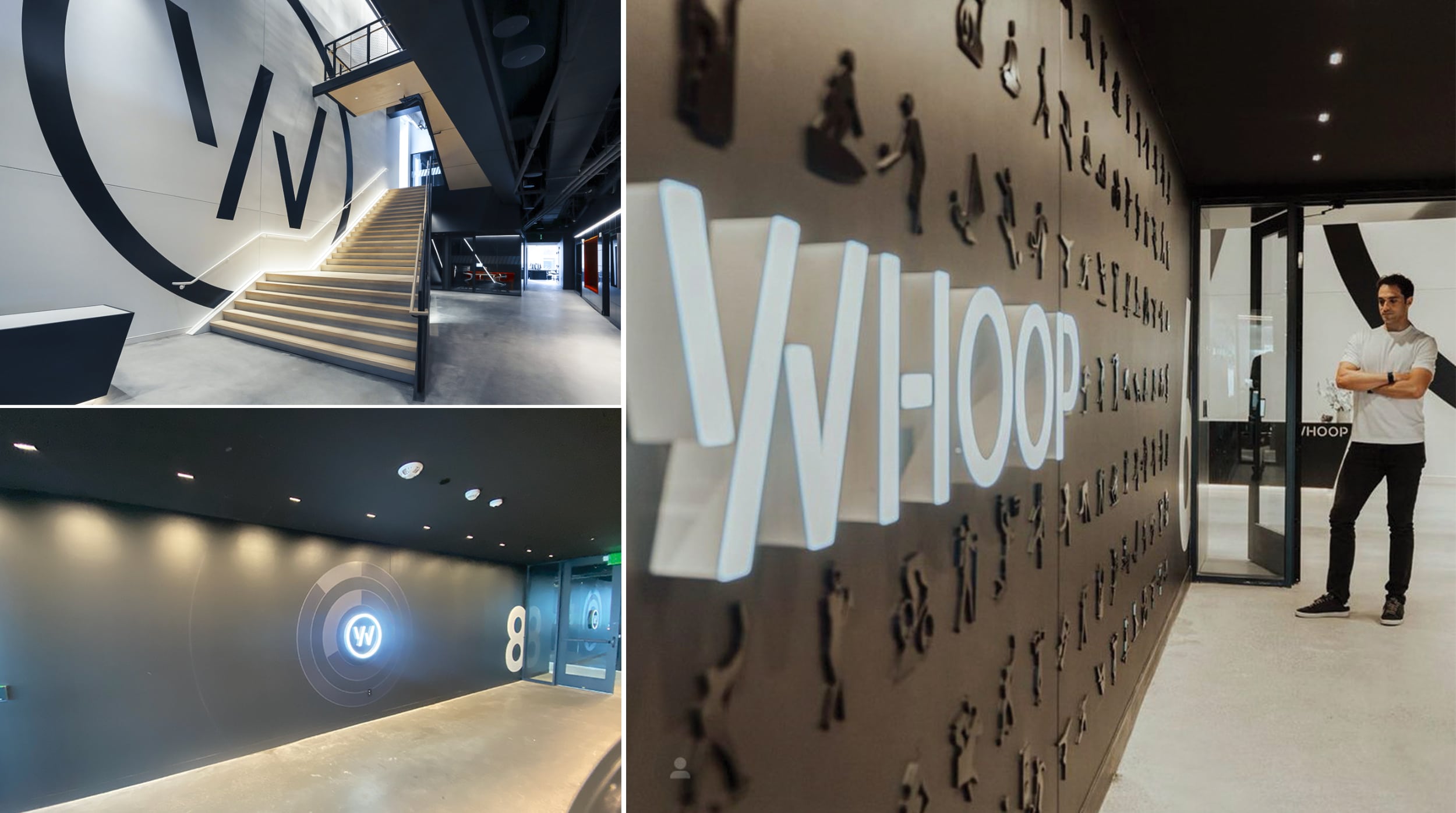
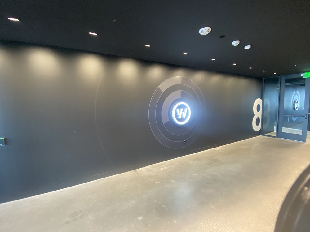
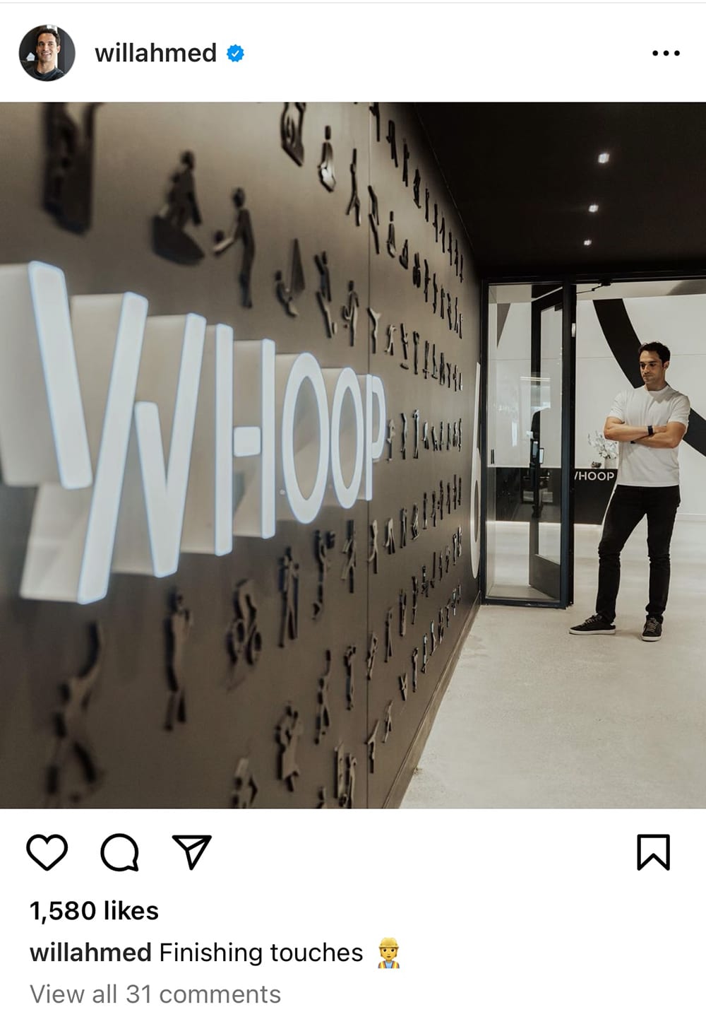
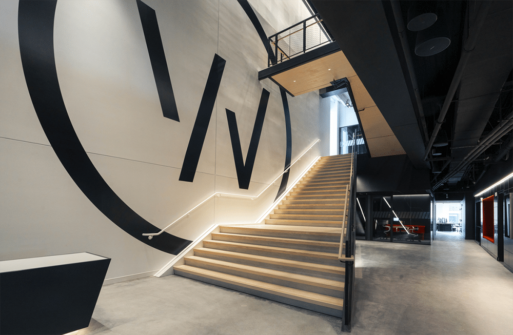
Advertisement ![]() whoop it up
whoop it up
This wall sign and athletic elements form an unmistakable brand.
ATHLETES A TO Z
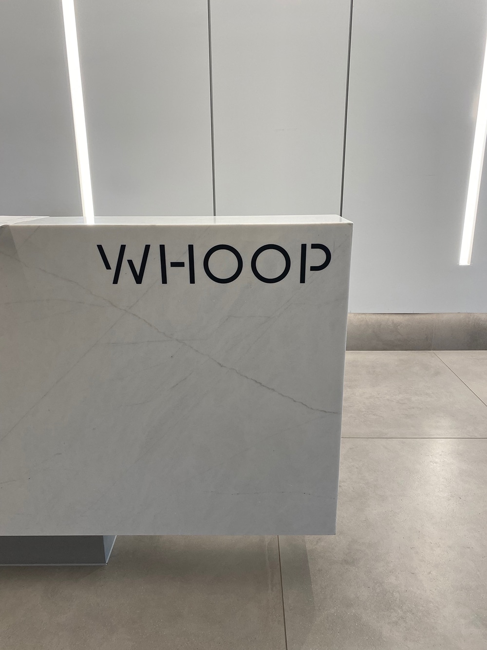
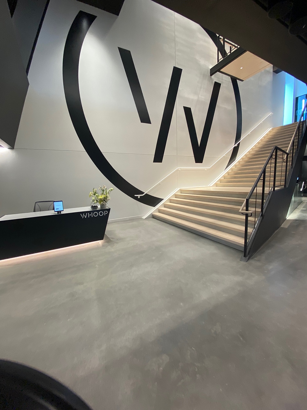
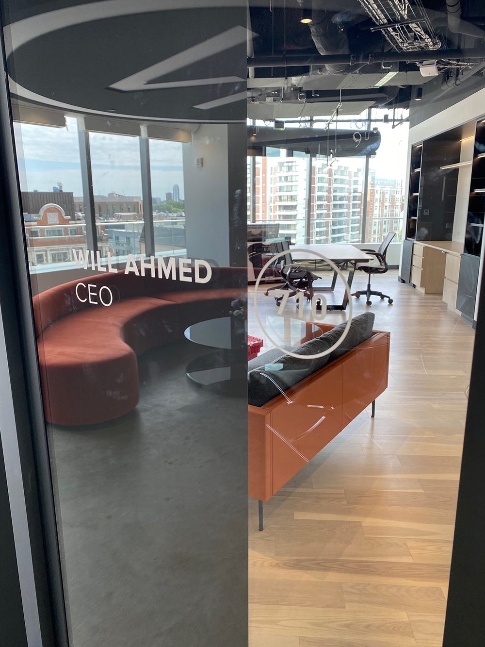
When WHOOP, a producer of world-leading fitness and health wearables, was opening its new global headquarters in Boston’s new Commonwealth Building, the firm was looking for a crisp, clean, contemporary welcome wall to introduce its clients, including high-profile athletes, and its team to this new space. After going through a number of design ideas, the group along with Whoop’s founder and CEO Will Ahmed agreed with the concept from design and creative agency Aruliden (New York) and awarded the job to Poblocki Sign Co.
The design features people performing different activities that Whoop’s product can measure. These icons include runners, tennis players, swimmers, basketball players and other athletic achievers constructed of acrylic, polymer and vinyl materials.
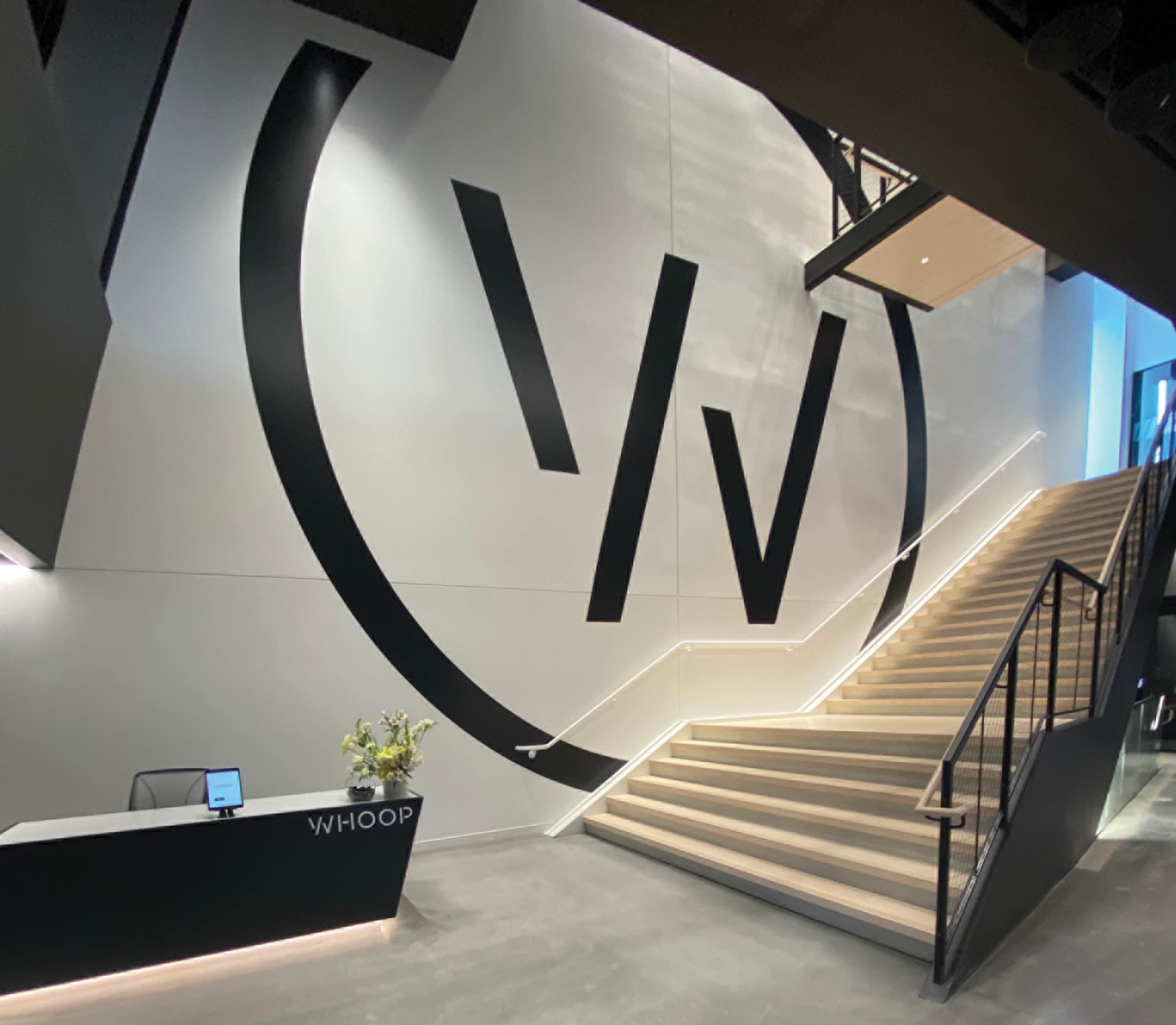
But what makes the sign architectural? Whoop’s custom high-quality signage amplifies its brand and evokes a feeling without being a distraction. Architectural signage elements blend in with not only the physical space, but also the cultural space where the firm is headquartered and clients visit.
“architectural sign trends will continue to evolve in a direction where signs cease to be solely advertisements”
“Your office space really matters, and having a great space, great environment and great design is going to improve everything about your company and really permeate through its culture,” Ahmed says.
The point person at Poblocki, Senior Sales Executive Sarah Horton, adds, “They wanted an impactful, ‘wow factor’ sign that promotes the company’s culture and branding and would inspire both the Whoop team and its clients.”
But the team faced time restraints and additional barriers. A very quick turnaround to meet the firm’s grand opening required the large wall graphic to be completed around the Fourth of July weekend. Before Poblocki’s team could get started, they needed to verify dimensions, wall-surface materials, paint materials/sheens and cures. Specific planning needed to take place for all of the wall icons to be installed and 30-ft. scaffolding to be erected in the lobby to execute the graphics.
 variations on a theme
Every wall for this client looks highly unique, yet logo, color, dimension and other elements carry through all of the walls.
To fashion the icon wall, the team used extruded acrylic products in both ¼-in. and ½-in. thicknesses. The acrylic is certified to contain 40-45% recycled materials with 100% of the internally generated acrylic scrap recycled. The team used Matthews Paint to match Benjamin Moore’s 2120-10 Jet Black, as well as ORAFOL’S ORABOND UHB 3594 and 3595 Ultra High Bond tapes to adhere the icons.
In the end, the Whoop office proved a transformative experience to all who entered due to the incredible partnership between Aruliden and Poblocki Sign. “When you have high-profile athletes come to your office, you want to make sure they have a great experience and really understand what your company is all about,” Ahmed says.
PHOTO GALLERY (26 IMAGES)


Secrets of Lead Generation
Boost your sales by generating more leads! In this light and lively webinar featuring Maggie Harlow, CEO of Signarama Louisville Downtown (Louisville, KY) and the “Business of Signs” columnist for Signs of the Times, learn the secrets of how leads are generated, where they come from and how you can cultivate better (not just more) leads.


Bulletins
Get the most important news and business ideas from Signs of the Times magazine's news bulletin.
-

 Business Management2 weeks ago
Alternative Management Advice for Sign Companies
-
 Fabrication + Installation1 week ago
Small Signshop, Big Fabrication
-
 Real Deal6 days ago
Sign Company and Customer Clash on “Minimum 2 Hours”
-
 Paul Ingle3 days ago
120 Years of Signs, and I’ve Seen 41 (Mostly)
-

 Benchmarks3 days ago
5 High-Performance Vehicle Graphics Projects
-

 Tip Sheet5 days ago
Workflow Automation, Budget Discussion and More Signshop Tips
-
 Maggie Harlow2 weeks ago
3 Steps for Performance Appraisal Preparation
-

 Editor's Note1 week ago
Consider the Alternative