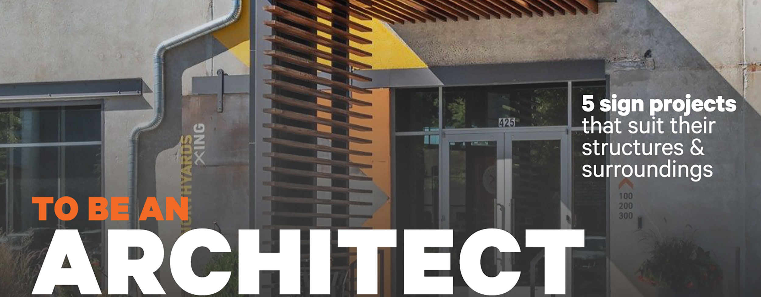
LIKE GEORGE COSTANZA from Seinfeld, I “always wanted to pretend I was an architect.” So, I contacted five companies from the Signs of the Times’ Brain Squad whose profiles included “Architectural Sign Mfr.” and asked each for a recent architectural sign project. Continuing my ‘facade,’ I also sought to know what they considered “architectural” about the signs. Their project settings ranged from a hotel to lofts to business developments and a university campus. What they all had in common were designs and materials to match or complement the look of the related building or area.
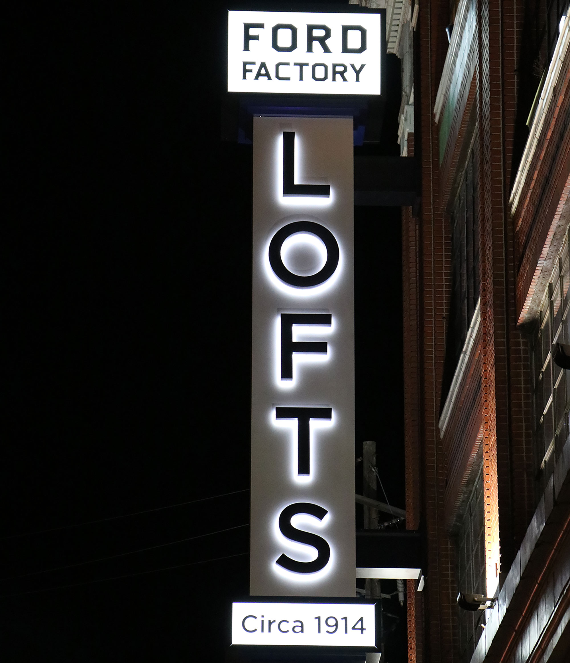
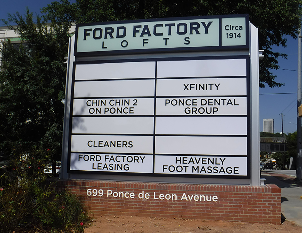
A simple vintage logo and I-beam design provide the feel of the original Ford Motor plant for these loft apartments.
PROJECT
Ford Factory Lofts, ATLANTA
Residential lofts with retail and restaurant storefronts on the ground level completed January 2021
FABRICATOR AND DESIGNER
Henry Graphics
Buford, GA
Key Architectural Details
From Michael Johnson, senior graphic designer for Henry Graphics: “The architectural aspects of the sign package were inspired… by the time period of when the building was constructed and its original use as a Ford fabrication plant, which gave a very industrial feel to the environment. To carry this into the design, the sign structures were fabricated to simulate I-beams, which incorporated the industrial ‘feel.’ To provide a more ‘old-time’ look to the package, the logo was designed with the intent of having a simple vintage look. The back panels for the logo are acrylic with a digitally printed vinyl overlay to replicate green-edge glass.”
Equipment and Supplies
MutiCam CNC router, HanleyLED Peregrine Series P-2072 white LEDs and HanleyLED power supplies, .125-in. aluminum, 3/16-in. white 7328 acrylic
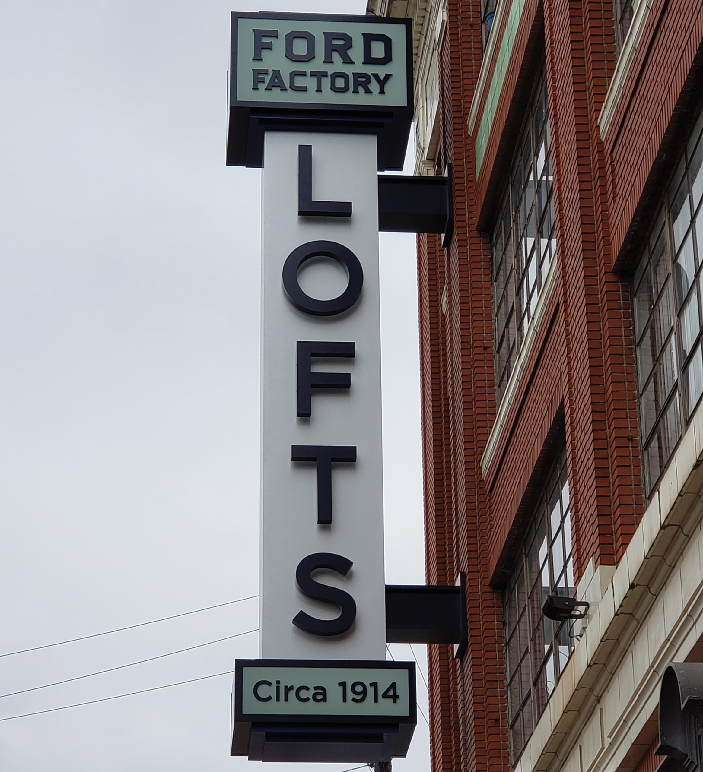
Despite 2-ft.-thick walls, the sign had to be bolted into the apartment spaces to keep from falling off the building.
Interesting Fact
“The one unusual aspect of this project, which none of us involved had ever encountered before in our various decades of experience, was the condition of the building wall to which we had to install the main blade,” Johnson said. “The building is over 100 years old and had concrete walls that were roughly 24-in. thick but, unfortunately, once we drilled past the first 4-6 in. of concrete, the remaining 18+ in. was like drilling into sawdust, which obviously wasn’t going to support a sign of this size.” To rectify this problem, Henry Graphics was forced to bolt completely through the wall – into the tenants’ apartments, Johnson said – and add bracing there to prevent the blade from simply pulling right off the wall.
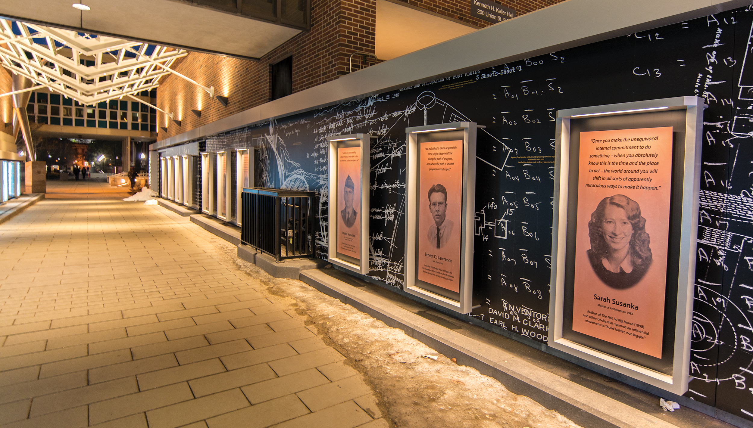
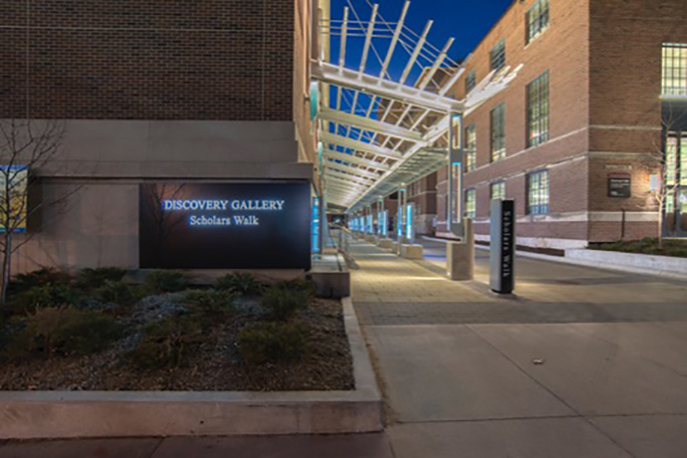
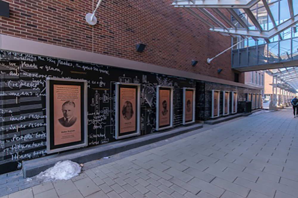
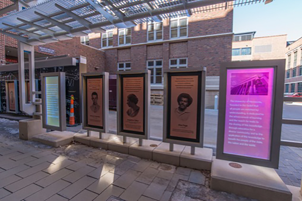
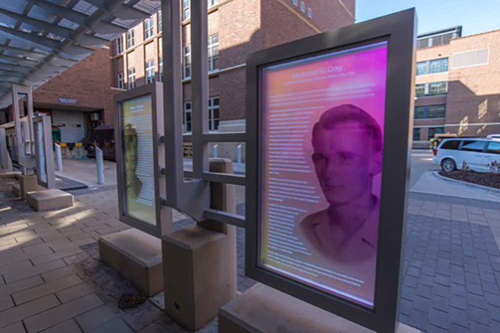
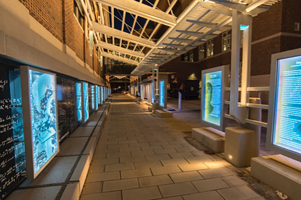
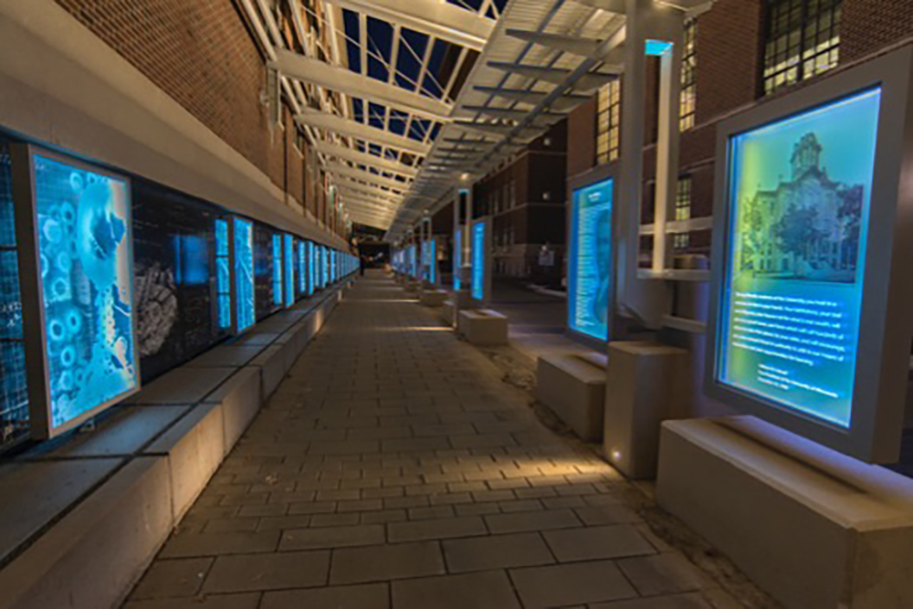
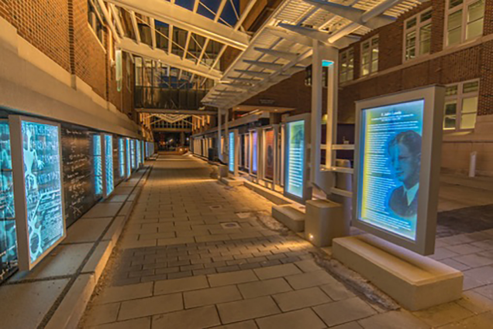
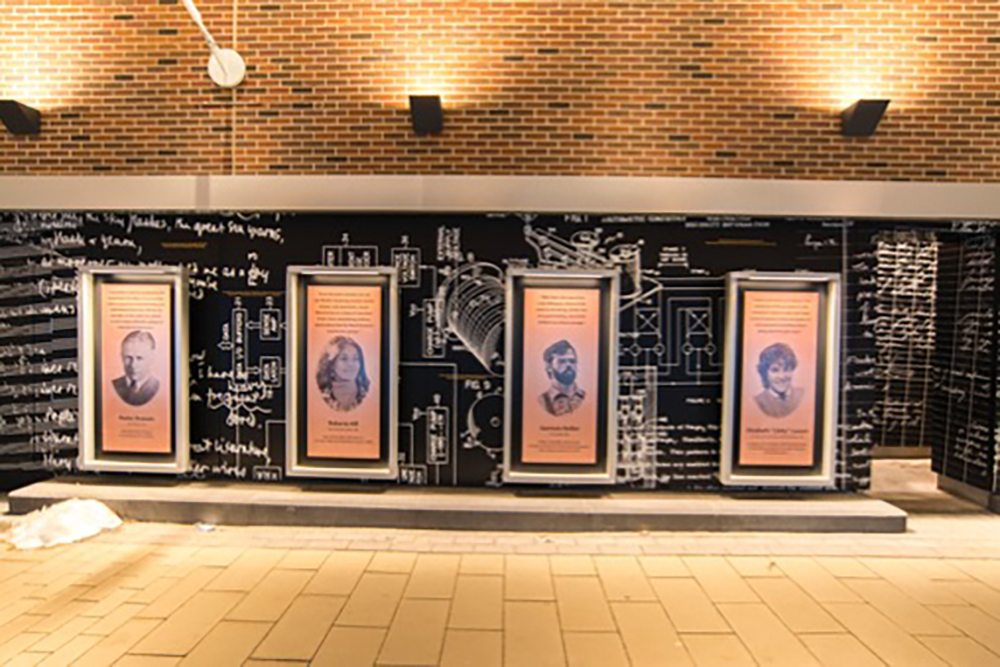
This “wall of discovery” on the University of Minnesota campus includes a “discovery gallery” of illuminated displays (lower right).
PROJECT
Scholars Walk, University of Minnesota, DULUTH, MN
Campus walkway that honors all the university academic awards, completed 2016-20
FABRICATOR
ARCHETYPE
Minneapolis
DESIGNER AND ARCHITECT
LA Ink (Minneapolis), Hart Howerton (Minnetonka, MN)
KEY ARCHITECTURAL DETAILS
From Gary Stemler, vice president of Archetype: “All the candidates’ names are carved into glass and edge-illuminated. In 2016 we [originally created] the wall of discovery … a fabricated aluminum wall with printed graphics of the notes of notable scholars. Over the top of those panels are edge-illuminated glass displays to highlight certain discoveries. In 2019-20 we fabricated the discovery gallery, which included a series of freestanding illuminated glass displays as well as externally illuminated aluminum displays with printed scholar bios. Those panels were mounted onto a wall that complemented the original wall of discovery with additional scholar notes.”
EQUIPMENT AND SUPPLIES
AXYZ 5010 ATC and Infinite 5012 ATC routers, Elumatec radial arm saw, swissQprint Nyala 3 flatbed printer (for glass), OKi ColorPainter M-64s printer (for vinyl), SloanLED modules and drivers, glass, aluminum and structural steel
INTERESTING FACT
“One of the most interesting projects I’ve worked on in my 30-plus years in the industry,” Stemler said. Working with the graphic designer and viewing the amazing discoveries has inspired him to send his kids to the university. “It was fun to look at the original scholar notes and see music by Bob Dylan right next to sketches [for] the first pacemaker designed,” Stemler said.
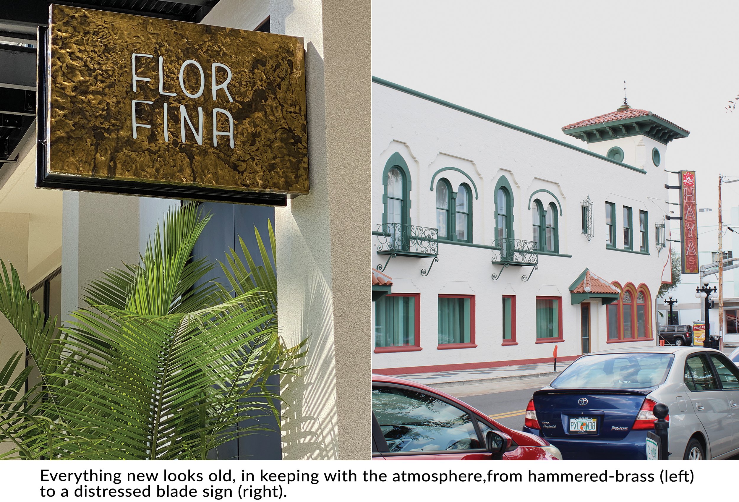
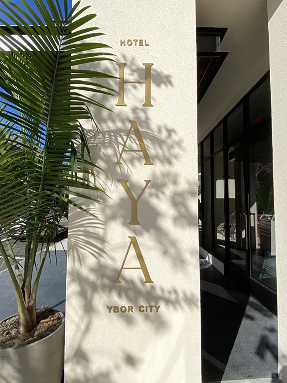
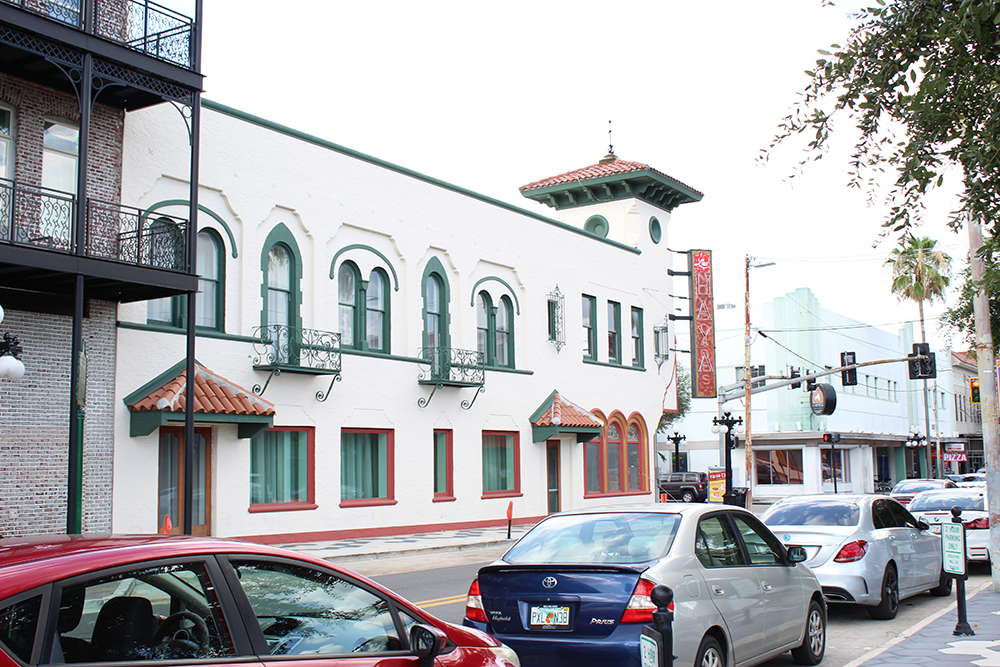
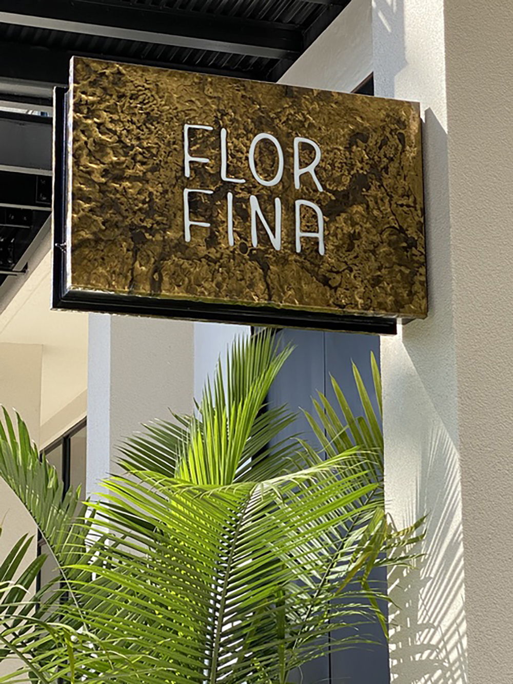
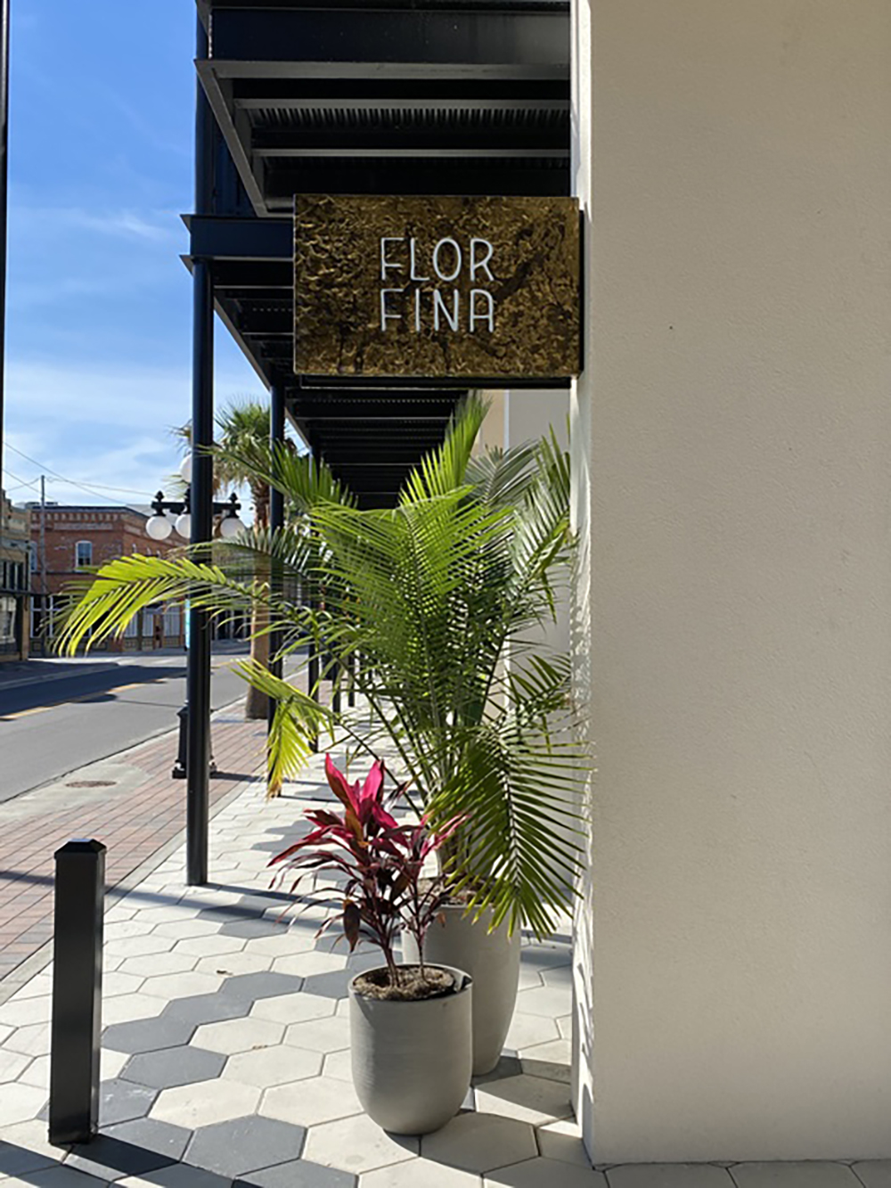
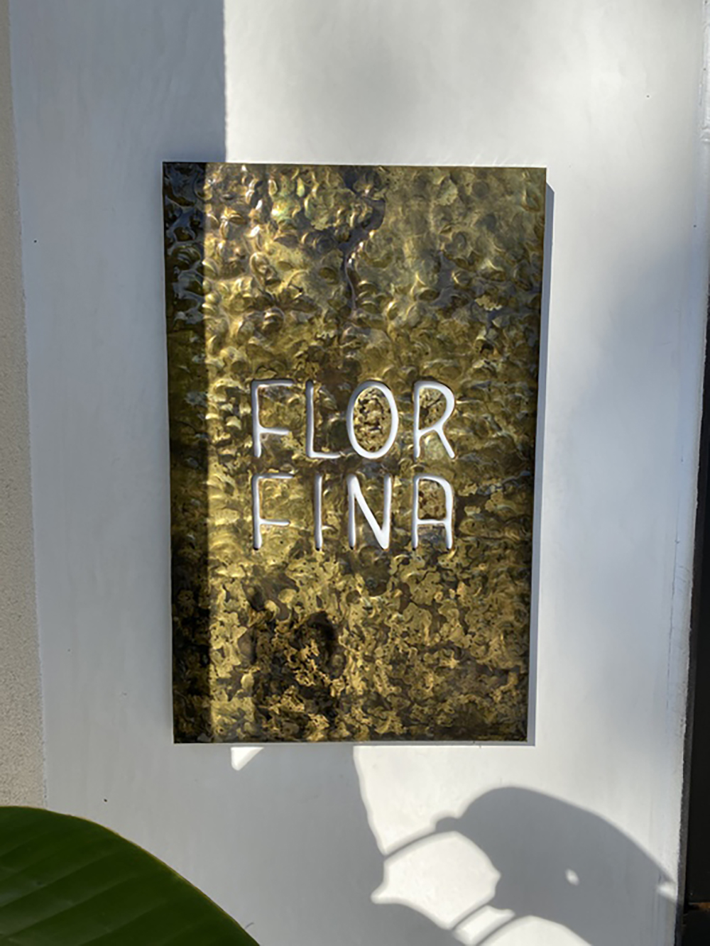
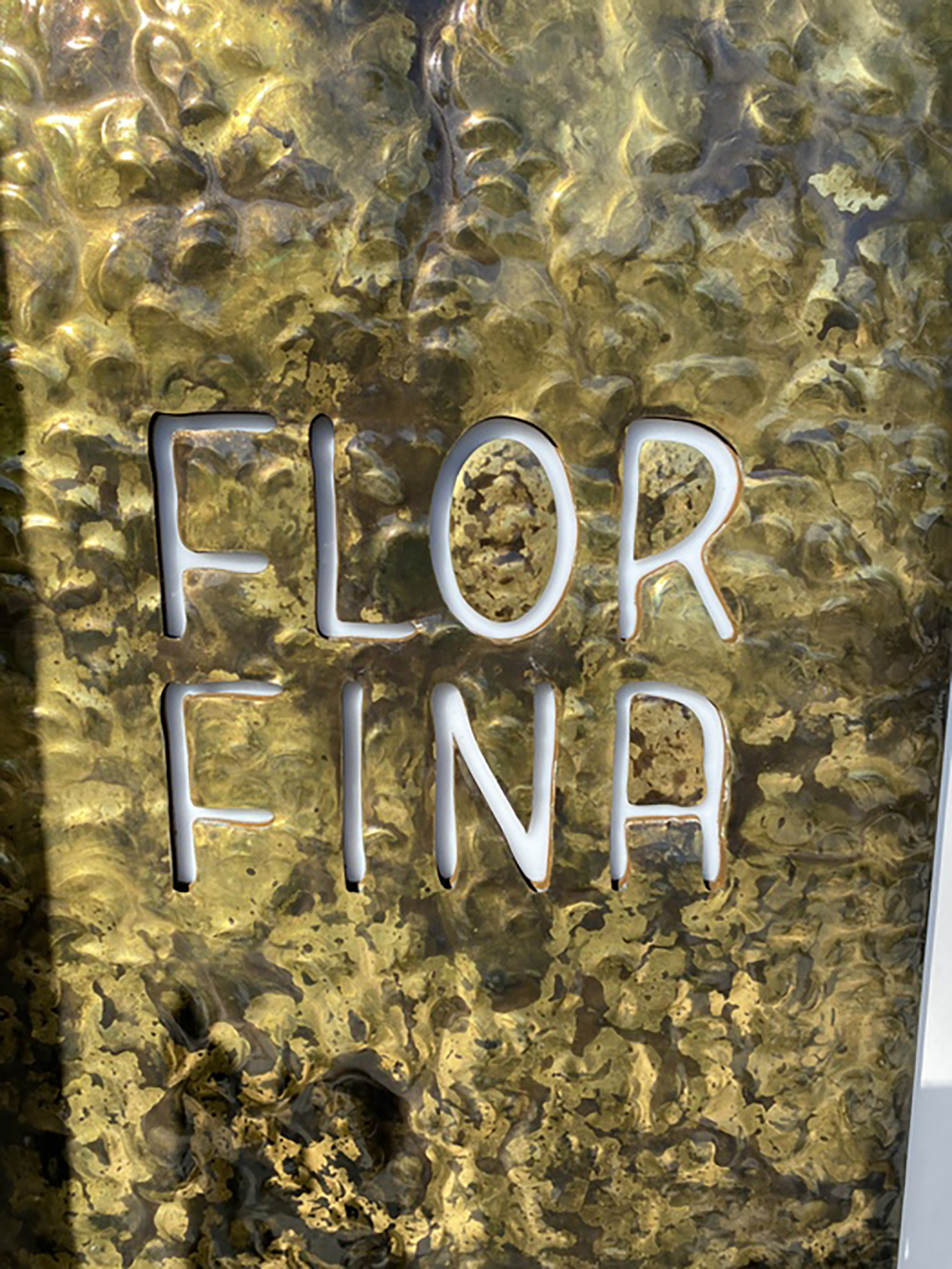
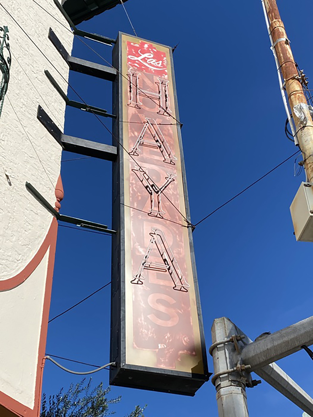
PROJECT
Hotel Haya, TAMPA, FL
Boutique hotel that pays homage to its historic past while keeping up with the soulful atmosphere of Ybor City, completed September 2020
FABRICATOR
CREATIVE SIGN DESIGNS
Tampa, FL
DESIGNER AND ARCHITECT
Aparium Hotel Group (Chicago), Studio Birdsall (Winter Park, FL) and Alfonso Architects (Tampa, FL)
KEY ARCHITECTURAL DETAILS
From Melanie Harden, executive vice president of Creative Sign Designs: “In keeping with the history and theme of Ybor City and the building itself, architectural elements used materials, hand-pinged brass, etc., in order to give all the signs the old, vintage look of being at the building for many years and [having been] fabricated many many years ago. [The complete sign package included] hammered-brass panel, an illuminated blade sign with brass panels, brass flat cutout letters and retrofitting an existing blade sign with neon lighting, as well as hand painted distressed face panels.”
EQUIPMENT AND SUPPLIES
Multicam 3000 Series Router, OMAX Waterjet, Miller Tig and Mig Welders, Trotec Speedy 400 laser engraver, RAS Shear and Brake, Vanguard VK300D flatbed printer, HanleyLED Phoenix Series PF-2080 LED lighting modules and 12V power supplies, brass sheeting, aluminum sheeting, aluminum tube, AkzoNobel paint and clear coat finishes
INTERESTING FACT
“The existing historic blade sign was grandfathered into the property and the structure had to remain but the client wanted the sign to be used,” Harden said. In order to do this Creative Sign Designs had to add structural updates but also keep the sign’s vintage distressed look, so they updated the sign with actual neon and architectural hand faux finishes to retain the desired, somewhat dilapidated appearance, Harden said.
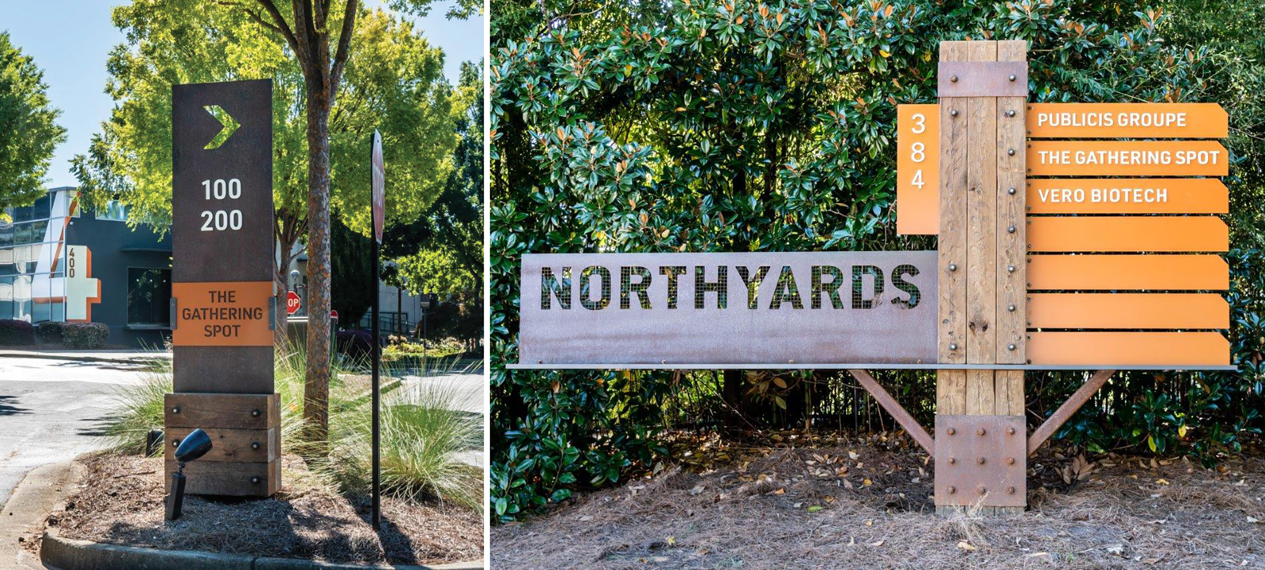
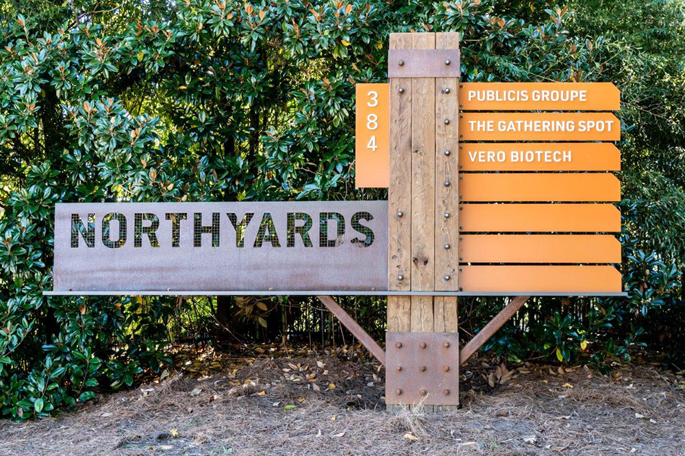
The designs and especially the materials recall the historically registered railyard originally built here.
PROJECT
Northyards Business Park, ATLANTA
Property originally developed in 1911 for the Southern Railway company, converted to offices in 2002 when also added to the National Register of Historic Places, completed September 2021
FABRICATOR
HENRY INCORPORATED
Decatur, GA
DESIGNER
Sky Design (Atlanta)
KEY ARCHITECTURAL DETAILS
From Jeff Grundman, creative director for Henry Inc.: “In recognition of the property’s rich history, Sky Design included motifs that bring to mind railyards and industrial warehousing, while still feeling clean and modern. To build these design elements, Henry used huge, rough-finished pressure-treated beams, along with raw steel, oversized hardware, and perforated square posts and angles. Where shapes did not exist ‘off the shelf’ Henry fabricated brackets and panels, cut-out directional arrows and dimensional letters. To complete the raw look, Henry further distressed the beams and stained them to add apparent age. The raw steel was rusted using a proprietary method developed by Henry, and then either painted in vibrant colors, or clear coated.”
EQUIPMENT AND SUPPLIES
MultiCam 1000 Series Router, skill saws, grinders, chop saws, other small tools, steel, aluminum, pressure-treated timbers and wholesale-acquired raw steel shapes
INTERESTING FACT
“To me the most interesting things about the job are the history of the site and Sky’s design work,” Grundman said. “We don’t do a lot of woodwork, particularly with massive 8 x 8-in. pressure-treated beams, so that was different.” Also, rust is something Henry avoids on most projects, but here it was a component in a finish system, Grundman added.
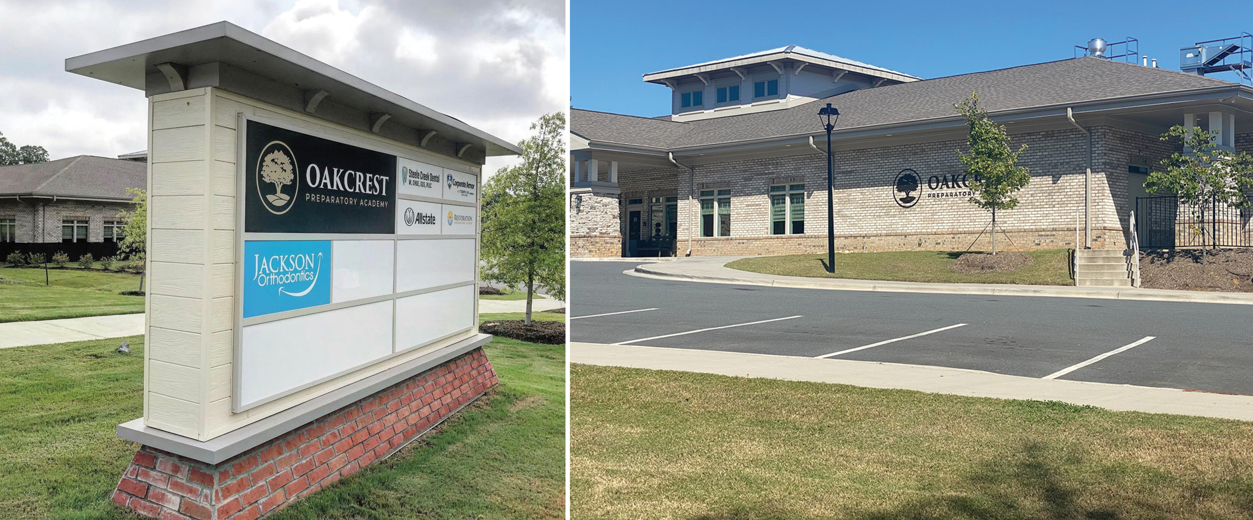
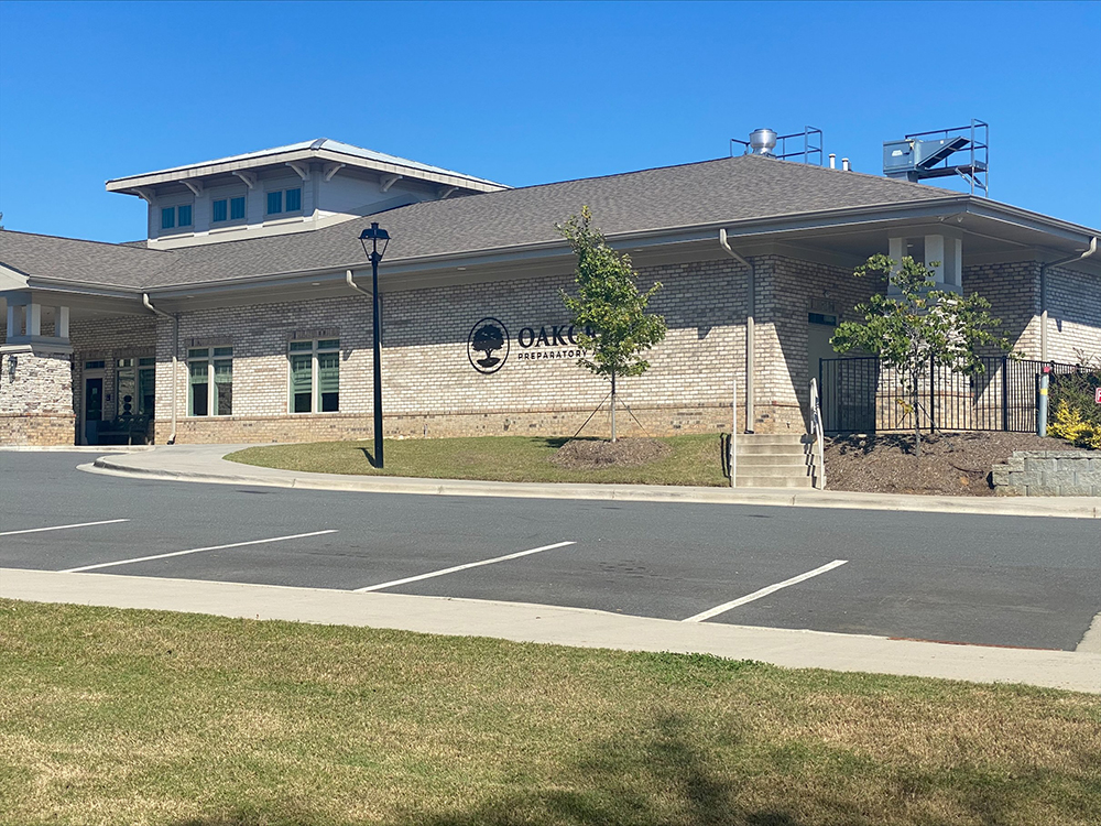
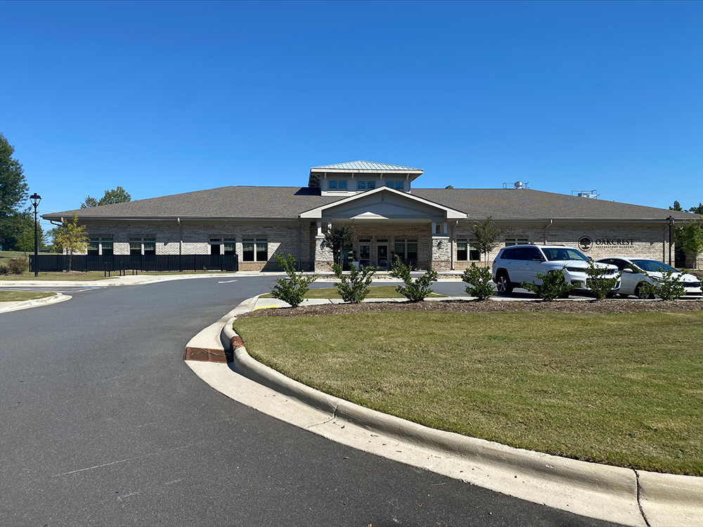
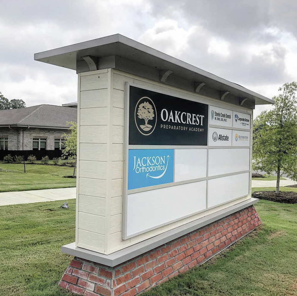
The same roof, siding and brick veneer from the building (right) were also used in the multi-tenant monument sign (left) for this development.
PROJECT
Multi-tenant sign for Ascent Real Estate, CHARLOTTE, NC
Development with tenants that range from a preparatory academy to dentistry, insurance agents and others, completed August 2020
FABRICATOR
RP SIGNS
Charlotte, NC
KEY ARCHITECTURAL DETAILS
From James Neely, director of project management, RP Signs: “The architectural elements… in the sign [included] the hardboard siding, which ties into the building design. Also we incorporated a cantilevered roof structure, which was a design element of the building as well.”
EQUIPMENT AND SUPPLIES
MultiCam CNC router, hand tools, Acrylite acrylic panels, James Hardie siding, Brick-It brick veneer, International Lighting Technologies LED modules and HanleyLED power supplies.
INTERESTING FACT
“The tapered brick base was a nice detail that we completed in-house,” Neely said. “Just not [the] typical rectangular or square base you see on most signs.”
PHOTO GALLERY (30 IMAGES)


Secrets of Lead Generation
Boost your sales by generating more leads! In this light and lively webinar featuring Maggie Harlow, CEO of Signarama Louisville Downtown (Louisville, KY) and the “Business of Signs” columnist for Signs of the Times, learn the secrets of how leads are generated, where they come from and how you can cultivate better (not just more) leads.


Bulletins
Get the most important news and business ideas from Signs of the Times magazine's news bulletin.
-

 Business Management2 weeks ago
Alternative Management Advice for Sign Companies
-
 Fabrication + Installation1 week ago
Small Signshop, Big Fabrication
-
 Paul Ingle2 days ago
120 Years of Signs, and I’ve Seen 41 (Mostly)
-
 Real Deal5 days ago
Sign Company and Customer Clash on “Minimum 2 Hours”
-

 Benchmarks2 days ago
5 High-Performance Vehicle Graphics Projects
-

 Tip Sheet4 days ago
Workflow Automation, Budget Discussion and More Signshop Tips
-
 True Tales2 weeks ago
My Shirt Says “Signs”
-
 Mildred Nguyen2 weeks ago
Interior Reimage Transforms Georgia School