As summer travel reaches fever pitch, millions of families begin the annual trek to the nation’s theme parks. These entertainment meccas face a dual challenge when it comes to signage. First, the parks’ wayfinding systems must direct visitors from point to point. At the same time, every sign — like a magic trick slowly revealed — must build a sense of anticipation and lead finally to the brilliant marquees, the pay-off vacationers are seeking
We visited Florida’s Epcot Center and spoke to artists and graphic designers from Walt Disney Imagineering to get a behind-the-scenes look at how they create their functional art.
Getting there, getting around
Most visitors begin their sojourn to Epcot on Florida’s Interstate 4. When Disney World opened 25 years ago, Magic Kingdom was its sole attraction. Since then, Disney World has evolved into a whole constellation of parks, including Epcot, MGM Studios, Pleasure Island and the recently added Animal Kingdom. This kind of aggregation became confusing, and many visitors didn’t realize that Epcot was a specific destination within Disney World.
To alleviate this problem, Disney created a series of gateways. The design firm of Sussman/Prejza & Co. began the project in 1990. The firm’s concepts were further developed by Ken Tobin and Michael Warzocha of Walt Disney Imagineering.
The project was finally completed in October of 1997. Now, standard highway department signage yields to Disney’s purple and red palette, which directs guests to specific parks. At the gateway marking Epcot Center Drive, Disney’s key characters — Mickey and Minnie Mouse — stand 16 feet tall and strike what Warzocha calls a ta-da” pose, as if presenting guests with a surprise.
Inside the Park
Conceived by Walt Disney as a means of “getting the future to people now” and first opened in 1982, Epcot is shaped roughly like an hourglass and is divided into two sections: Future World and World Showcase.
According to Anne Tryba, manager of graphic design at Walt Disney Imagineering, all layers of Epcot’s signage are designed to “immerse guests in a seamless environment.”
Once guests enter, they receive guide maps (available in a number of languages) to help them wind their way through the park. The wayfinding system is further supported by directional stanchions pointing the way to key attractions. Information kiosks feature tip boards and a map identifying all attractions by location and number. Next to each listed attraction, an LED message conveys estimated wait times.
Both halves of Epcot are designed around pavilions. Future World is patterned in a circle, which is connected to a central point that permits visitors to zigzag back and forth from one pavilion to another. The World Showcase pavilions surround a lagoon.
This concept helps distinguish individual attractions, yet keeps each one connected to the rest. When guests use the wayfinding system to arrive at certain rides, shows or exhibits, they encounter marquees, which help add excitement, color and authenticity to each attraction.
To achieve an environment where so many signs cohere, Epcot relies on four primary departments. Show designers hold both aesthetic and executive responsibilities for the look and feel of the attractions. Architects plan pavilions and structures. Graphic designers work to provide images and visual texture for everything from wayfinding signs to billboards to the marquee entrances of the attractions themselves. There is also a department that encompasses both show and theme lighting.
To execute the idea of a seamless environment, signs are constantly added, subtracted, changed and calibrated. Epcot relies on Walt Disney World Central Shops. This on-location, unionized shop partners with the Disney parks on maintenance, including fabrication and installation of graphics such as showcards, backdrops and goldleaf designs. Most of the larger marquee-style signs, however, are fabricated by companies that bid for Epcot’s contracts.
Future World
Epcot’s hallmark, a huge geodesic dome containing a ride called “Spaceship Earth,” stands as the defining feature of Future World, the section of the park that spotlights the relationship between science and nature. With its emphasis on the frontiers of technology, and a dome that’s become arguably one of the most easily identifiable structures in the U.S., Future World has created a visual legacy that the park’s designers still try to maintain.
One of the primary features in Future World is “Innoventions,” which is a pavilion featuring a new product showcase. Here, inventions such as software and telecommunications systems are placed on interactive display, that allows visitors to see, touch and test products that are just on the cusp of hitting the market.
When it came to developing signage to mark Innoventions, designers had to get down to the work of innovating. As Tryba explains, “All our design disciplines at Imagineering bow to the storytelling.”
The Innoventions story began with an idea for a logo featuring a lightbulb, a very literal invention that, over the years, has developed into a metaphor. To make the human connection, the lightbulb was portrayed being held in a hand. The body of the bulb was designed to resemble the geodesic dome, thus linking the symbol to the whole theme of Future World.
Senior graphic designer Mike Godby took the notion further and developed a storyline about the dawn of ideas and the human capacity to turn wonder into invention. Working on the broader canvas of a large marquee designed in a multilayered grid pattern, Godby planted the lightbulb icon in the center of the sign. He then added a human figure and symbols to represent scientific theories, inventions, and planetary symbols. According to Godby, the sign “succeeded in showing technology starting with an idea, and through the evolution of ideas, technology going into homes, into cities, and then into outer space.”
As the marquee was being developed, architects designed a free-standing, 45-foot tower composed of stainless steel to support the sign. Above the marquee is an illuminated symbol for the locations of Innoventions. The tower is crowned by a strobe light, developed by the show lighting department, which projects over the pavilion.
Another of Future World’s most popular venues is the attraction “Honey, I Shrunk the Audience,” based on a Disney comedy starring Rick Moranis as bumbling inventor Wayne Sczalinski.
Principle fabrication designer Chris N. Barker created the signage for the main marquee, which features the title of the attraction. At both ends of the sign, the letters are full-scale, but in the middle, the font begins to shrink under the fire of Sczalinski’s invention, a ray-gun.
Barker describes the sign’s dynamic: “Two tubes of neon come out of the gun’s barrel. There’s a whole sequence, every 40 seconds, that starts off by energizing and lighting up different transformers in the gun. As it works its way down, the sign itself blinks on and off, and there are strobes within the ray that start to fire off. Smoke starts to rise from the sign at the point of the word ‘Shrunk.’ ”
This sets off what Tryba cites as a prime example of a story within a story. The notion, Tryba explains, is that the audience is going to The Imagination Institute to see Wayne Sczalinski presented with an award.
“There’s another layer of signage in the Imagination Institute building to develop this illusion,” explains Tryba. “There’s a poster cabinet that announces the presentation, and a timeline illustrating great inventors in American history.”
After absorbing the atmosphere in the lobby, the audience is then invited into the auditorium. There, they are provided with special “safety glasses” intended to protect their eyes from the demonstration of the ray-gun. Then the awards presenter, Wayne and the Sczalinski family appear in 3-D.
“Well, of course the whole thing goes amok, and the machine goes haywire,” says Tryba. “The audience gets a taste of how the machine really works.”
The Living Seas
An attraction that meshes science and nature is “The Living Seas.” Designer Gregory Paul describes the main marquee as a freestanding collection of rockwork — simulated rocks built with cage, then covered in concrete. Affixed to the rockwork are stainless-steel channel letters and a logo from United Technology, the company that sponsors the exhibit.
The sign is complimented by a dynamic sea effect, which generates a lot of response and interactivity from those in line, especially children. Says Paul, “To simulate when a wave comes in, there’s kind of a gush of water that sprays up on the rocks. The water is controlled by a special-effects pump set on a timed sequence. Water then collects in a tidal pool.”
Behind the rocks and tidal pool is a mural, designed by show producer Tim Delaney, featuring the sun reflecting off the ocean.
With the tone established, the storyline begins to develop. Visitors walk through an area that appears to be a museum. This space features artifacts from the history of ocean exploration, such as diving bells and other antique equipment. A series of plaques helps support the artifacts.
The museum also functions as the queue for a pre-show film, which prepares visitors for their visit to the Sea Base, a research center. Visitors are transported to the Sea Base via three hydrolaters, which are basically underwater elevators.
“The hydrolaters are supported by graphics and backlit transparencies to represent various levels as you’re transitioning from the surface deeper down into the sea,” explains Paul. “The hydrolater actually has windows in it to show water and a bubble effect to give you the illusion that you’re going to the bottom.”
Once visitors exit the hydrolaters, they climb into a ride vehicle featuring Sea Base graphics, logo and numbers. When guests come to the unload area, they enter the Sea Base itself, a two-story research center comprised of four main modules. Each of these modules is supported by composites of images, photos, graphics and text, which are photocomposed, made into 8-by10-foot transparencies, then enlarged and printed in cibachromes, a high-intensity color transparency.
“We did a ton of documentation,” says Paul of the project. “We did studies of mammals, coral reefs, live dolphins, coral reef, kelp. This information is applied to transparencies to let visitors identify what they’re seeing.”
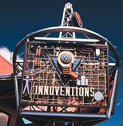

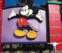
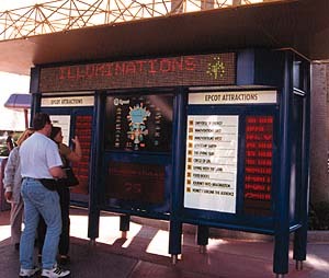
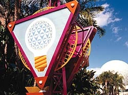
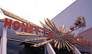
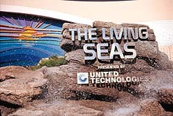
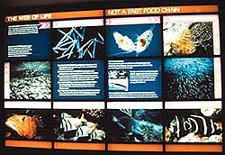


 Photo Gallery2 weeks ago
 Ask Signs of the Times2 weeks ago
 Paula Fargo1 week ago
 Real Deal6 days ago
 Photo Gallery1 week ago
 Women in Signs2 weeks ago
 Projects6 days ago
 Women in Signs2 weeks ago