Go Big or Go Home
These three shops cleverly transformed huge spaces using EGD as a way to calm, direct and create community.
AT THE CRUX OF experiential graphic design (EGD) is the creation of environments that communicate to one another. No longer simply “wayfinding,” EGD also encompasses exhibit and retail design, architectural graphics, signage and sign programs, branded spaces and even digital technologies and systems.
All of these elements have to work together to make it easier for the users of the space to get around. And, while they’re getting around, one might as well make the experience entertaining, colorful, surprising, delightful… you get the picture.
It is in the unexpected that these three companies excelled, creating spaces to soothe children, direct shoppers and make employees feel appreciated, all while pushing the envelope of what EGD can do.
WONDER AROUND
BOSTON CHILDREN’S HOSPITAL
There’s no way around it: Being in a hospital, especially for a child, can be a stressful and scary situation, but thankfully all-beige decor is now a thing of the past. Today’s children’s hospitals are bright and cheery spaces, full of colorful walls, murals and other designs, all thoughtfully planned out with the goal of making a hospital stay less clinical and more about patient recovery and happiness.
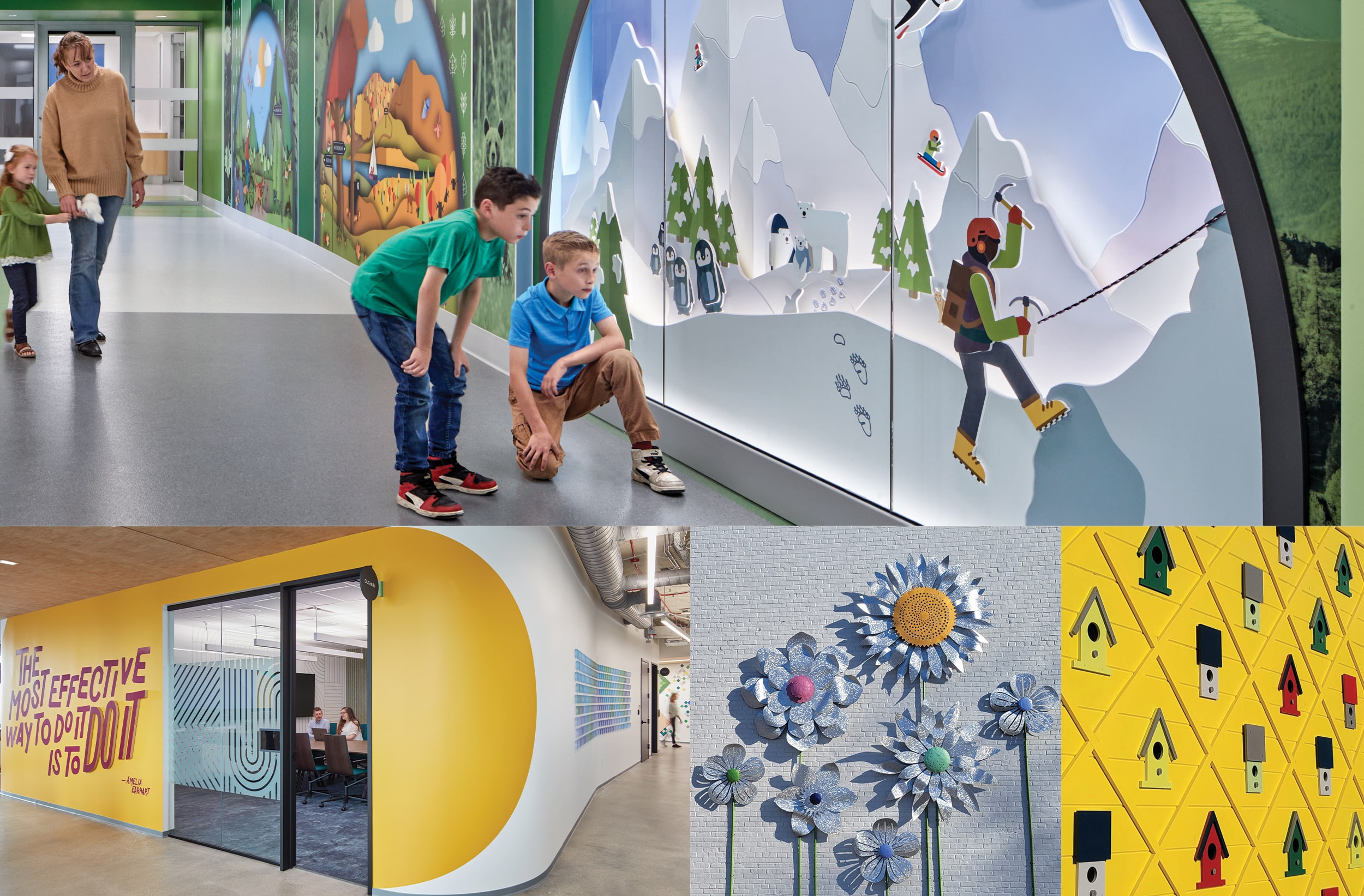
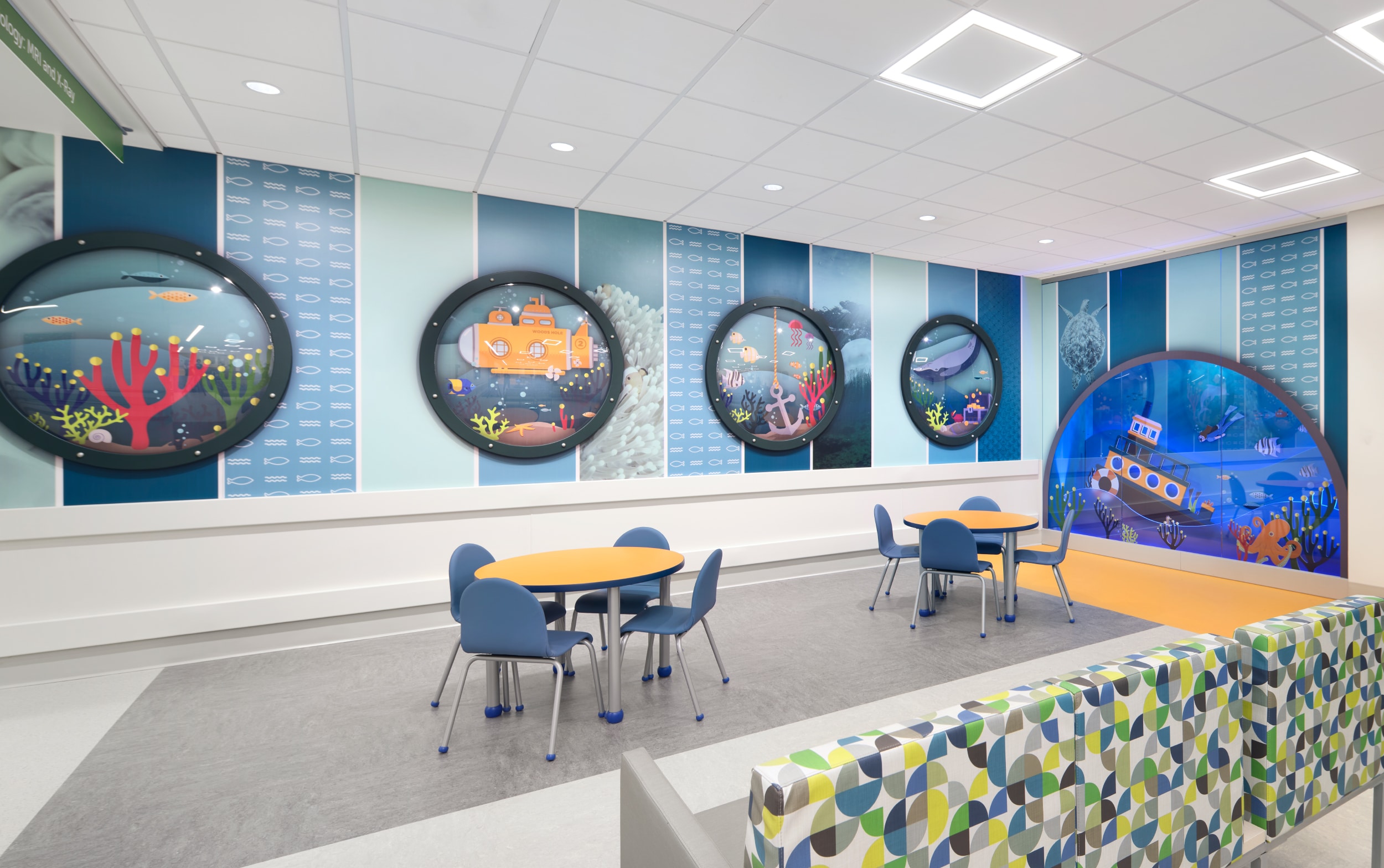
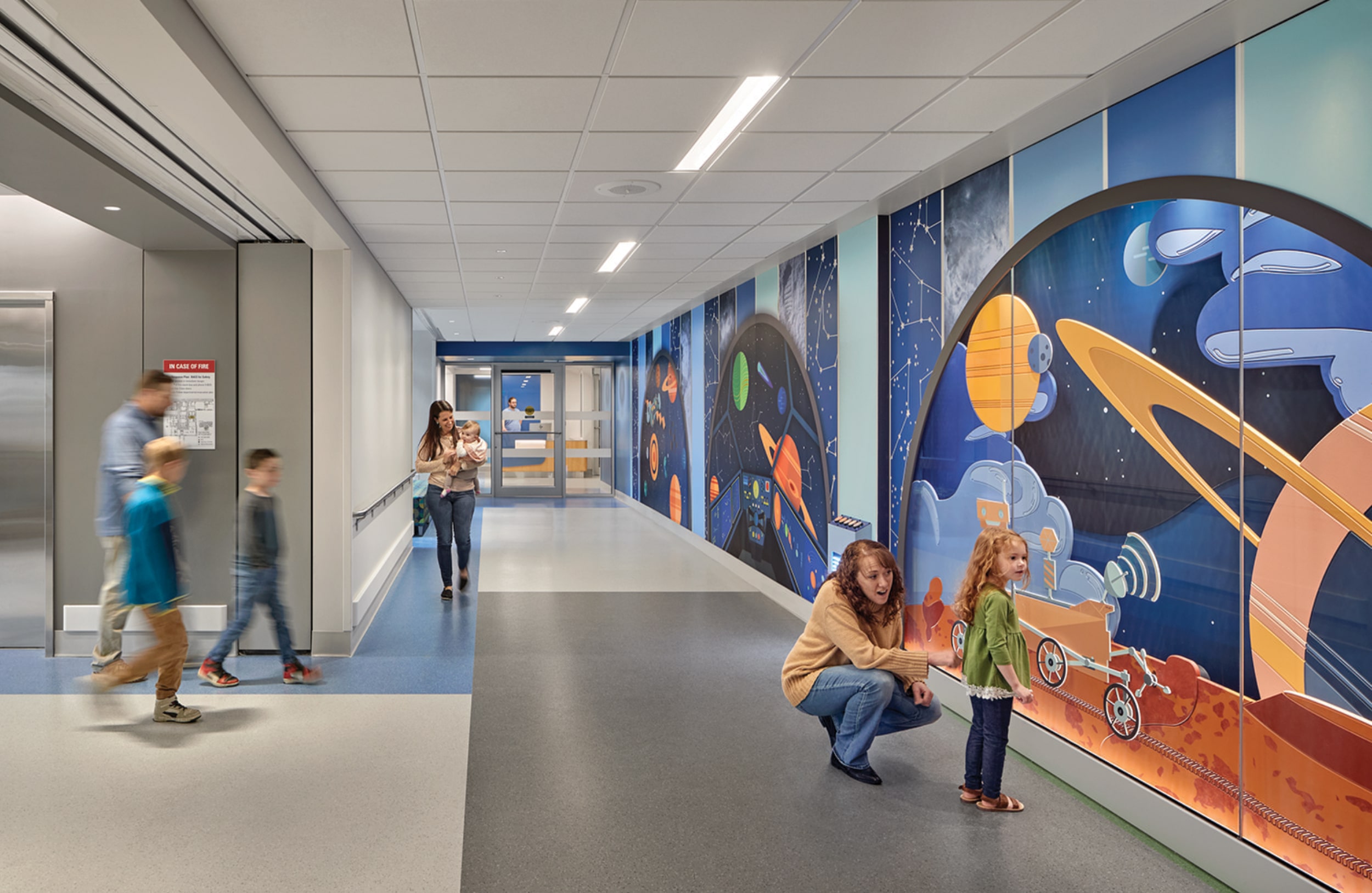
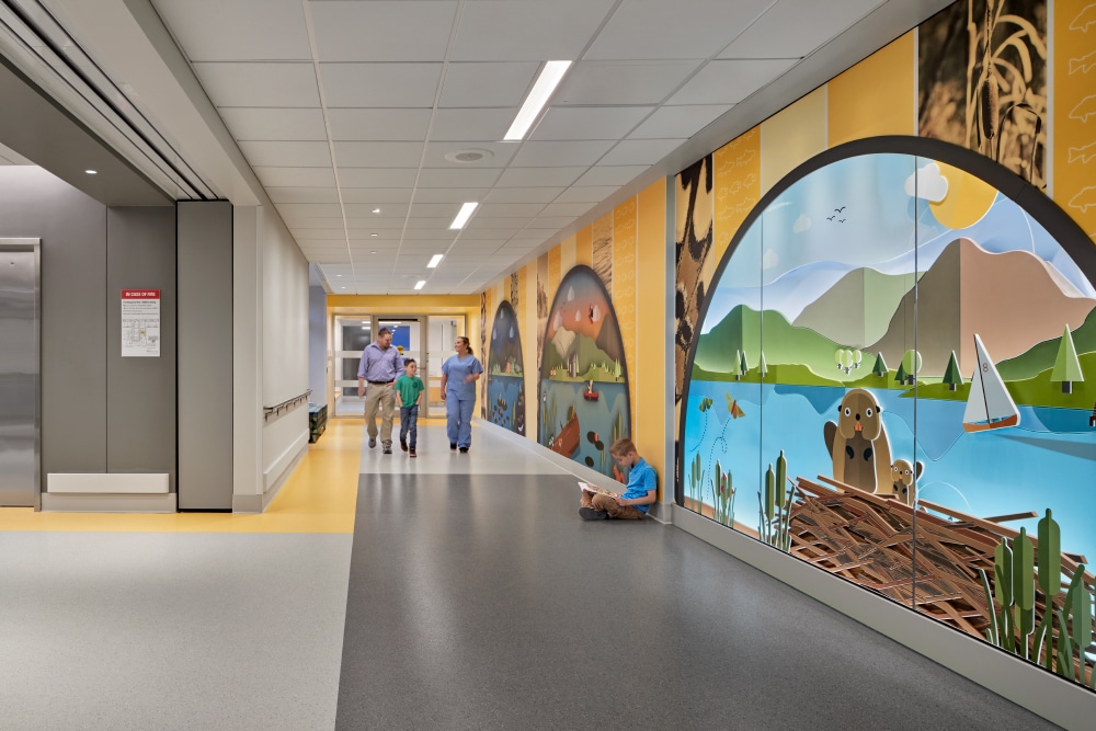
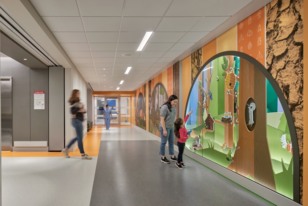
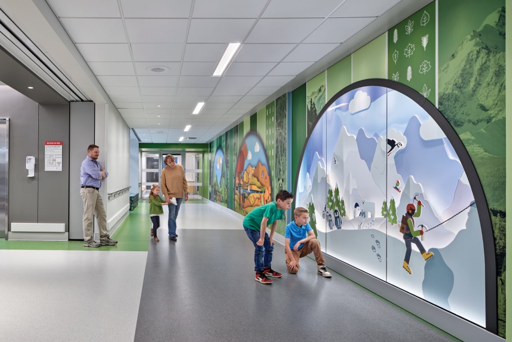
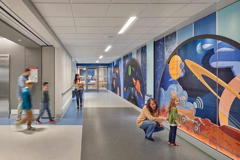
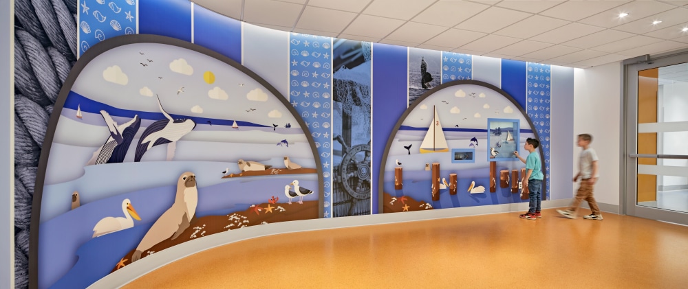
“A trip to the hospital can be intimidating, and our goal is to make that experience a little bit easier,” ArtHouse Design’s (Denver) Principal and Design Director Beth Rosa says of their recent design and fabrication project for an immersive (and entertaining) EGD program that filled the spaces of the 11-story, 575,000-sq.-ft. Hale Family Center for Families at Boston Children’s Hospital.
“Working in health care is profoundly rewarding,” Rosa says. “An increasing number of studies show that incorporating art into health care environments can have beneficial effects on patient recovery, and our designs offer unexpected moments of calm and wonderment during what could be an otherwise stressful time.”
Also rewarding? Having your work noticed. After several Boston Children’s Hospital administrators saw (and were impressed by) the major theming, wayfinding and donor signage program ArtHouse created for Strong Memorial Hospital (Rochester, NY), they asked the company to submit an RFP for the Boston project.
The client’s request was to fill nine large walls leading from elevator lobbies down the corridors toward reception. The designs had to serve both as interactive artwork as well as subtle wayfinding, and they needed to fit within the building’s existing theme while offering a fresh, unique experience.
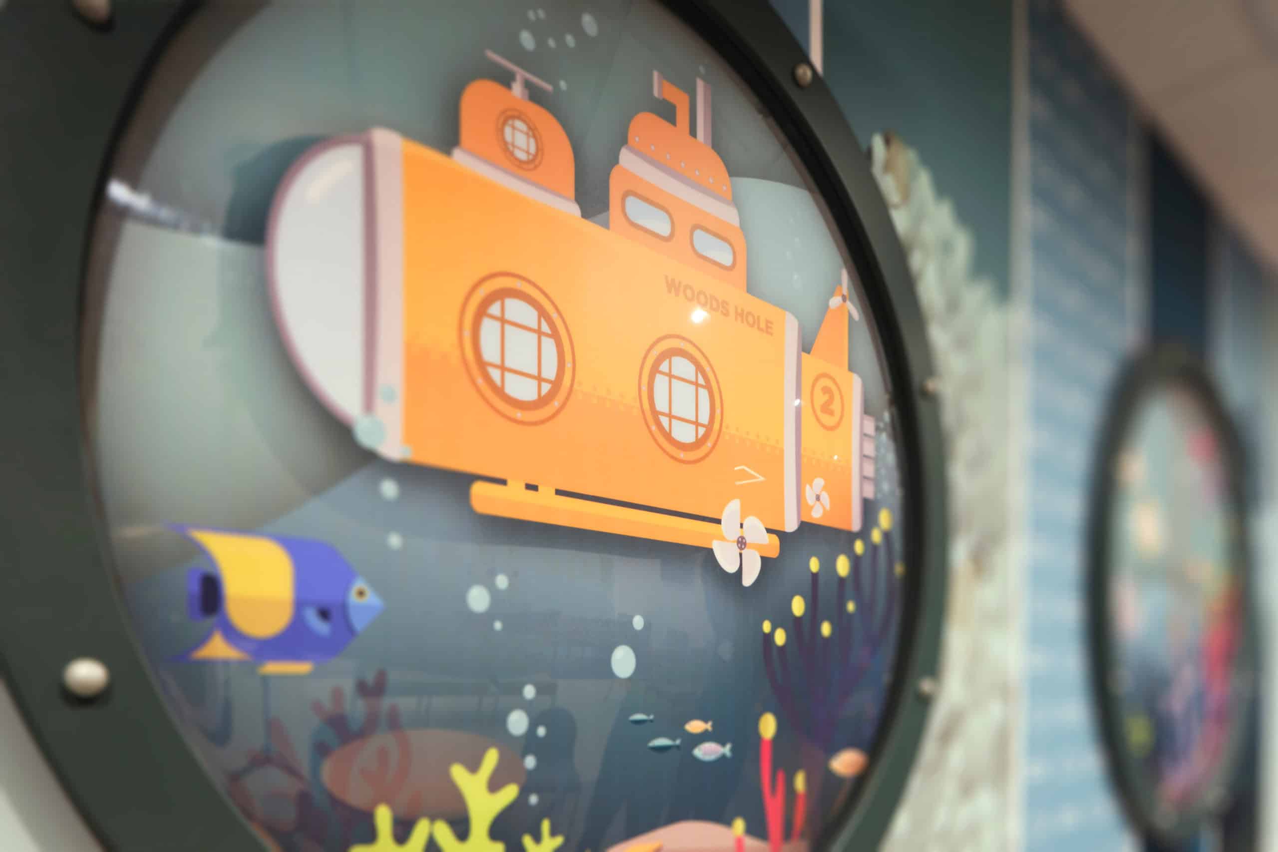
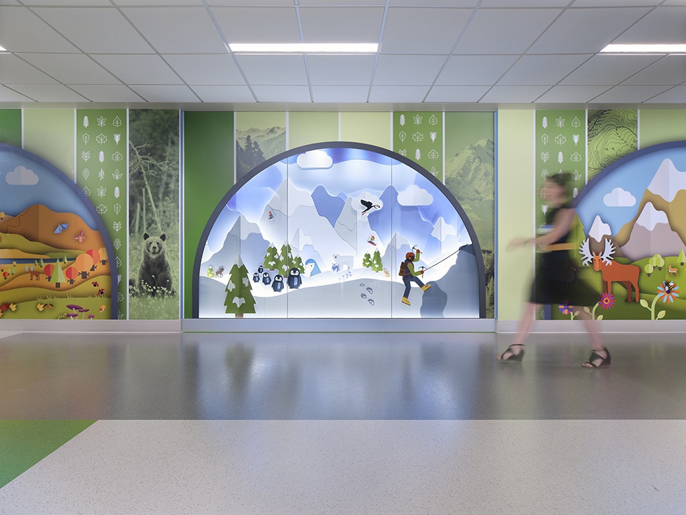
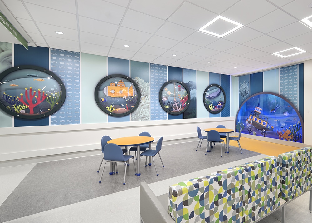
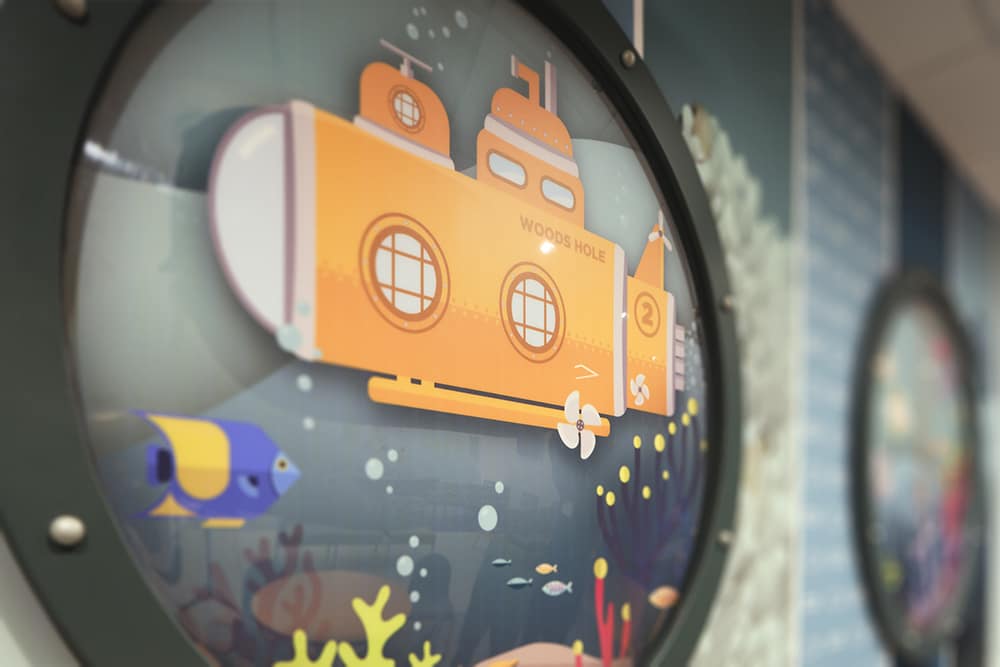
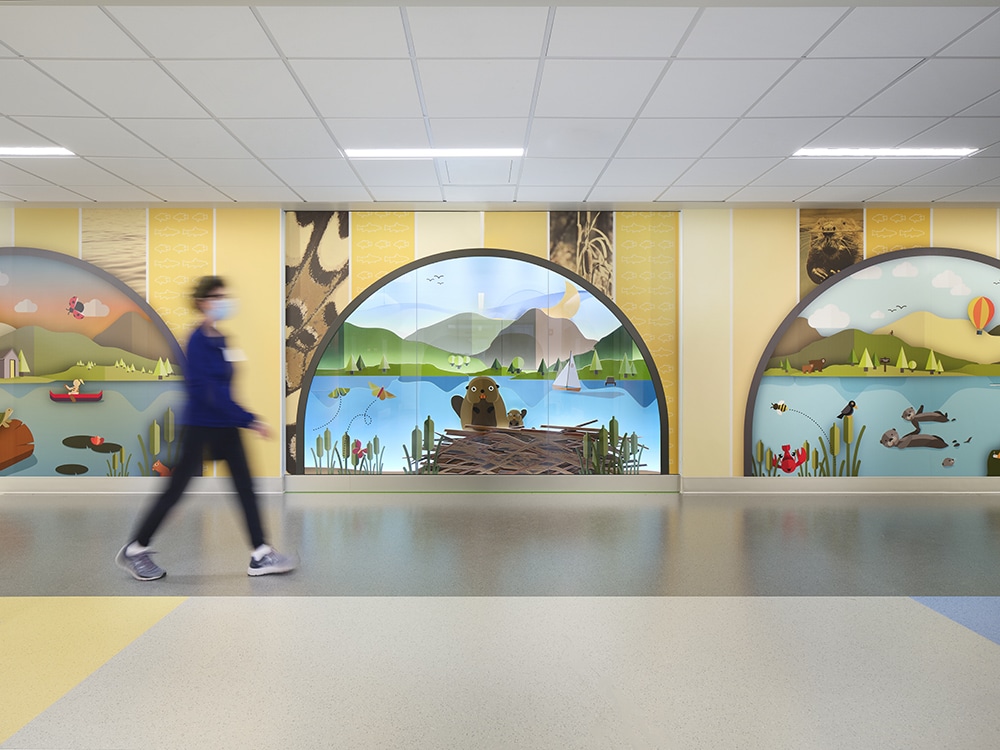
 ArtHouse Design designed and fabricated an immersive, entertaining EGD experience for the Hale Family Clinical Building at Boston Children’s Hospital that took up an entire 11-story, 575,000-sq.-ft. space. The project’s interactive, 3D pop-up-book theme helps foster a sense of wonder and engagement using authentic Boston iconography and recognizable scenes from the metro region.
ArtHouse developed and coordinated a 3D pop-up-book theme featuring interactive, multi-layer automatons under 8-ft. arches meant to foster a sense of wonder and engagement, as well as to distract, surprise and entertain kids without the use of tech and screens.
The design concept was well received by stakeholders and user groups alike, including patients who receive treatment and stay at the hospital. “Many of the young patients are treated by the same care team into adulthood so it’s important that the designs appeal to all ages,” Rosa says.
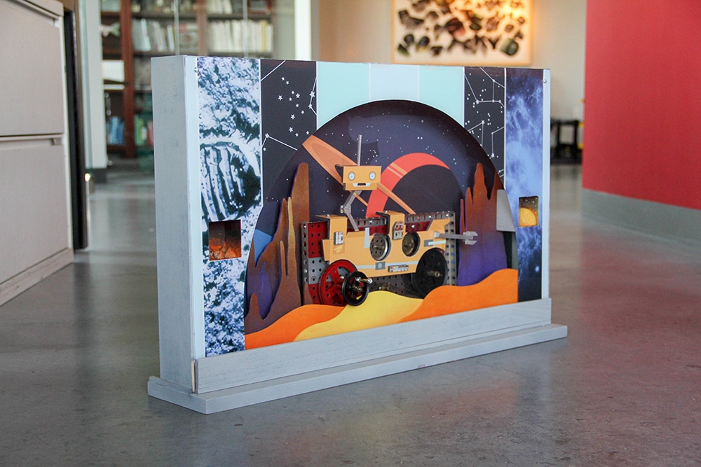
Once the design direction was approved, ArtWorks created to-scale, hand-built working models of each floor’s design to illustrate its interactive components to the client team.
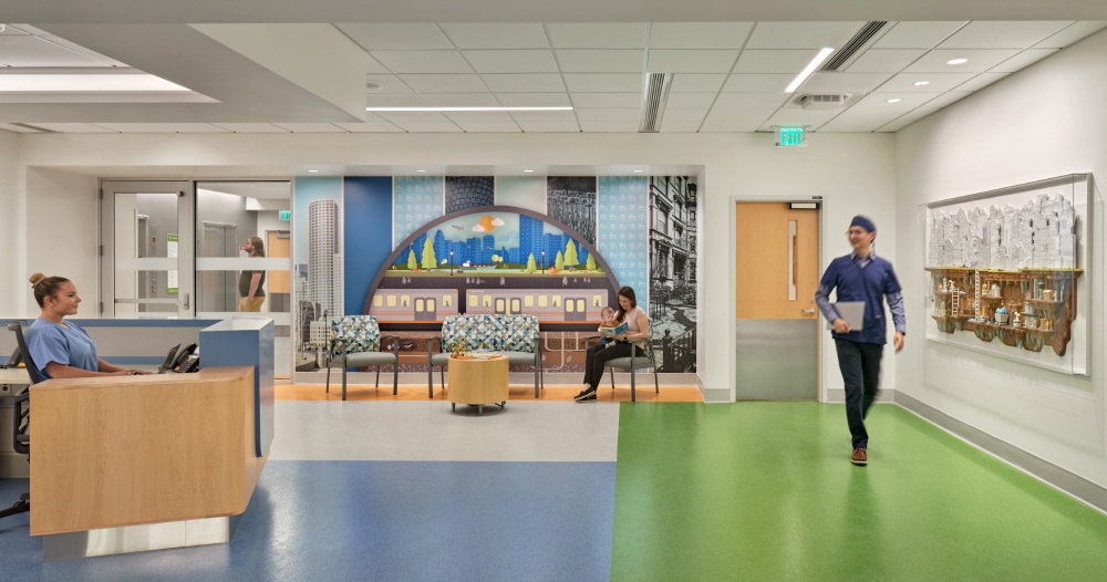
The installations begin by welcoming visitors as soon as they exit the elevator and serve as a guide toward reception and appointment check-in. Along the way, there are a few surprising moments, like walking through an underwater world, through an enchanted forest and across captivating mountains — all to give patients a moment of calm before their visit, to forget why they’re at the Center for even just a short time.
From there, the rest of the hospital’s themed floors feature authentic Boston iconography, from puffins to harbors to swan boats, with scenes from the metro region recognizable to local and international guests alike.
ArtWork’s Rosa, together with artists and engineers from Dillon Works (Seattle), coordinated the program’s installation with hospital stakeholders, the project architect, the general contractor and multiple subconsultants, which included handling the logistics of getting the life-size art pieces transported across the country, delivered to the loading dock and into the elevator — all during a pandemic, no less.
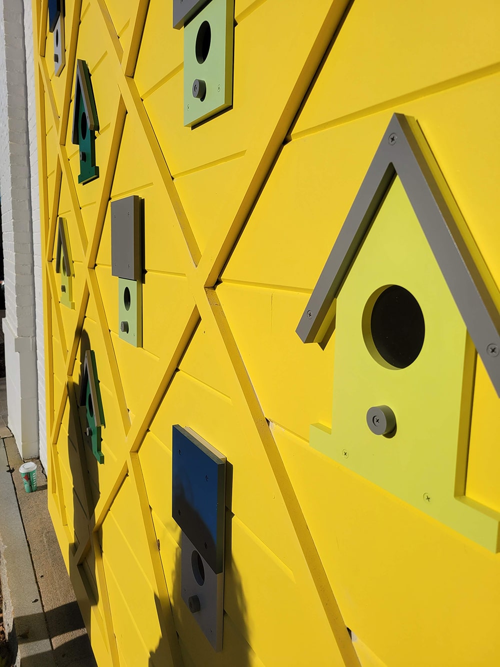
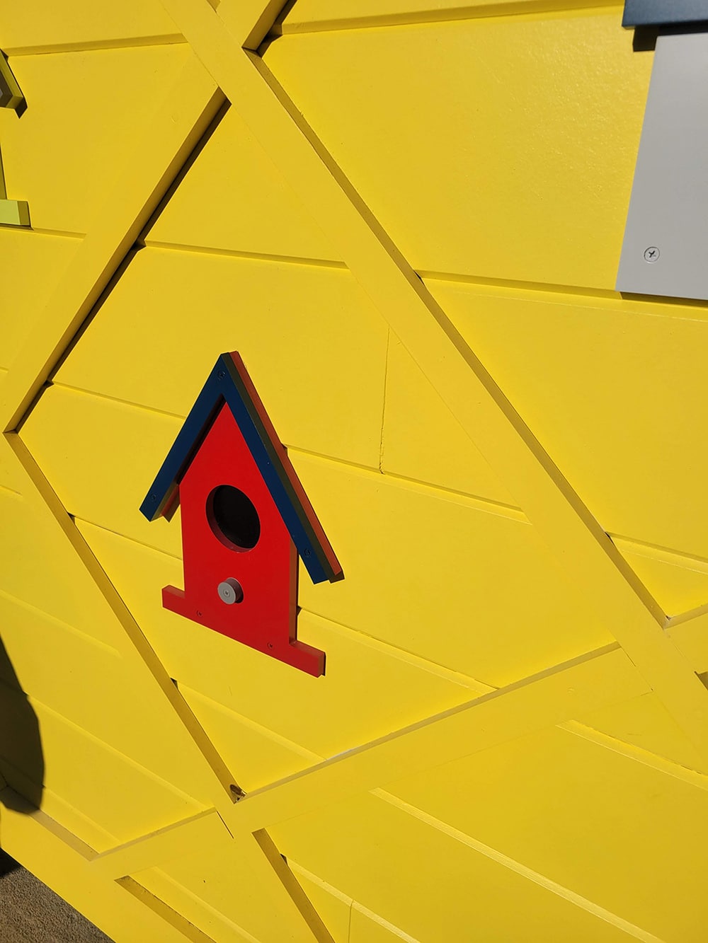
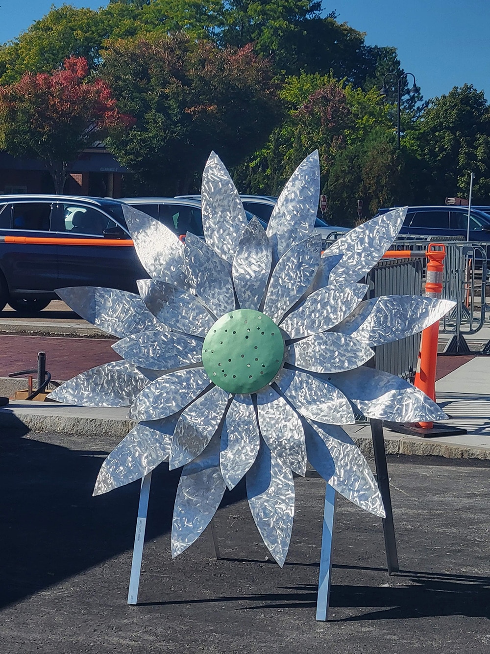
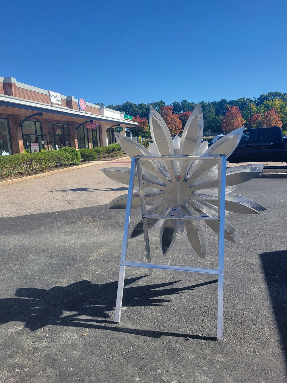
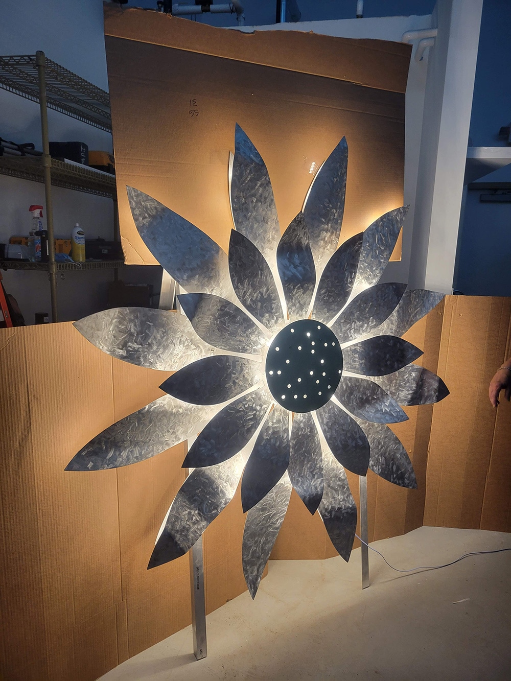
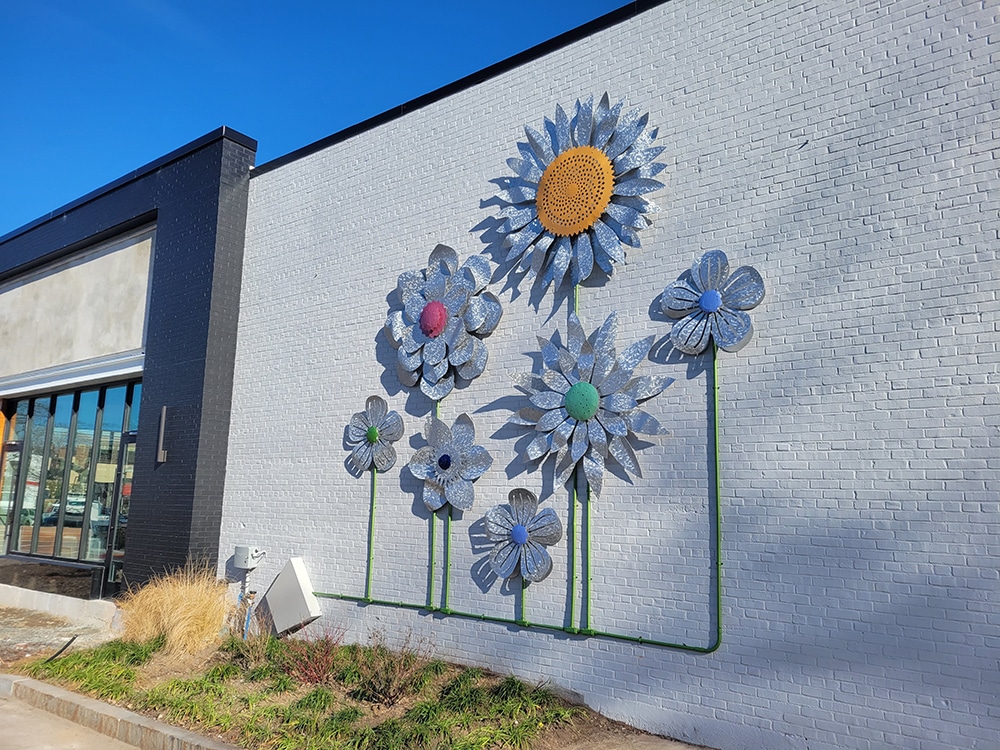
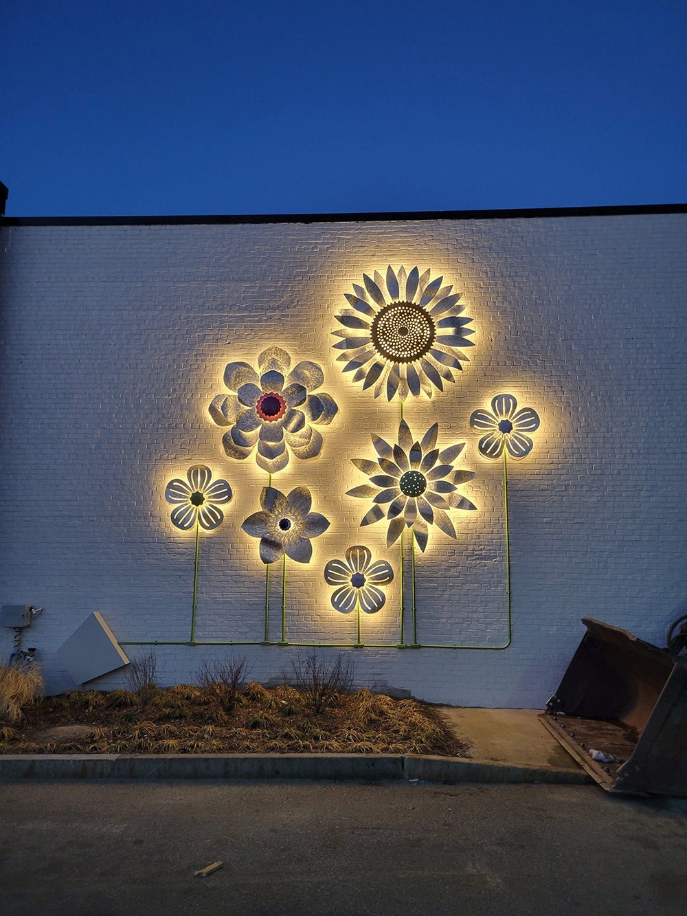
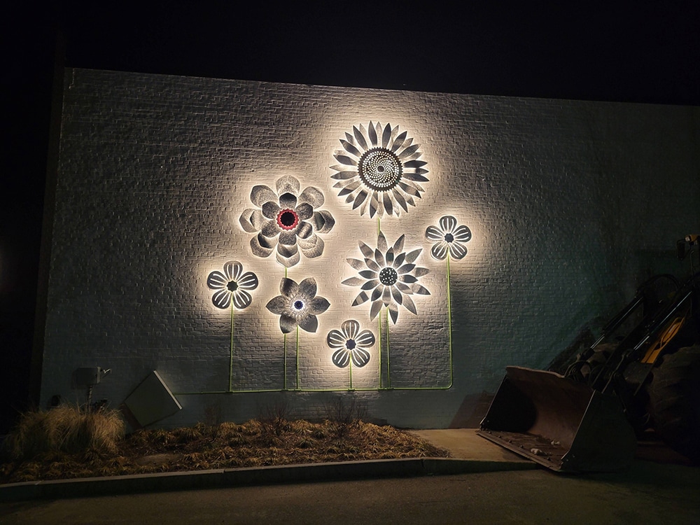
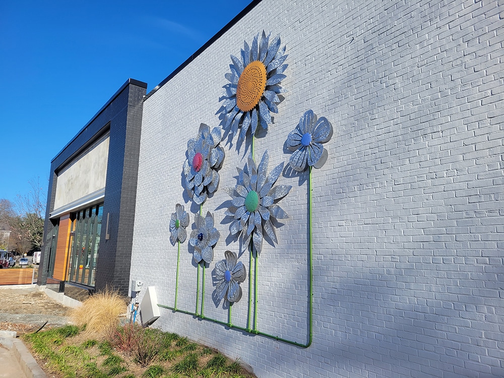
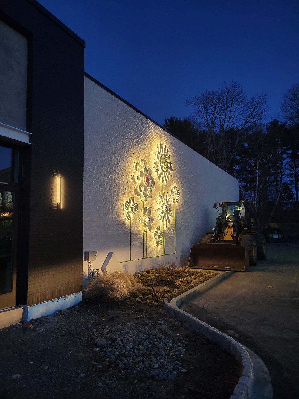
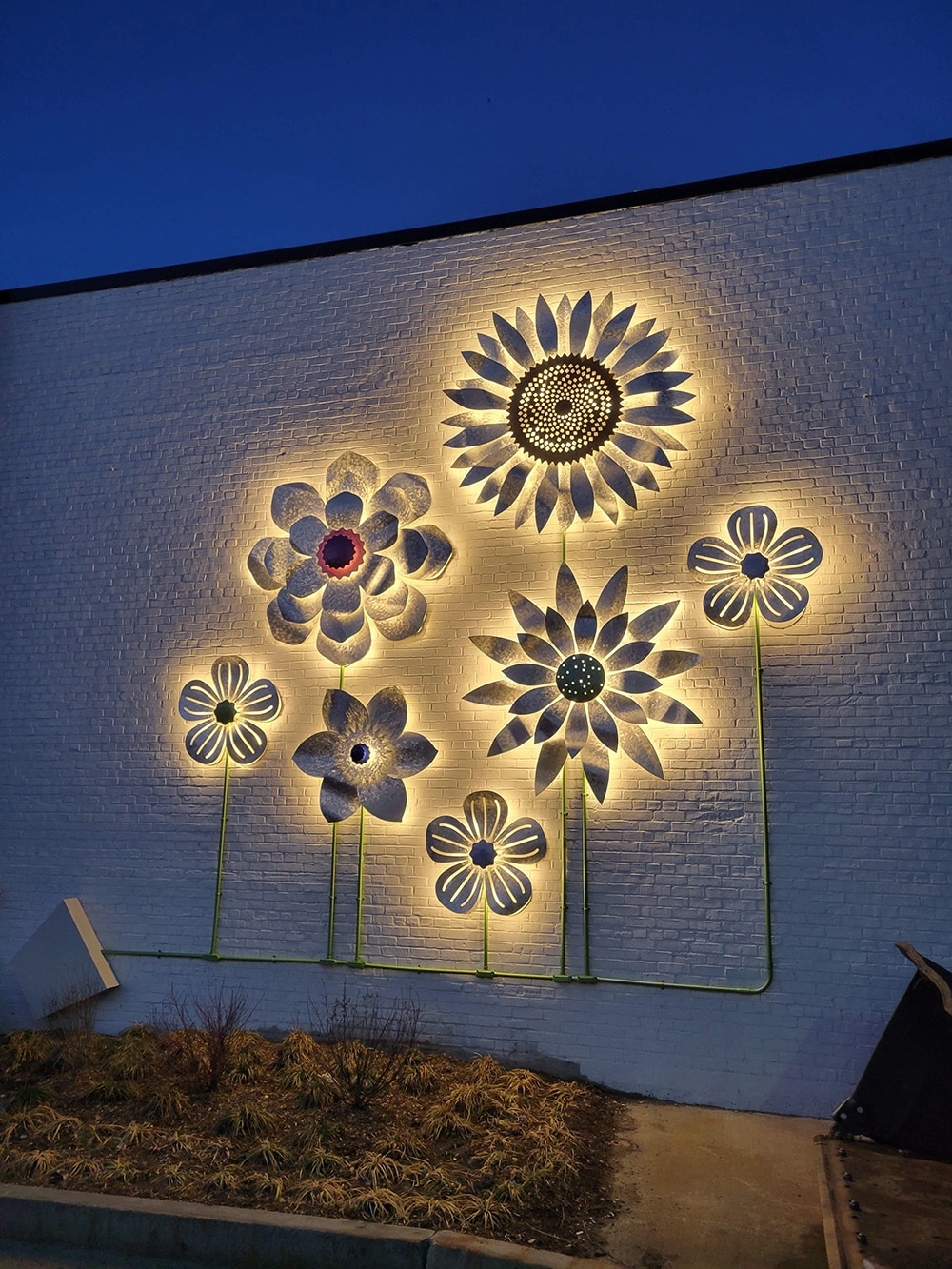
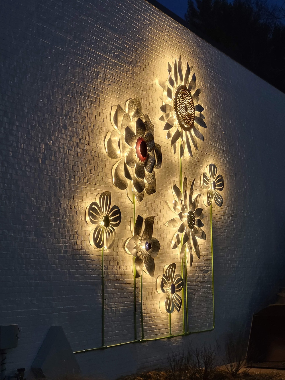
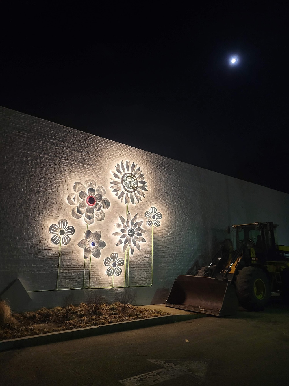
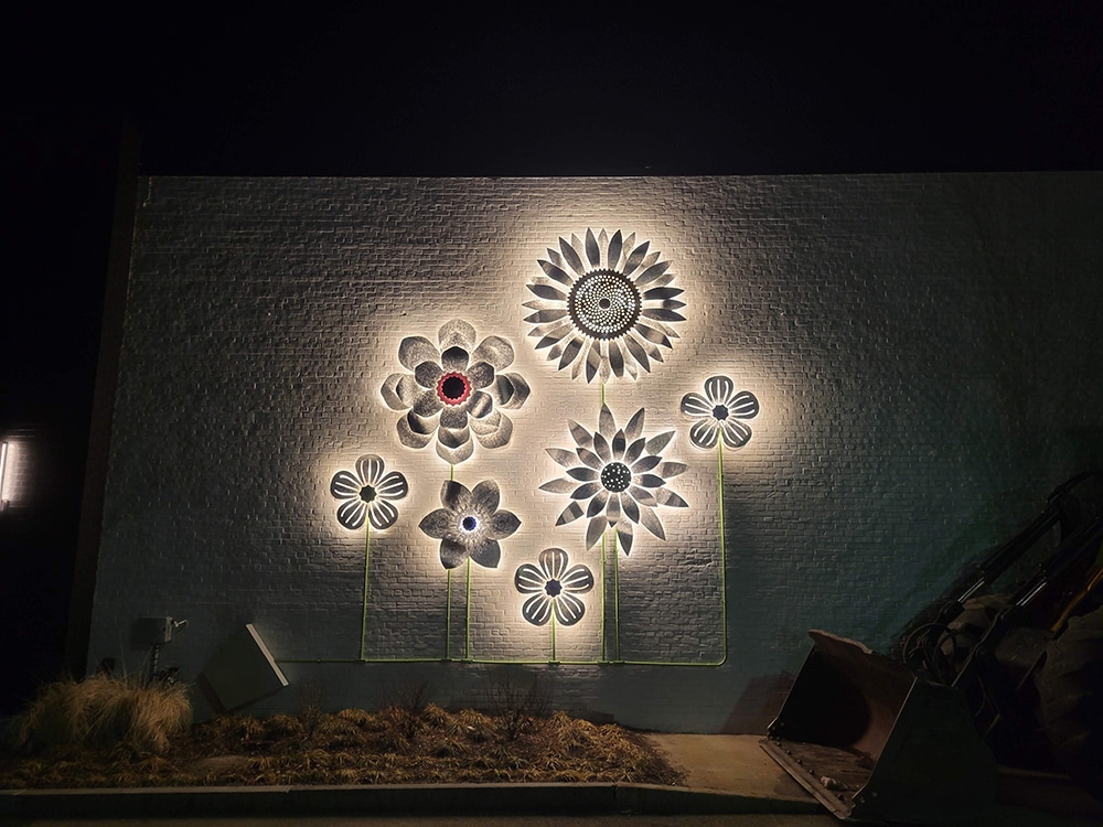
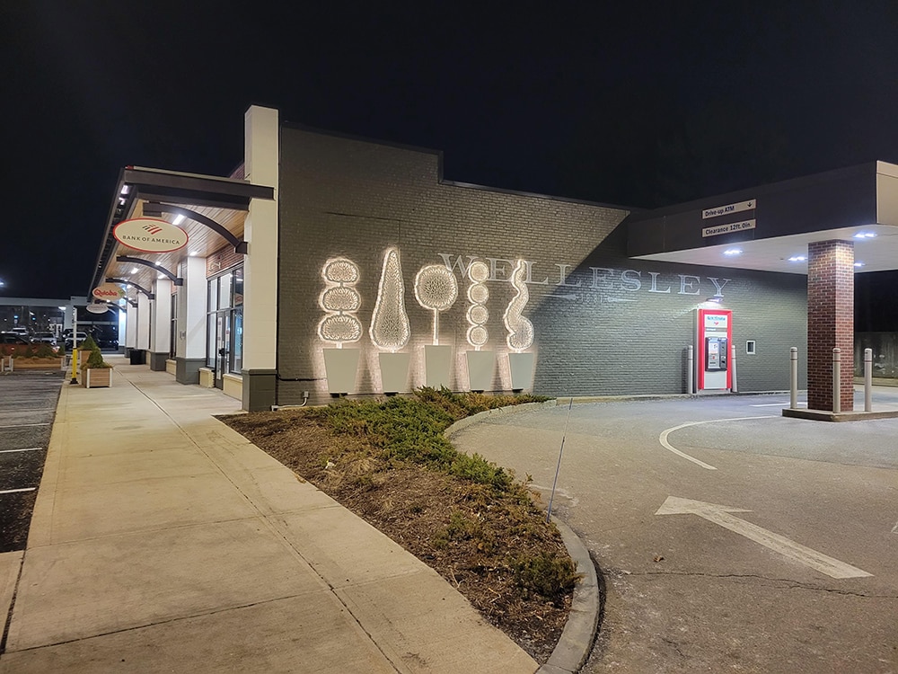
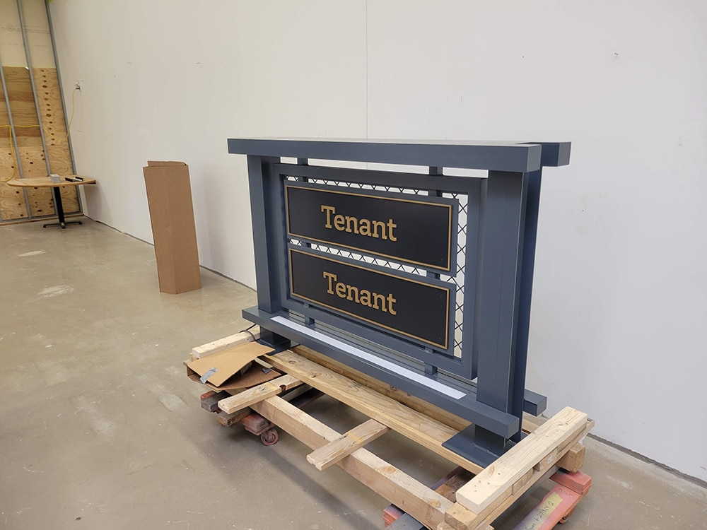
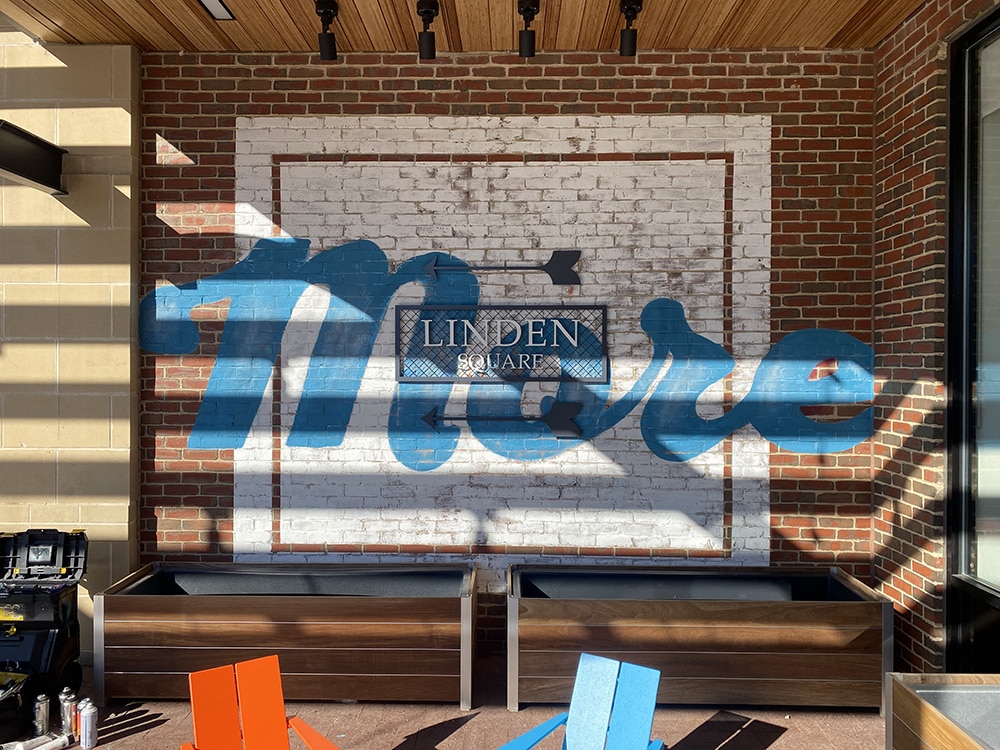
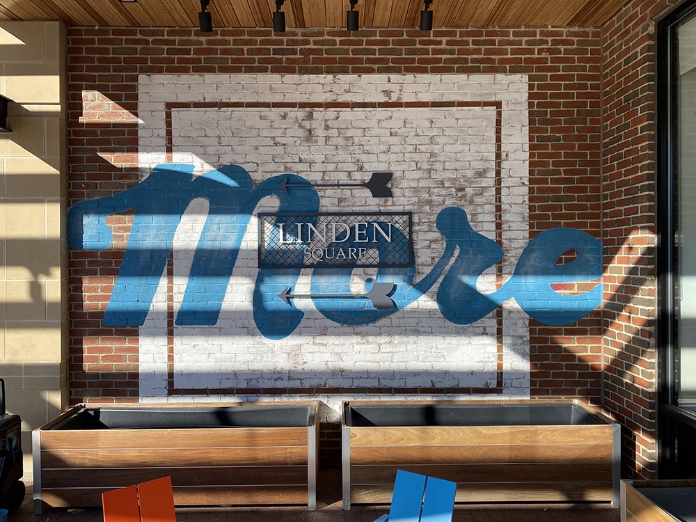
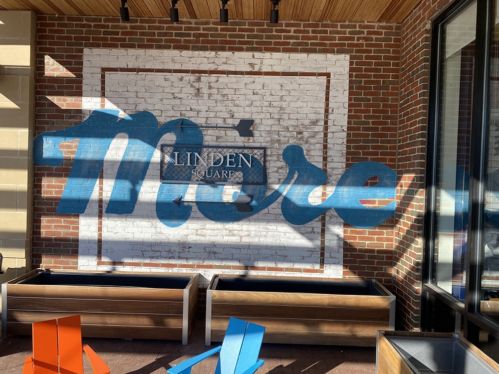
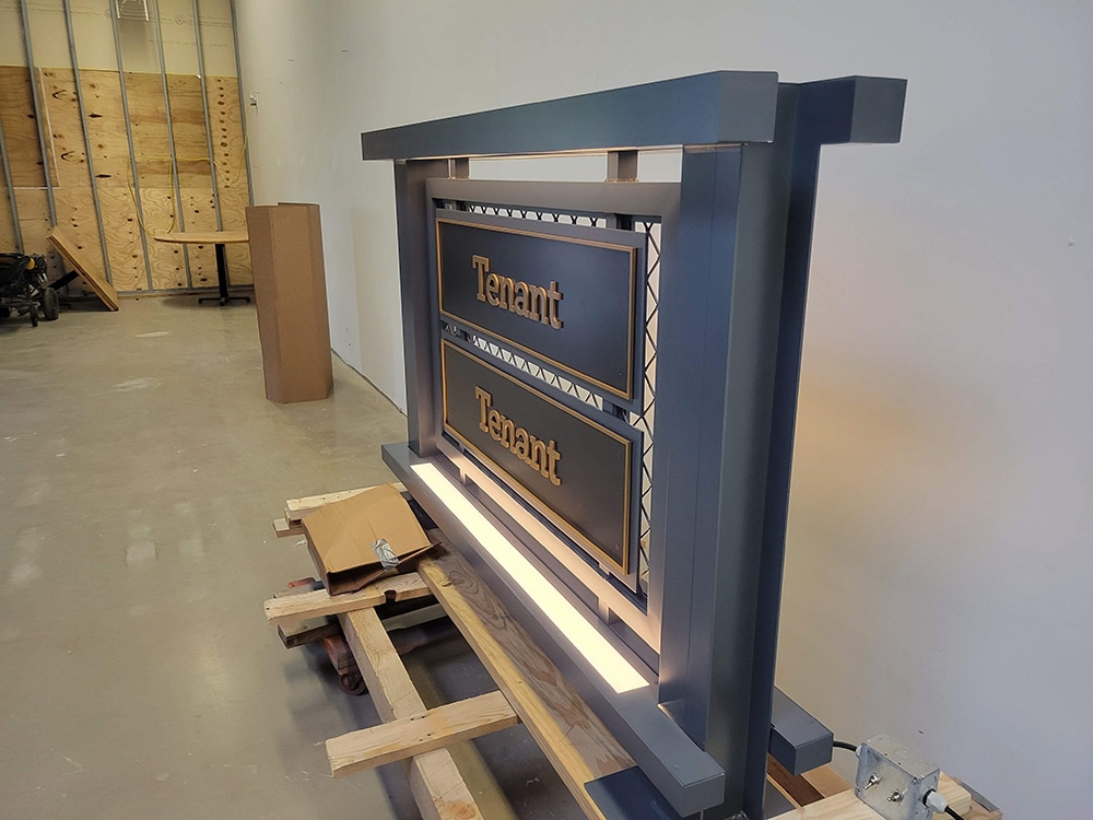
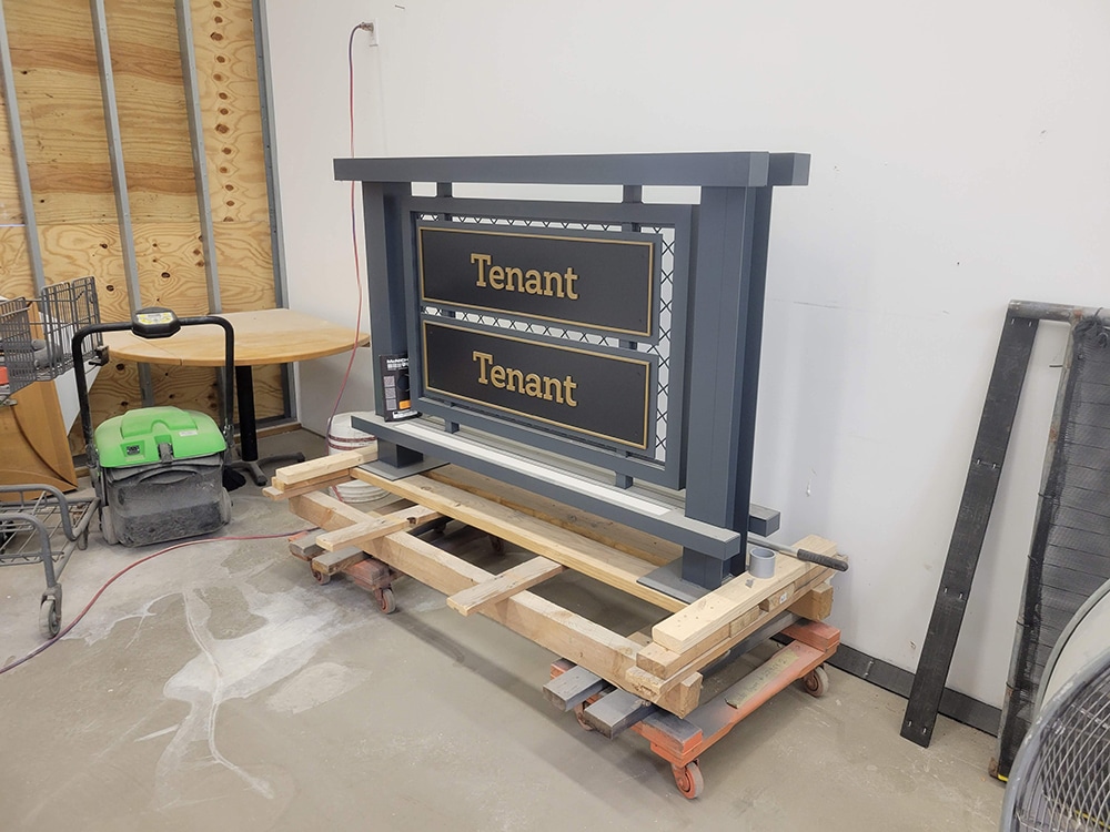
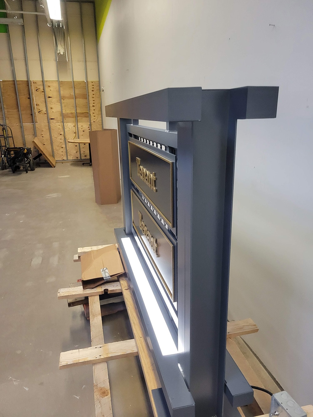
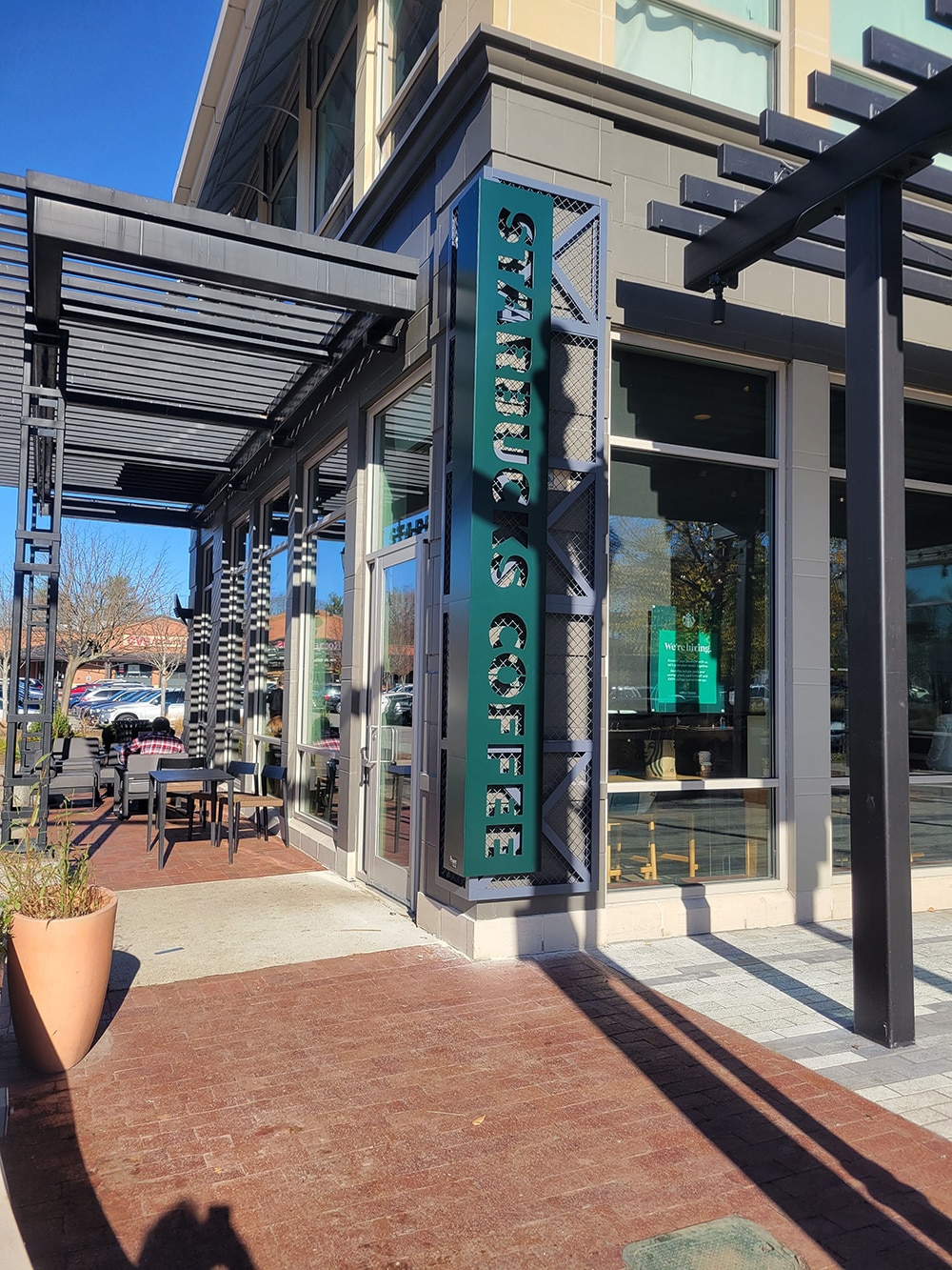
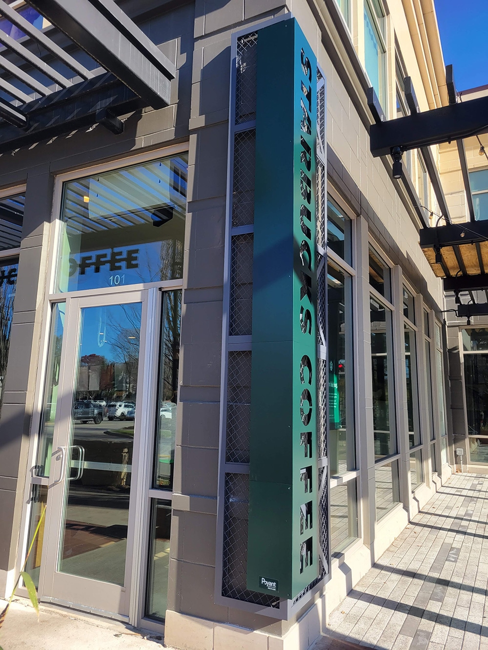
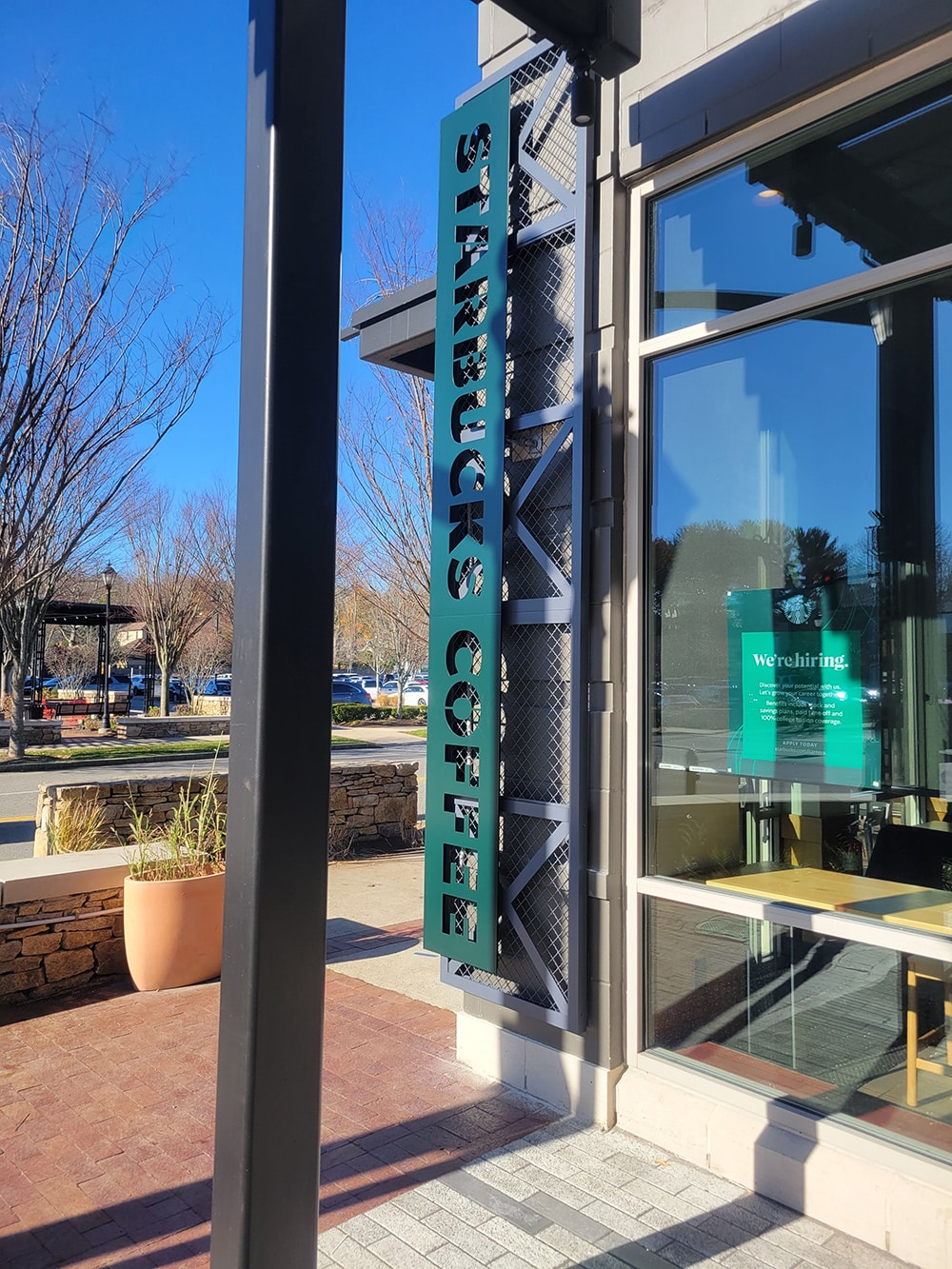
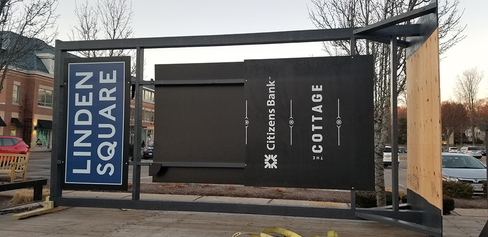
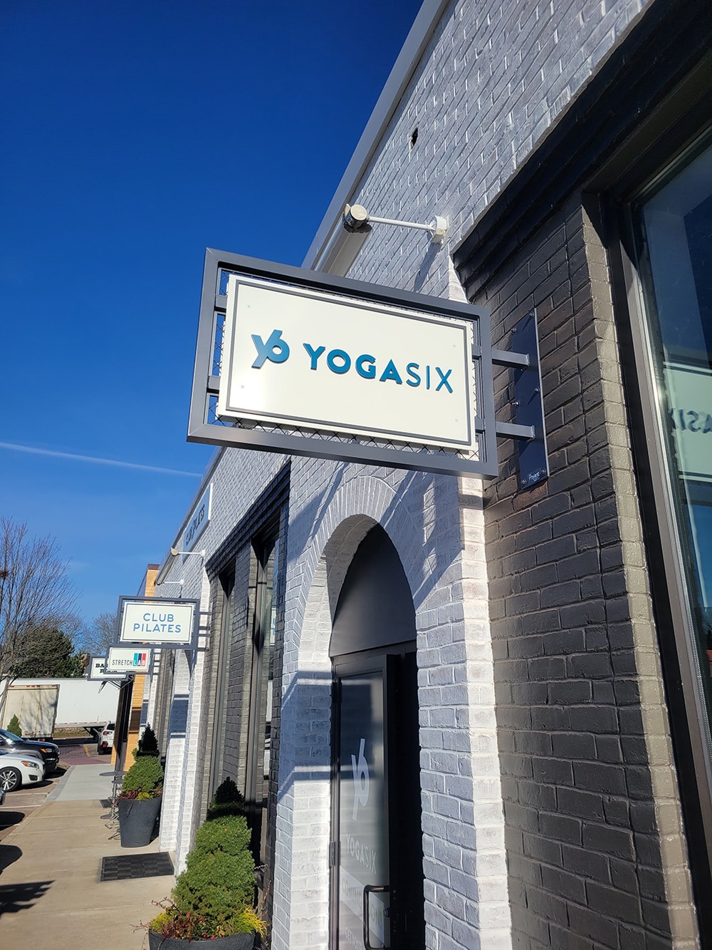
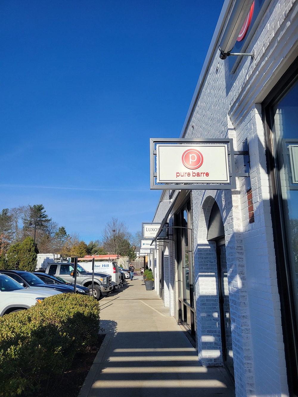
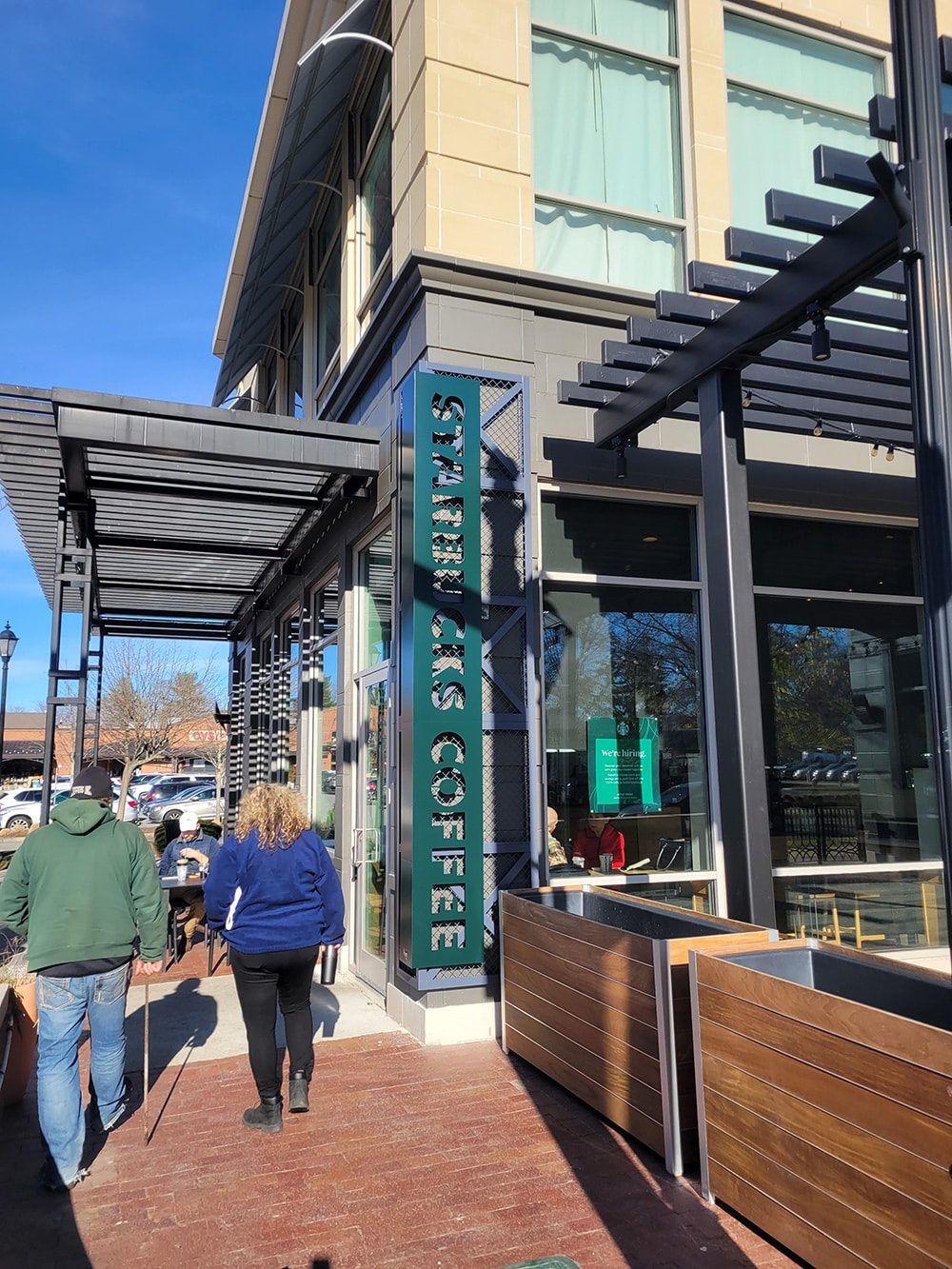
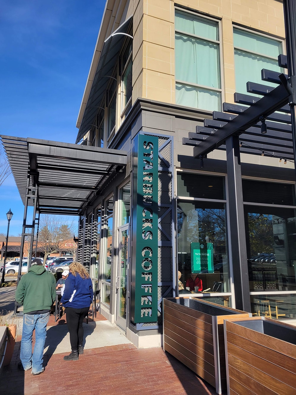
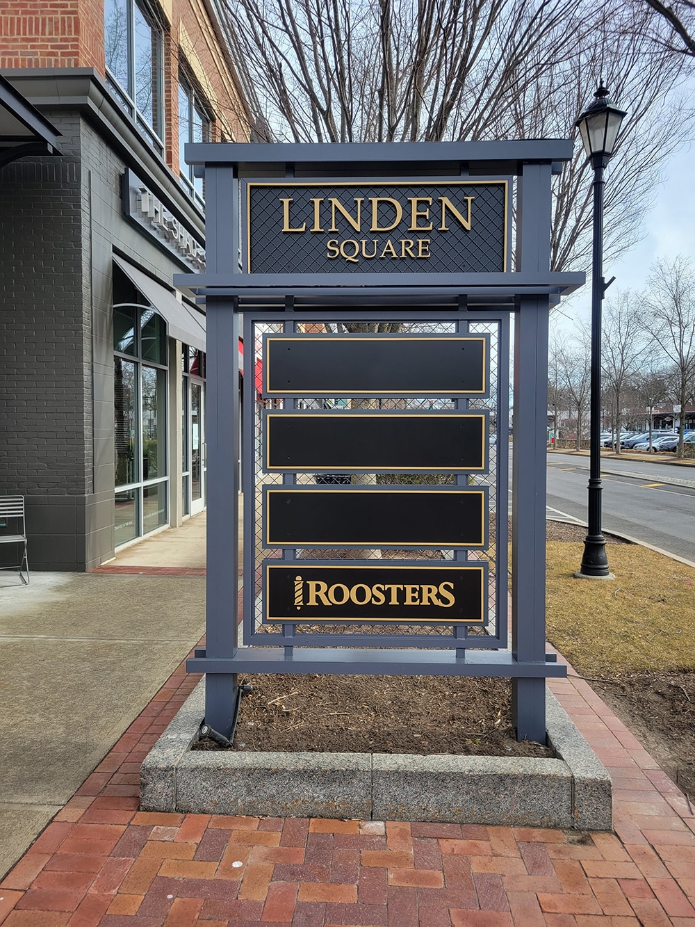
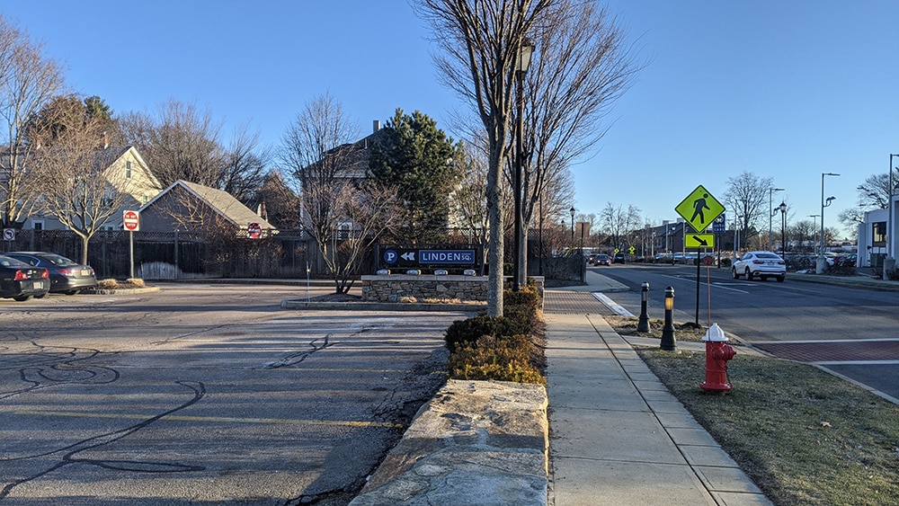
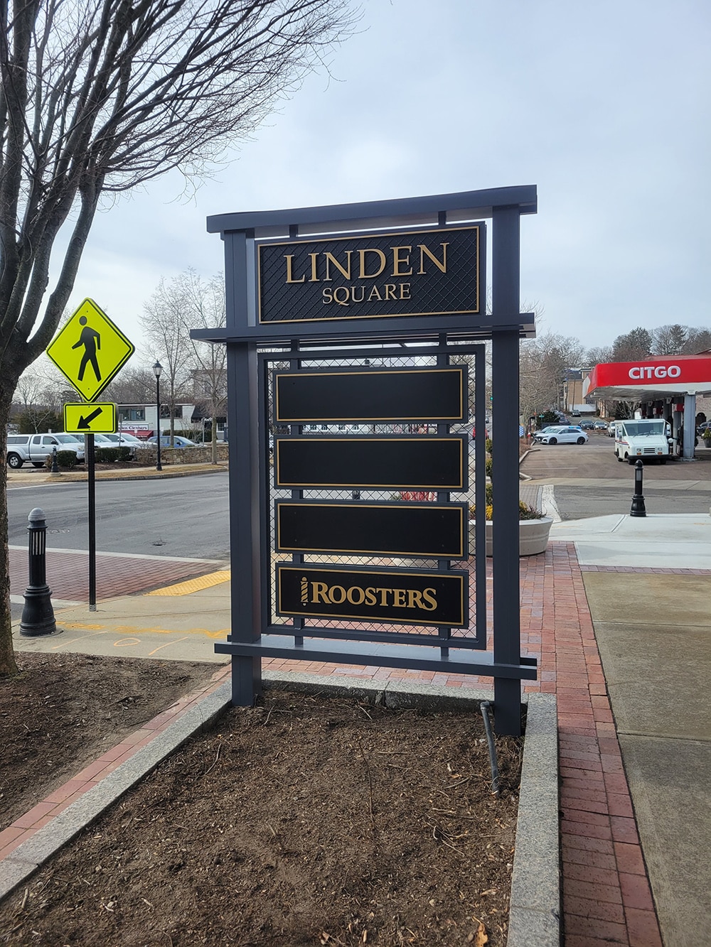
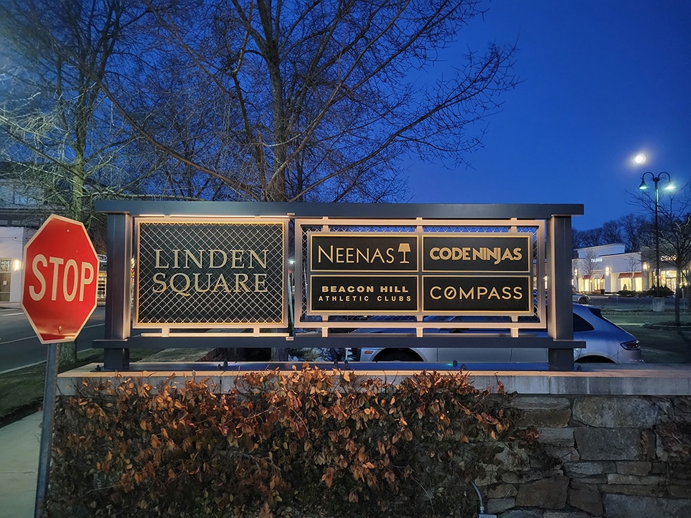
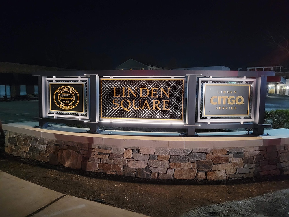
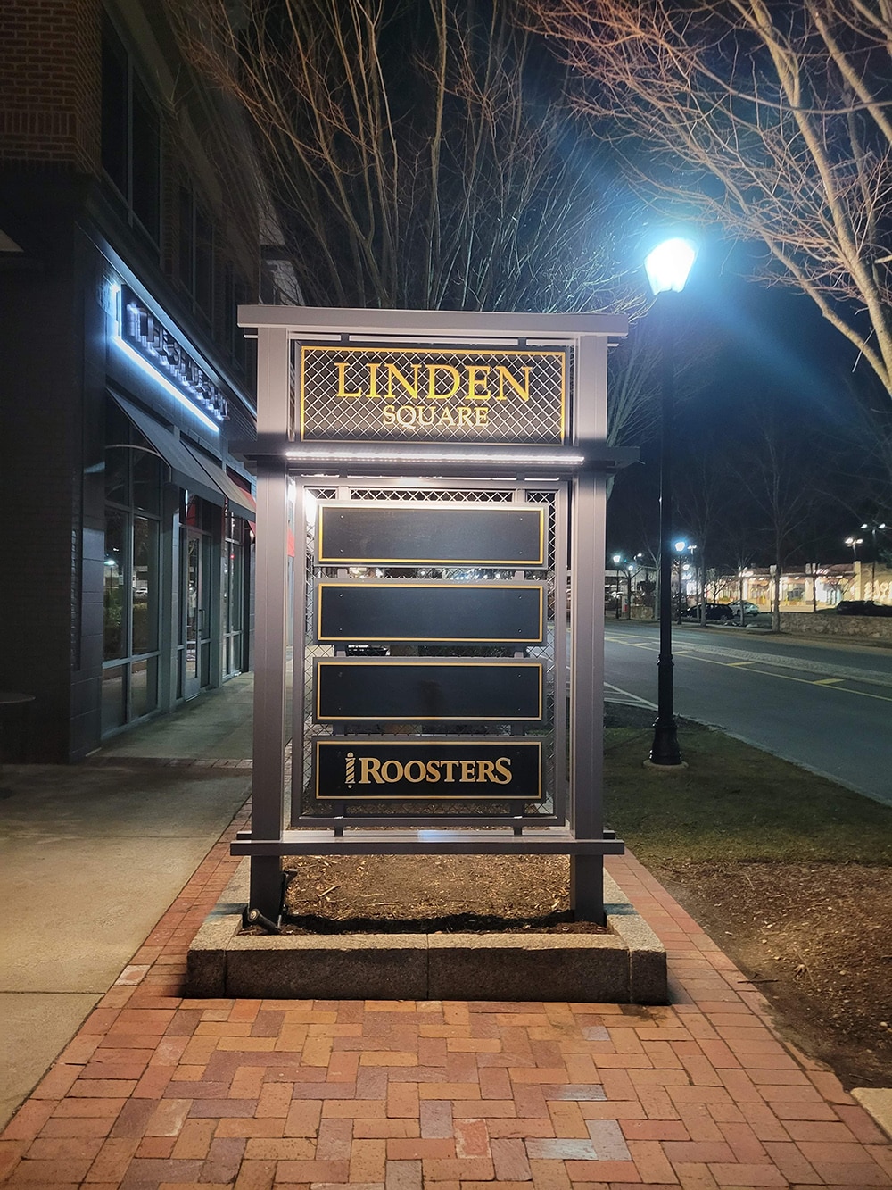
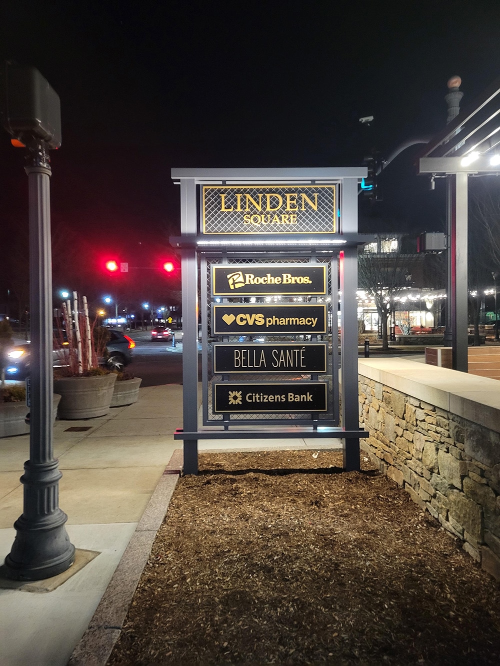
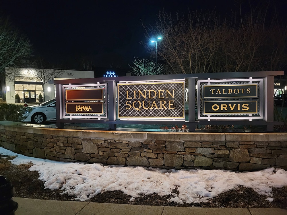
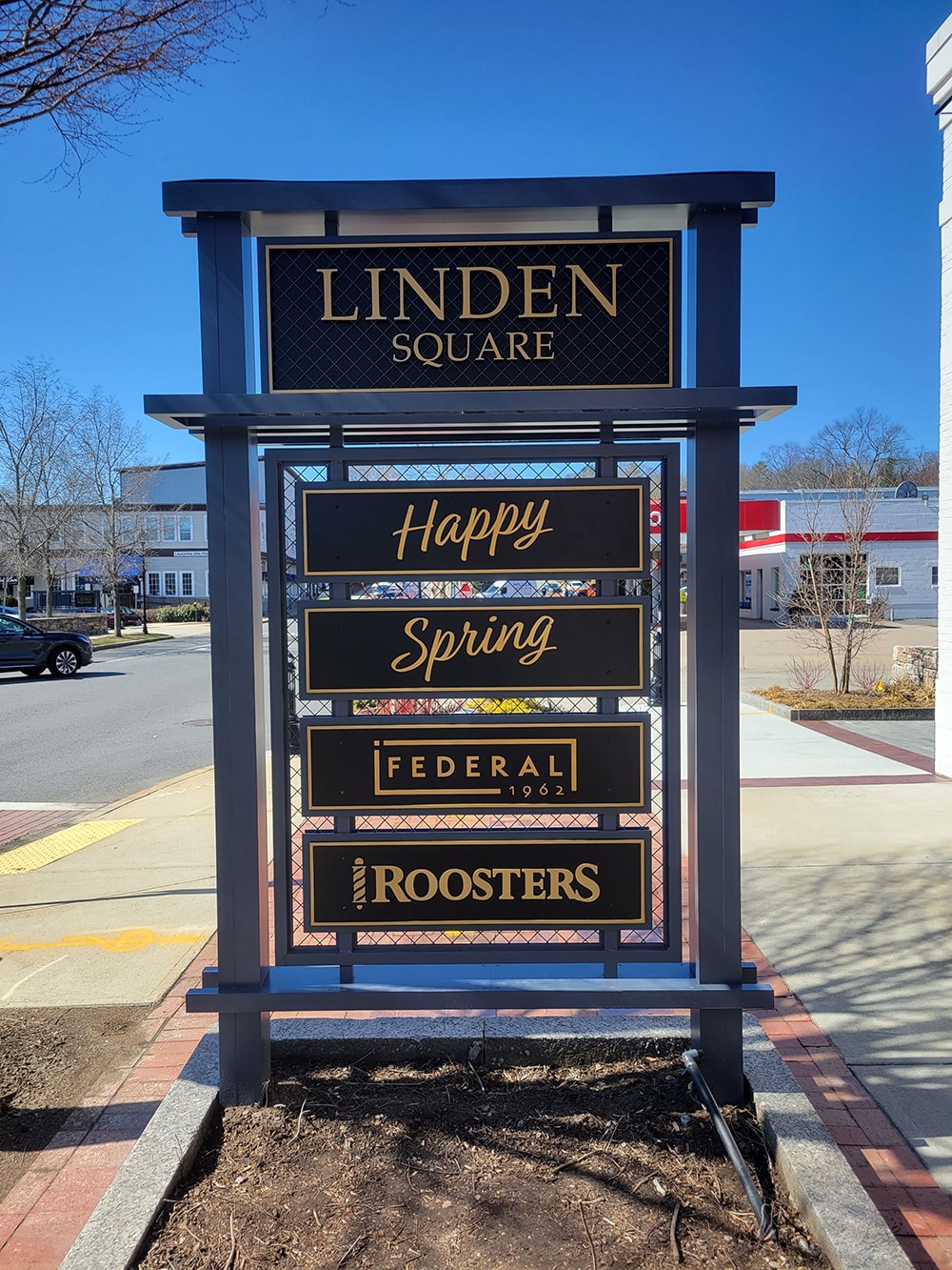
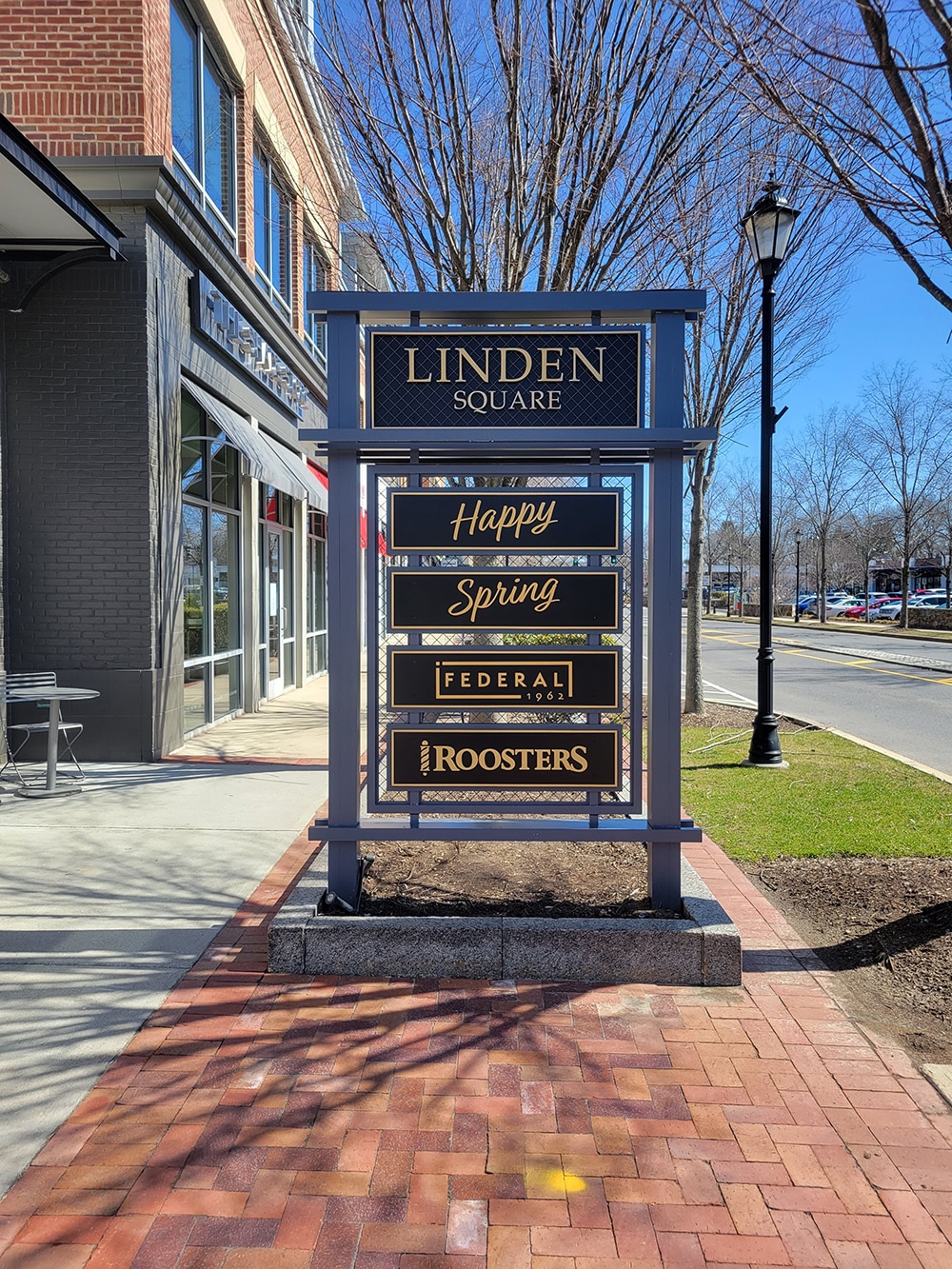
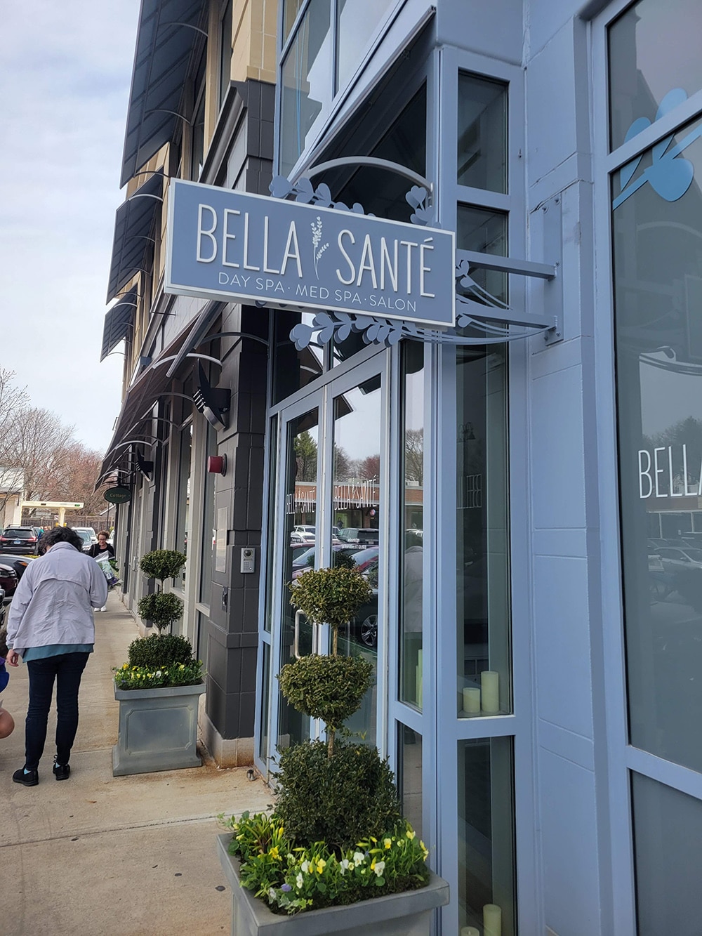
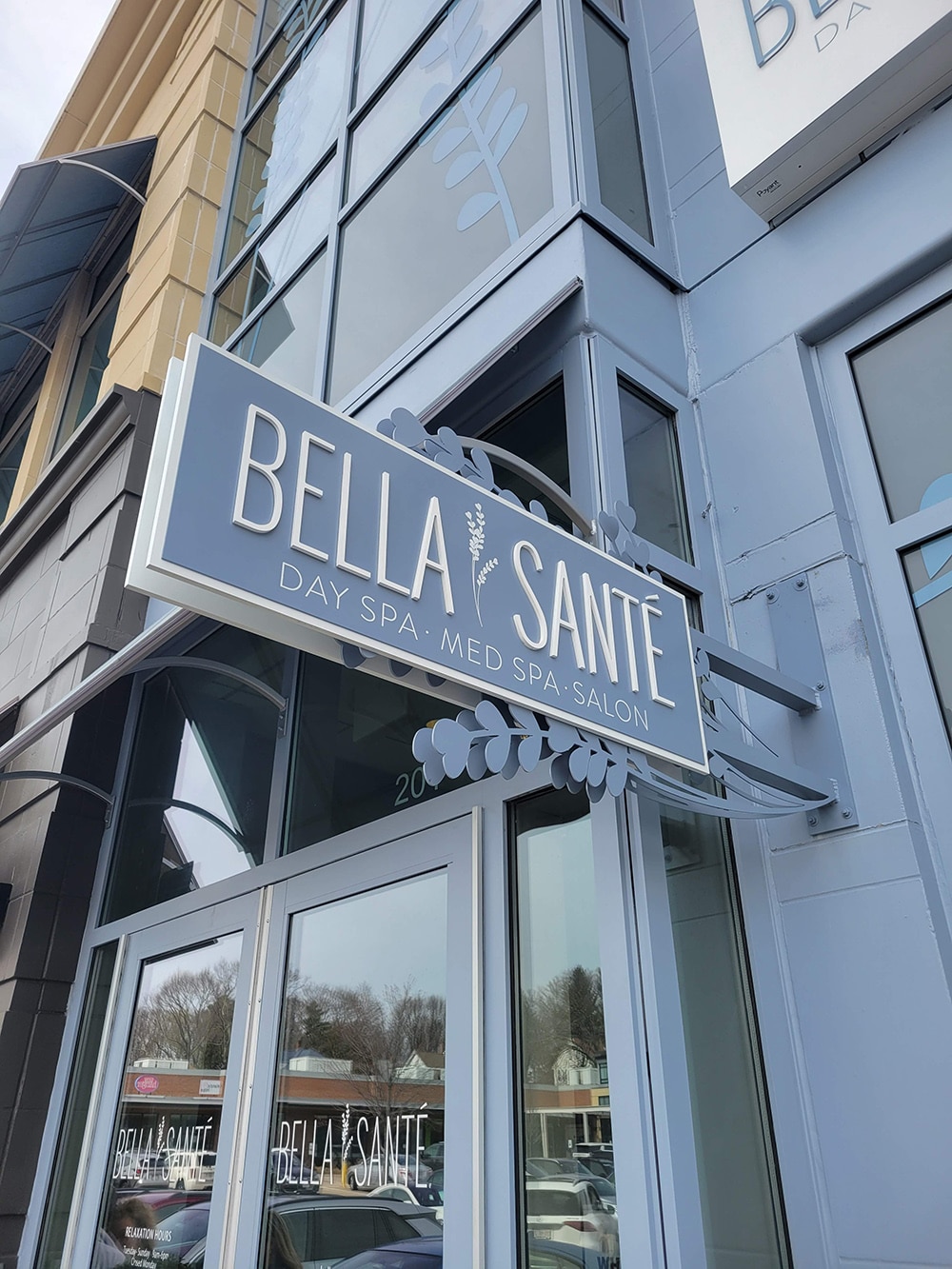
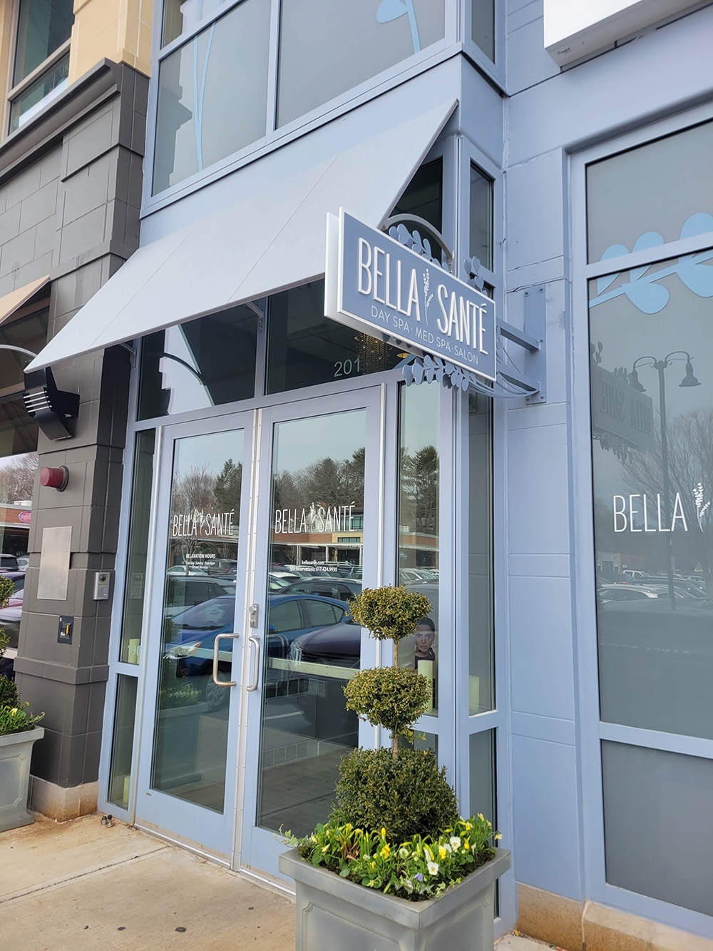
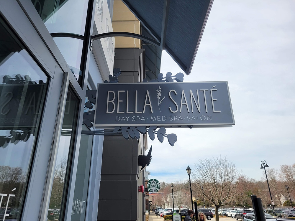
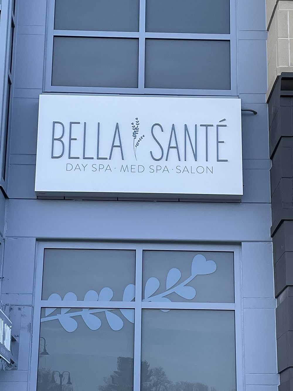
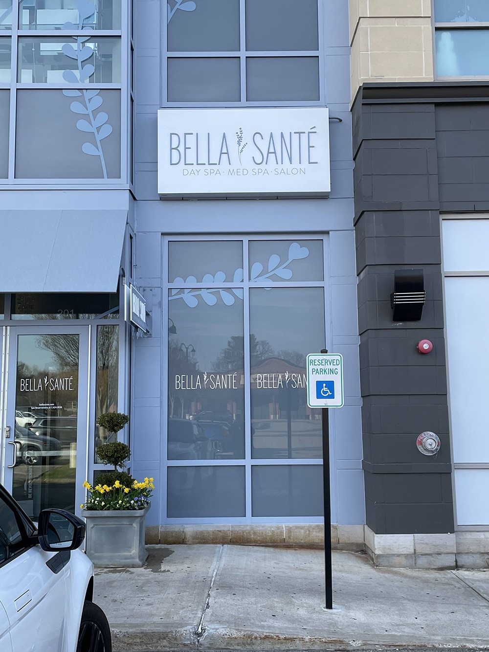
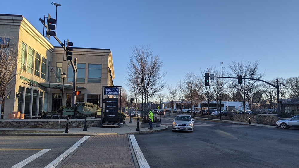
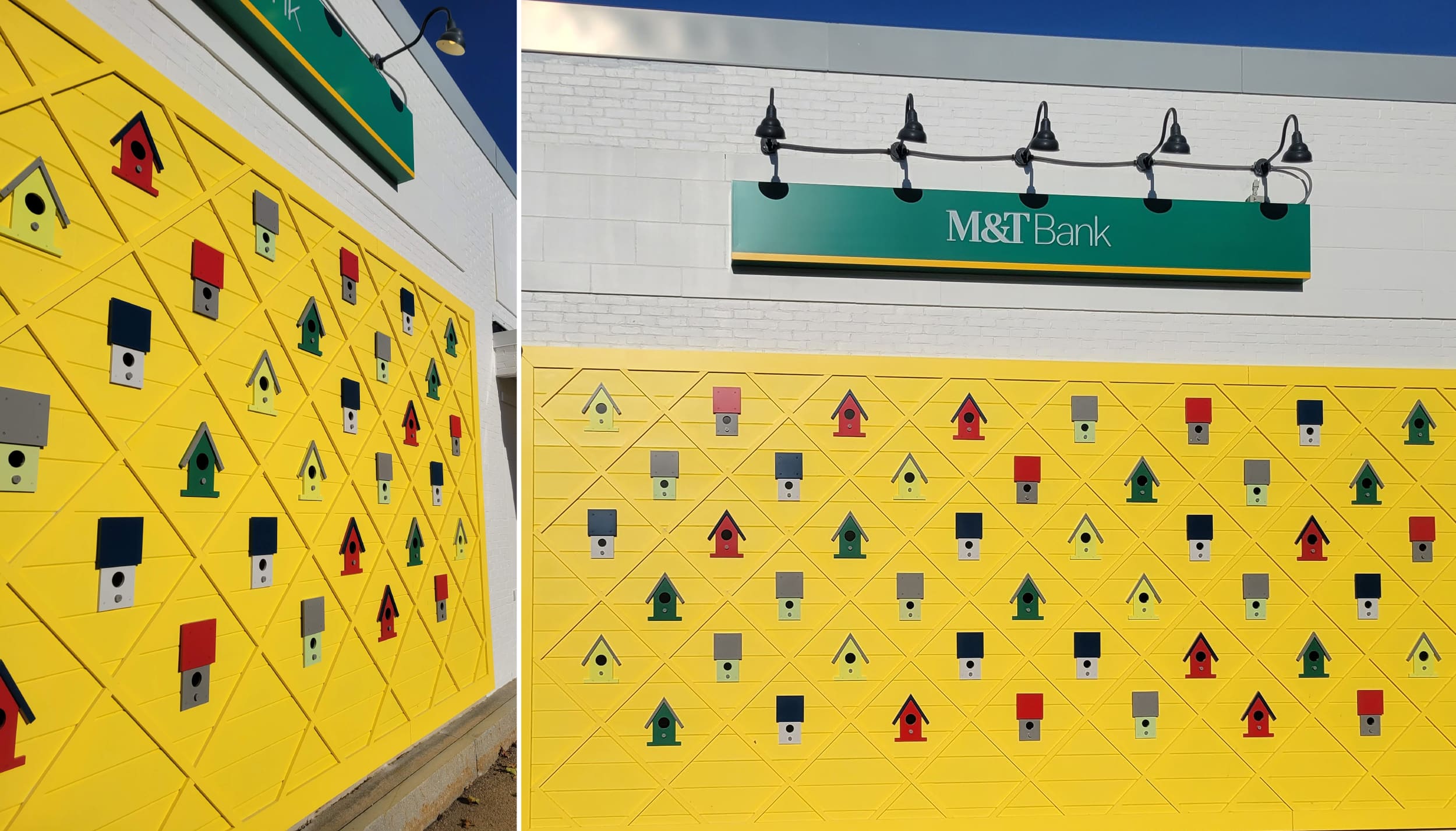 Poyant completed branding work on Linden Square, a 250,000-sq.-ft. shopping, dining and lifestyle destination center that includes a total of 24 signs, ranging from identity and wayfinding to murals.
WOW FACTOR
Visual branding company Poyant (New Bedford, MA) considers themselves experts at building brands through design, engineering, production, installation and ongoing maintenance to enhance existing brands. And this isn’t just lip service: The team has been at it since the 1930’s, crafting signage for all sorts of industries, from corporate to institutional and from healthcare to retail.
So it’s no wonder, then, that when long-time client Federal Realty Investment Trust (North Bethesda, MD) required massive branding and EGD work on a 250,000-sq.-ft. shopping, dining and lifestyle destination center, they hired Poynant.
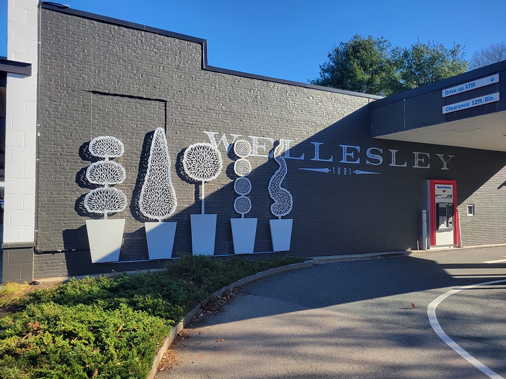
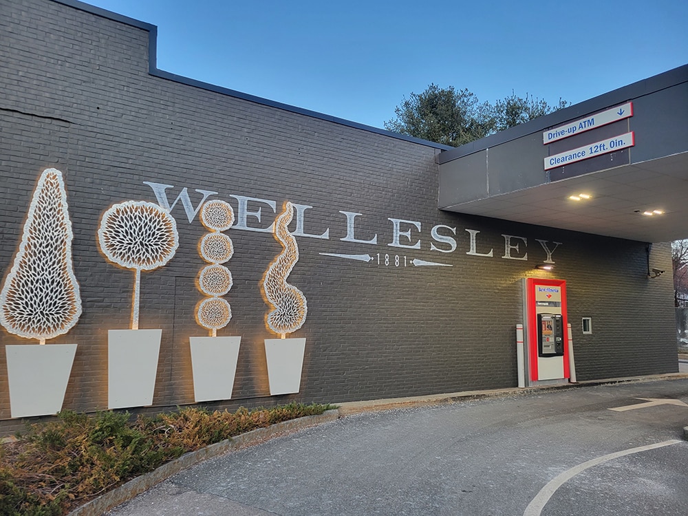
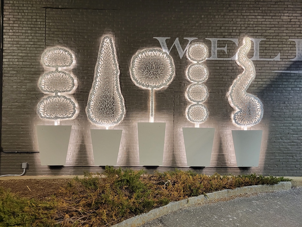
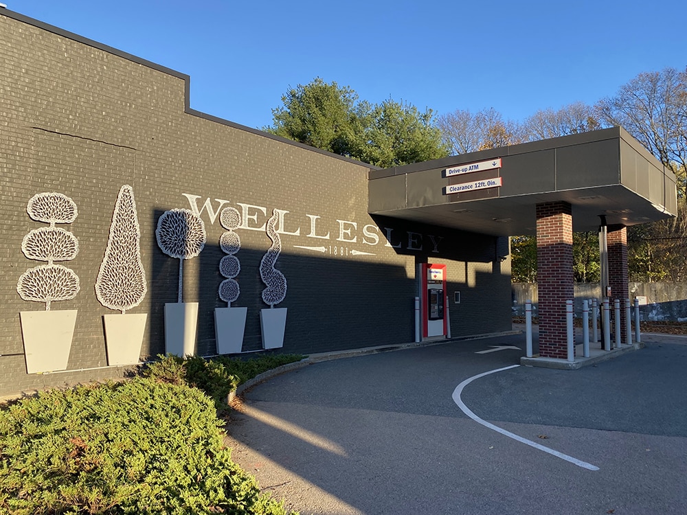
Linden Square (Wellesley, MA) offers a typical mix of stores, services and restaurants found in the suburbs meant to entertain and aid the city’s residents, family and friends — but at a much larger scale. Poyant Senior Account Executive Jason Fredette explained that the Square is a very busy urban center with high vehicle and foot traffic; therefore, adding wayfinding to guide the patrons to their destinations was integral.
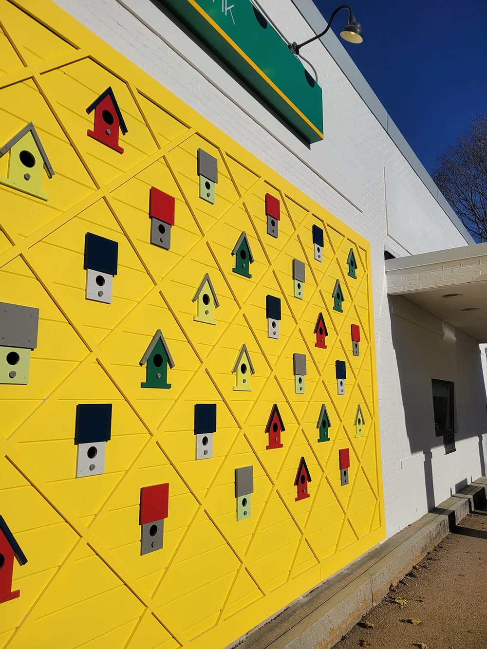
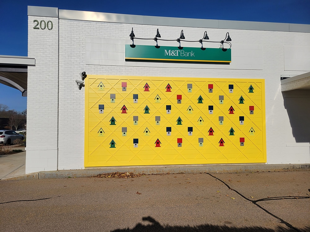
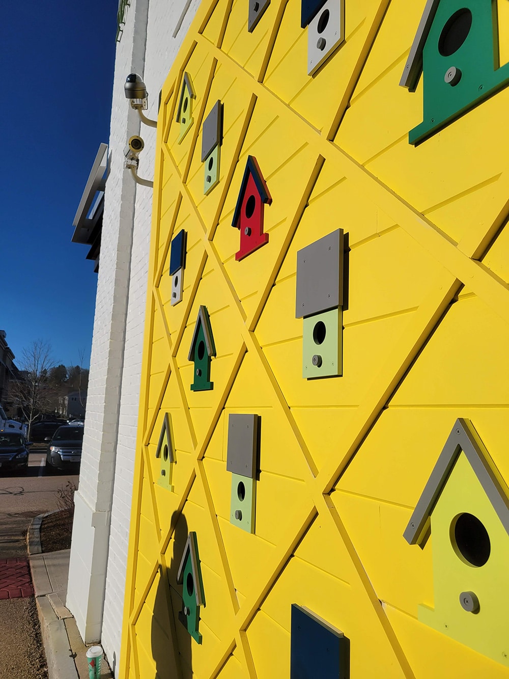
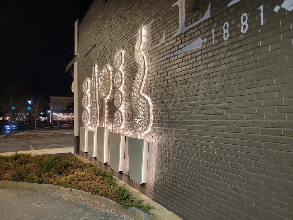
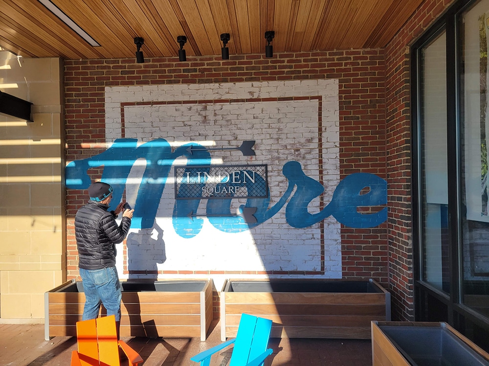
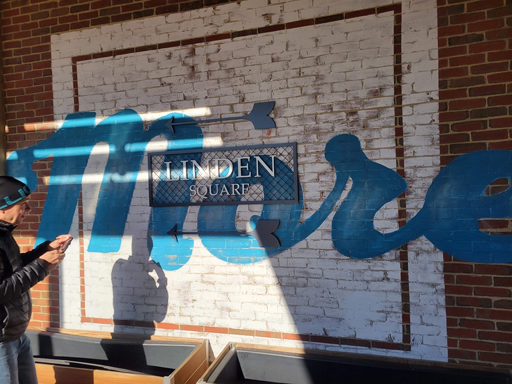
Poyant worked with Federal Realty and their designer, Brian Pearce, principal of omloop (Framingham, MA), to create solutions that reflected the designer’s intent, to the tune of 24 signs in total: six identity and wayfinding, five art walls, 10 retail signs and three murals to help people navigate the shopping destination.
Once Poyant and Pearce settled on the signage, Poyant created mockups and prototypes, helped secure sign permits, fabricated the signage, installed it and will maintain it as well.
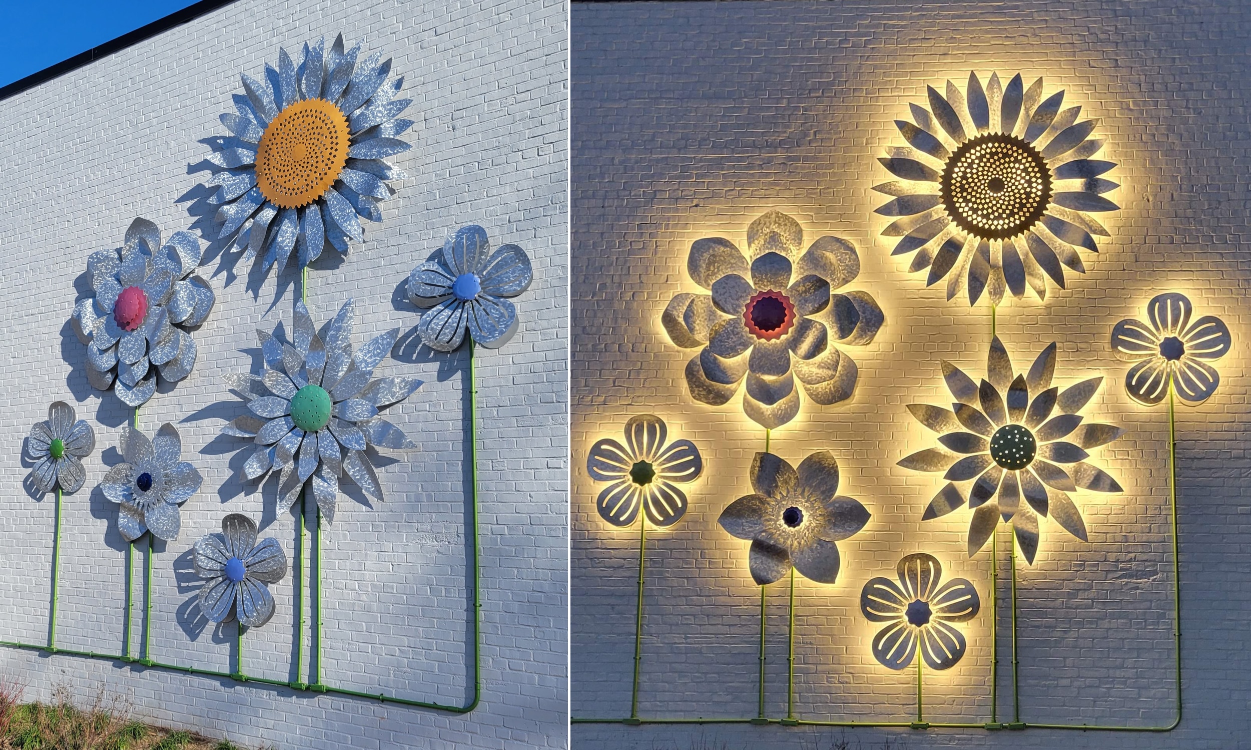
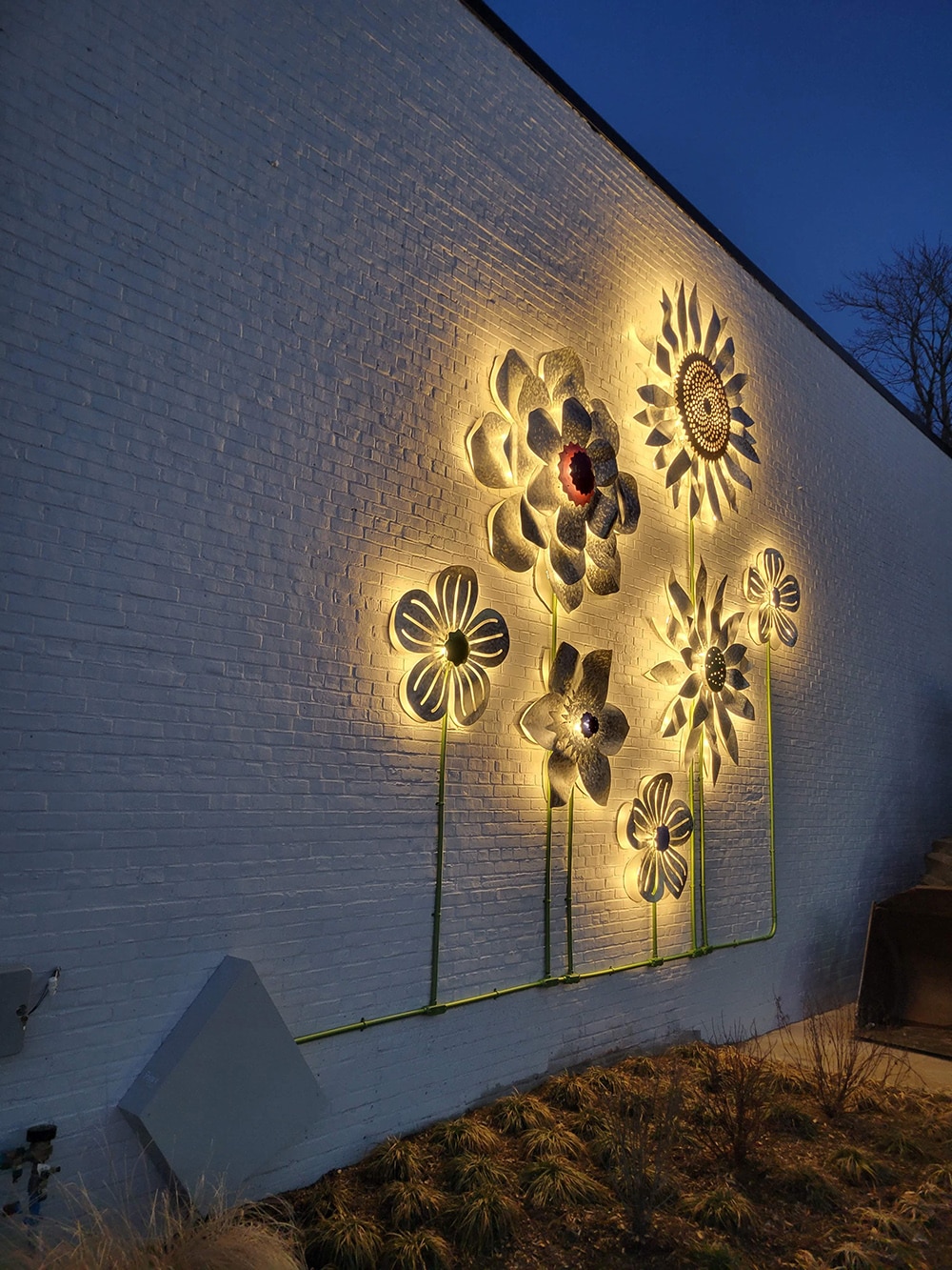
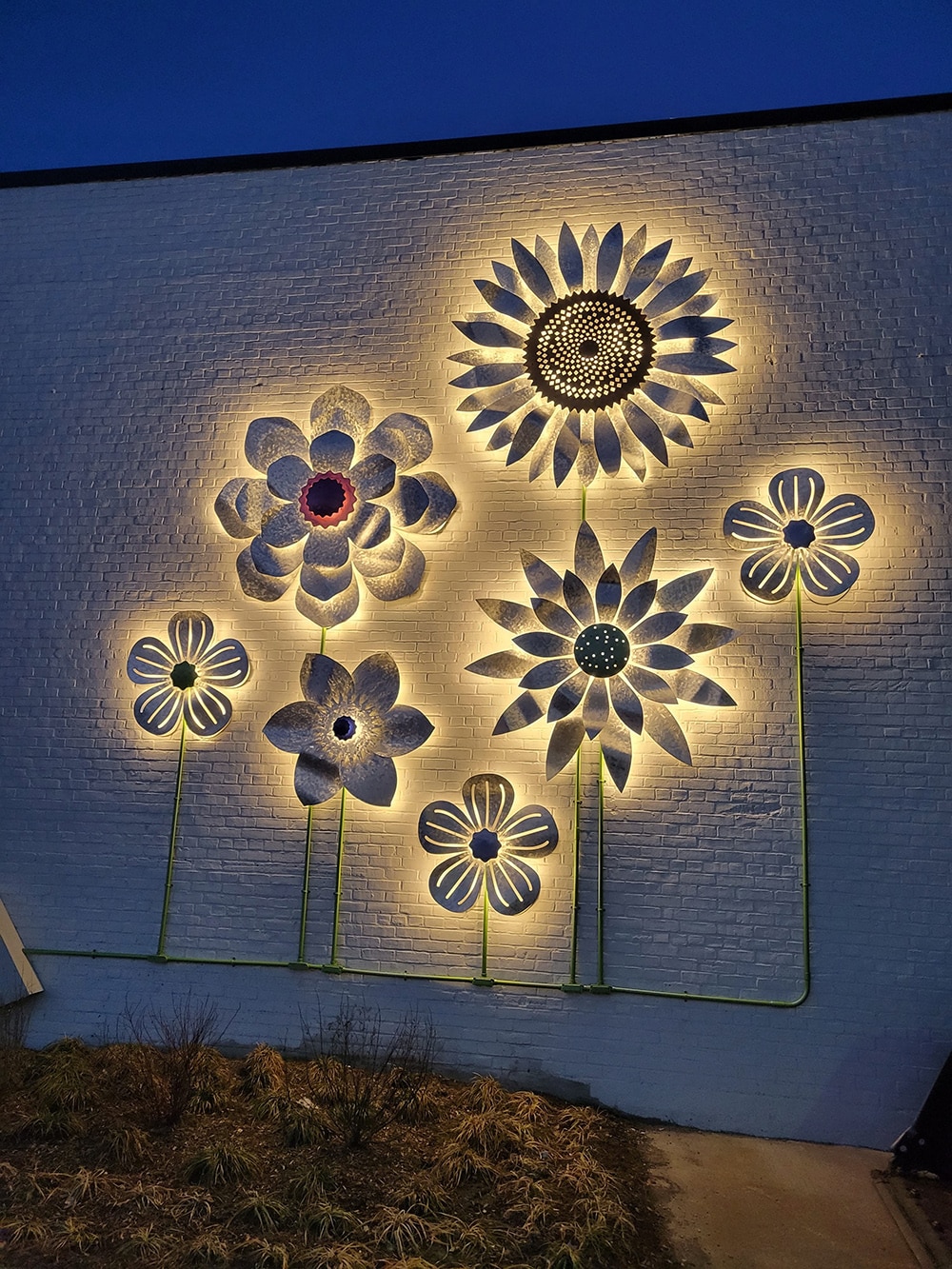
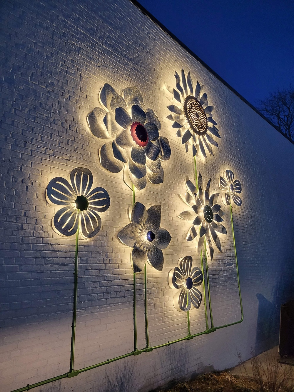
To create the double-sided, externally illuminated monument signs, Poyant removed and disposed of existing plate-mounted signs and replaced them with aluminum framing and mounting plates, wire mesh and acrylic and aluminum panels painted in shades of white, gold, black and gray.
Dimensional graphics were created using a variety of materials, such as LED-backlit aluminum flowers in bright colors; halo illuminated, aluminum dimensional graphics trees; and custom-fabricated, acrylic birdhouses in shades of blue, yellow, red, black, gray and green.
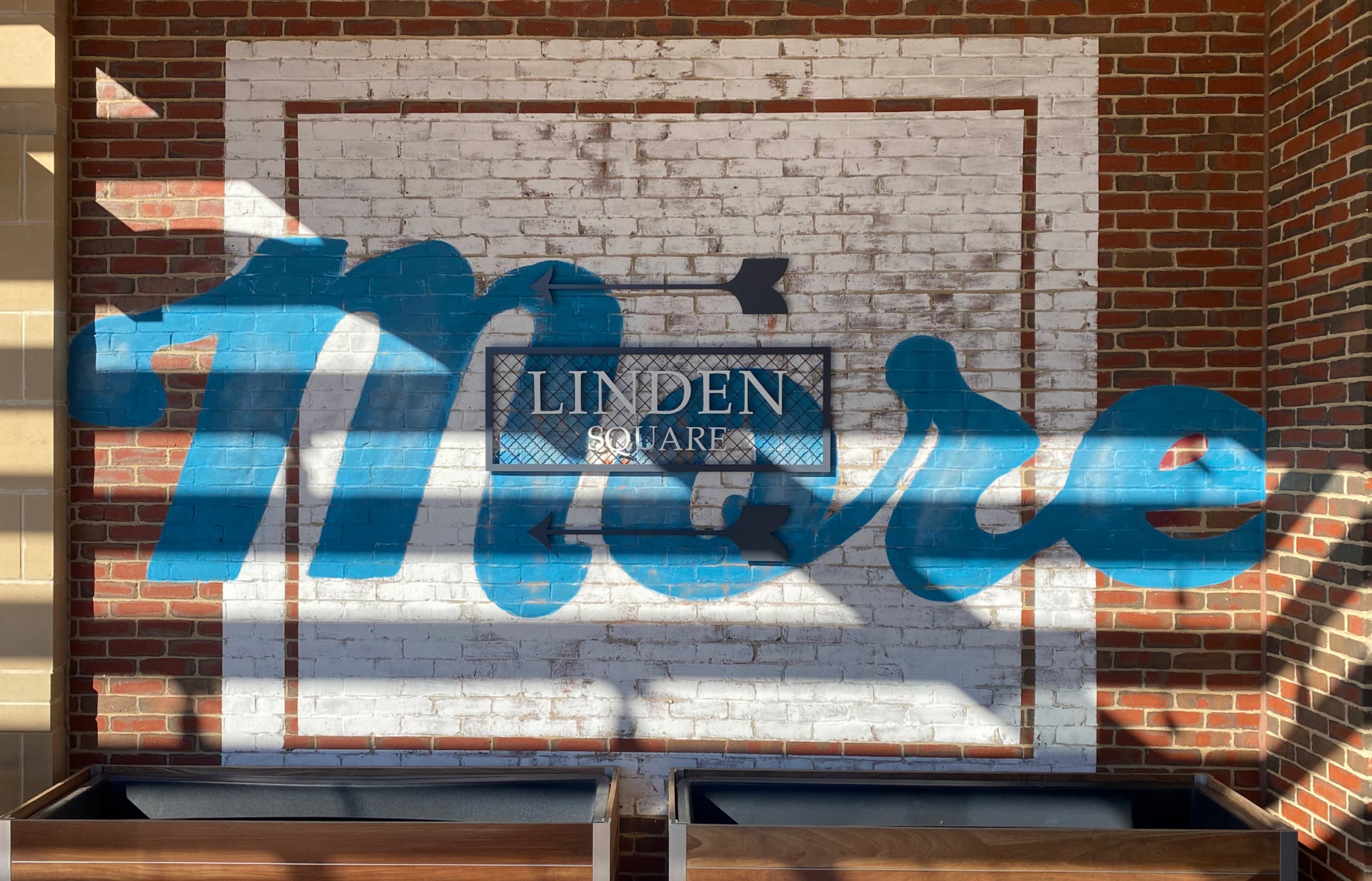
Whimsical and wayfinding wall murals were handpainted with the aid of a digital projector, and other retail signs were built to individual company specs and mounted on wire mesh.
Although Linden Square had a unique set of EGD challenges, Fredette says that’s why clients choose Poynant. “We deliver the wow [clients] are looking for in a cost-effective manner, [by] being able to develop highly custom and unique solutions that create a tangible product from the design intent of the client team,” he says.
How to Incorporate Client Feedback. Experts Offer Their Top Tips:
Incorporating client feedback can be… tricky to say the least. For tips on how to tackle the good or workable ideas tactfully and thoughtfully (without sacrificing the overall vision), here’s more advice from our sign experts.
- Beth Rosa, ArtWorks
My tip would be to take the unforeseen circumstances that may initially seem catastrophic to the design with grace and fluidity — and to see them as a design challenge to dream up something even more exceptional. - Jason Fredette, Poyant
[Strive for] open, honest communication on what is possible within the time constraints and budget. Inform the client of changes to schedule, budget or design and how the three interplay on delivery and execution. - Joe Wilush, Moss
Always keep the design firms’ and clients’ “design intent” in mind. This is Moss’ north star while working through projects and is considered throughout our entire technical design, fabrication and installation phases.
TRIPLE THREAT
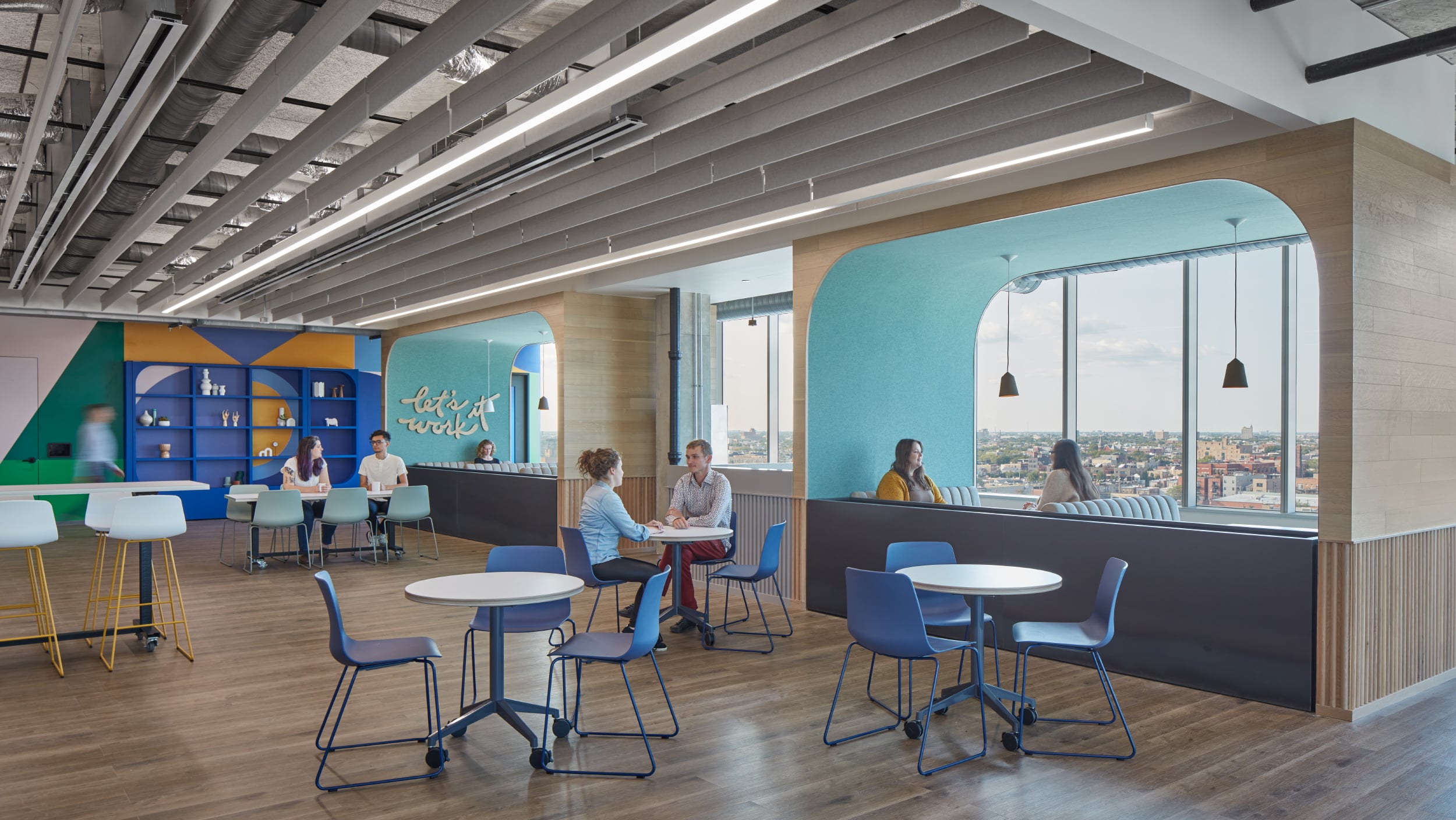
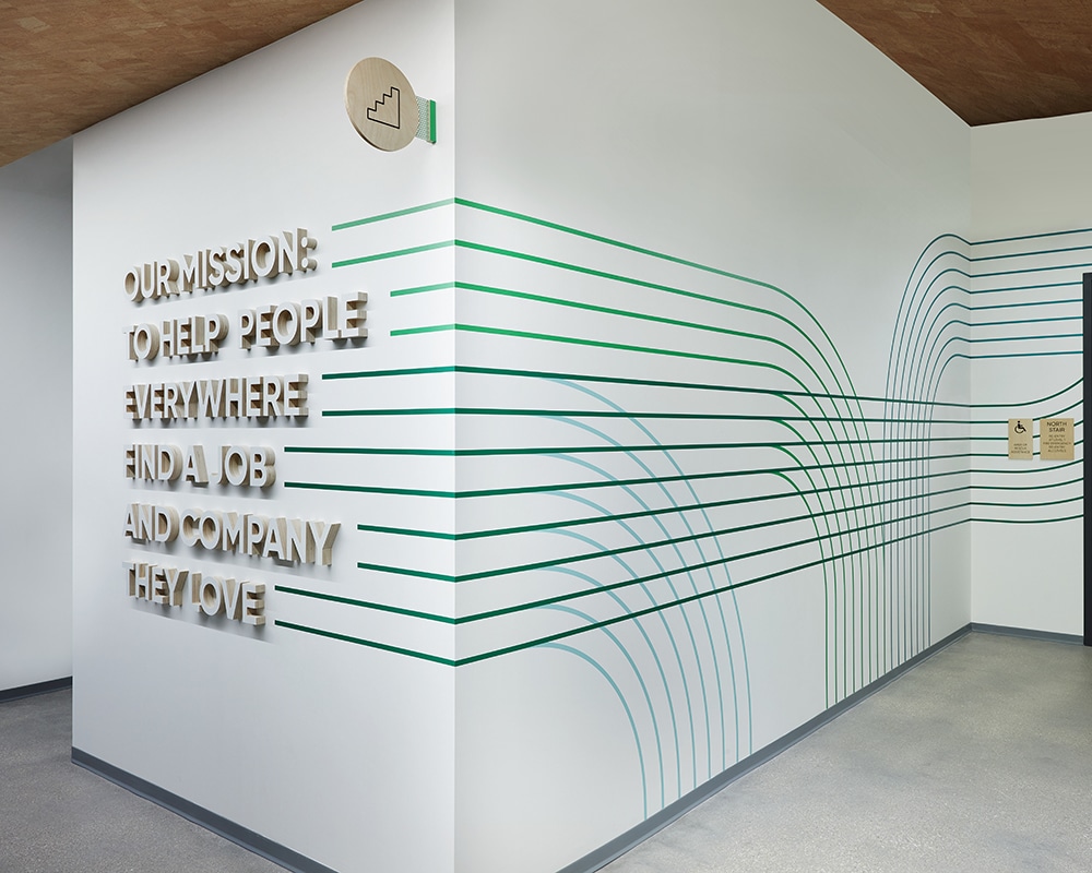
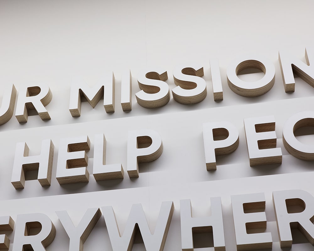
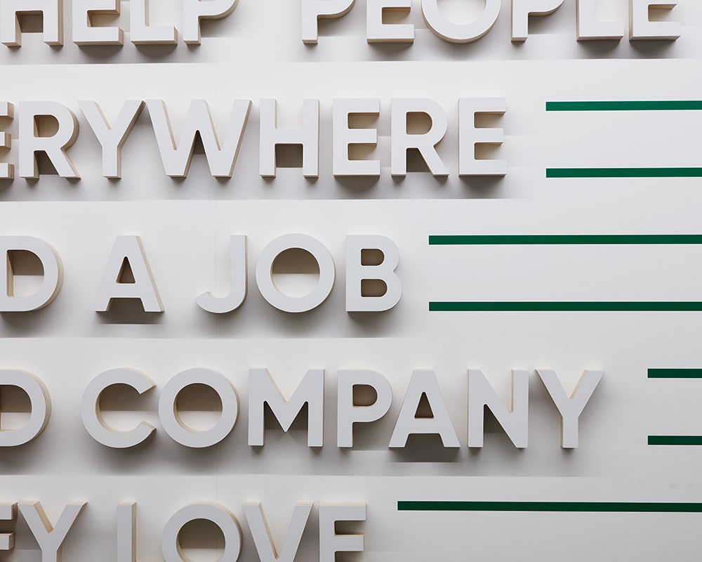
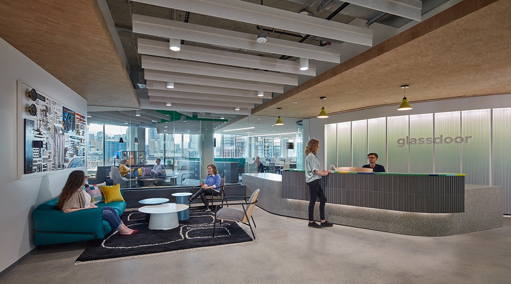
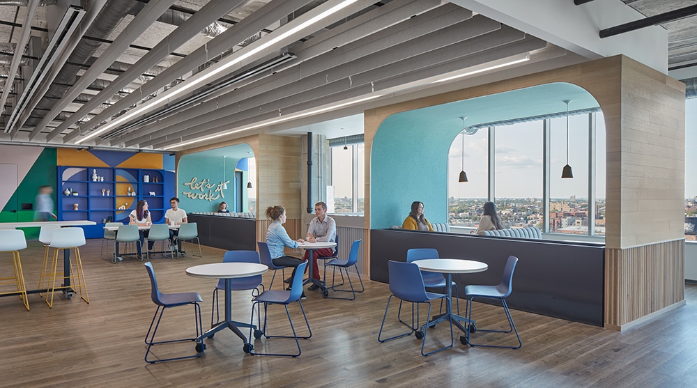
Glassdoor’s (Chicago) motto is “You deserve a job that loves you back.” How apropos, then, that in choosing a branded environments partner, they’d choose Moss Inc. (Franklin Park, IL), a company that believes “delivering exceptional value to our customers makes it possible to provide excellent returns to our employees, communities and shareholders.”
It would seem to be a match made in B2B(2B?) heaven, and, according to Moss’ Strategic Account Manager Joe Wilush, it was. “Through our close and effective collaboration with [Glassdoor] and designer Media-Objectives (Chicago), [we] fabricated an inviting space through cohesive, colorful environmental graphics and signage that were consistent with the brand’s vibrant branding and messaging [that] gives the space a brand-new look to inspire creativity and collaboration among employees.”
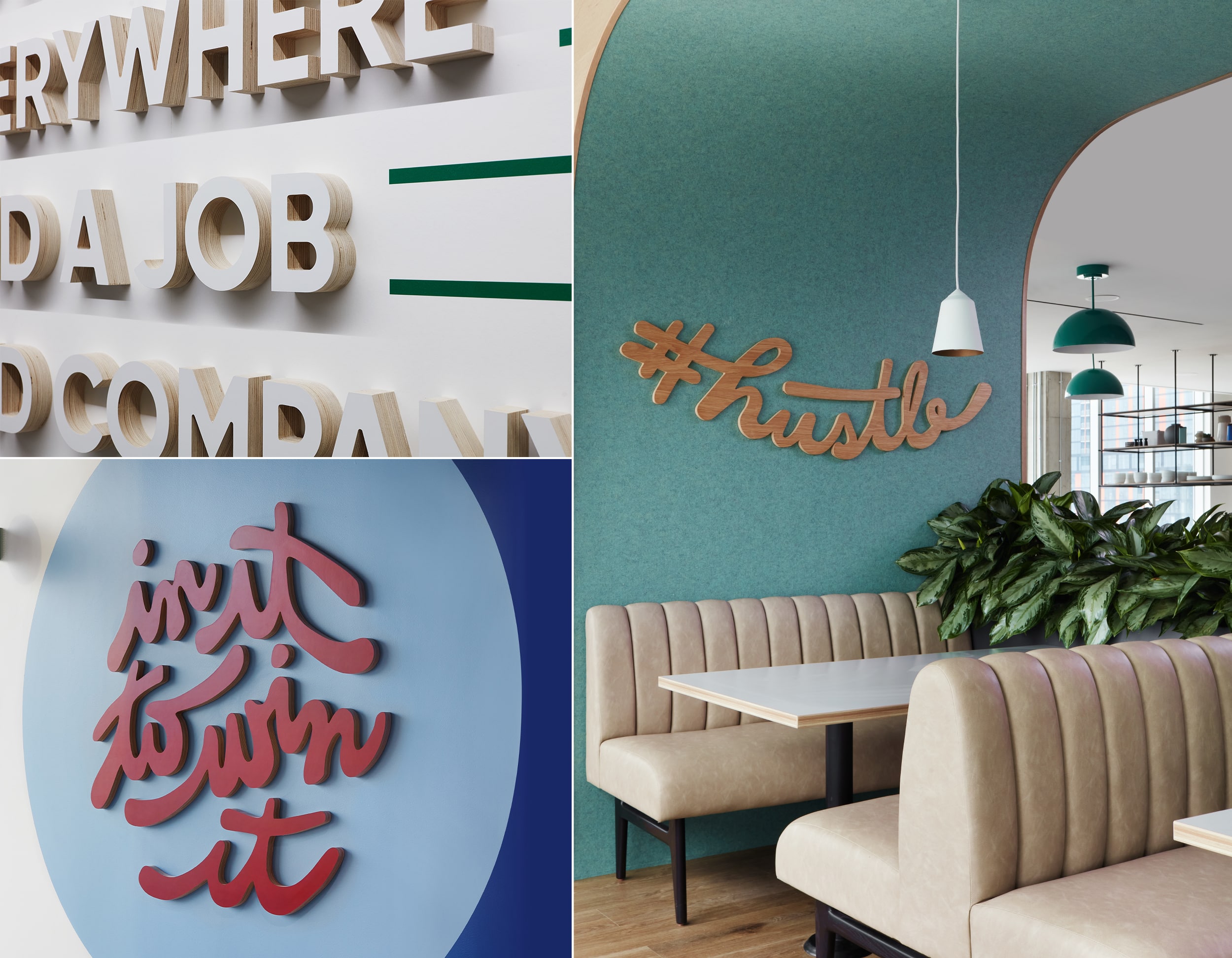
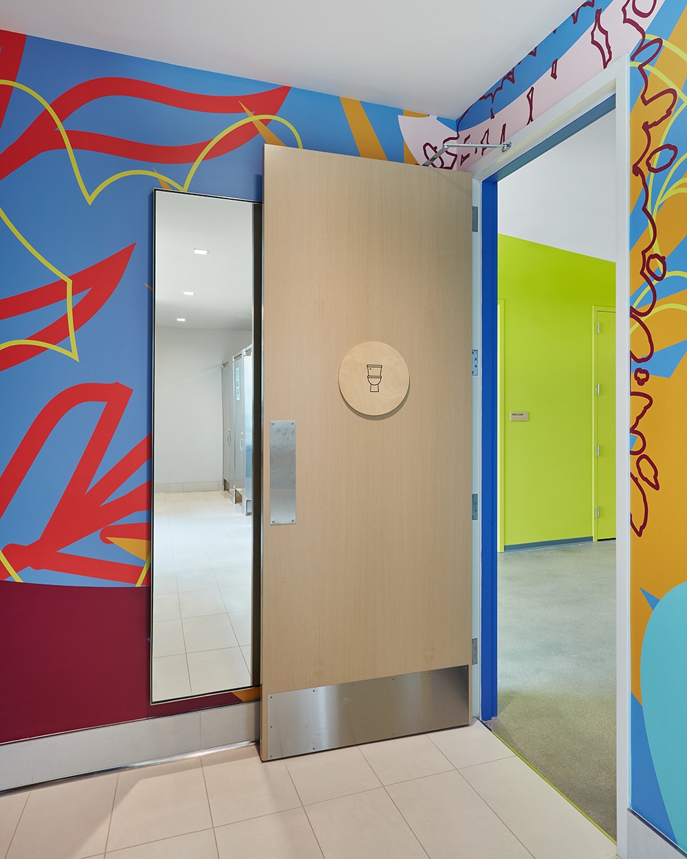
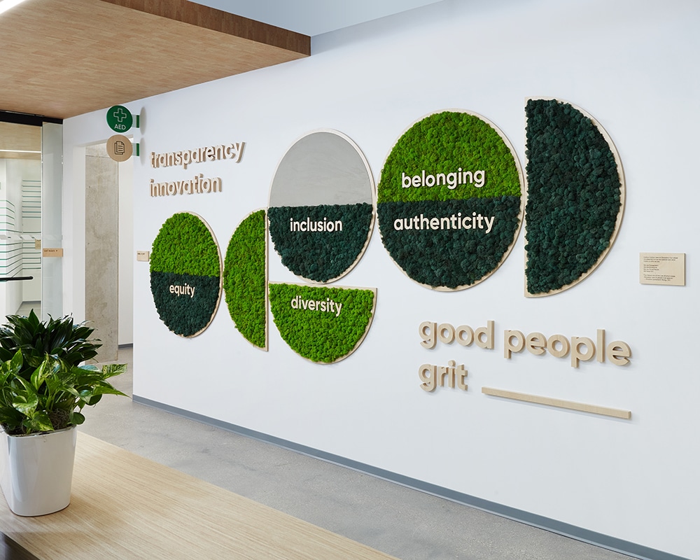
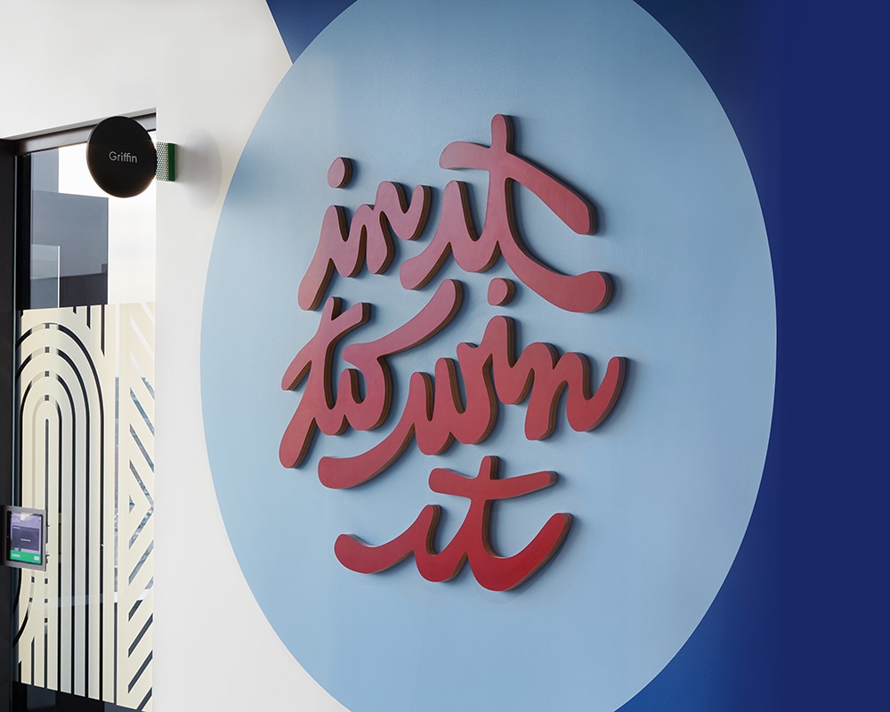
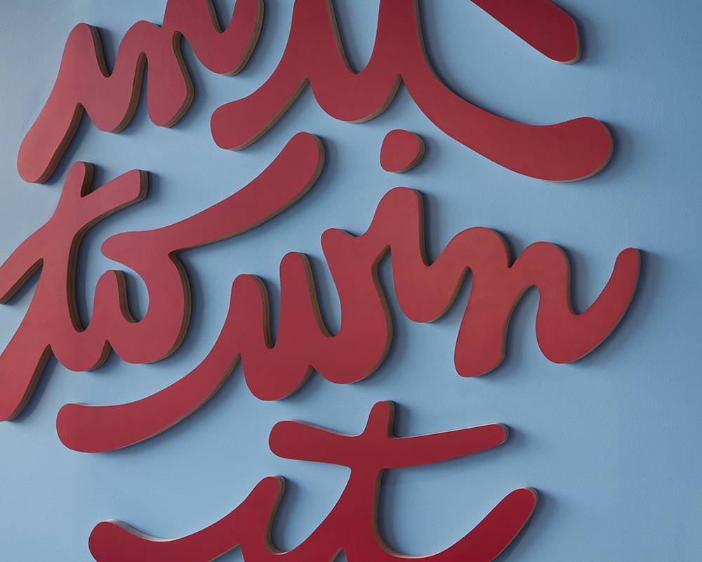
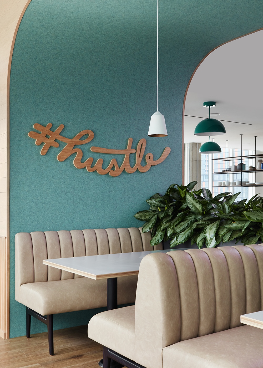
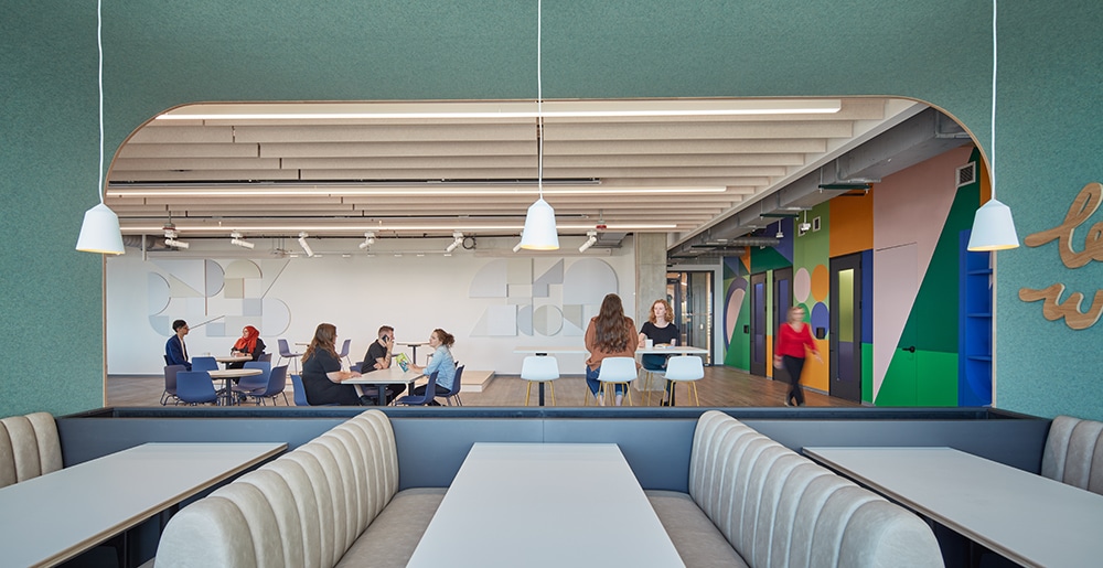
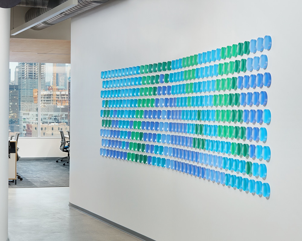
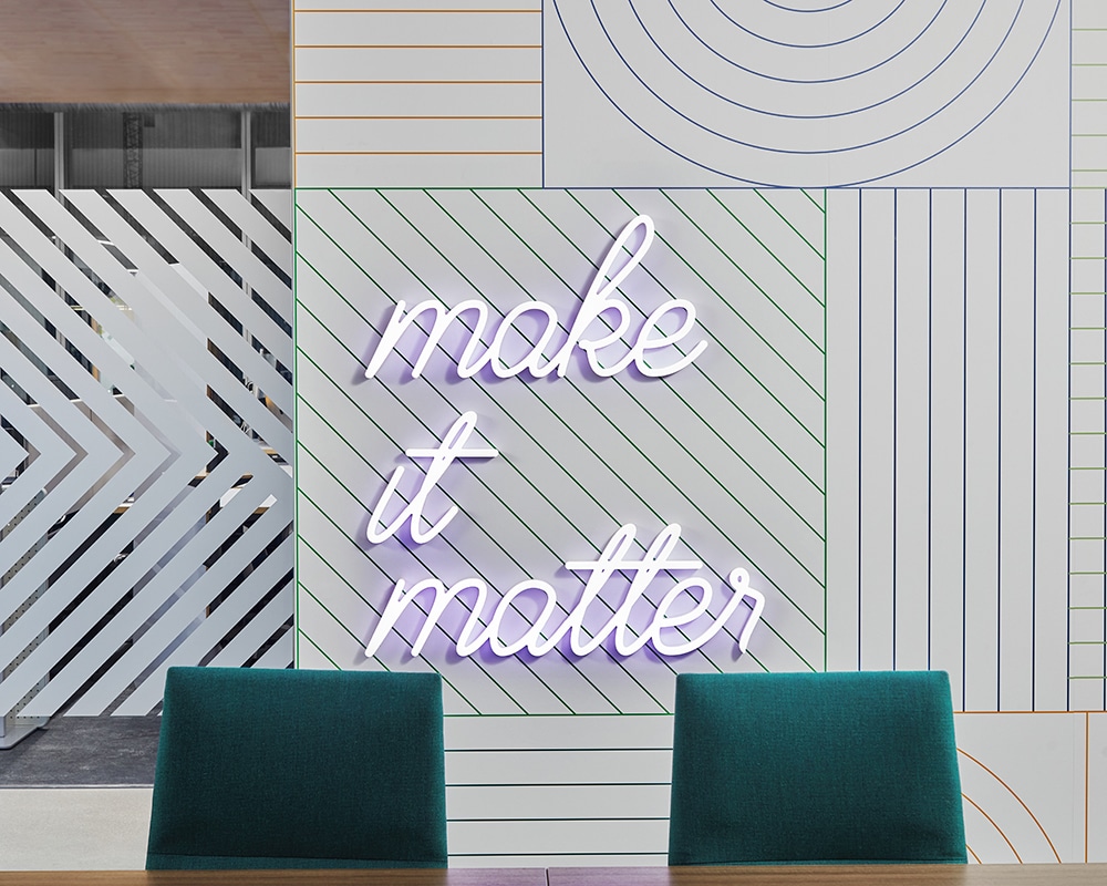
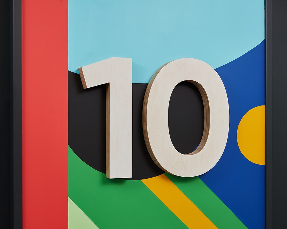
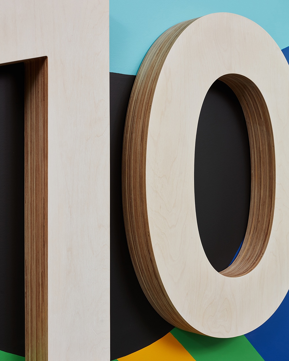
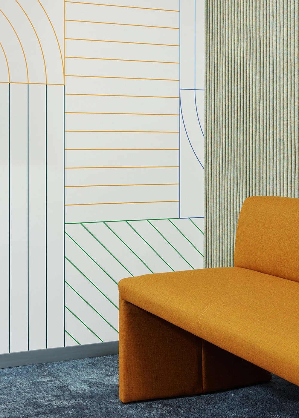
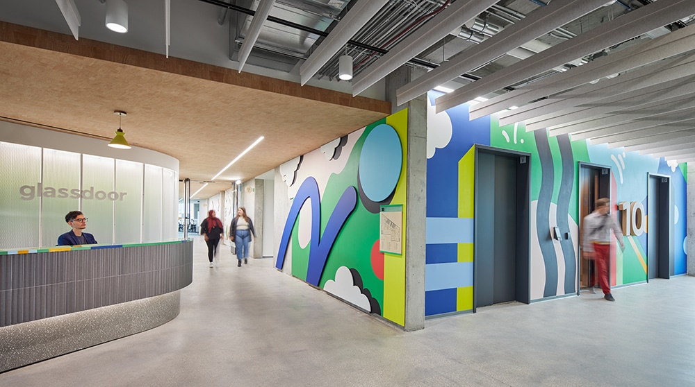
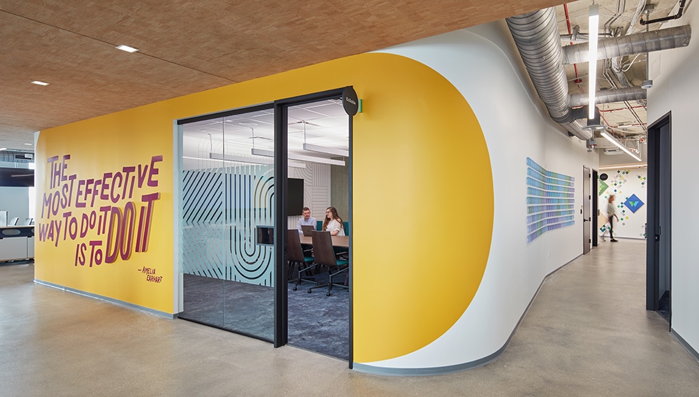
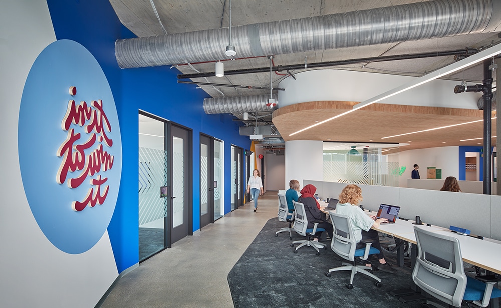
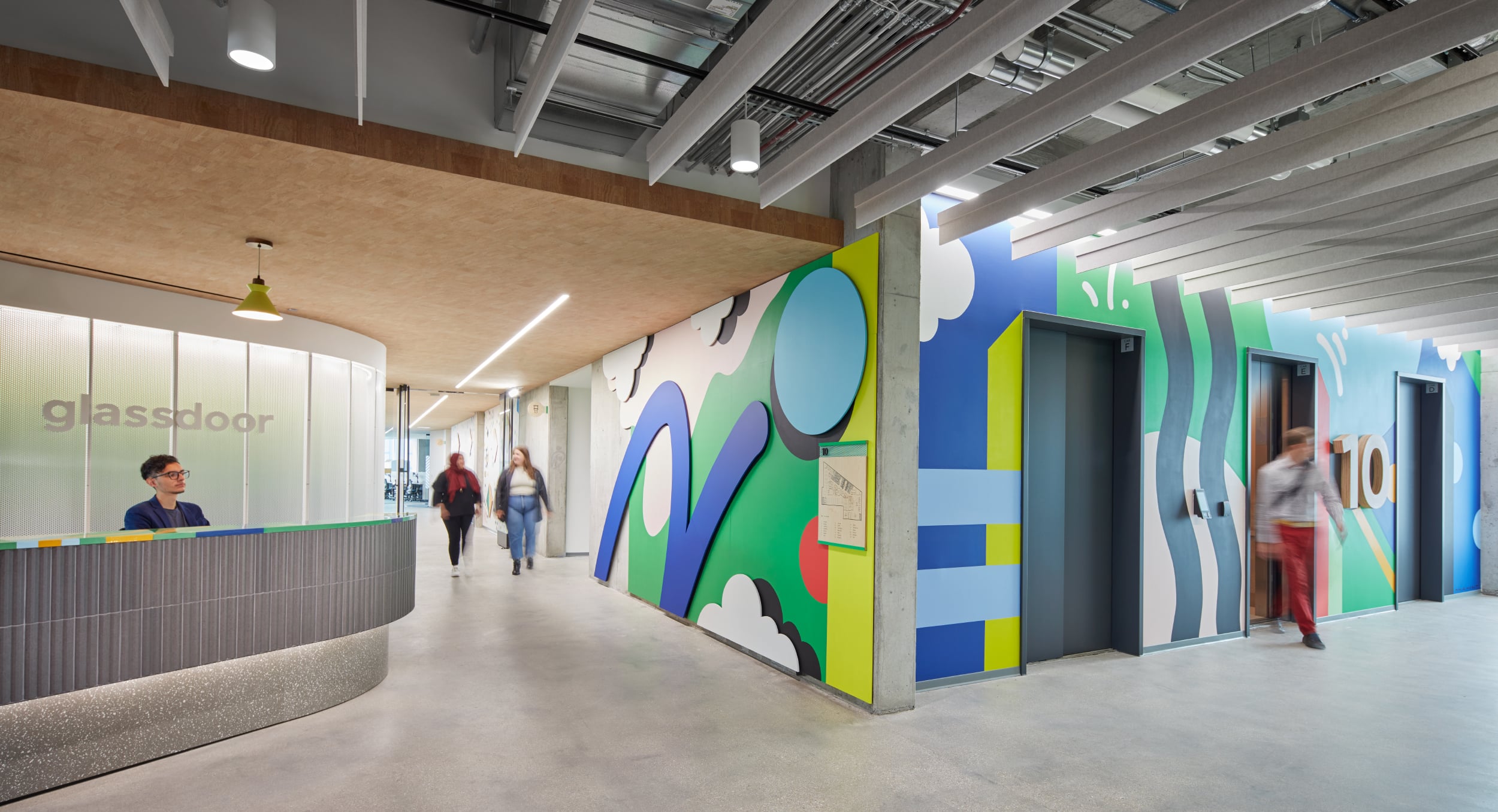 Moss, Inc. transformed the 20,711-sq.-ft. Glassdoor Chicago office by creating cohesive, colorful environmental graphics and signage in keeping with Glassdoor’s vibrant branding and messaging to give the space a brand-new look that would inspire employee creativity and collaboration. The project included wallcoverings, dimensional letters and logos, glass film, vinyl PSA on walls and custom dimensional pieces.
Wilush explains that, while Glassdoor initially approached Media-Objectives to develop the design, Media-Objectives then reached out to Moss to fabricate and execute the environmental branding of their Chicago corporate office, as the two companies had worked together on a different Glassdoor project several years ago.
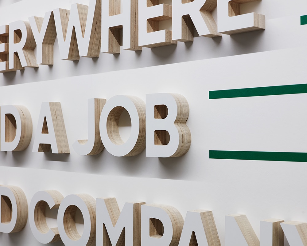
Media-Objectives supplied all artwork to Moss, who then created EGD components for the 20,711-sq.-ft. Glassdoor Chicago office including wallcoverings, dimensional letters and logos, glass film, vinyl PSA on walls and custom dimensional pieces.
Media-Objectives specified 90% of the materials, choosing wood dimensional letters (instead of acrylic) so that the raw wood look would be visible on the returns. Other materials used in the wallcoverings included vinyl, acrylic, wood, concrete, moss and store-bought frames.
Each element underwent an exhaustive solution and technical design process before being sent to Media-Objectives for approval, so that all parties were in continual agreement on materiality and build method, Wilush says.
Moss’ work in tandem with Glassdoor and Media-Objectives also helped ensure that Glassdoor’s principles and values were articulated in the environmental branding and, since Glassdoor provided a detailed budget before the project began, Moss was able to avoid project surprises and ultimately save the client money.
Most of the elements Moss installed will last 10 or more years, and Moss also offers a warranty on the production and installation.
PHOTO GALLERY (97 IMAGES)
? Art House Boston Childrens Hospital | Poyant Linden Square | Moss Glassdoor

Secrets of Lead Generation
Boost your sales by generating more leads! In this light and lively webinar featuring Maggie Harlow, CEO of Signarama Louisville Downtown (Louisville, KY) and the “Business of Signs” columnist for Signs of the Times, learn the secrets of how leads are generated, where they come from and how you can cultivate better (not just more) leads.


Bulletins
Get the most important news and business ideas from Signs of the Times magazine's news bulletin.
-

 Business Management2 weeks ago
Alternative Management Advice for Sign Companies
-
 Fabrication + Installation1 week ago
Small Signshop, Big Fabrication
-
 Paul Ingle2 days ago
120 Years of Signs, and I’ve Seen 41 (Mostly)
-
 Real Deal5 days ago
Sign Company and Customer Clash on “Minimum 2 Hours”
-
 Benchmarks2 days ago
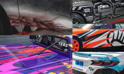
5 High-Performance Vehicle Graphics Projects
-

 Tip Sheet4 days ago
Workflow Automation, Budget Discussion and More Signshop Tips
-
 True Tales2 weeks ago
My Shirt Says “Signs”
-
 Mildred Nguyen2 weeks ago
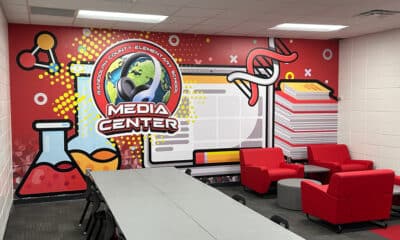
Interior Reimage Transforms Georgia School