9 Signmakers Name Their Most Unforgettable Projects
For one reason or another, these projects made memories that will last a lifetime.
EVERY SIGN COMPANY has at least one unforgettable project — whether it be a complex installation that tested a company’s skill set or meaningful signs that made an impression on a building or the community at large. Signs of the Times’ recent Brain Squad survey invited companies to share the projects that truly stand out in their portfolio. Here’s what they had to say.
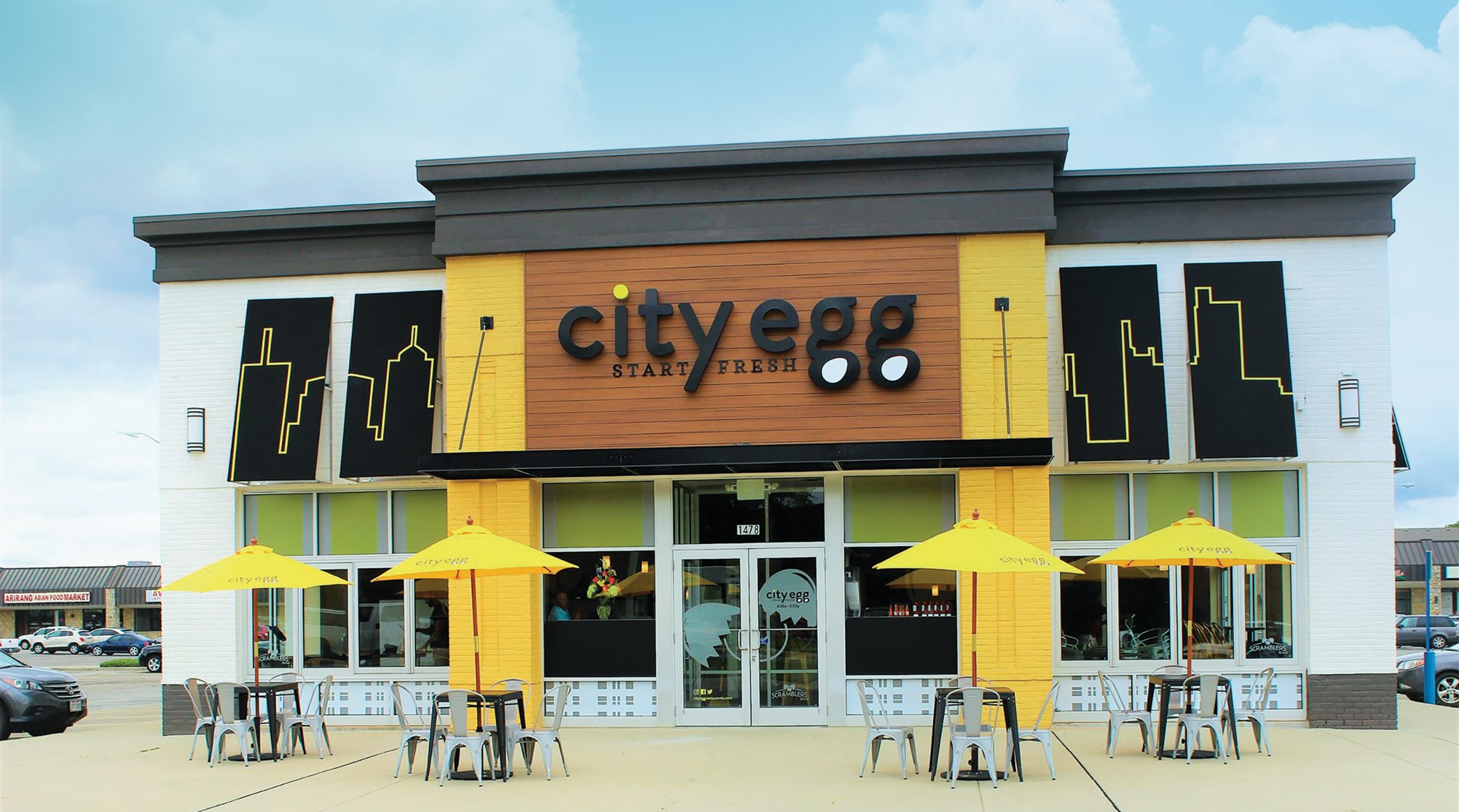
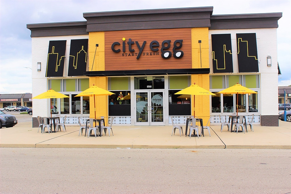
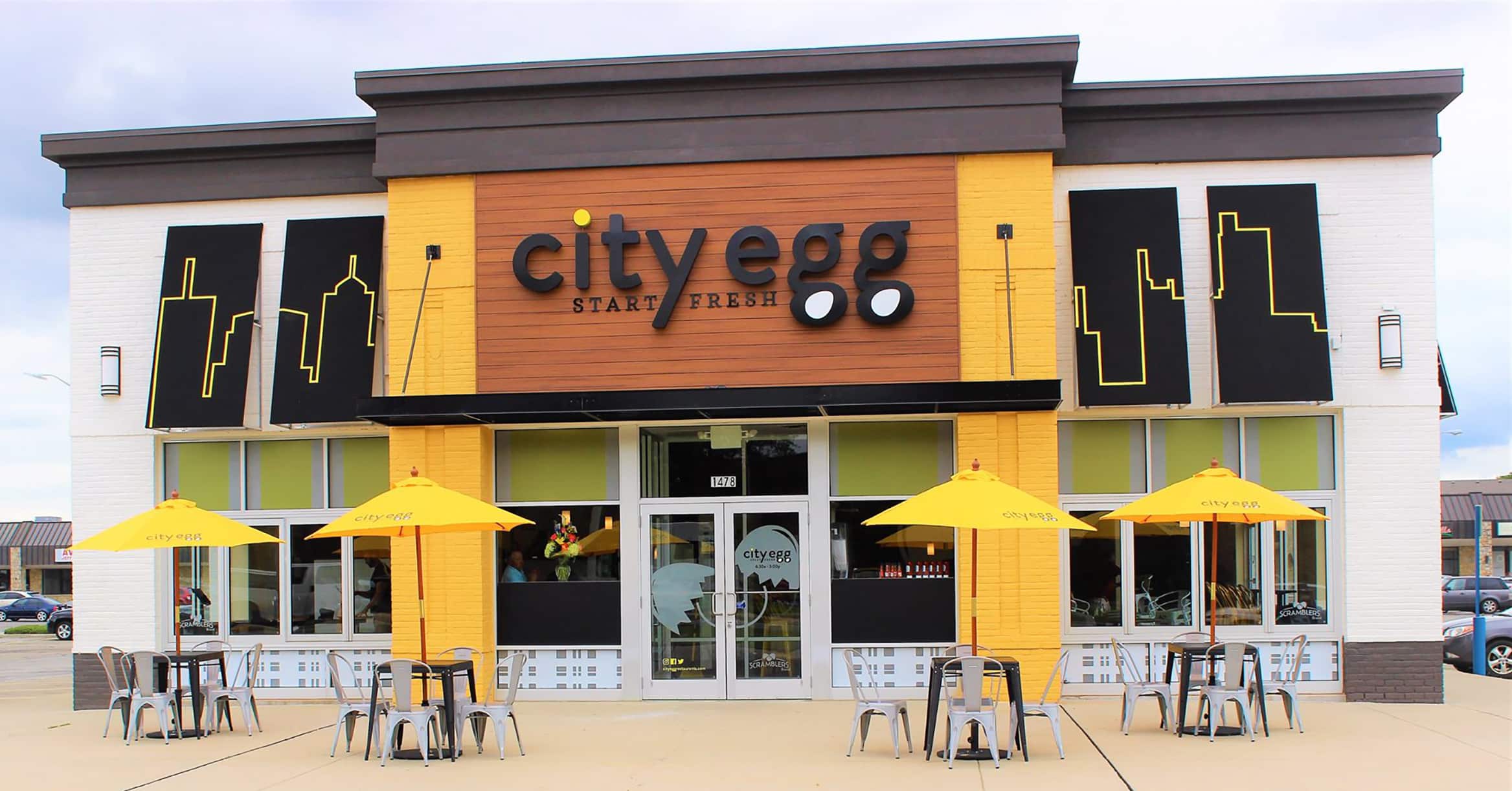 Egg-cellent: Little excites sign pros more than the chance to create an entire concept.
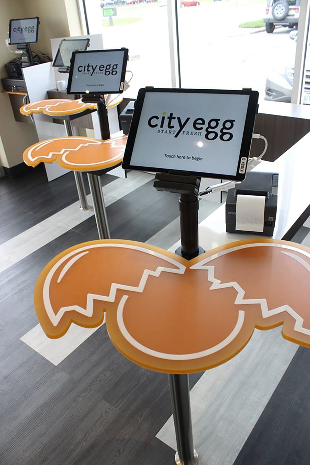
OVER EASY
Fastsigns (Toledo and Maumee, OH) Owner Karrie Brock and her team were recently tasked to create a restaurant concept from the ground up, including its name. The restaurateur, Scramblers Brands, also based in Toledo, found a prime spot in sister city Columbus, OH, to launch their flagship fast casual restaurant concept, City Egg.
“Given this was an entirely new concept, we did all the signage inside and out,” Brock says. “This included two sets of backlit flush-mount channel letters (approximately 15 x 3 ft.) and printed frost window vinyl with printed cast vinyl graphics. [For the] interior, we did 3D ½-in. acrylic, vinyl wraps, and a brick vinyl, as well as a PVC/vinyl word wall.”
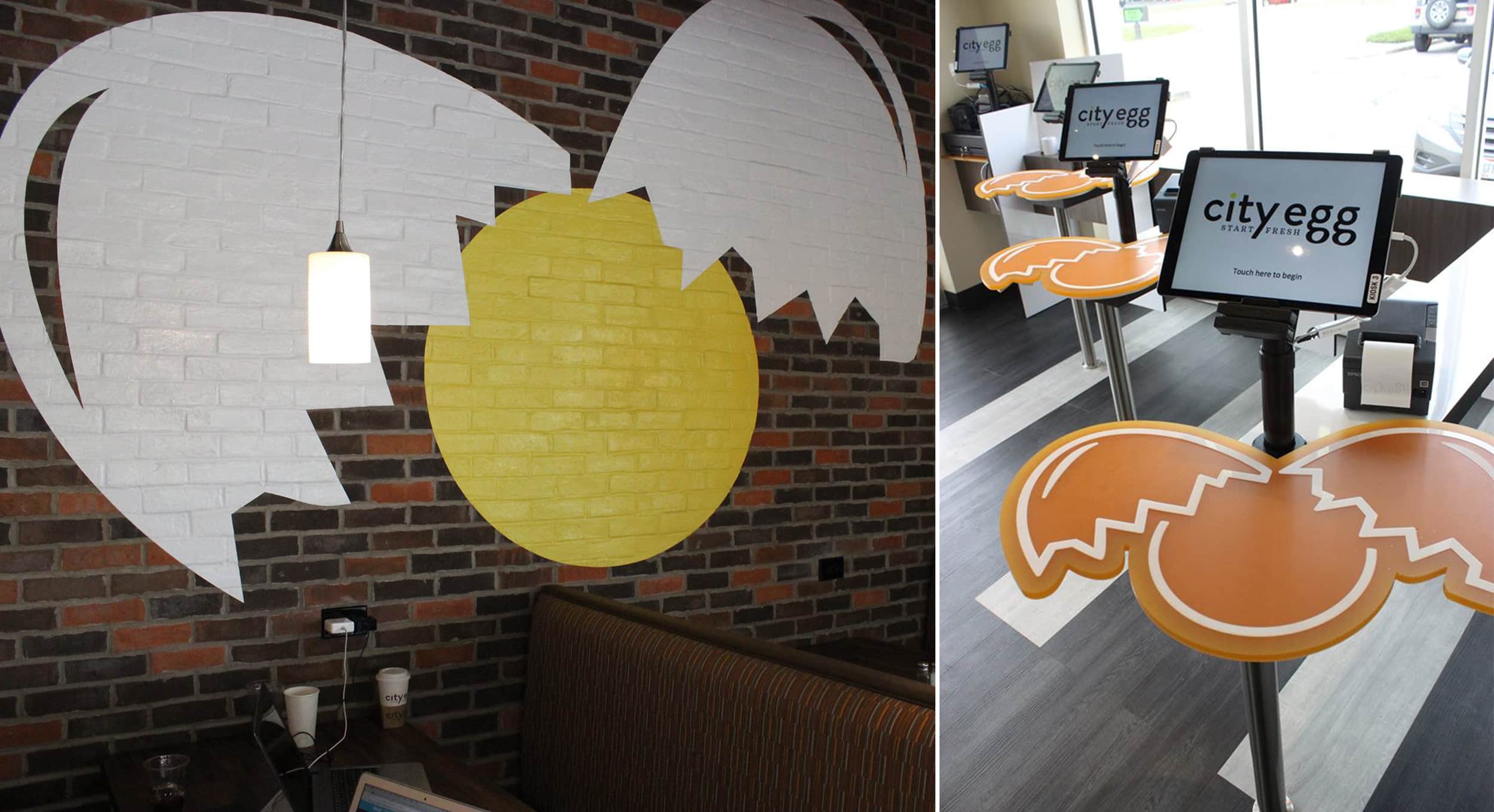
Brock says that being able to create the brand from the ground up was an amazing experience that doesn’t come around often. “The full creativity you have when you dictate the brand can develop the signature look and feel,” Brock says. “I’m an interior designer by education, so having the ability to create a space to fit the graphics makes even more of a dream come true.”
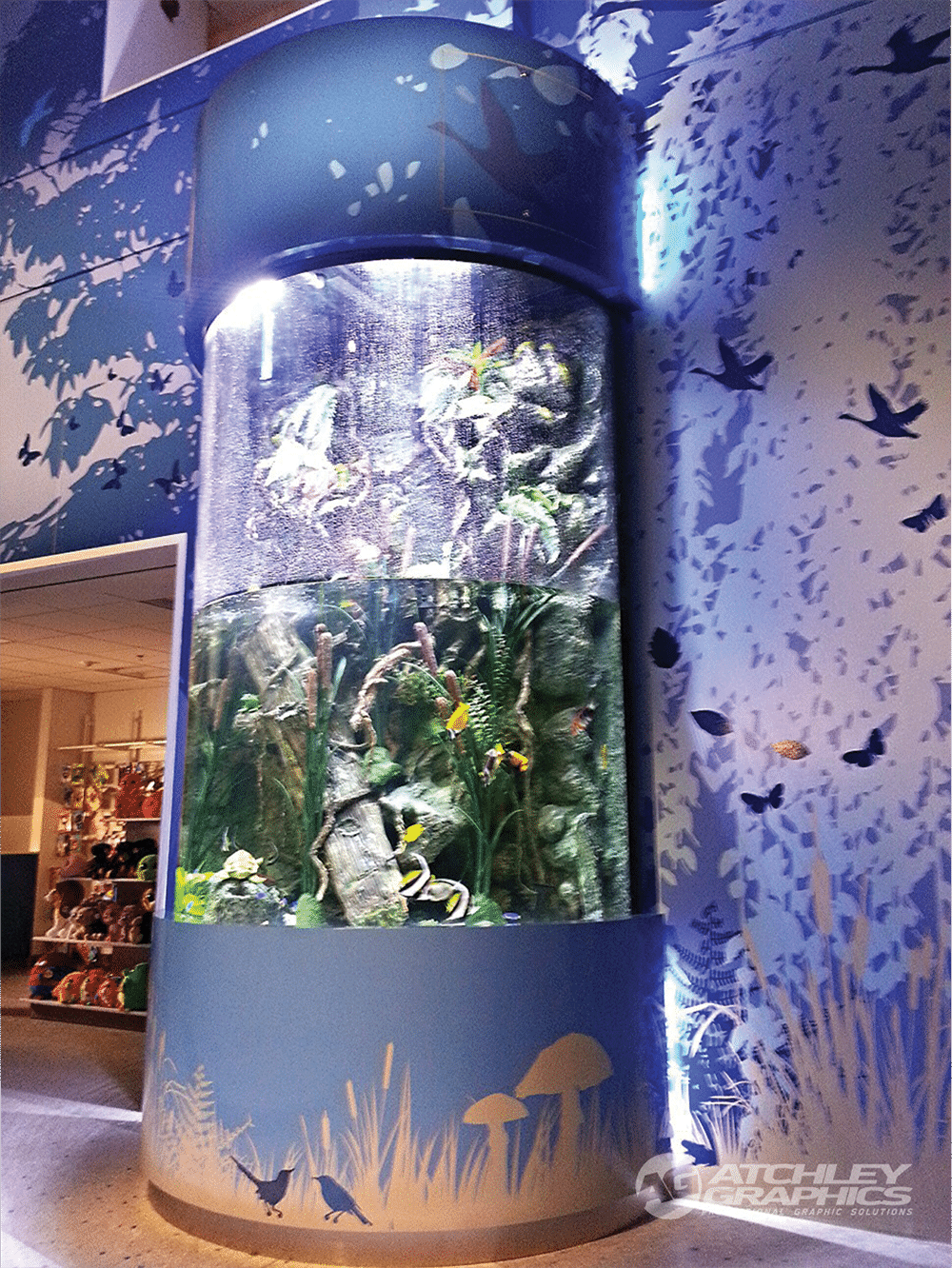
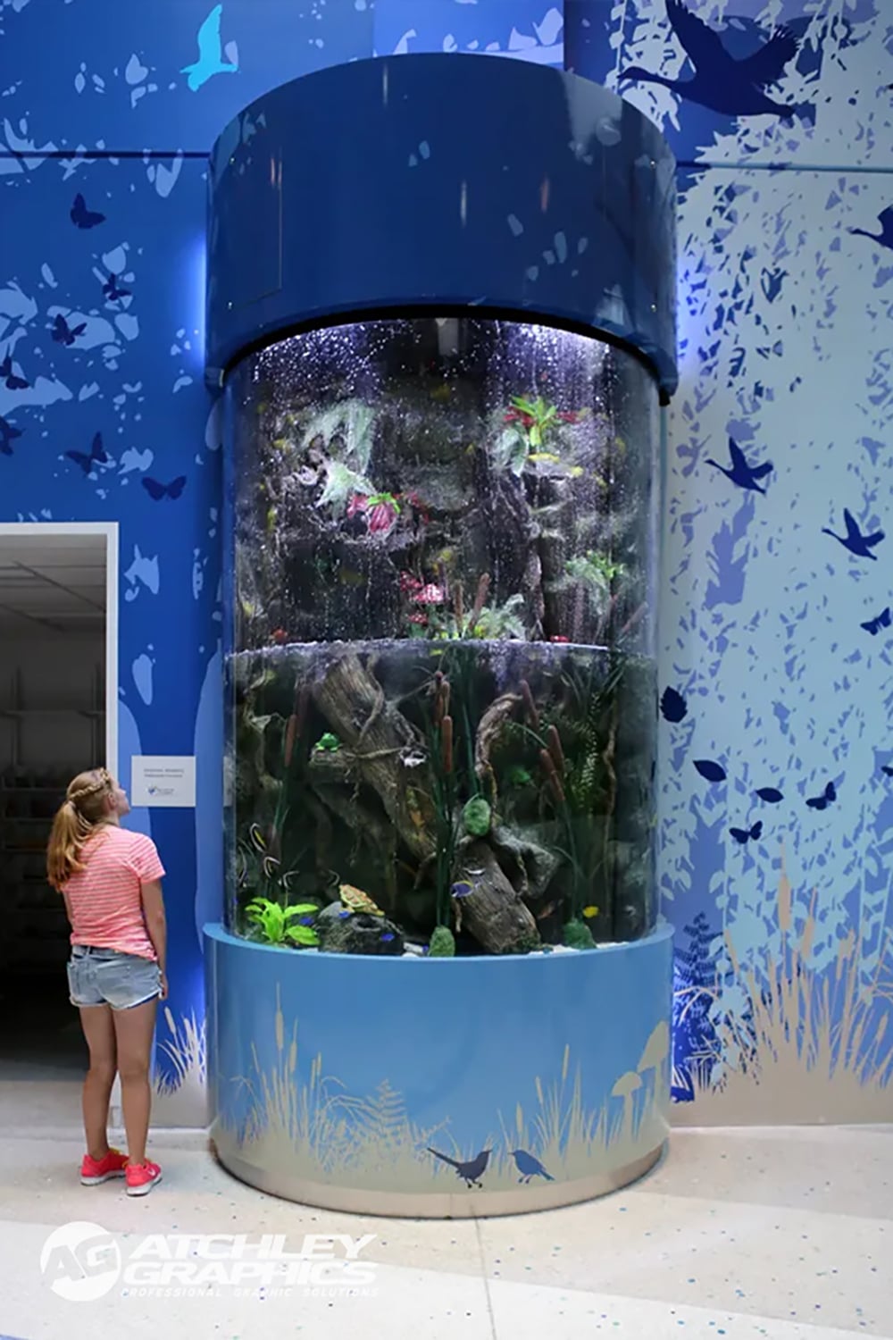
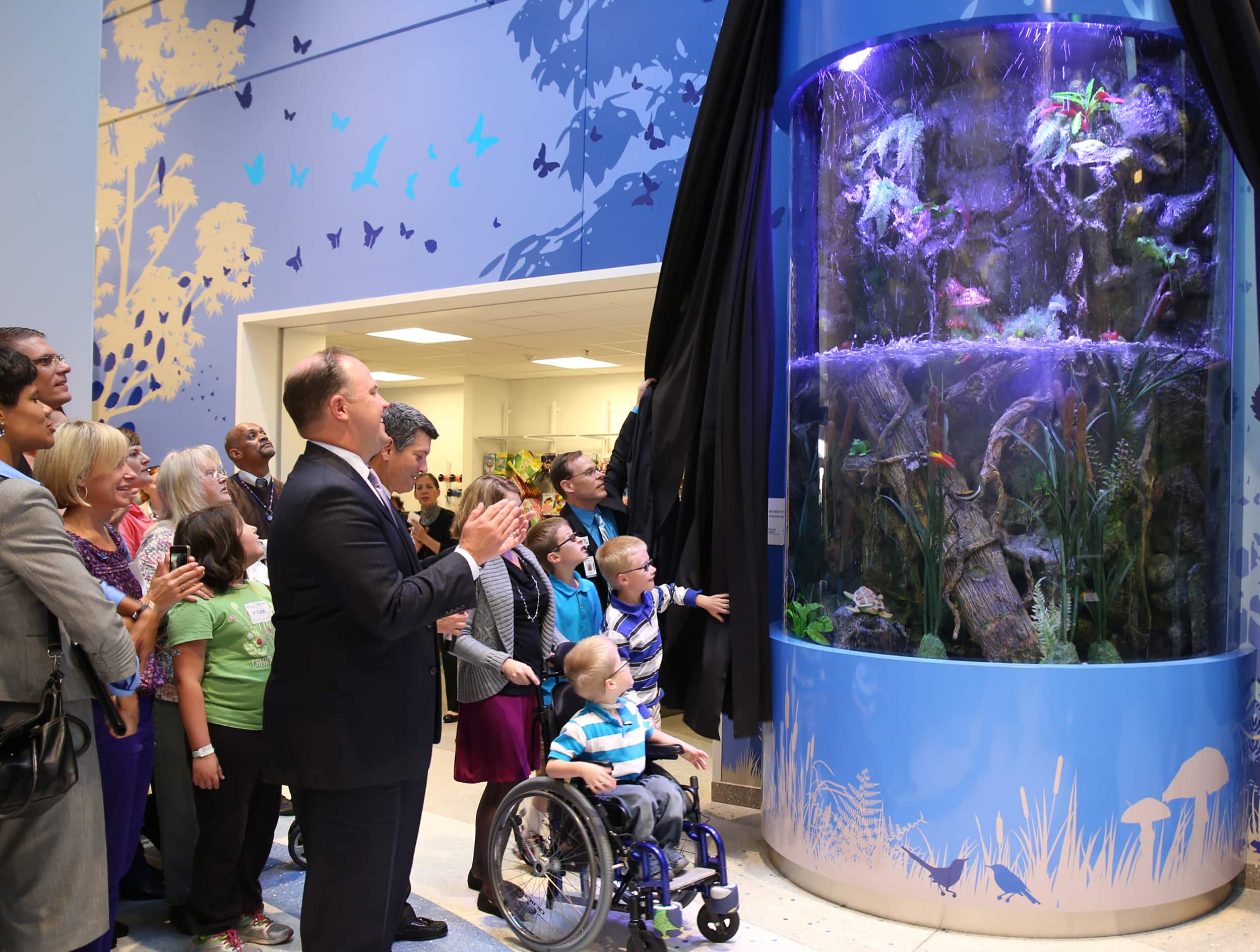 Fish wrap: A TV show came calling and the job was for a children’s hospital. What could be better
GETTING TANKED
For the team at Atchley Graphics (Columbus, OH), being contacted by the staff of the television show Tanked was a memorable moment in itself, but the result was a significant moment in the company’s history. The Tanked staff was asking Atchley’s team to produce and install custom graphics for an aquarium project at Nationwide Children’s Hospital in Columbus.
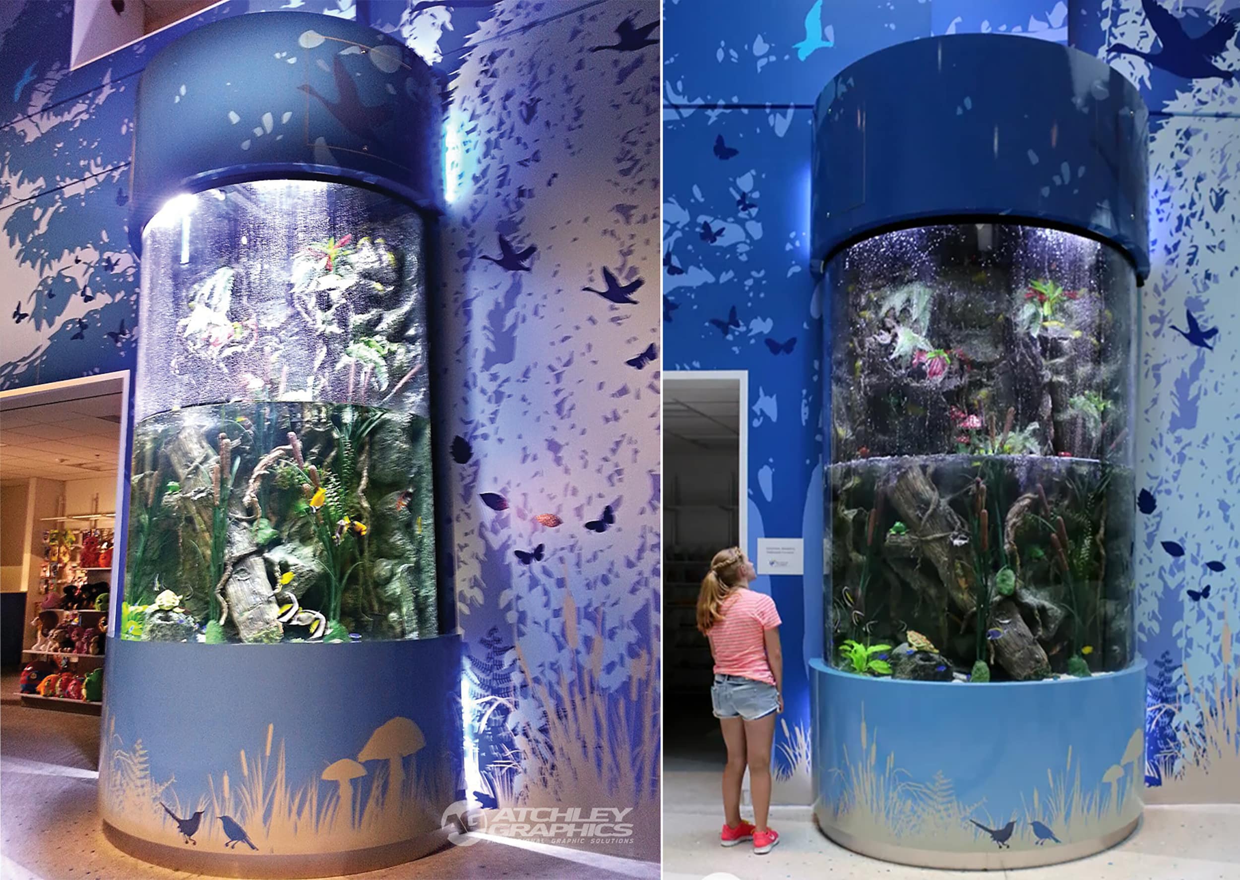
The aquarium tank, situated in the interior lobby, was approximately 8 ft. in diameter and 14 ft. tall, with both the top and bottom wrapped. “The wrap was mostly composed of large flat panels installed on a curved surface. The artwork was a rendering of a nature scene to go along with the content of the aquarium environment,” says Derek Atchley, owner of Atchley Graphics. The shop used 3M 180 wrap media and Scotchcal Gloss Overlaminate 8518, printed on HP latex printers.
“All of us felt the most heartwarming part of the project was that it was for the children at the hospital,” Atchley says. “The look on the kids’ faces when the project was unveiled was priceless. Not one of our staff that was onsite had a dry eye.”
Advertisement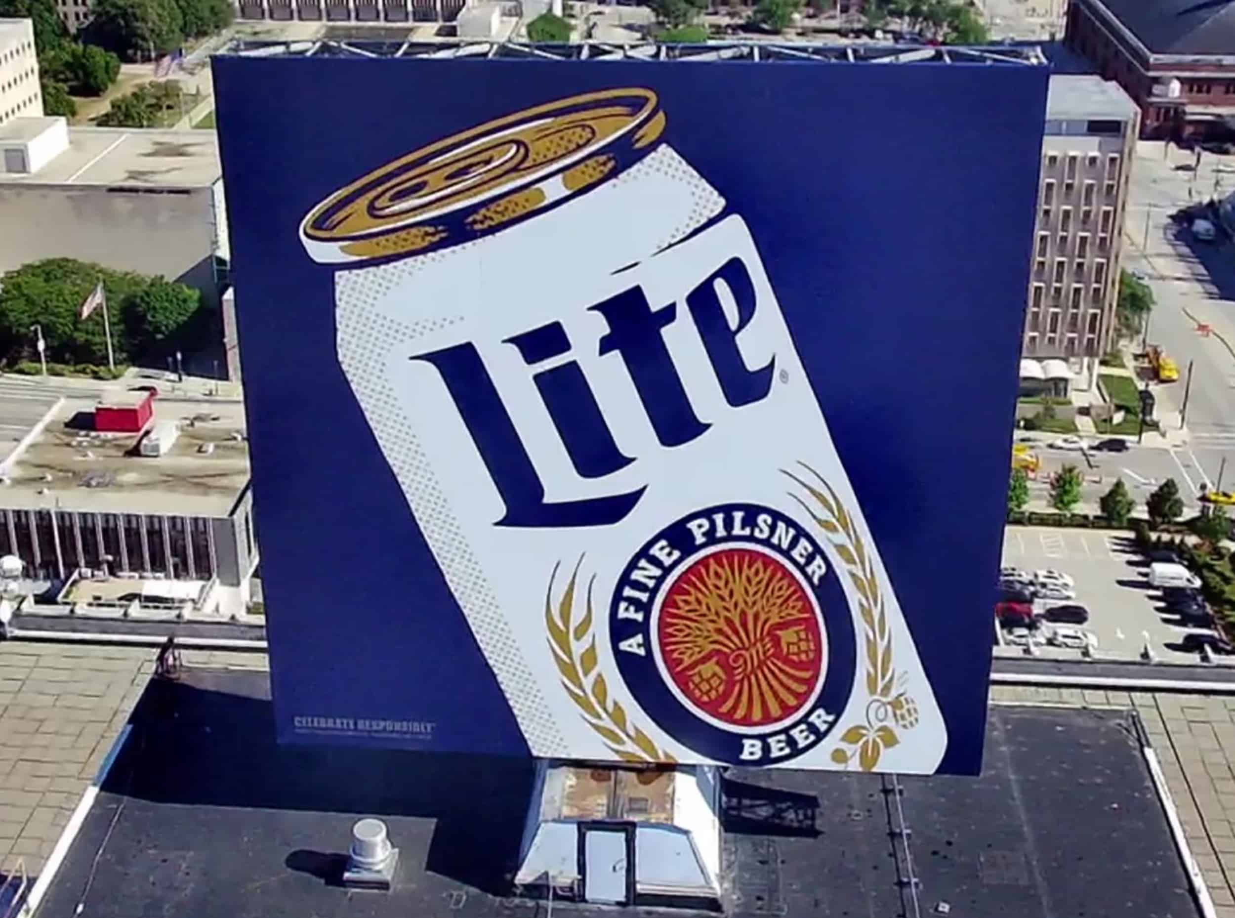 Large scale: Every sign company remembers those truly huge jobs that everyone could see.
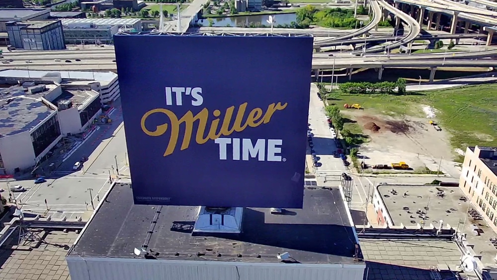
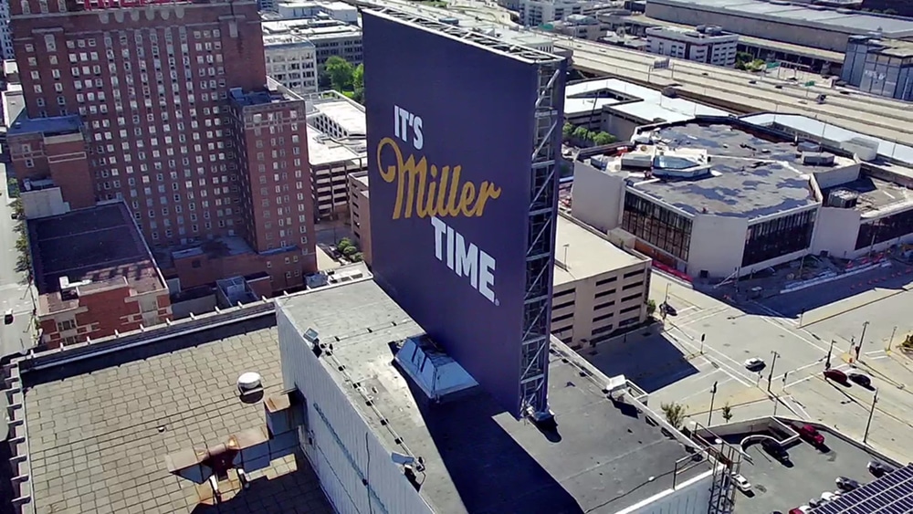
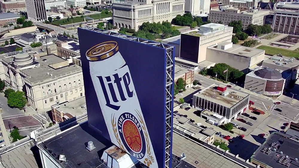
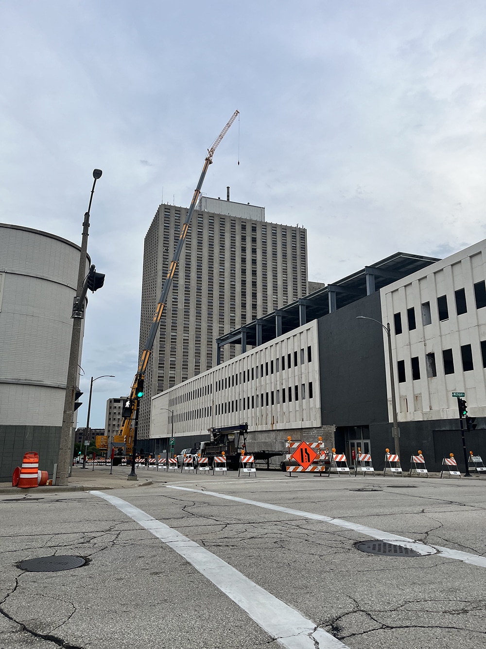
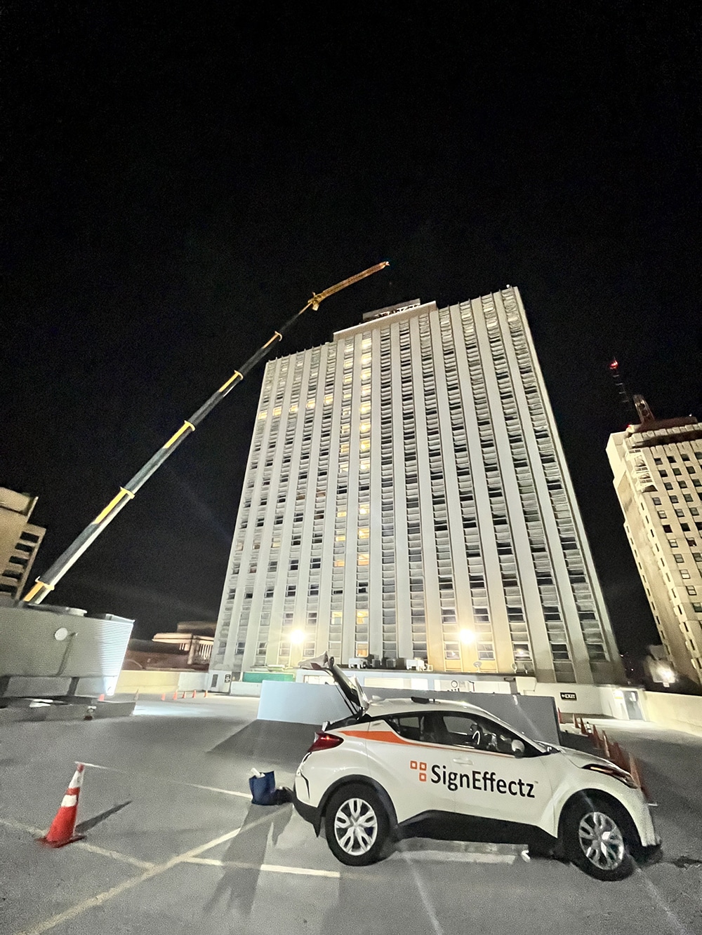
BIG BEERS
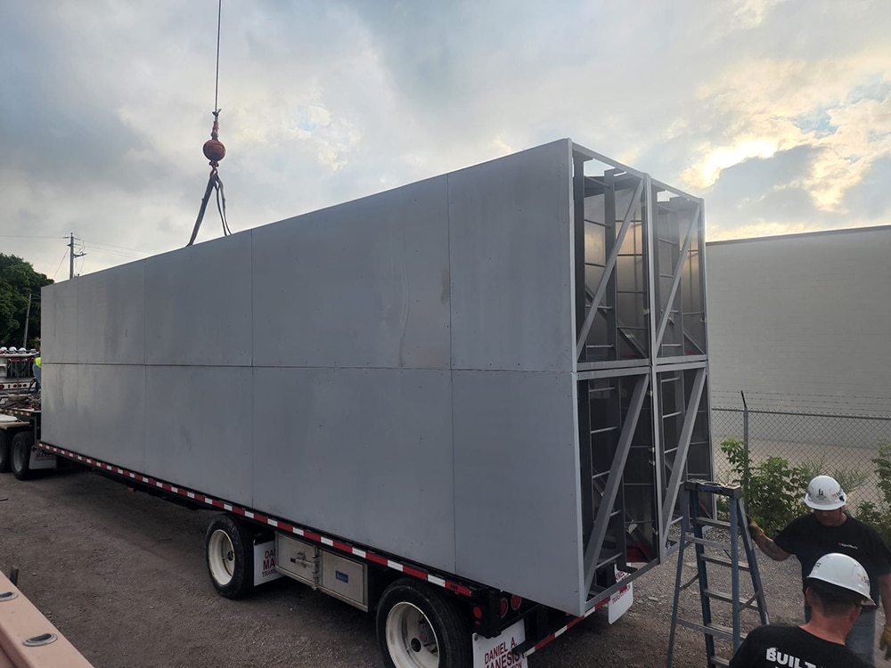
Milwaukee-based Sign Effectz partnered with local J. Jeffers & Co. and Ideal Crane Rental (Madison) on the design, fabrication and installation of a 40 x 40-ft. Miller Brewing Co. sign that sits atop a 22-story downtown Milwaukee building. Using a crane that extended 325 ft., the final sign installation consisted of a sign frame with eight 5 x 40-ft. pieces, as well as a pole structure to support the sign.
As Adam Brown, president of Sign Effectz, explains, it took an entire day just to set up the crane and five semi-truckloads of ballast weight anchored the back of the crane. “What set this one apart was that the project scale was considerably larger than most others,” Brown says.
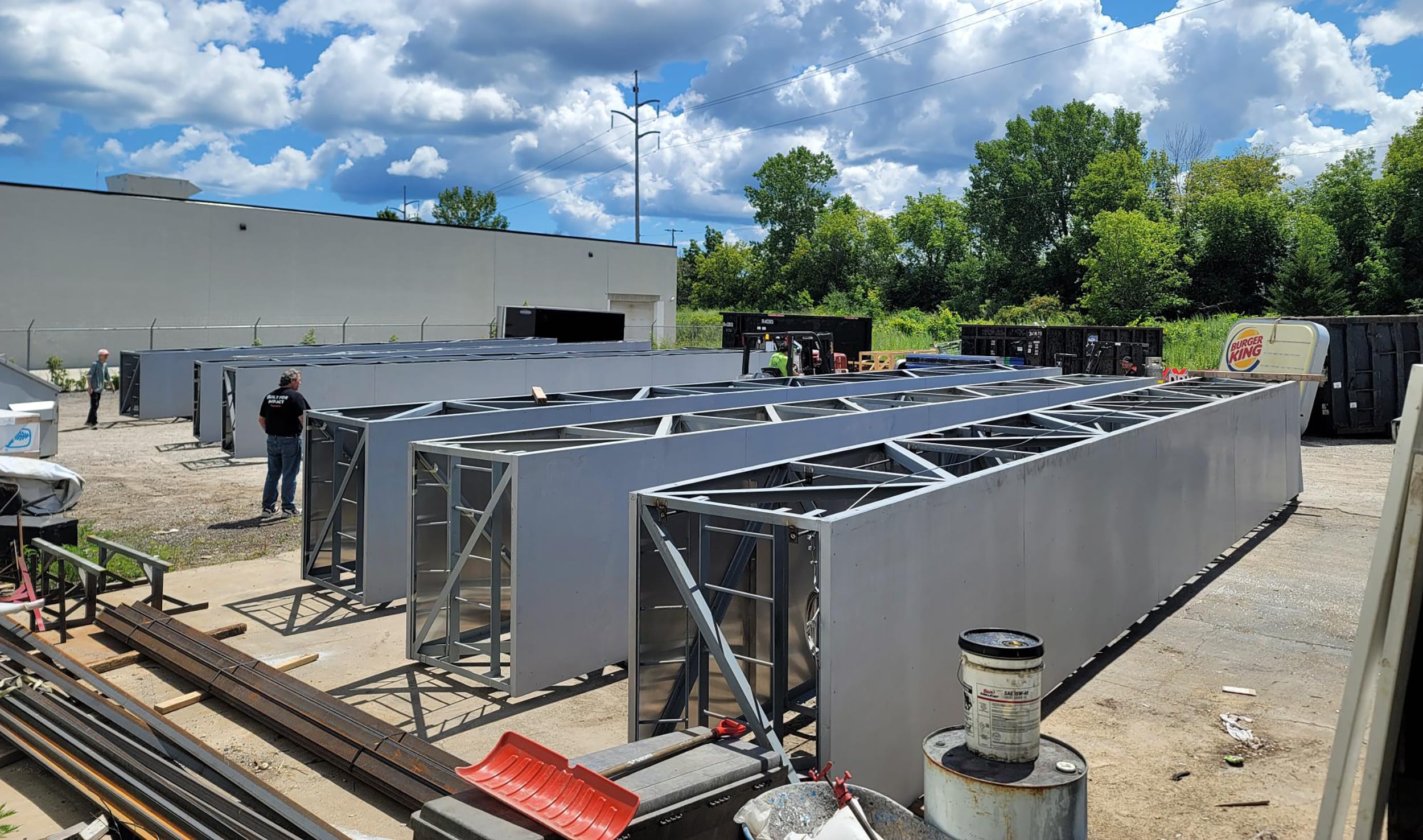
The team faced fabricating the massive frames in their shop and putting the 40 x 40-ft. faces on at the installation site. However, the operations team found the appropriate shop space and perfect location to build the frames, and installed both signfaces in only three hours.
“It’s a tangible element. It’s there for all to see,” Brown says. “The fact that signs are the face of the public, and this one is so iconic to the city of Milwaukee, made it stick out even more and made the gratification of a ‘job well done’ that much sweeter.”
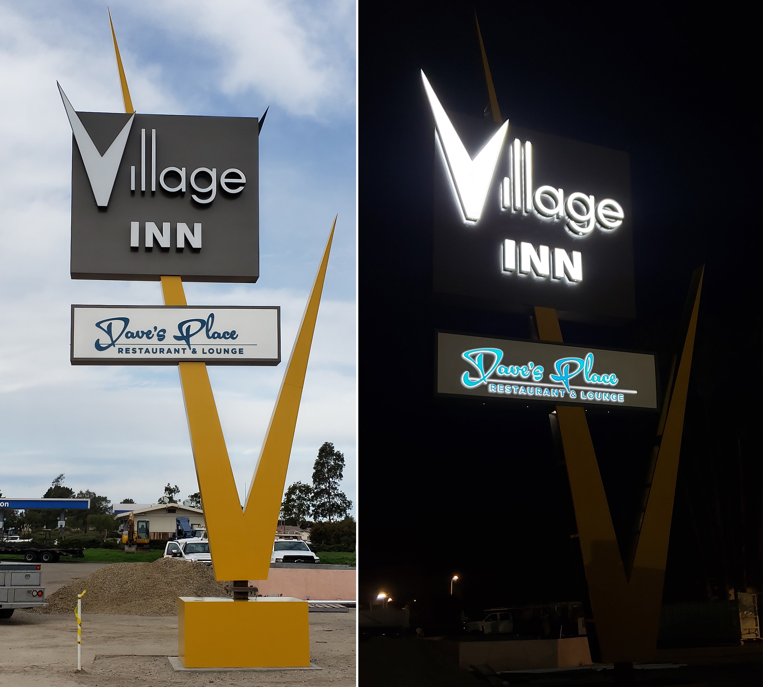 Going retro: Re-creating a local landmark sign from an old postcard ranks right up there.
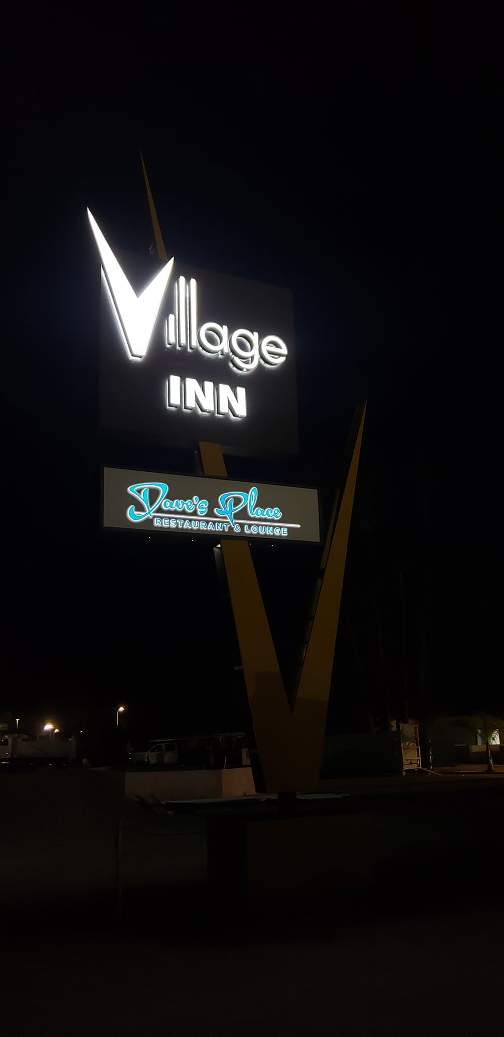
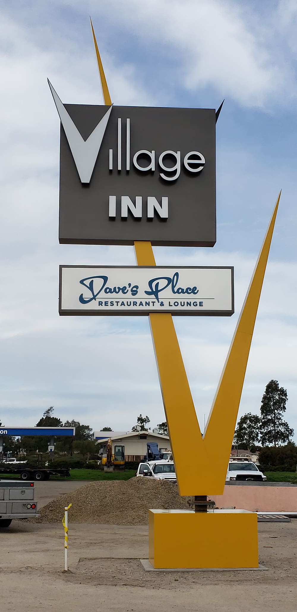
V IS FOR VINTAGE
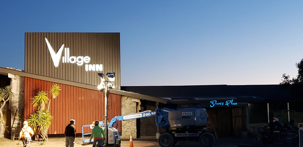
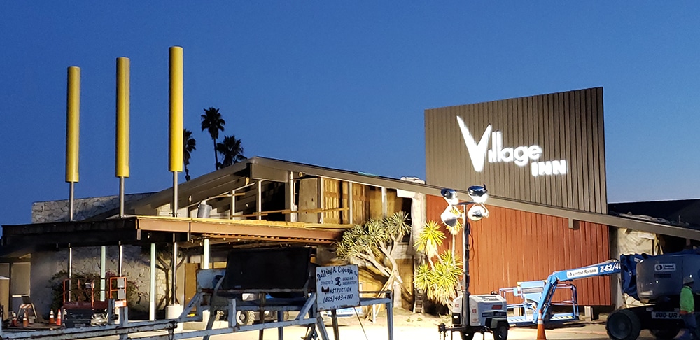
Bringing a derelict hotel “back to life” is part art, part science and requires a lot of hard work. Just ask Pat Dacy and his team at 3V Signs & Graphics (Torrance, CA), who needed to remove the old pole sign and recreate the original Village Inn “V” pole sign from a postcard image.
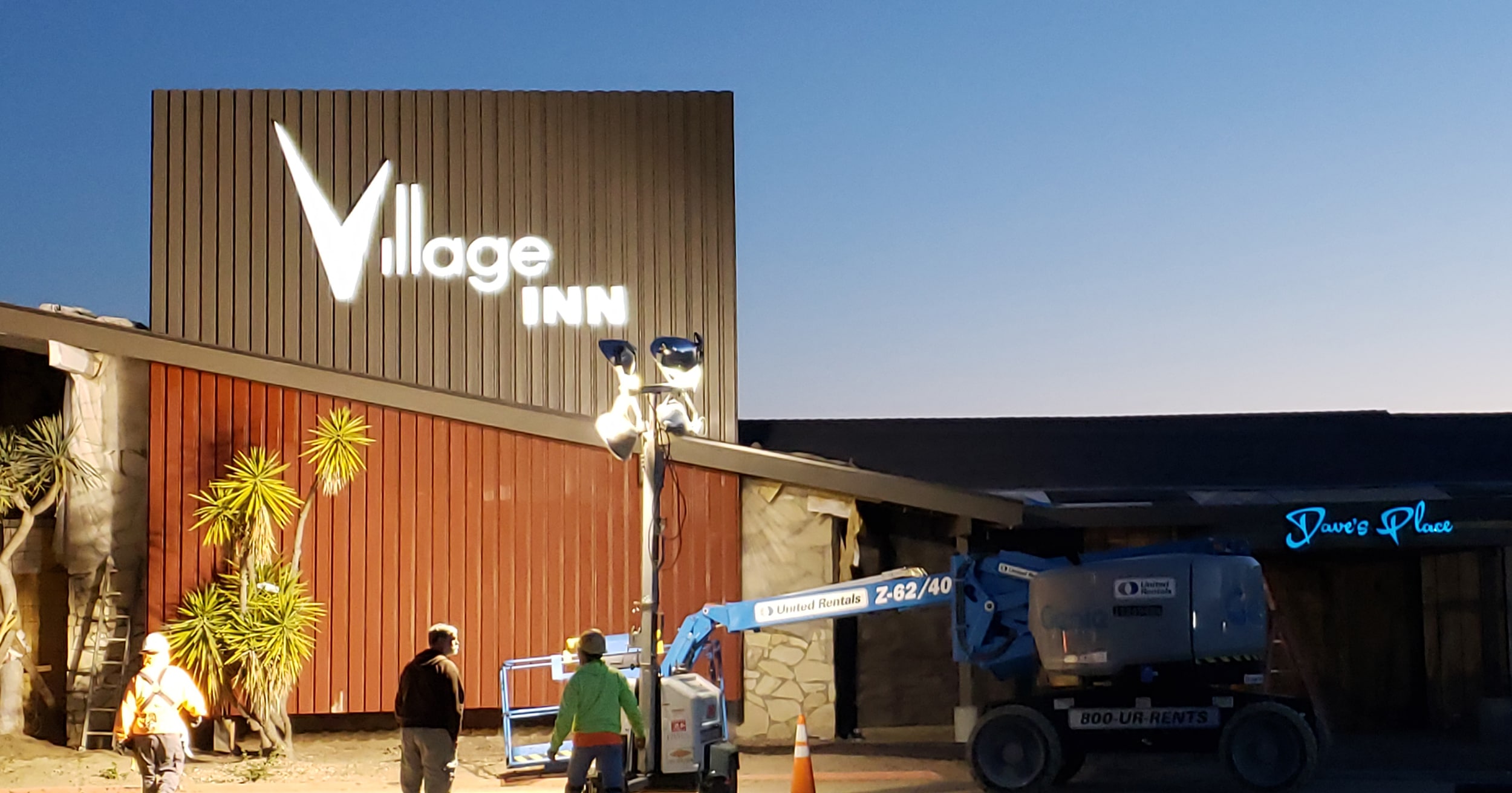
The original sign, based on diagrams provided by the county, was 42 ft. tall. New county guidelines limit height to 35 ft., so 3V Signs scaled the sign down. “We added 20-ft.-tall ‘Popsicle’ elements to the drive through and new channel letters for the revived restaurant. We also needed to design new directional and internal ID signage that has a retro 1960’s feel,” Dacy says. “Designing from a postcard was fun and the county was very helpful in getting the project through the local bureaucracy.”
Dacy also enjoyed taking the project from concept to final build with a broad team of fabricators and installers. “Everyone pitched in to make it happen,” he says. “The client and community were extremely pleased with the final product as a local landmark was resurrected.”
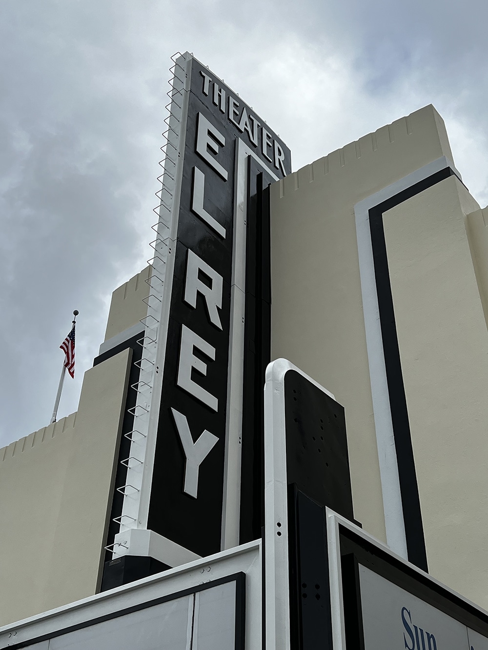
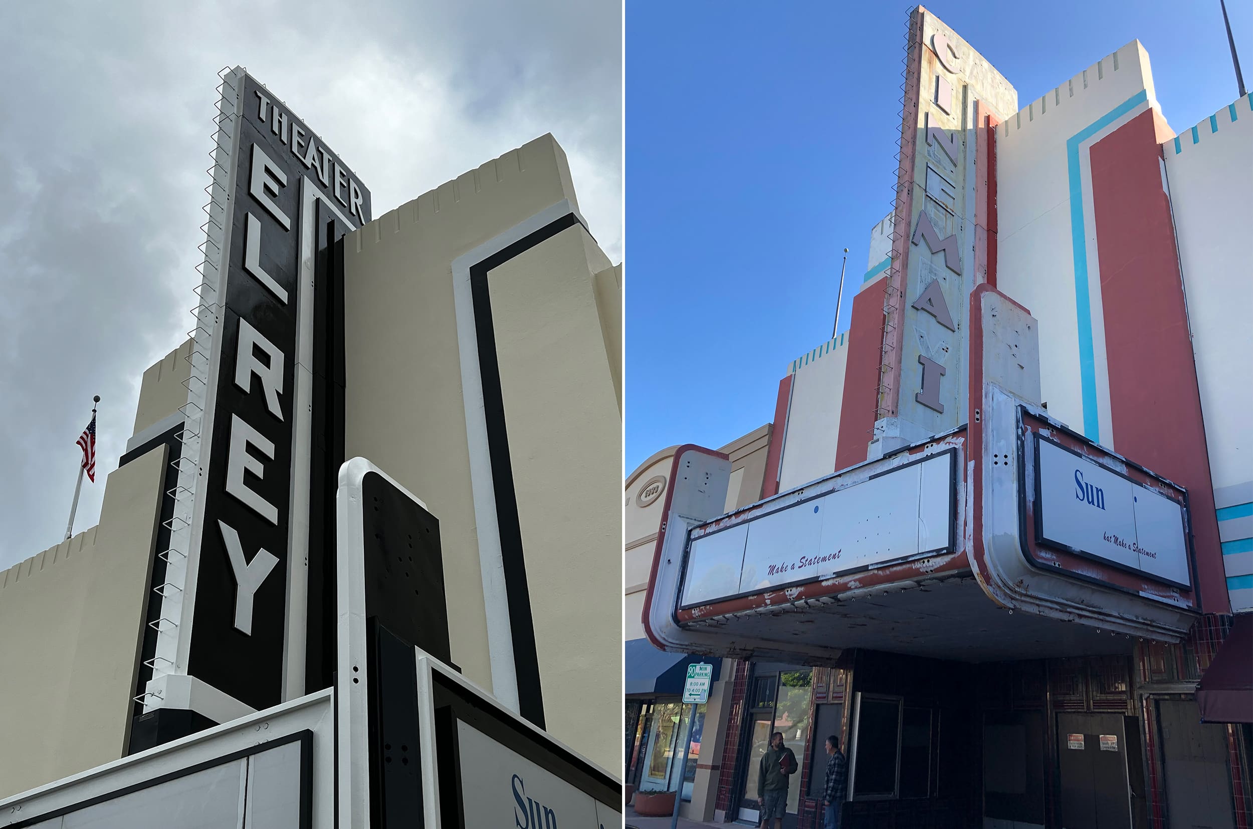 Film icon: Bringing back an historic main street focal point is definitely one for the scrapbook.
NOW SHOWING
At the top of Oldtown Salinas, CA, you will find the historic El Rey Theatre adorned with its vintage sign originally installed in 1935. Jeremy VanderKraats, owner at hometown Signs by Van, and his team refurbished the sign, restoring its former glory. “The sign is vital to the overall aesthetic of that area. Being over 50 ft. tall, it’s the first thing you see driving down Main Street Salinas,” VanderKraats says. “Bringing historians in made our job of re-creating the original as streamlined as possible.”
Prior to proper refurbishing of the sign, the building’s exterior needed a huge upgrade. Signs by Van partnered with Tony Trejo, a local commercial painter with experience in facade renovation, to recondition the building’s exterior.
Once all of the building and sign were repainted, it was time for the shop’s SCM router to cut out the 1.5-in.-thick HDU letters, VanderKraats says. “The most challenging part of that portion of the build was making sure the letters we built matched the historical letters on the sign. We used Adobe Illustrator and Photoshop and lots of measuring to ensure a perfect fit.”
Advertisement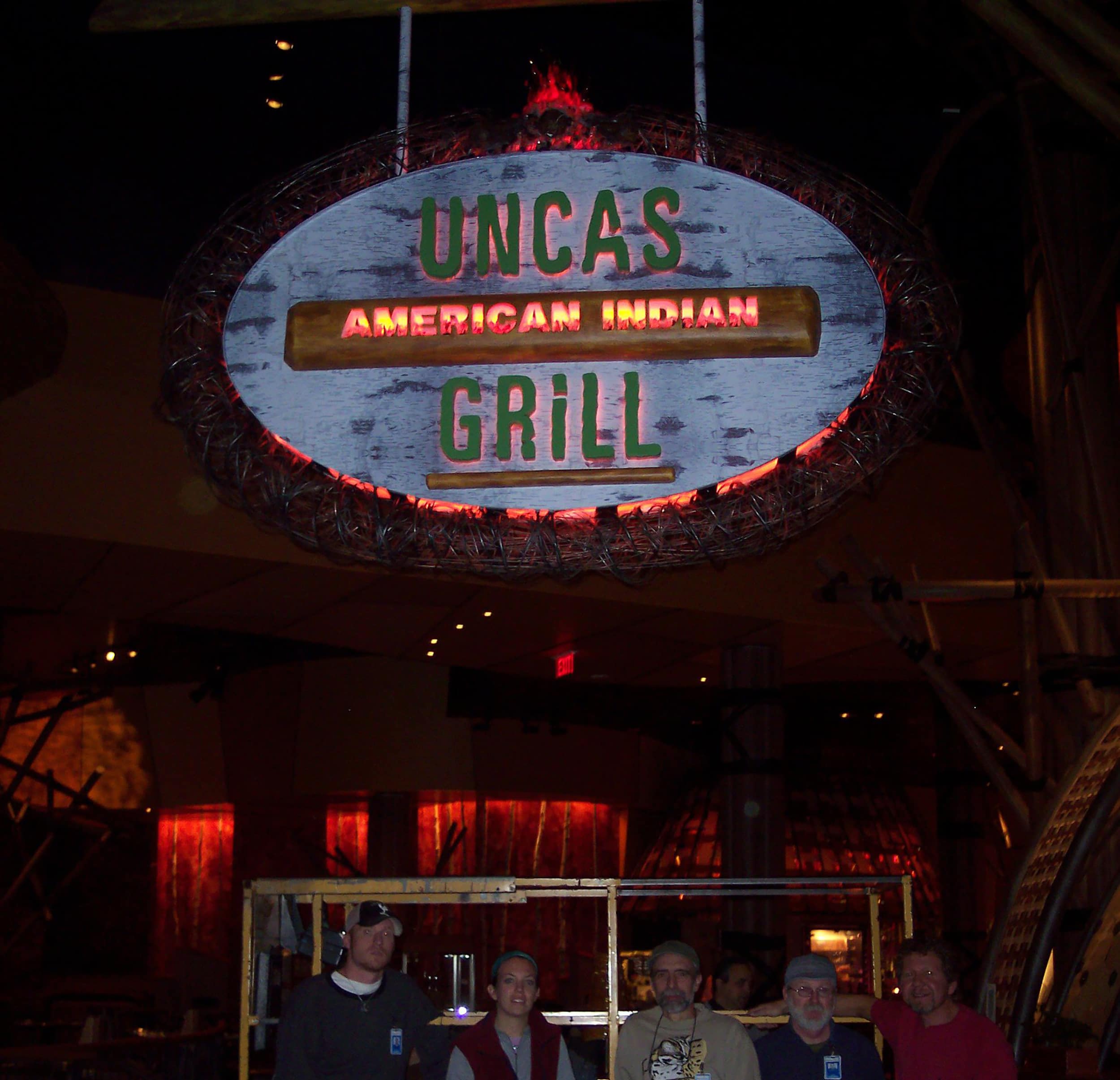 Casino royalty: Sign companies deserve recognition for great signs, and winning an award for one makes it that much sweeter.
CONTEST CLASSIC
Back in 2007, Burke Enterprise (Oakdale, CA) won first place in the annual Signs of the Times Sign Contest. The company created signage and custom light fixtures for the Uncas American Indian Grill at the Mohegan Sun Casino & Resort in Montville, CT.
The single-faced 7 x 12-ft. oval sign, which weighed over 1,800 lbs., was entirely hand cut with a digital printed birch bark background. The copy and logs comprised 18-lb. signfoam and the sign’s ‘fire effect’ at the top was cast-resin lit from below with LED ambulance lights. Over a mile and a half of spun wire in sizes from .125 in. to .5 in. surround the perimeter of the sign.
“This project not only included the sign but also the pipe structure and two conical vent hoods,” says Bob Burke, owner of Burke Enterprise. “The coordination on site was intense. It was the biggest job we had done until then and the second (and last) time we entered the contest.” Perhaps they’ll try the contest again this summer.
 Higher degree: The greater the challenge, the better the memories.
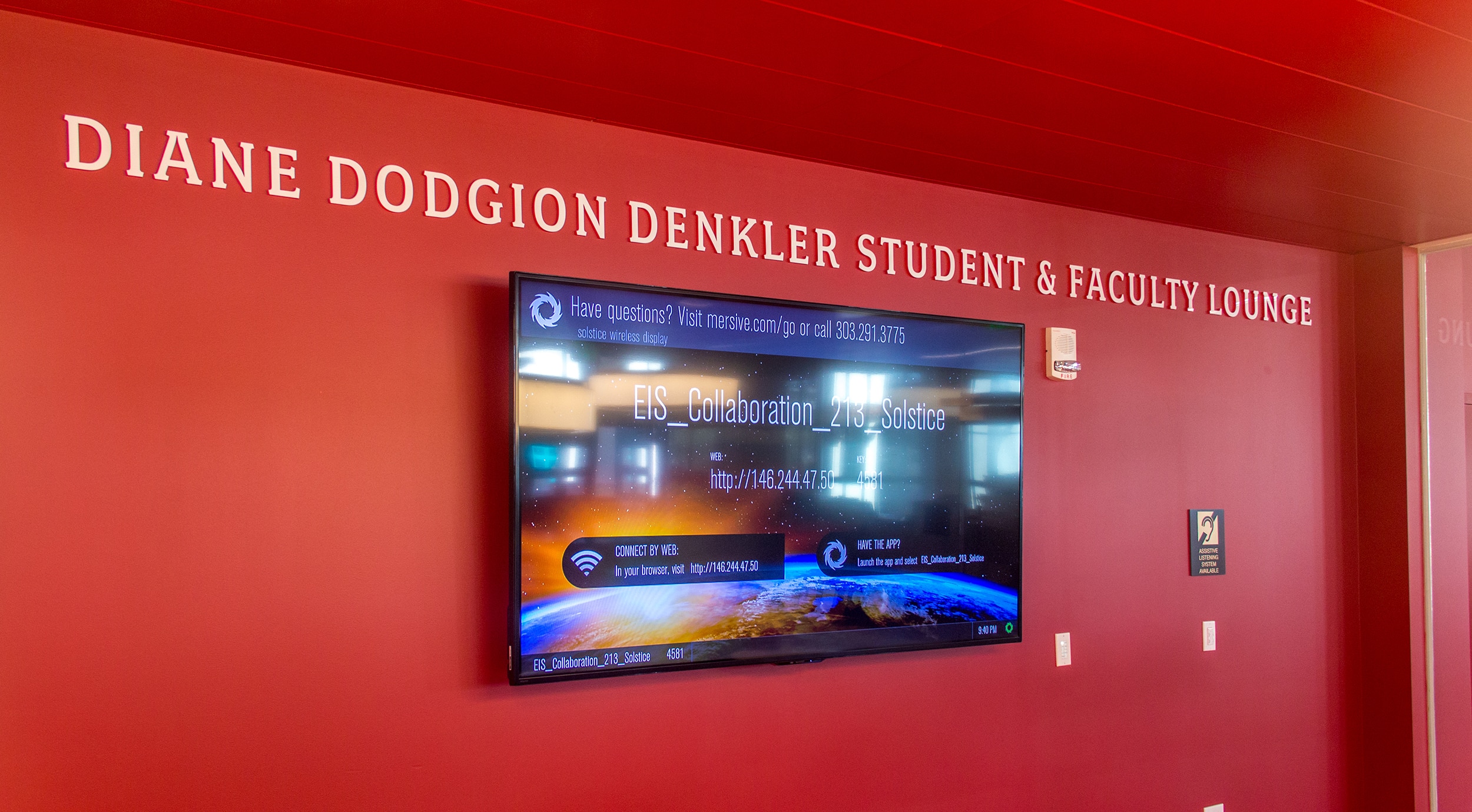
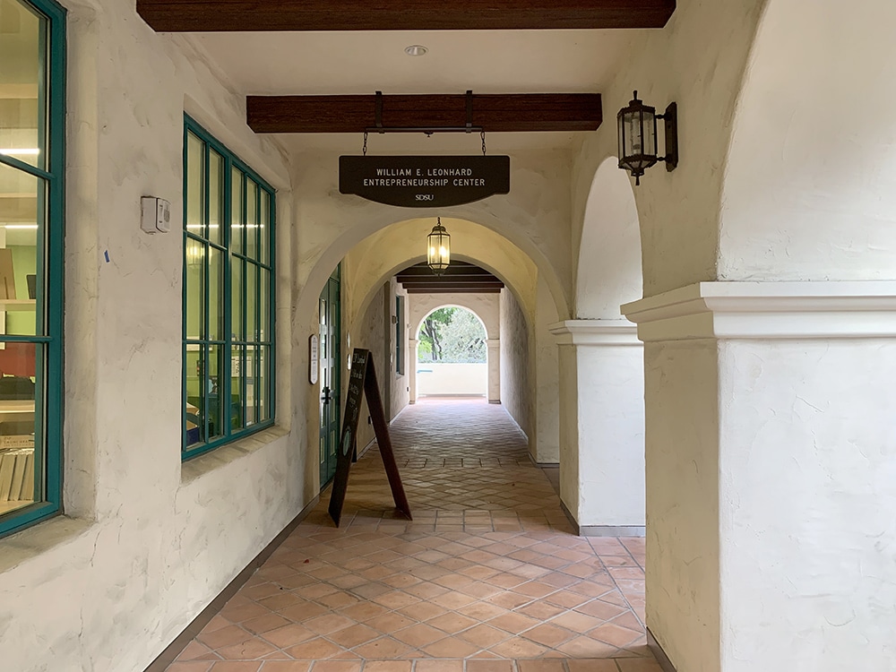
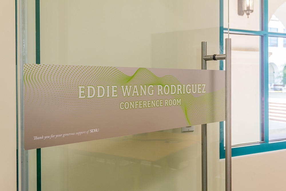
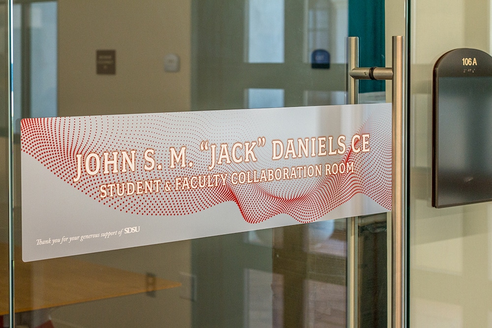
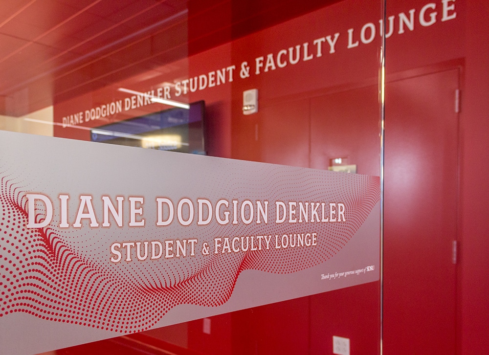
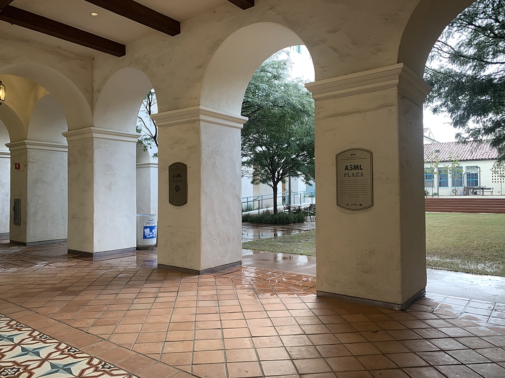
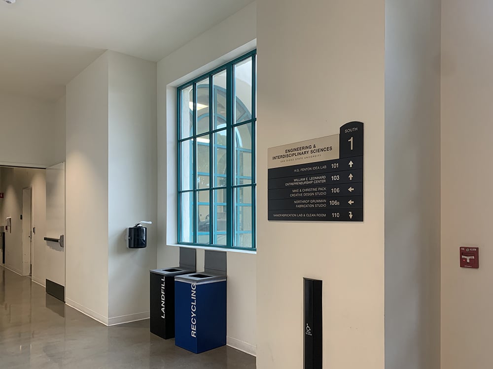
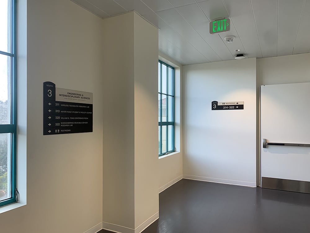
DEMONSTRATING DEDICATION
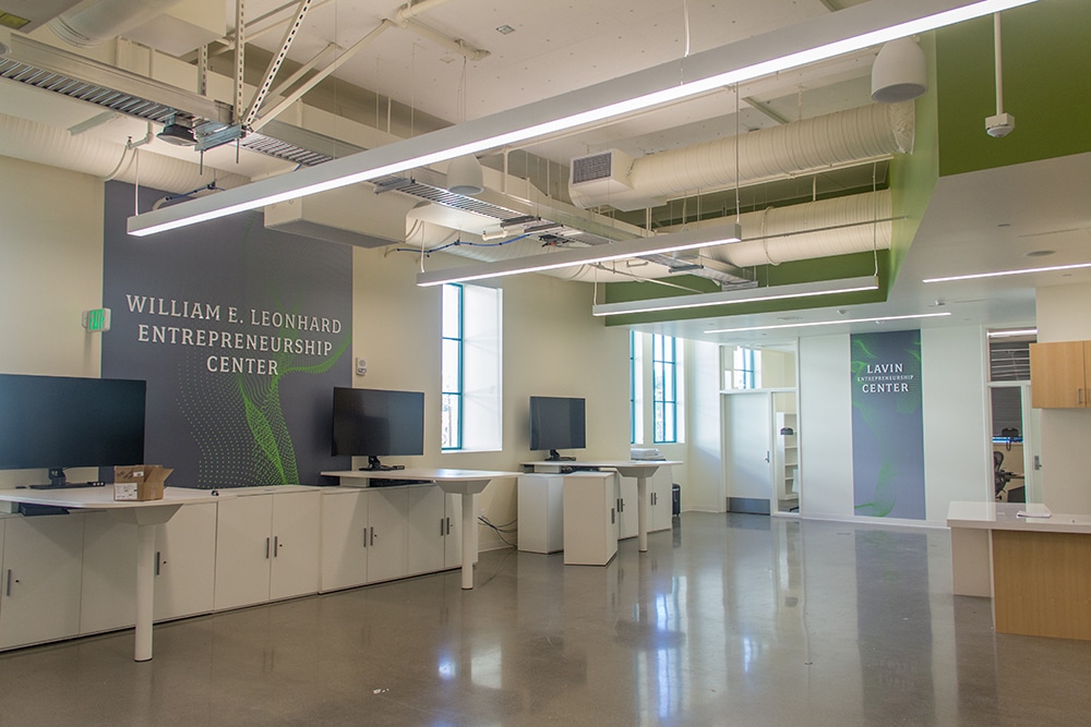
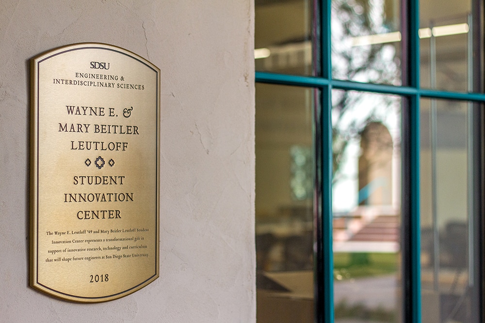
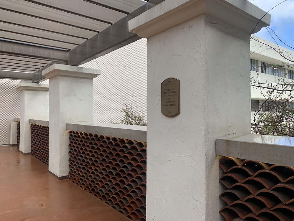
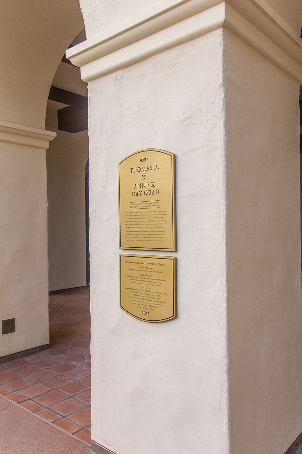
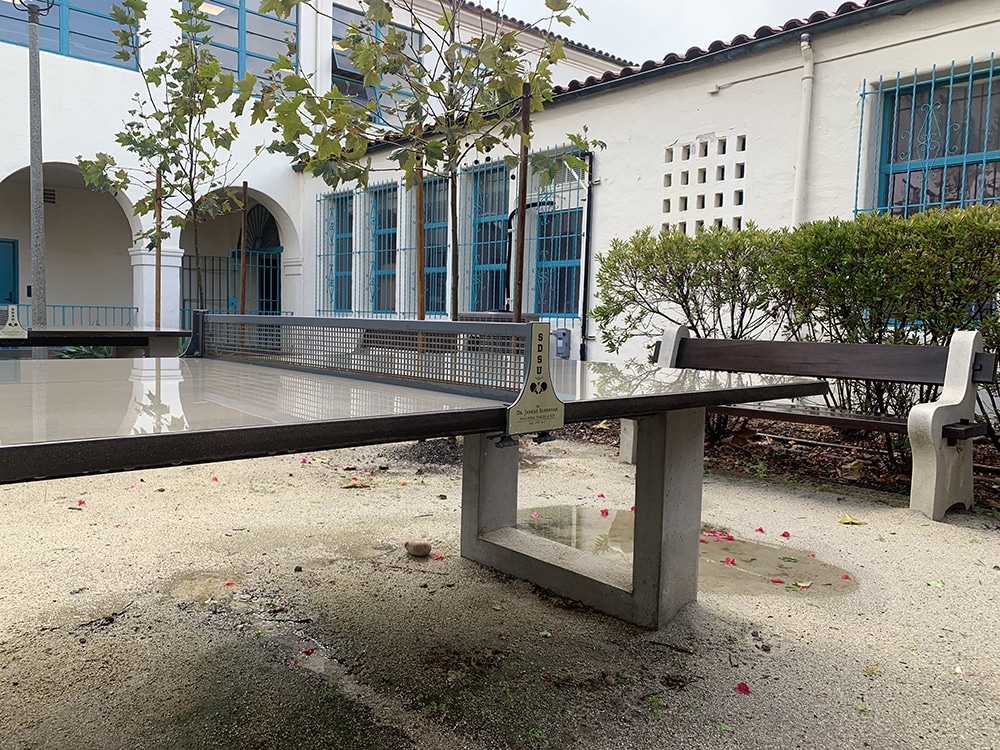
The San Diego State University (SDSU, San Diego) Facilities Graphics team put together a donor recognition sign program for the new Engineering and Interdisciplinary Sciences building, from concept to installation. Together they established the donor levels, designed the donation tracking diagrams and spreadsheets, designed the signs and the manual, and installed the signage. “Our fabrication capabilities are limited, but we still did a good amount of fabricating,” says Grace Francisco, facilities services lead graphic designer at SDSU.
From building title letters to laboratory wall graphics to hanging promenade signs, the size and scope of this signage project was expansive. What’s more, the exterior walls of SDSU’s buildings have a high-profile stucco texture, which required a lot of grinding to install the exterior plaques and wayfinding signage.
“College campus signage is often standardized, so most of our designs fit into a template,” Francisco says. “We design custom graphics occasionally, but it’s rare that we get to design, implement and install a custom package with such a large scope.” Despite the project needing to be completed before the dedication ceremony, Francisco and her team had to wait to get occupancy to start installing. “Our team took about three weeks prior to the ceremony to install 80% of the package and another two weeks to install the rest of it,” she says.
 Sign mixology: Having your work on three episodes of a popular show will “bust open the [memory] books.”
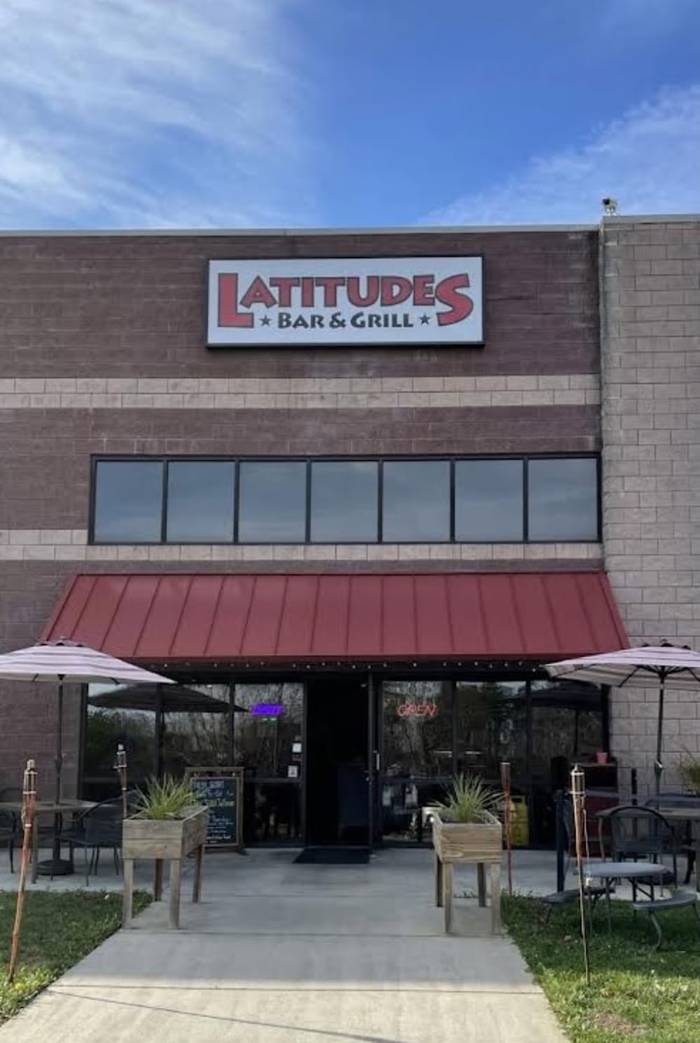
STRESS TESTED
When Bar Rescue Host Jon Taffer and team had three locations they would be “flipping” and needed new signage, Signs Designed of Charlotte (Charlotte, NC) produced and installed the signs for the Paramount TV show. The first location was Latitudes Bar & Grill (Denver, NC) — where the Signs Designed team recently replaced a 4 x 12-ft. white acrylic panel with full-coverage, digitally printed translucent vinyl graphics on an existing wall-mounted cabinet sign, as well as two 25 x 72-in. panels.
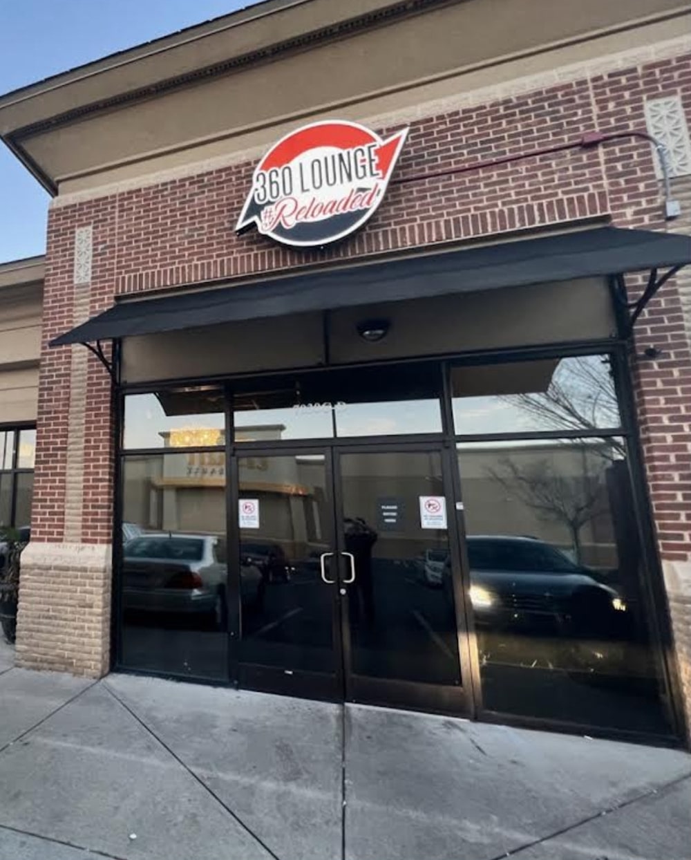
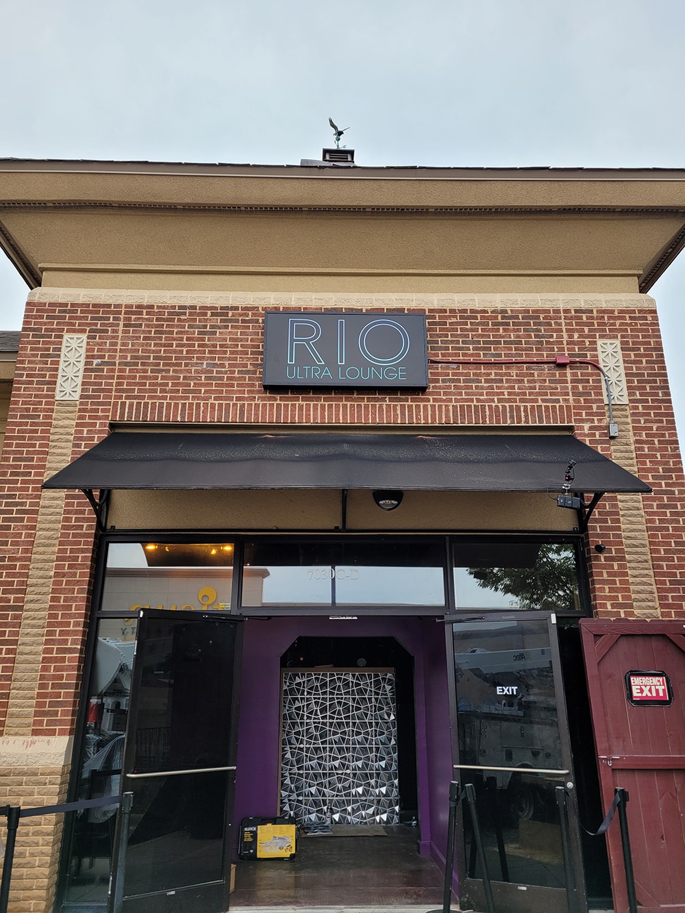
As he does sometimes, at the second location, Charlotte’s 360 Lounge Reloaded, Taffer rebranded the business as Rio Ultra Lounge. The existing sign was a contour channel logo with a very unique shape. Because it would not be reused, Signs Designed had to facilitate swift permitting and fabricate a brand new wall-mounted cabinet sign.
“The final location was changed [to Hickory, NC] last minute from what we were initially told,” says Cassidy Mullis, general manager of Signs Designed. The shop had to replace the double-sided flex face of a huge illuminated pylon sign. “Since we would not be able to produce the flex faces with a 24-hour turnaround time, we instead converted the cabinet frame to receive flat faces,” Mullis says. The 8 x 11-ft., 4-in. sign faces initiated a frantic hunt for sheets among suppliers for acrylic that would be large enough — but all ended well. “This definitely kept our team on their toes, as we quickly needed to come up with a new game plan for this last episode,” she adds. “We hope that these three episodes provide exposure and growth for our business.”
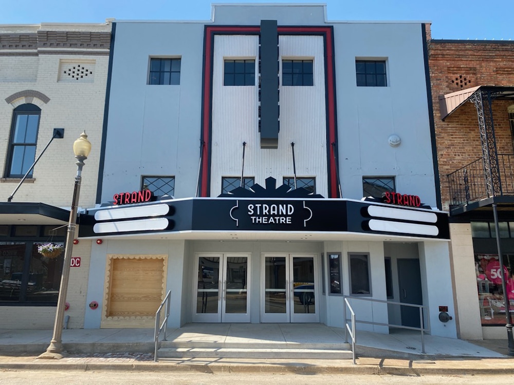
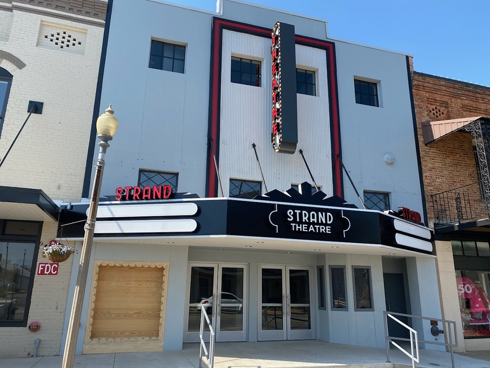
Advertisement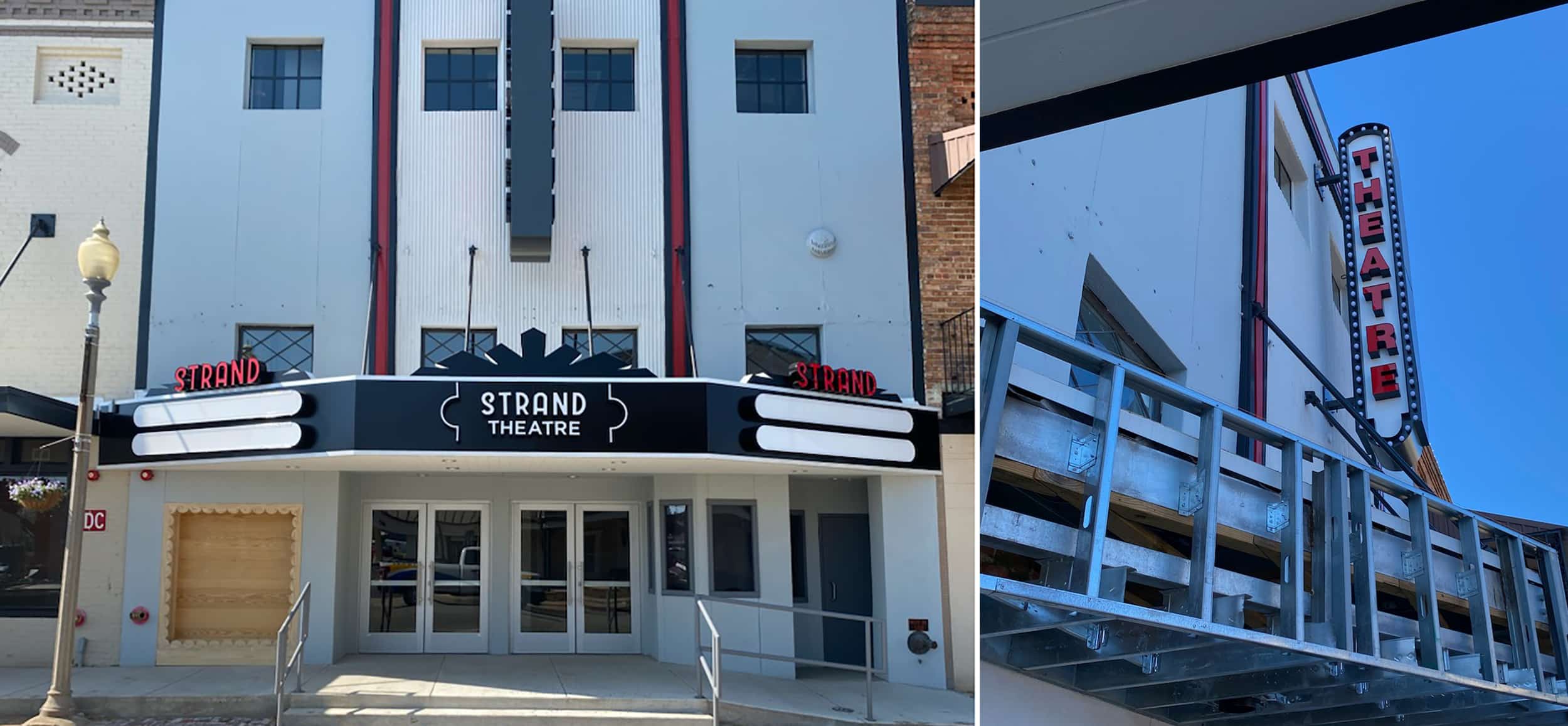 Long running: Projects that take many, many years to complete tend to remain front of mind.
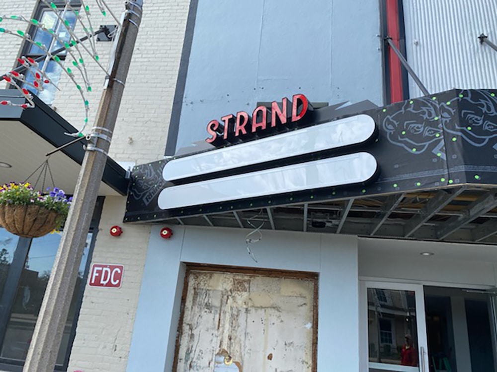
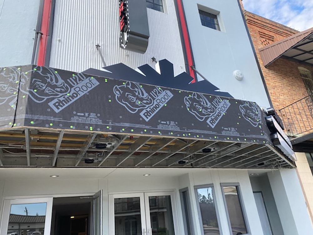
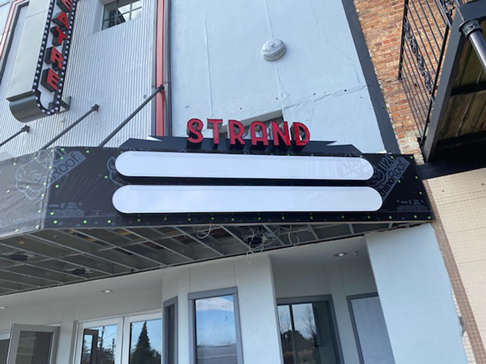
TEST OF TIME
The team at Wrico Signs (Mobile, AL), began working with an architect in 2015 on the designs for the sign at Strand Theatre, an historic movie theater undergoing renovations in Atmore, AL. “We researched various types of historical signs from the ’50s and ’60s to come up with the concept,” says Kelli Johnson, office manager at Wrico Signs. “Obviously, neon was a big thing back then.”
For Jeremiah Johnson, lead installer, and the Wrico crew, being limited on space in front of the Strand Theatre was the most challenging aspect of the project, with cars and trucks zooming past — while keeping a safe and productive job site. “Taking part in recreating a historical landmark such as the Strand for people young and old to enjoy today was a big deal,” Johnson says. “To be able to see history come back to life — whether it be the flashing lights of the flag-mounted wall sign, or the glow of the LED neon rope lighting — makes people of all ages feel like a kid again.”
The project took seven years of concepts and pricing, but finally everything began to come together, Johnson adds. “It was a very intriguing journey.”
PHOTO GALLERY (73 IMAGES)


Introducing the Sign Industry Podcast
The Sign Industry Podcast is a platform for every sign person out there — from the old-timers who bent neon and hand-lettered boats to those venturing into new technologies — we want to get their stories out for everyone to hear. Come join us and listen to stories, learn tricks or techniques, and get insights of what’s to come. We are the world’s second oldest profession. The folks who started the world’s oldest profession needed a sign.


NUtec Digital Ink Invests in Solar Energy for Facility

5 Reasons to Sell a Sign Company Plus 6 Options

21 Larry Albright Plasma Globes, Crackle Tubes and More


Bulletins
Get the most important news and business ideas from Signs of the Times magazine's news bulletin.
-

 Tip Sheet1 week ago
Always Brand Yourself and Wear Fewer Hats — Two of April’s Sign Tips
-

 Photo Gallery3 days ago
30 Snapshots of the 2024 ISA Sign Expo
-

 Ask Signs of the Times5 days ago
Why Are Signs from Canva so Overloaded and Similar?
-

 Real Deal2 weeks ago
A Woman Sign Company Owner Confronts a Sexist Wholesaler
-

 Benchmarks1 week ago
6 Sports Venue Signs Deserving a Standing Ovation
-
 Photo Gallery9 hours ago
21 Larry Albright Plasma Globes, Crackle Tubes and More
-

 Women in Signs2 weeks ago
2024 Women in Signs: Megan Bradley
-
 Women in Signs1 week ago
2024 Women in Signs: Ashley Borell