Once upon a time, when bona-fide artisans weren’t relegated to “niche markets” in favor of cheaper, lowest-common-denominator mass production, environmental graphics entailed far more than merely communicating a brand or civic identity. From the late 19th to mid-20th Centuries, far-reaching building projects featured unusual graphic elements, such as rooftop gargoyles, bas-relief sculptures and (a hallmark of the Art Deco era) elaborate sconce fixtures.
Walking through such august buildings, which are often neglected within the United States’ atrophied inner cities (a visit to Detroit’s Masonic Temple in 2004 for the International Letterhead Meet provided such a showcase), suggests the emphasis architects, and the moguls behind these edifices, placed on distinctive design.
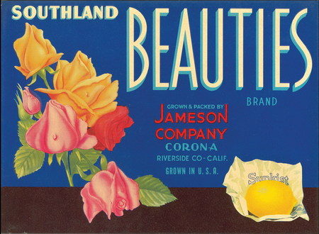
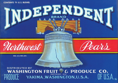
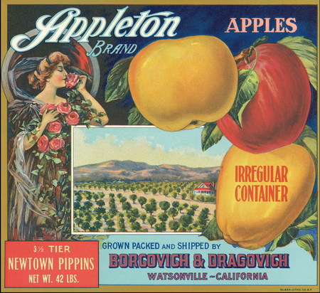
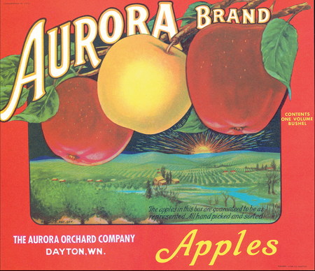
However, not all commercial artistry of that era resided in architecture. A visit to a street market or corner grocery store (a very different experience from today’s one-stop megastores) offered a cornucopia of color virtually absent from today’s retail packaging. For example, in the era before produce was delivered in stamped, pre-corrugated boxes, these foods were shipped in wooden crates that bore labels designed to differentiate a purveyor’s product from his competition.
Admittedly, some were akin to the impulse-inducing imagery of TV ads. Yet, these labels reliably delivered attractive illustration, iconography and typography.
A pair of antique-label enthusiasts recount how these labels were devel¬oped, and two signmakers who revere these bygone commercial design styles discuss how they influence and inspire their technique.
Advertisement
A history of labels
Circa 1880, after the Gold Rush had subsided on the West Coast, agriculture became an economic focus of California’s central and northern, inland areas (and, to a lesser extent, Arizona, Oregon and Washington). A favorable climate and droves of Americans, lured west by the siren song of land ownership and a fresh start, launched a vibrant and competitive industry.
Most produce was shipped thousands of miles away to distributors and markets throughout the East and Midwest. In its relative infancy, the West Coast’s agribusiness was wide-open – myriad growers were entrenched in a survival of the fittest. When selling virtually identical products of similar quality, sitting in otherwise nondescript wooden crates, the label on the crate’s top became the most valuable opportunity to snatch a potential customer’s attention.
Unfettered by modern labeling regulations, growers were granted virtually unlimited artistic license. According to David Hall, a label enthusiast who sells enlarged, digital prints of traditional labels through his website, www.boxofapples. com, many early-era labels featured such “natural” or “homespun” themes as pristine Western landscapes, animals or angelic children. In the 1920s, as more health benefits of fruits and vegetables were revealed, the labels’ buzzwords emphasized health or depicted vibrant, joyous characters.
In the latter years of crate-label art, they mimicked the increasingly sophisticated designs of print ads and showcards, which featured geometric patterns and larger typestyles that emphasized brand recognition.
Lithography dominated crate-label printing. Approximately a dozen lithography houses competed; the most notable included Schmidt, Western Lithography and Olsen Bros.
Advertisement
Dick Maule, a label devotee for approximately 30 years and proprietor of the Antique Label Co. (San Clemente, CA), said German immigrants, among others, helped elevate the technique to an art form. To create each template, they imported Bavarian limestone and etched patterns by hand. Colors were individually layered on the etching stone and embedded on the lithograph, which yielded patterns with very fine detail.
Because the template-creation process was so lengthy, prolific productions runs usually ensued – printing one million labels wasn’t uncommon.
However, as the business pace increased in the 1920s, the painstaking stone-etching technique proved unwieldy, and offset lithography became the decoration method of choice.
In the early 1950s, wooden crates were swiftly replaced by cardboard boxes, which were cheaper to mass-produce and could be easily screenprinted. As such, the crate-label market died, and remnants were relegated to storage sheds and attics of the produce companies that held onto unused labels.
The names of label designers are, apparently, lost to history. Maule theorized that signmakers, fine artists and others who developed label artwork didn’t want to be perceived as “sullying” their artistic integrity by devising massproduced, commercial art. Also, the produce suppliers for whom they worked owned the rights and probably weren’t especially interested in crediting the artist responsible for their iconic labels.
Advertisement
Signmakers reflect
Bill DeBekker, owner of 3rd Dimension Sign Co. (Canon City, CO), entered the sign business 15 years ago to help a friend who’d opened a vinyl-decal shop. Two years later, he became a partner. When the partnership dissolved, DeBekker moved the shop to Valentine, NE, and shifted the shop’s focus to router-cut, dimensional panels and, later, inkjet printing. Five years ago, he returned the shop to Colorado.
As his sign-industry experience grew, DeBekker sought additional resources to stoke his imagination. He’s purchased roughly 30, label-related books that feature thousands of designs, as well 20 to 30 authentic original labels. DeBekker views them as a professional investment.
“It’s more than worth spending an extra 20 minutes to review and draw inspiration from past design techniques,” he said. “These label designers were given free reign to incorporate their own color palette, icons and letterstyles. That level of freedom is pretty inspiring and helps motivate me when I’m having a brain cramp about a particular sign’s design. I do a lot of work in historic districts that tourists commonly visit, so it’s helpful to use a repertoire of vintage fonts.”
DeBekker is also an aficionado of stamped cigar labels. He’s also obtained numerous cigar boxes with similar, intricate graphics. His favorite is the Bank Note logo, which resembles a promissory note or stock certificate from the early 20th Century.
Tony Segale, owner of Lodi, CA-based Segale Fine Art & Gold Leaf Sign Co., lives near Central California’s San Joaquin Valley, which is also known as “America’s Salad Bowl.” Napa Valley, the epicenter of the U.S. wine industry, is also nearby. Being proximal to both industries, he’s accumulated a tidy stash of Robert Mondavi wine-crate labels (his shop was once the Mondavi family home) and fruit-label samples from within the community.
“These labels aren’t just a hobby to me,” Segale said. “They’re a symbol of the history of this region as well as being an inspiration to revere traditional typefaces and techniques in my work.”


 Tip Sheet2 weeks ago
 Photo Gallery3 days ago
 Ask Signs of the Times5 days ago
 Real Deal2 weeks ago

 Benchmarks1 week ago

 Women in Signs2 weeks ago