For most artists, their first active experience with color was scribbling between the black lines in a coloring book with their favorite colored crayon. As our intuitive perception of color becomes more sophisticated, we also develop a sense for what the public accepts as appropriate, and a keen awareness of the latest style or fad.
Relying on the waves of our contemporaries — or splashes of personal emotion — can limit our development as sign artists, however. Colors that are in style” are not necessarily the most appropriate colors to use on a job. Any style, imitated or original, rarely succeeds without a clear understanding of fundamental principles of design and color theories.
In this article, we’ll discuss how to select colors for a sign from a color wheel, using time-tested theories regarding color compatibility. Remember, any color scheme has potential, providing you understand how to manipulate the three attributes or “dimensions” of color: hue, value and intensity. Each of these dimensions will be discussed in greater detail.
Ultimately, our goal is to help you enhance your design with color. Just as you adapt layout to suit the text and graphics on a particular sign, so too should you be able to adapt color schemes. Your goal as a designer/colorist is to communicate a wide range of visually stimulating messages. Color can provide the emotional impact to your design that will encourage action by the viewer.
Color’s three dimensions
As stated, any color scheme has the potential for success, providing you learn to manipulate the three dimensions of color. For every color in the spectrum, these dimensions are hue, value and intensity.
“Hue” is a term used to describe the actual color. On a color wheel, the hues are: yellow, yellow-green, green, blue-green, blue, blue-violet, violet, red-violet, red, red-orange, orange and orange-yellow. Of these hues, yellow, blue and red are primary colors; green, violet and orange are secondaries. The rest are considered intermediates, or tertiary colors.
“Value” refers to a color’s relative lightness or brightness. Each of the primary, secondary and intermediate colors described above is at a level of full-saturation or brightness, when there is no black, white or gray added to the color.
“Intensity” describes a color’s brilliance or purity — whether the color is in its original state, or whether it has been mixed with another hue.
Understanding the dimensions of color is important, so that you can manipulate them to your advantage. For example, there are several color rules that apply when you want to change a color’s hue. These rules include:
• Mix two primaries to yield a secondary color. Mix a primary with one of its nearby secondaries to create an intermediate color.
• If you want to “warm” a color, add red or yellow (or a color with a lot of red and yellow in it). If you want to “cool” a color, add blue or a blue-based color.
• To create a harmonious “natural” shade of a color without changing its hue, add just a touch of the color’s complementary color. Complementary colors are directly across from one another on the color wheel.
• To dull your color without changing its hue, add a small amount of equal-value gray.
In addition to these hue-related rules, there are also rules for changing a color’s value and intensity. These are as follows:
• To lighten a color’s value, “tint” it — that is, add white to it.
• To darken a color’s value, “tone” it — add black.
• Mix two hues if you want to reduce intensity.
• Add black or white to any hue to reduce intensity and change value.
• Add a lighter-value gray to a color to reduce intensity and create depth.
• Add an equal-value gray to reduce intensity without changing value.
• Mix direct complements together to reduce intensity, darken the value and create a naturally harmonious hue.
Color-Wheel Theory
Artist Michael Eugene Chevreul (1786-1889) is credited for formulating the first systematic attempt to study and write about the subject of color combining. From his laws of contrast and harmony have stemmed concepts of monochromatic, analogous, complementary and triadic color schemes that are found in most modern art textbooks.
The best way to understand Chevreul’s theories is to think of the color wheel as a clock. Colors that fall next to one another on the “clock” — at 12:00 and 1:00, for example — are called “analogous” colors. Colors directly across from one another (at 12:00 and 6:00) are “complementary” colors. And colors that are almost directly across from one another (12:00 and 5:00) are “indirect complements.” Similarly, “split complements” include a color and its two indirect complements (12:00, 5:00 and 7:00).
Two color schemes Chavreul developed that are particularly important for sign-makers are his equal-triadic and unequal-triadic color combinations. An equal-triadic color scheme includes three colors on the color wheel spaced equidistantly apart from one another (at 12:00, 4:00 and 8:00). Examples of equal-triadic color combinations include: red, yellow and blue; green, purple and orange; yellow-green, blue-violet and red-orange; or blue-green, red-violet and yellow-orange. Were you to draw lines between each of the colors in an equal-triadic color scheme, you’d form an equilateral triangle.
In contrast, an unequal-triadic color scheme incorporates two of the three colors included in an equal-triadic’s scheme, plus a color analogous to the triadic’s third. For example, an unequal-triadic color scheme would include yellow, blue and red-orange, instead of yellow, blue and red.
What does all this mean? That by taking the equal- and unequal-triadic principals, and moving the “clock hands” in any direction, you can discover a wealth of color schemes you likely never considered.
Interestingly, at approximately the same time Chevreul was busy studying color theory, James Callingham authored a book called Sign Writing and Glass Embossing (1871). Callingham also discussed color theory, but specifically applied these color theories to the sign industry. He writes: “It is important to bear in mind that there can be no perfectly harmonious arrangement of colors from which either of the primary colors is absent.”
Choosing a Color Scheme
As stated, there are a lot of color combinations from which you can choose. How do you begin the selection process?
First, consider what color/colors the client specified. For example, is there a corporate color that must be used?
Second, consider where the sign will be installed. Does the sign need to match the colors of the architecture? Given the nature of the architecture, are there colors that would decrease the sign’s visibility (ability to be located) and legibility (ability to be read)? For example, the client may request that you install blue channel letters on his red-brick building. At night, the illuminated letters will indeed be readable; in the day, however, they’ll be hard to see. In such situations, advise your client of other options. If the letters must indeed be blue, advise that he use colored trim cap, or paint the sides of the cabinets white. Remember, you are the sign professional. The client is paying for your expertise — so offer it. More advice: Should you have a client that insists upon a color scheme you strongly believe will not work, note your concerns on the job’s invoice. Don’t be held accountable for someone else’s error in color judgment.
Another factor that you should consider when choosing a color scheme? The nature of the business for which the sign will be used. Select colors that stimulate the intended emotional response from viewers. A hot dog stand at a crowded intersection may need a bright red and yellow sign. But an attorney whose office is near the town’s courthouse likely needs a sign in more muted colors.
Truly, most people with common sense can select appropriate colors. Our instincts are better than we realize because of our collective subconscious. Through the years, humans have reacted in a similar way to the symbolic meaning of colors; red is commonly associated with love, white with purity, black with death, and green with peace and hope. But red is also perceived as the appropriate color representing danger, hatred or murder, etc. It has been said that color is the most subjective aspect of all the arts. Don’t let dual meanings for colors confuse or defeat your purpose of creating effective color combinations.
Consider this scenario: Many people would agree that green is a good choice for a hardware store sign; the color implies growth and improvement of our habitat. But don’t groan if and when your client, a hardware store owner, suggests you use mauve and teal on the sign. If the client is trying to portray an active, progressive spirit, these colors may be effective. One way to make these colors work is to compromise: Shade pure green with a little magenta to make a dark complementary background; tint the magenta with white for your dominant copy, then add a little medium light gray to the blue green for the secondary copy.
Once you have considered what colors you “must” use (the corporate color, the color of the building, the nature of the business, etc.), it’s time to choose the colors you’d like to use. Here’s how to select a color scheme: On a color-wheel diagram, check off the colors you will use. Draw lines between these two colors. Then, draw a line to the third color that will result in an equal-triadic or unequal-triadic color scheme.
Achieving Balance and Rhythm
A sign typically incorporates copy of primary, subordinate, and in some cases, tertiary importance. When you lay out a sign, you recognize what lettering is the most important and give it a font of greater size and line value; in addition, you generally place the most important text in the sign’s center for maximum visibility.
Similarly, you should vary the color of your text according to its relative importance. Warm colors advance; cool colors recede. As such, place your colors in their natural order of depth perception. Put warm colors in the foreground, on the dominant copy. The middleground (subordinate copy) can be the same color, if it is lighter in line value or cooler in hue than the first. The tertiary text should be the coolest hue.
An exception to this rule: If you use black or white lettering for the primary text, you can use warm color for your secondary contrast. In addition to being used as primary text, black and white can sometimes also be used as secondary copy, as a “rhythm color.” However, there is a caution when doing so: Black and white text should be placed strategically, in modest quantities, so as not to overpower the primary text.
Other factors to consider when determining color placement:
• Pure color becomes more brilliant if placed on its complementary opposite. Pure color also becomes more brilliant if placed on black or white or surrounded by a black or white outline, or if the area balance is unequal.
• Pure color becomes less brilliant if placed on the same background hue; if placed on a middle-value gray or surrounded by a middle-value outline; or if each area of color is equal in shape and size.
• Just as color creates a visual hierarchy for text on a sign, so too does it affect a sign’s graphic/pictorial elements. Large color panels and borders on a sign should differ in shape and size to create unequal balance. And the value contrast of subordinate panels should not be stronger than your dominant graphic element. Borders should likewise be rendered in colors of low value and low intensity.
• Another hint: Try to use a hue more than once on a sign. Rhythm on a sign is created by repetition of a color, line value or other elements throughout your layout. The purpose of rhythm is to lead the eye through the composition. You can create rhythm in several ways.
For instance, alternate warm and cool colors throughout the sign to relieve the monotony of heavy copy. Also, create background rhythm with textures, airbrushing, pinstripes, etc. — just be sure that the value contrast between the background color and the decorative effect is very subtle. This is a useful way of incorporating the customer’s favorite color on a sign, or a color that harmonizes with the environment. Background designs also allow sign-makers to fill excessive negative space in a layout.
Remember, even if you are fabricating a poorly designed sign, you can make color rhythm work to your advantage. Warm the sign’s dominant elements, and cool its subordinate text and graphics.
More importantly, remember this: As with anything else in this world, color rules can be broken — once you understand the fundamentals.
Mark Baty began his sign career in 1954. Since 1975, he has served on the advisory committee of the Commercial Art Dept. at Des Moines Area Community College, where he instructs classes in Lettering and Sign Art. Mark also conducts weekend color workshops at his shop, and has presented color seminars at tradeshows and Letterhead meets around the country.

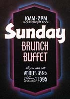
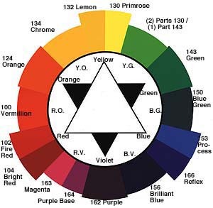
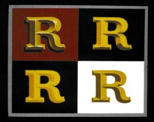


 Photo Gallery2 weeks ago
 Paula Fargo1 week ago
 Real Deal1 week ago
 Photo Gallery1 week ago
 Projects1 week ago
 Women in Signs2 weeks ago
 Signs of the Times2 weeks ago
 Business Management6 days ago