To lure corporations, cities frequently offer tax breaks and other incentives. But the incentive offered to Knight-Ridder Corp., a publishing conglomerate of more than 40 dailies, was particularly unique: San Jose, CA, offered to rewrite its sign code.
Background
In the late ’90s, Knight-Ridder decided to move its headquarters from Miami to Silicon Valley, enabling the company to better report on technological developments. Downtown San Jose, CA, seemed like a perfect location — almost.
Why "almost"? Because the company wished to make its new California presence known with a large, on-premise sign. But San Jose’s restrictive sign code prohibited the type of display Knight-Ridder wanted.
To ensure the company’s relocation — and the economic boon associated with the relocation — the San Jose Redevelopment Agency agreed to rewrite its sign code. However, agency officials also recommended Knight-Ridder hire Michael Manwaring of The Office of Michael Manwaring (San Francisco), a sign designer with whom they had previously worked. Familiar with Manwaring’s reputation, the Redevelopment Agency believed he would create an upscale display that would meet Knight-Ridder’s needs, while enhancing the city’s skyline.
Knight-Ridder’s design firm, Frankfurt Ballkind (New York), initially contacted Manwaring about the project in the summer of 1998. The firm explained Knight-Ridder was relocating into one of the nicest buildings in San Jose, and the city would consider loosening its sign-code restrictions for a well-designed, well-made sign.
"The Redevelopment Agency was hoping to set a precedent for other corporations with this sign," explains Manwaring. "The agency could tell those companies, ‘Yes, you can have a rooftop sign, as long as it’s as good as the [Knight-Ridder] sign.’"
Design
When pencil-sketching possible sign designs, Manwaring says he started by simply "putting letters on the building." He soon realized that mounted lettering would not be the best course of action. "To fit properly on the building, the lettering would be so small you wouldn’t be able to read it from the ground," he explains.
So instead, he created two signs for atop the building. "Knight-Ridder moved because of the energy of Silicon Valley — it’s a gold rush of sorts and really positive. I wanted to reflect that type of energy in my design," Manwaring recalls.
Specifically, he created two curved signs that appear "sculptural" and "ready to fly." He says, "The curve — especially the way it’s tied — represents a pulled bow and arrow that is ready to spring. The building itself is flat; the bow complements the flatness because it contrasts with the flatness." But there was a problem with his design.
To ensure readability, each sign would have to be quite large — 13 x 95 ft. Because the Knight-Ridder building was in the flight path of the San Jose Airport, the signs needed to be lowered to meet FAA guidelines. Manwaring then had to design the signs to cantilever over the edge of the building.
Co-designer Tim Perks, also of The Office of Michael Manwaring, took Manwaring’s concept sketches and transferred them via Form Z, Electric Image and Vectorworks software into a refined design.
"We only lowered the signs to where they absolutely had to be. We didn’t want to lower them so much that the bow would be completely surrounded by the building; then they would look more like conventional signs, and they would lose part of their energy," Manwaring explains.
Another design challenge? The signs could not be attached to the building surface itself. First, because the building owner didn’t want to deface the granite surface. And second, because there needed to be enough room for window-washing equipment to be lowered from the roof.
"Tim and I had a very clear idea of what we wanted the structures to look and feel like. How they came out is pretty close visually to our original rendering," Manwaring recalls.
Engineering
Manwaring and Perks were especially concerned about the engineering phase of the sign project. They believed the signs’ structural work was an important aspect of the visual dynamic. Although they knew a great deal of welded steel would be required to support each of Knight-Ridder’s two 54,000-lb. signs, they wanted the steel structures to look lightweight.
"I’ve worked with engineers and have had difficulty in achieving things I wanted to appear lightweight," says Manwaring. "It takes extra work to get a sign looking light, while keeping it safe as it hangs over public space."
As such, Manwaring and Perks recommended that Frankfurt Ballkind hire Ove Arup, an engineering firm in San Francisco. Ove Arup’s Kevin Clinch coordinated the engineering for the sign.
Manwaring is particularly pleased with Clinch’s work. "There’s a great deal of structure in the signs, but it’s well hidden. They still look pretty much like they were originally proposed," Manwaring says. "We were hoping we wouldn’t have to have catwalks. But they did a good job engineering the catwalks too — they’re very light looking."
Mock-ups
The signs incorporate Knight-Ridder’s recently redesigned logo. But choosing the best color combination for the logo proved an arduous task.
To facilitate the process, Arrow Sign Co. (Oakland, CA) fabricated numerous full-scale mock-ups of individual letters using various materials and types of illumination. Each mock-up was lifted, via crane, so that Manwaring, Perks and representatives from Frankfurt Ballkind and Knight-Ridder could see which colors and lighting were most readable from a distance.
Manwaring considered using Knight-Ridder’s logo colors — blue and green — for the sign, but he determined they would look too harsh against the building’s rich, red color.
"We tried illuminating the face with light escaping out the back; we tried halo-lit letters; we tried combining those options. We also tried white letters with blue and green lighting out the side. And we tried different silver colors, different Alucobond

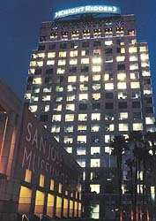
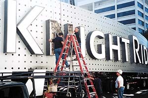
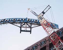
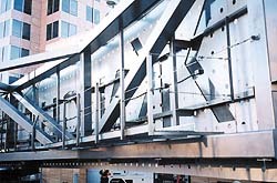
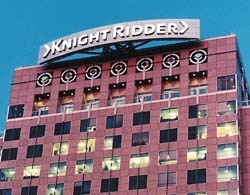
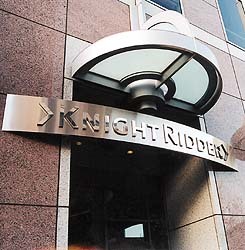


 Photo Gallery1 week ago
 Ask Signs of the Times1 week ago
 Paula Fargo5 days ago
 Real Deal2 days ago
 Benchmarks2 weeks ago
 Photo Gallery5 days ago
 Women in Signs1 week ago
 Women in Signs1 week ago