Business Management
New Arby’s Logo Tweaks Company Brand
Opinions vary on whether if flourishes or fails
Introducing the Sign Industry Podcast
The Sign Industry Podcast is a platform for every sign person out there — from the old-timers who bent neon and hand-lettered boats to those venturing into new technologies — we want to get their stories out for everyone to hear. Come join us and listen to stories, learn tricks or techniques, and get insights of what’s to come. We are the world’s second oldest profession. The folks who started the world’s oldest profession needed a sign.


2024 Sign Contest Open for Submission

A Sign Company’s Team Sponsorship Blends Involvement and Fun

Sign Company Takes Credit When Not Due


Bulletins
Get the most important news and business ideas from Signs of the Times magazine's news bulletin.
-

 Photo Gallery2 weeks ago
30 Snapshots of the 2024 ISA Sign Expo
-

 Paula Fargo1 week ago
5 Reasons to Sell a Sign Company Plus 6 Options
-

 Real Deal1 week ago
A Woman Sign Company Owner Confronts a Sexist Wholesaler
-

 Photo Gallery1 week ago
21 Larry Albright Plasma Globes, Crackle Tubes and More
-

 Projects1 week ago
Graphics Turn an Eyesore Cooler Into a Showpiece Promo in Historic Plaza
-

 Women in Signs2 weeks ago
2024 Women in Signs: Alicia Brothers
-
 Signs of the Times2 weeks ago
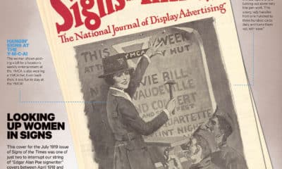
July 1919 Signs of the Times Cover Features Woman Installer
-

 Business Management6 days ago
3 Things Print Pros Must Do to Build Stronger Relationships in the Interiors Market