Lessons in Electrical Sign Manufacturing
From design flaws to cleaning up others’ mistakes.
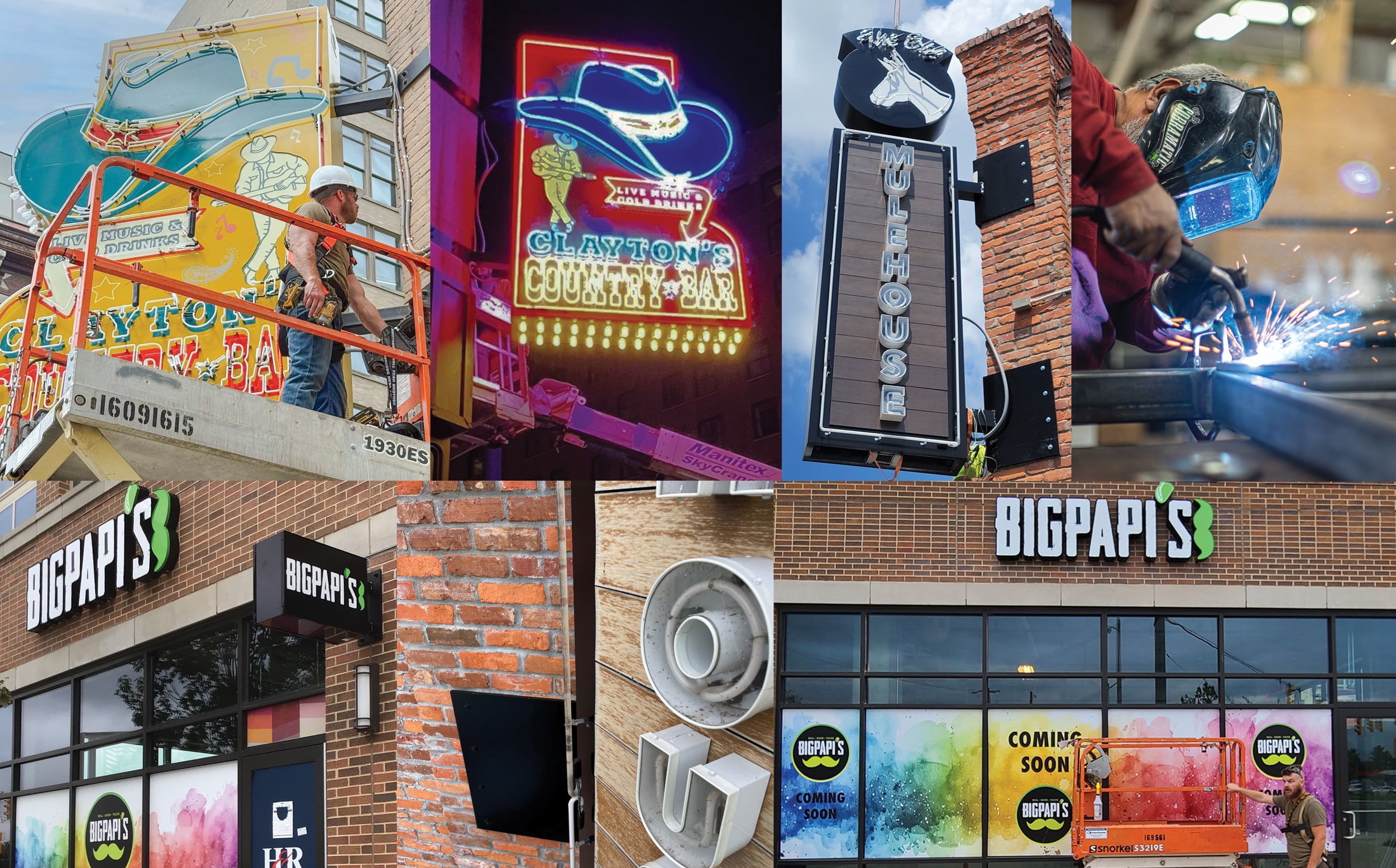
SIGN PROS WILLING to help everyone in the industry comprise who and what we rely on to report practical signmaking tips and techniques. But sign pros willing to share lessons learned from inexperience or mistakes hold a special place in our hearts at Signs of the Times. It takes a stable and secure person to let others in on their missteps, though of course, the lessons taken from less-than-ideal experiences often prove the most valuable. Following are brief tutorials from four sign companies, sharing their experiences and hard-earned benefits to save your shop from similar situations.
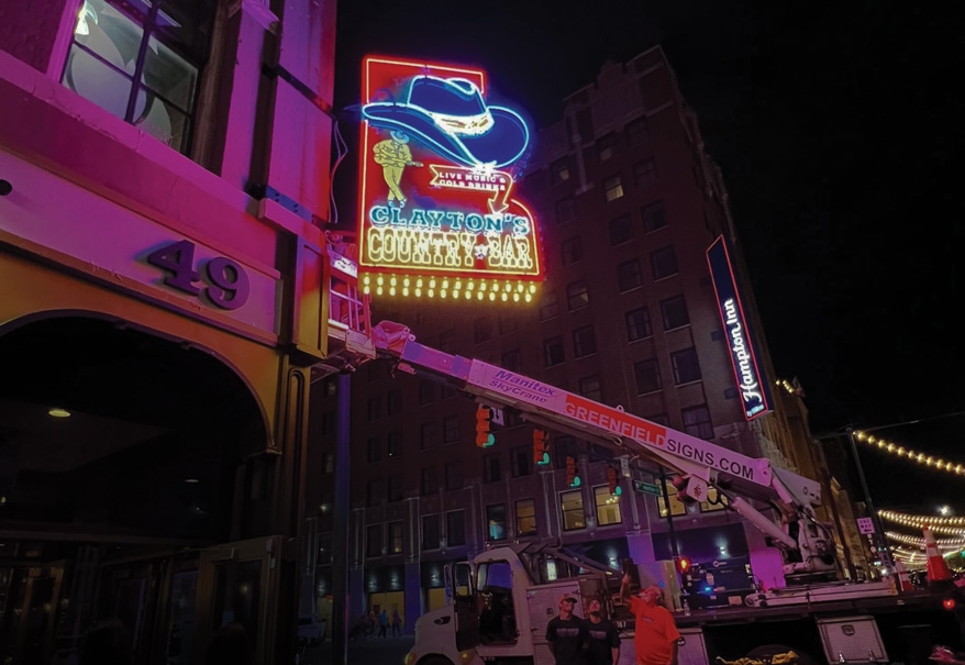
Requiring 14 hours, the installation of this sign didn’t conclude until after dark, one of many lessons learned.
INDIANAPOLIS: Greenfield Signs Inc.
Phil Walsh, president | Client: Clayton’s Country Bar (Indianapolis)
Greenfield Signs won this job through a business relationship with the building owner.
Original Plan
A country bar sign in the Nashville style. Clayton Anderson and his girlfriend showed Walsh a lot of signs in Nashville that they liked. They also sent him their branding. “Clayton, his girlfriend and I sat in my office while I laid out the design and ideas I had from what they showed,” Walsh says. “Over a few weeks we had a design together.”
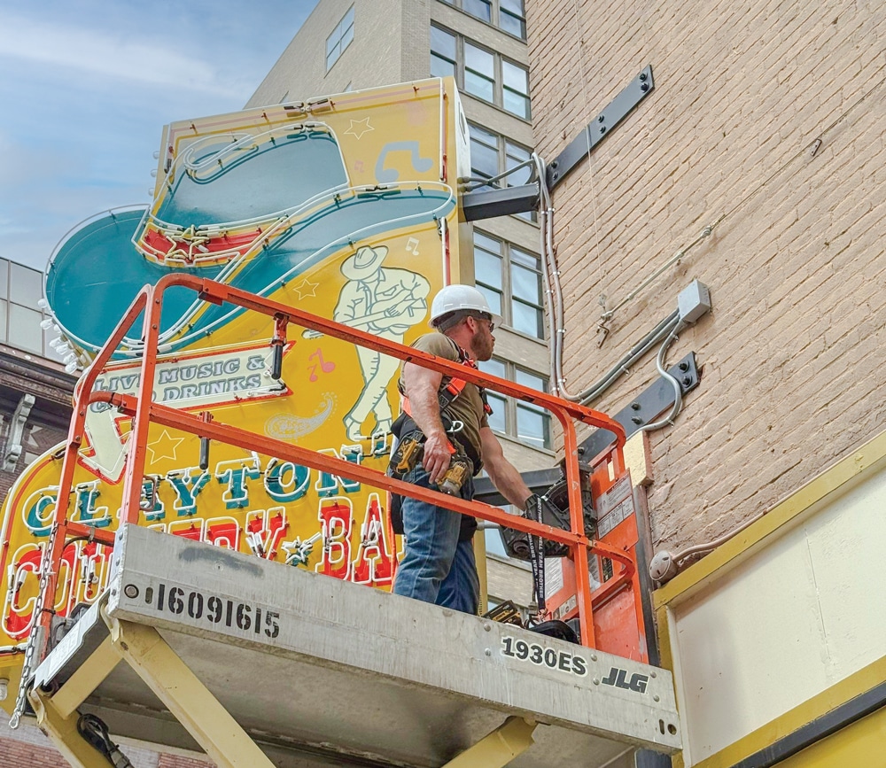
The large panels with the bulbs and sockets turned out to be difficult to remove for servicing — providing another lesson.
Lessons Learned
1 The importance of the difference in weight between magnetic and electronic transformers. Magnetic would have added more than 500 lbs. to the aluminum-framed sign. “Going electronic saved the weight and heat,” Walsh says. “We just had to use more transformers, as electronic transformers are weaker when comparing, say, a 12030 electronic and 12030 magnetic.” In addition, the size of the transformers would have necessitated that the width of the sign be 2-3 ft. deep and have a cooling system. Despite avoiding that, Greenfield still put electric fans in the sign to help dissipate the heat.
2 Using LED and neon together on the same sign. “This was a first for us to incorporate internal LED lighting with external neon,” Walsh says. The shop learned how to have both components inside the same sign and how to use the space and wiring while still having lighted portions.

3 Install vs. balance on a 120-plus-year-old building. “Everything fits great inside the shop but when it came to the building, making it fit was much harder,” Walsh says. He admits that maybe they could have had larger tolerances in the mounting pockets. “It all worked out,” he says, “but a 14-hour install could have been much shorter, of course.”
4 Servicing this sign could have been thought out a little better. Post-installation, Walsh found that while it was not hard to get into the sign for servicing, the large panels with the bulbs and sockets would be easier to handle if the panels had been made in shorter sections, he says. Removing and installing the long panels from a lift around all the glass are difficult.
Like all of us who are bent on improving our craft no matter where we stand, Walsh takes a typically philosophical approach to learning sign manufacturing lessons. “Outside of lessons learned, the best part of the project is the satisfying feeling of looking at it and seeing the joy it brings to so many people in our city and visitors to the city commenting on it,” he says. “The sign is the focal point of so many photos of visitors and news stations.”

Applying vinyl around the edges of the letters created a mottled effect purposefully emphasized for location two.
FREDERICK, MD: Sign Solutions
Tim Ward, managing member | Client: Big Papi’s, two locations: Rockville, MD and Alexandria, VA
Sign Solutions originally bid on Big Papi’s first location elsewhere, but lost the job to a competitor. Later, Big Papi’s reached out after finding Sign Solutions through an online search and asked them to quote their new Rockville location.
Original Plan
Using Big Papi’s logo with white and lime green push-through letters in an illuminated box. “We were familiar with their existing signage — white channel letters with black gem cap and returns — but noticed it lacked contrast during the day,” Ward says. “We proposed a push-through copy sign with internal illumination for better daytime visibility.”
To help sell the concept, Ward built a small-scale sample of the original plan. The client loved the look, the idea and the effort Sign Solutions put in. “But unfortunately, the landlord rejected the concept, despite having no formal signage criteria,” Ward says.
In response, the shop fabricated three sets of channel letters on raceways with black backer panels for improved contrast. The client was pleased with the results. The following month, they fabricated two more sets of channel letters, an avenue sign cabinet and a push-through tenant panel for Big Papi’s Alexandria, VA location.

Using SATcap and clamps proved to be easy for gem capping.
Lessons Learned
1 Ward states the project presented a challenge due to the irregular logo shape and lettering style. The shop used their Computerized Cutters Accu-Trim EDGE to form the letter returns. They also considered pan-formed faces — which they do in-house — but the property required gem cap.
“I had read about SATcap in Signs of the Times earlier this year and saw it demonstrated at the 2025 ISA show in Vegas at the Grimco booth,” Ward says. “I was impressed enough to order a few rolls while still at the show.” Back at the shop, they reviewed Satcap procedures, and Ward’s son William (along with another fabricator) completed the gem capping. “William commented that it was the easiest gem capping he’d ever done, despite needing to clamp certain parts to ensure a proper bond,” Ward says.

2 Ward also used Sign Solutions’ Accu-Trim notching feature and cut .063 backs on their MultiCam 3000 CNC router. The faces were made from 3/16-in. Chemcast 7328 white acrylic with applied black Avery Dennison HP750 High-Performance Cut Vinyl to create a mottled effect around the edges. These were then laser-cut on their Laguna Tools C02 laser cutter/engraver before gem capping.
“On the second location, we wanted to enhance the effectiveness of the signs, so the mottling effect took more time than expected, which we accounted for upfront,” Ward says. “Still, the added effort paid off: The client was so pleased they said they’re no longer looking for another sign company.” Always give more than expected, Ward advises. “Going the extra mile builds your reputation for quality and creativity.”
New panels slip over a frame and are screwed from inside with this reworked mall sign. “You can never really have too many clamps,” Gaskins says.
PENNSAUKEN, NJ: Abco Signs
Rocco Gaskins, owner
The issue was that another sign company originally installed some monument signs at a mall. However, they were going out of business at the end of the project. “I suppose that they did what was expedient to get the last two sets of monument panels completed,” Gaskins says, whose company had just completed an installation project for Ruggles Sign (Versailles, KY) at a small department store in the same mall. About a week later, Abco Signs got a call from the construction company that had remodeled the mall. “We had been recommended by Ruggles since they are too far away to do something like this,” Gaskins says.

The construction company asked what could be done with the tenant signs on this street. The main set of monument signs in front of the mall had individual tenant panel sections and the same was needed on the back side of the mall. With just one large aluminum panel (about 4 x 7 ft.) the entire face of the original monument would need to be replaced to change any tenant’s name.
“The tenant panels on the front of the mall, while they look good from outside, are very difficult to re-create for new tenants,” Gaskins says. “I designed a system for the back side of the mall where the new panels just slip over a frame and are screwed from inside.” To change the tenant panels in front of the mall, which Abco Signs still does, is quite a chore, he adds. “We have since developed a simpler system to make/install the panels in front of the mall.”

Once in the outdoor elements, the laminated wood panels would fade badly in less than a year.
TUCKER, GA: Image360 Tucker
Earl Walker, president | Client: The Old Mulehouse (Jasper, GA), an American restaurant with a modern twist on the neighborhood tavern, an offshoot of Grecian Gyro.
We were hired to help them create the new brand’s logo,” Walker says. “We had been doing work for [the Grecian Gyro] for 20 years since I put postcards in their drive-in window, and one of the owners came to our shop to meet with the company that kept marketing to them.”
Original Plan
Wanting to create an authentic look to capture the nostalgia of Jasper, the owners converted an old repair garage into a restaurant. “I had the bright idea to put wood on the sign to match the wood on the interior of the location,” Walker says. One of the owners was concerned that using real wood might attract bees. “So, I suggested we use a composite material that looked like wood,” Walker continues.
The building had been built in the early 1900’s, and pieces of the bricks were literally falling off. The Image360 Tucker team had to use large plates to secure the sign to the building to bear the weight. The project was delayed because the city engineer wanted to be on-site to ensure the building was structurally sound and could support the weight.

The sign worked great in the shop, but within six months, two different transformers blew out.
Lessons Learned
1 Always consider the natural elements when being creative with electric sign design. “We designed a beautiful sign to capture the rustic look of Jasper: exposed neon and laminated flooring panels to simulate the appearance of old wood,” Walker says. However, the laminated panels couldn’t withstand the sun and completely faded. “To repair the broken neon has cost us thousands,” he adds.
“As designers, we always want to create unique and artistic signs,” Walker says. One lesson imperative for designers is understanding production and manufacturing. “Take time to work with your production team. Attend the sign shows to learn about the materials, their benefits and limitations,” he says. “Though we thought we hit a home run in achieving the client’s desired look, we failed to consider the maintenance.” To add insult to injury, the location was two hours from his shop.

2 The other lesson learned is to consider putting together a maintenance plan for your sign projects. “Also, please verify with your manufacturer that they are using quality parts,” Walker cautions. “We had two transformers blow within six months, both of which had to be replaced under the manufacturer’s warranty.”
“Neon rope” was new and had not been proven long-term in the industry, Walker says, so Image360 Tucker had gone with traditional neon. As a result of the experience he encourages other sign pros not to be afraid to mix new with proven methods. “Always consider the elements when making a sign,” he concludes. “Conduct a thorough survey of the building and identify any obstacles that may impede your creative process.”
PHOTO GALLERY (18 IMAGES)


Secrets of Lead Generation
Boost your sales by generating more leads! In this light and lively webinar featuring Maggie Harlow, CEO of Signarama Louisville Downtown (Louisville, KY) and the “Business of Signs” columnist for Signs of the Times, learn the secrets of how leads are generated, where they come from and how you can cultivate better (not just more) leads.


Bulletins
Get the most important news and business ideas from Signs of the Times magazine's news bulletin.
-

 Business Management1 week ago
Alternative Management Advice for Sign Companies
-
 Fabrication + Installation7 days ago
Small Signshop, Big Fabrication
-
 Paul Ingle2 weeks ago
120 Years of Signs, and I’ve Seen 41 (Mostly)
-
 Real Deal3 days ago
Sign Company and Customer Clash on “Minimum 2 Hours”
-
 True Tales2 weeks ago
My Shirt Says “Signs”
-
 Mildred Nguyen2 weeks ago
Interior Reimage Transforms Georgia School
-
 Maggie Harlow1 week ago
3 Steps for Performance Appraisal Preparation
-
 Tip Sheet2 days ago
Workflow Automation, Budget Discussion and More Signshop Tips