Channel Letters
Signshop Writing the Future of Channel Letter Design
Its recent design modification became the shop’s standard after client feedback.
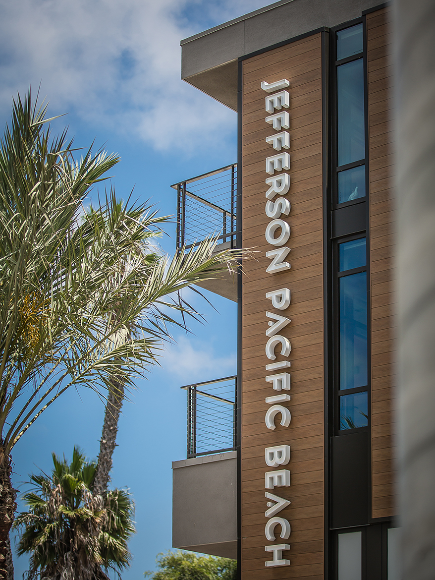 Designed by TCA Architects (Los Angeles), these halo letters were made even more interesting by recessing the face 1.5 in. on a 4-in. letter body, which creates added dimension and richer feeling during the day and is further highlighted at sunset when the lighting accentuates the recessed layer.
LOOKING BACK OVER the last 15-plus years I have been in this industry, my team has produced countless sets of (what you might call) “standard” channel letters for a wide variety of clients. Don’t get me wrong; precoated coil letters with flexible trim cap serve an important role and bring value to many of our best customers on a daily basis. But for some, the oversaturation of this branding staple has given the term “channel letter” a negative stigma. As I’m sure you can probably attest and our experience in service work confirms, quality of materials and craftsmanship vary greatly. LED hot/dark spots, delaminating trim cap, over/underpowered lighting and rusting cans (just to name a few) have given the innocent channel letter a bad rap, and we are seeing more jurisdictions (such as Berkeley, CA) create design restrictions that prevent what they perceive to be a “cheap look” from taking over.
Our team has been fortunate to work with clients, architects and design firms no longer content with basic or bare-minimum standards, and have helped us side-step mediocrity on dozens of projects ranging from mild to wild in the effort to catch the eye of future clients, and stand out from the sea of trim cap and pre-coated coil.
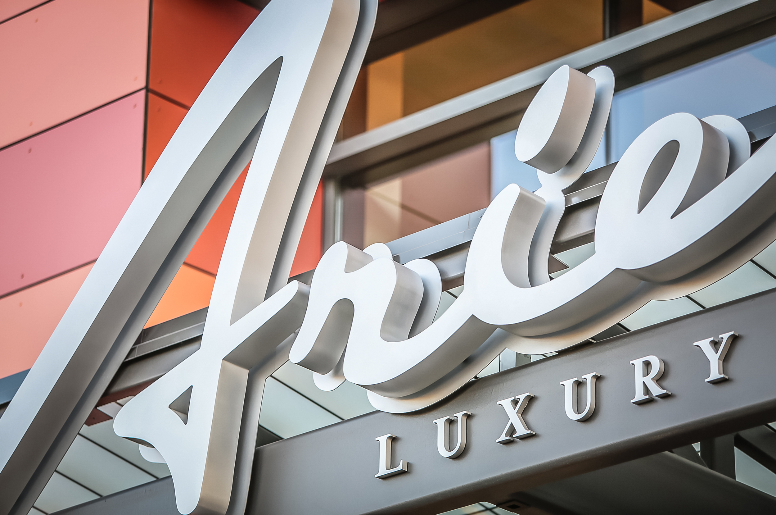
Canopy-mounted letter sets always provide mounting and wire-management challenges. While standard face-lit letters would have been easier, Hollis Brand Culture (San Diego) wanted a minimalist backdrop and reflector for the internal lighting to create an elegant daytime view.
Luckily, it doesn’t take much to upgrade from our bread-and-butter industry default. Just the transition to “trim-cap-less” faces, commonly machined from ½ to ¾-in. white or clear acrylic, can make a tremendous improvement in richness and appeal. They can be a bit tricky to get right, but the final product is well worth the learning curve. Based on client feedback, faces without trim cap are now our standard when designing master sign programs for mixed-use buildings and retail centers.
Many of our clients and collaborators also feel that the reverse-can “halo” letter is getting a bit boring. For them, we offer examples of recessing the face to create a more dynamic daytime view. For others, we offer an additional push-through component that converts a welded or machined letter into a creative, dual-lit variant.
Over the years we have continued to evolve our product line to accommodate client requests for thinner profile, edge lighting, dual illumination, faux neon and more. For the team at Clear Sign & Design, we are constantly challenging the standards and searching for new, more creative methods that meet our durability expectations. Our culture of collaboration underpins the process of seeing the art in all that we do. When those forces align, our team can create some pretty amazing things.
AdvertisementSo, the next time your clients ask for something more original, or even if they don’t, show them all the options, so they can stand out from the crowd in their own way. Better yet, challenge your design team — as we do — to create the “next big thing” for the industry to adopt.
Introducing the Sign Industry Podcast
The Sign Industry Podcast is a platform for every sign person out there — from the old-timers who bent neon and hand-lettered boats to those venturing into new technologies — we want to get their stories out for everyone to hear. Come join us and listen to stories, learn tricks or techniques, and get insights of what’s to come. We are the world’s second oldest profession. The folks who started the world’s oldest profession needed a sign.


NUtec Digital Ink Invests in Solar Energy for Facility

5 Reasons to Sell a Sign Company Plus 6 Options

21 Larry Albright Plasma Globes, Crackle Tubes and More


Bulletins
Get the most important news and business ideas from Signs of the Times magazine's news bulletin.
-

 Tip Sheet1 week ago
Always Brand Yourself and Wear Fewer Hats — Two of April’s Sign Tips
-

 Photo Gallery3 days ago
30 Snapshots of the 2024 ISA Sign Expo
-

 Ask Signs of the Times5 days ago
Why Are Signs from Canva so Overloaded and Similar?
-

 Real Deal2 weeks ago
A Woman Sign Company Owner Confronts a Sexist Wholesaler
-

 Benchmarks1 week ago
6 Sports Venue Signs Deserving a Standing Ovation
-
 Photo Gallery8 hours ago
21 Larry Albright Plasma Globes, Crackle Tubes and More
-

 Women in Signs2 weeks ago
2024 Women in Signs: Megan Bradley
-

 Women in Signs1 week ago
2024 Women in Signs: Ashley Borell